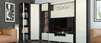
Choosing stylish cabinet furniture for the living room is 90% the key to success. After all, this is the largest piece of furniture in the room, which will attract the most attention. In addition, usually a TV is placed in the slide, which means that views will be directed in this direction. We have collected stylish and original options that are trending in 2022.
Minimalist slide
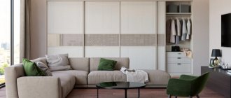
Over the past few seasons, one of the most stylish trends in interior design has been the pursuit of minimalism. This topic also included slides for the living room. What are they? These are completely closed shelving (so that there are no unnecessary details in the room) without handles.
The composition looks more complete if the TV is not recessed inside the cabinet, but is located on the same level as the doors. If you choose a minimalist slide to match the wall, it will visually expand the space. This is especially true for living rooms up to 15 square meters.
Forms and features of placing a slide in the living room interior
The shape of a modern wall-slide for the living room is chosen depending on the specific solution for arranging the interior of the room. Furniture sets can be straight or angular.
- Direct. Modern headsets can be placed in a straight line along the wall. This arrangement is especially beneficial for square and rectangular rooms. Often the components of a linear slide wall simply cannot be placed so that they fit into a corner. That is, it is the connection of the modules in a certain order that gives the composition a complete and harmonious look, and when this order is changed, the external integrity of the slide is disrupted. The standard version of a straight wall involves the presence of several cabinets, open and closed shelves, and a TV stand, which is the center of the set. The elements of the linear complex are arranged symmetrically. The highest elements are placed on the sides of the central cabinet, the rest are placed as they descend towards the edges. This arrangement visually makes the room taller. Also, with a linear arrangement, it is possible to place tall cabinets at the edges, and install a TV in the middle on a central low cabinet and hang several shelves above it.
<
>
- Angular. The corner complex is a practical solution for living rooms with a small area, as it allows you to effectively use the corner space. Despite its compactness, the corner wall is quite spacious. With the help of such a set you can adjust the shape of the room; it will fit perfectly even into a long, narrow living room. Most often, a wardrobe is used as a corner module, which is surrounded by other sections on the sides. But the arrangement option also looks very interesting when there is a stand with a TV in the corner, shelves are hung above it, and shelves are installed on the sides. In principle, you can put any module in a corner and arrange the elements around it so that the complex looks harmonious and stylish. The corner wall allows for asymmetrical arrangement, which gives free rein to imagination. The wall can be positioned in such a way that one wall is completely occupied, and the one adjacent to it is only partially occupied. This is a good solution for small rooms with a window near the corner.
It is the corner version of the slide that will help rationally use free space that cannot be used otherwise.
Classic
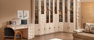
Until now, classics are most often used to design living rooms. And this is not surprising. The style creates a very cozy and relaxing atmosphere. In addition, the classics can rightly be called the most solemn style, so it will be pleasant to receive guests in such a living room.
Nowadays, a lighter version of the classic is in fashion, so light-colored furniture is more common. Dark massive slides are suitable for cottages; in an apartment I would like to see a more sophisticated option.
Also, the distinctive features of the classics include an abundance of glass, symmetry, the presence of figured cornices and decorative panels, doors with panels and interesting handles made of heavy metal.
If you don't like white furniture, take a closer look at the models in café au lait color. In 2022, he firmly conquered the pages of fashionable glossy interior design magazines. The color is as versatile as possible, pleasing to the eye and very cozy.
White slides have their own advantages. There is no other color that also “saves” space. Even such a large piece of furniture as a wall-sized slide will not look bulky if you choose white.
In general, open shelves also make furniture lighter, but the important point is what you fill them with. In classics, every detail is important, so you need to think in advance what items will end up on the open shelving.
It is better that they are in the same style and similar colors. How can you recognize the interior created by the designer at a glance? The shelves in it will be half empty. After all, the task of the slide is to become not just a storage place, but an interior decoration. Ideally, things should occupy no more than 30-40% of the total open space.
TV cabinets
When the living room requires a minimal amount of furniture and modern interior design, it is good to make long hanging TV stands and cabinets. They can be located parallel to the cabinet or asymmetrically, and include open shelves for glassware or decor. Such slides are suitable for the living room, where modern interior details are a priority.
Instagram @germann_design
Instagram @shemsne
Instagram @rimi.mebel
Instagram @styleville.mebel
Instagram @styleville.mebel
Slides with fireplace
Could there be a more cozy element in the living room than a fireplace? I think no. Nowadays, real wood-burning fireplaces are used extremely rarely, and gas and electric fireplaces can be built into furniture. This will not harm the slide or the equipment.
At the moment, the location of the fireplace under the TV has become a classic. For the composition to look organic, their sizes should be approximately the same. The TV can be a third smaller because it is located higher. But it is better not to purchase a fireplace that is too small: it may simply get lost against the background of the entire wall and not produce the desired effect.
By the way, the slide under the fireplace does not have to be made to order. Many manufacturers offer ready-made models along with fireplaces. This is much more convenient, since the sizes of fireplaces vary greatly. And you don’t have to waste time on selection.
As for the fireplace itself, the more natural the fire in it looks, the cooler it will be. Don't chase brightness. Let it be better not so noticeable, but more realistic.
Symmetrical models
As we mentioned above, symmetry is one of the hallmarks of classics. Nowadays it is extremely difficult to find symmetrical wall models for the living room. Every furniture designer wants to bring his own original details, so the appearance of the models becomes more and more complex.
If you are a follower of the classics, it is better not to experiment with asymmetry. Attempts are rarely successful. Playfulness can be introduced with the help of interesting objects on the shelves and more free placement of upholstered furniture.
For those who like more unusual models, slides are suitable, in which the shelves differ slightly in width and height on different sides of the center. In general, multi-level shelves are a separate big trend for 2022, which we will discuss in more detail below.
Wall slide for the living room - design features
A furniture display for the living room is a complex of elements of different sizes, shapes, and configurations, which make up a harmonious composition in a single color and style. The peculiarity of the design is the obligatory observance of an increasing sequence of elements. This design feature of the furniture gave it the name “slide”.
Initially, the slide was a pyramid-shaped shelf in which crystal and other utensils were stored. However, over time it transformed and began to denote the modern idea of a wall.
The modern wall has a number of obvious advantages, which determined its popularity in modern interiors:
- Compactness of furniture with its large capacity.
- Mobility – the ability to easily swap modules.
- Beautiful appearance.
- Wide selection of shapes, colors, materials, configurations.
- Possibility of choosing a design.
When choosing a wall slide for the living room, it is important to decide what will be placed in it. A wardrobe is needed to store clothes, and a special cabinet is also required for dishes. If the slide is necessary for installing video and audio equipment, then the wall should be equipped with large shelves. This type of furniture is also suitable for placing books, installing a TV and decorative elements.
Asymmetry
Designers emphasize the modernity of the model precisely with the help of asymmetry. If classic models could have been found in the same form even among your grandparents, then asymmetry is a fairly fresh trend.
To facilitate the design, shelves are often placed on only one side, and the other is decorated with a decorative panel. Thin wooden slats and marbled materials are especially relevant.
You can also make the design more airy if the bedside table is hung on the wall. You can provide lighting and in the evenings it will seem as if the slide is floating in the air. This move is almost as spectacular as a fireplace.
It is better to make blank walls either in light or very dark colors. Intermediate options may be too reminiscent of office furniture and look bulky. By the way, the trend is wood with a clearly defined pattern - veins, knots, irregularities.
If you place the TV inside the slide, you need to make sure that there is a visually free area around it. Shelves located too close, especially if there are a lot of them, will distract from viewing and create visual noise.
Color and design
Briefly about styles:
- Minimalism. Simple colors - simple shapes. Any painting or decoration of furniture is strictly rejected - only the most necessary. Mini-slides that match the spirit of the style are best suited.
- Provence. Characteristic features: natural wood with simple painting. The colors are light, pastel, possibly with floral patterns. Linear type only – angular ones are prohibited!
- Classic. Symmetrical cabinets in light colors. Gold painting and metal fittings with a golden tint are welcome.
Multi-level shelves
The same trend that we mentioned above. Different heights and widths of the shelves help make the furniture more interesting; there will definitely be something for the eye to grab onto. This also sets the dynamics and the interior looks more alive.
Again, before ordering such furniture, clearly imagine what you will place on the shelves. They are usually quite narrow, so they are not very functional. That is, arranging your home library in this way is not the most brilliant idea.
Items must fit the dimensions of the shelves. A vase that takes up only a quarter of the cell will look bad. A bouquet of flowers can save the situation. Likewise, a part that occupies the entire volume of the shelf will most likely spoil the overall appearance. Write in advance where you can place which piece of furniture. You may have to make more than one rearrangement.
Slide + table
Often in small apartments, the living room also serves as an office. In this case, the table can be combined with a slide. This is a good idea only in one case - if you live alone. In all other situations, your loved ones will most likely greatly interfere with your work. Especially if everyone gets together to watch TV. In addition, from a psychological point of view, it is more comfortable to sit with your back to the wall, and not to the center of the room.
Wall slide in the interior - photo
<
>
A wall slide is an interior item that will help you properly plan the living room space, save free space even in a small room, place all your things in one furniture set, and at the same time become an indispensable and bright decoration of the living room.
Slide with wardrobe
Another option, possible only in small apartments. If the area allows you to move the wardrobes to any other place, be sure to do so. They look completely out of place in the hall.
When there are no other options, try to make your cabinets as inconspicuous as possible. Choose furniture without handles, light colors; you can make the cabinet not the full height of the wall. As a last resort, you can make the remaining components of the slide lighter and smaller.
Direct
For this type of furniture, a straight slide is a classic. They are the ones most often given preference when choosing an option for arranging rooms in which you can achieve maximum harmony with the overall style of the room. A straight wall-slide is well suited for a large or medium-sized hall; it will also look great in spacious living rooms. It will take up empty space and decorate a large room without the effect of clutter.
Freestanding models
Just a few years ago, only free-standing models were available for sale. Now designers are striving to decorate the entire wall. But this does not mean that the slides have disappeared from sale.
How to recognize a stylish model? Geometry is trending. If it seems that the slide consists of figures that are found in Tetris, you can take it. Plus, those same models are usually painted in three colors: no more, no less.
What then indicates outdated models? Patterned glass and mirrors, large metal handles, contrasting combinations: beige and brown, light gray and wenge, a large number of small cupboards, closed and open shelves. Such slides will definitely not take root in your living room! All options below are obsolete. If they don’t seem terrible now, they will definitely start in 1-2 years.
By the way, many free-standing models have a back panel on which the TV is usually mounted. If the panel does not reach the ceiling, the solution can be called an anti-trend. The exception is when its tone-on-tone color matches the color of the wall.
If we talk about what is more relevant - glossy or matte surfaces - the answer will be unequivocal: matte is now in the top. Gloss is found in kitchen facades, but practically does not appear in living rooms. A glossy slide will fit well only into very restrained interiors in muted colors. Bright glossy surfaces will not come back into fashion anytime soon.
If you have a large wall, the slide should be commensurate with it. You should not choose models that are less than 50% of the total volume of the wall. Options that occupy almost the entire wall always look better. It feels like the furniture was made to order.
Walls with hidden TV
For those who watch TV extremely rarely and pay great attention to detail, a sliding door would be an excellent option. She will be able to close the TV at all times when it is not in use.
Also, when the TV is pushed forward, shelves are often placed around it. But so that the details do not distract from viewing, they are located behind closed doors, in the center of which there is a special hole for the TV. If you plan to use them frequently, carefully check the equipment's fastening.
Cabinets
The first question you need to ask yourself before choosing furniture for your living room is: what function should it perform? To be additional storage space, room decoration or just a traditional element? In the latter case, you can completely abandon the slide in favor of a cabinet.
Often there is simply nothing to put in a large pile and closed cabinets remain half empty. Or rubbish begins to accumulate in them, which is no better. If it seems to you that there is not enough space in one cabinet, it can be supplemented with a hanging cabinet or a narrow shelving unit.
When comparing solid slides and models consisting of several elements, the main factor is the size of the room. In a small living room (up to 15 square meters), a set of several pieces of furniture would look better. In a large space, a single slide covering the entire wall will look more advantageous.
Modular
This already mentioned type of slides is the most practical type of such furniture. And all this because the modules (shelves, cabinets, etc.) can be swapped and get the most optimal and convenient option. If a modular wall-mounted wall with a wardrobe is installed in the living room, then after some time you can modify the configuration of the furniture and “refresh” the interior of the room.
Shelving
Nowadays, many people are abandoning the TV, replacing it with a computer screen. This transforms the approach to decorating a living room. Because in the first case, the TV is the main object of attention, and in the second, you need to choose a new accent.
The rack will cope with this role perfectly. To enhance the effect, you can add lighting and create a thematic selection of parts on the shelves. Don't get carried away with too many family photos, 1-3 is enough. You can dilute them with interesting photographs without people, posters or paintings.
Also, travel souvenirs often look too colorful. But you can try to select them in the same color scheme, style or from the same material. But the crystal or sets on display are a relic of the Soviet era.
Books always look great. The library-living room is the most cozy room in its essence. If you have a rich collection, it would be a good idea to add additional lighting to the shelves - highlighting such valuables is a pleasure.
The accent can be not only the contents of the shelf, but also the shelf itself. For example, due to an unusual color. Everyone is accustomed to the fact that shelving is usually made either in white or in the color of natural wood. Choose a color that is not the most common for furniture - and the original, memorable living room is almost ready!
The shape of the rack may also be unusual. An option for the most daring is to place a TV on an open shelf. By the way, a translucent shelving unit is a very good solution for zoning a kitchen-living room.
For dishes
If your home has a lot of all kinds of utensils - decorative vases, plates, figurines, then you can make cabinets with open shelves, thanks to which all this beauty will delight the eye not only of the owner, but also of the guests who come. Traditionally, dishes are placed in a sideboard with glass doors, so a wall-mounted wall can also be used for this purpose if you make glass doors and shelves in it. This option is perfect for any living room.
Instagram @interdesign_shymkent
Instagram @belorusskaiamebel
- Decoration
Making stained glass on a window in 5 steps: a simple method with video instructions
Wall constructors
A trend that is now actively coming into fashion is slides that seem to be made up of different parts of a construction set. If you like a similar model, you can safely take it: this style will not go out of fashion very soon.
To summarize, I would like to list the main parameters for choosing a wall or slide (as you prefer to call it) for the living room. For small rooms, light models consisting of several elements are suitable. In larger ones, full-wall cabinet furniture will be more relevant.
The trend is geometric, multi-level shelves, combinations of three colors, asymmetry, brevity, lack of handles, matte materials. At the same time, the classics are eternal! And most importantly, first of all, do not start from fashion, but from personal preferences. This makes it easier to find the perfect option. Find modern sliding wardrobes in the hallway using the link.
Tips for choosing colors
It’s easier to choose a color if you know its effect on the interior:
- Brown. Gives a feeling of fundamentality and heaviness. This is why it is so common in older Renaissance styles. Combines with any warm and soft tones. It contrasts with all cool shades.
- Black. It is believed to negatively affect the interior due to bad associations. In fact, it is an ideal tool for highlighting accents. For example, black furniture in a white interior looks impressive.
- Grey. A good choice for pastels and whites. As an accent it is worse than black, but at the same time its effect is softer. It is not so radical, so it is better suited for light designs.
- White. Necessary in small rooms, as it visually enlarges the room. White furniture will appear less heavy if placed in a tight space.

