A cozy interior necessarily means beautifully decorated walls. To decorate them, you can use paint, panels and other materials, but the most popular option is wallpaper. They play a serious role in the perception of the entire interior as a whole, so it is important to choose their appearance correctly.
In addition, you need to pay attention to performance characteristics. We will discuss all these nuances in detail in the article.
What to consider when choosing quality wallpaper
Of course, the wallpaper should match the style of the interior and look harmonious, but an equally important factor is its quality. Wallpaper from an unscrupulous manufacturer will last you only a short time, so the first thing you need to pay attention to is:
- Environmental friendliness. Wallpaper must be made from safe materials.
- Moisture resistance. This is especially important for the kitchen and children's room.
- Density.
- Easy to care for.
- Resistance to fading and abrasion.
- Fire resistance.
Good wallpaper that meets all of the above criteria may cost more than lower-quality analogues, but in the future you will feel that they are fully worth their cost. They will not have to be re-glued for many years.
Current trends 2021-2022
- Botanical print. These include large palm leaves, rare plant species depicted on canvases, and the like. This design looks very harmonious, especially against the backdrop of living plants in pots.
- Provence and French pastoral. These are simple scenes from village life, which can depict animals, plants, birds and people.
- Geometric print. This print does not lose its relevance over many seasons; with the help of different lines, shapes and angles you can give the interior a certain style.
- Spotted print. A very non-standard solution that enlivens the interior.
- Animal print. This is an original choice for the interior, suitable for bold decisions.
- Relief and textured surface.
- Gradient. The transition of colors allows you to create a soft, and at the same time, stylish interior design.
Paper wallpaper
The most common wallpaper. They can have one or two layers. The choice of paper wallpaper is huge: ordinary smooth, with three-dimensional patterns and designs, corrugated. When choosing, pay attention to the weight - the heavier the roll, the better the quality of the wallpaper.
This type of wallpaper is the cheapest, but also the most unreliable.
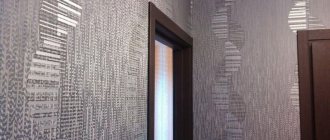
Geometric wallpaper is the hit of the season
Geometric wallpapers have become especially popular recently. It is these patterns, appearing in muted tones, that are ideal for various types of rooms, especially bedrooms and children's rooms. Diversity and versatility are the main reasons why geometric wallpapers are so readily chosen by buyers and interior designers. They make it very easy to liven up a room and introduce an interesting decorative element that will attract attention.
Choosing the right geometric pattern can also improve the optical reception of a room, which may appear taller, wider, or larger. Geometric wallpaper can display a variety of shapes, which are most often found in a specific order. For this reason, wallpapers of this type are suitable for almost any style - they are universal and easy to hang.
Striped wallpaper, interesting interior design
One example of geometric wallpaper is striped wallpaper. Most often, the wall behind the head of the bed is decorated in this way, using a vertical arrangement of stripes. At the same time, the room appears optically higher, which is especially useful in the case of high headrests. The horizontal arrangement of the stripes , in turn, makes the room wider. This pattern works best as wallpaper for a child's room, which is usually much smaller than other rooms in the house. Striped wallpaper can be:
- neutral in muted tones,
- bright and contrasting, with bright and rich colors.
The thickness of the strips is also important. If you want a muted effect, choose low-contrast colors . Thanks to this, the wallpaper will turn out delicate and balanced. If you want to highlight the wall and draw the attention of guests to it, you should choose thinner stripes and contrasting colors. This method of wall decoration is suitable primarily in youth and children's rooms.
Polka dot wallpaper
Another equally popular geometric motif is polka dot wallpaper . This type of geometry is considered artistic and is therefore more often used in modern interiors. Polka dot wallpaper looks best when the main color is a light shade - pastel, gray or white. Then the room does not seem overloaded, but bright and open.
When choosing polka dot wallpaper , you should pay attention first of all to their size. When deciding on small dots, you should not place them evenly on the background. As an option, the points can be given a certain shape, but then they should not appear on the entire surface of the wall.
People who value classics and timelessness can choose white and black polka dot wallpaper. They are best combined with red elements, which can be accessories or furniture. Then you will have a great composition in a retro style.
Multi-colored dots are also good as wallpaper for a girl's room . They can make the interior a cheerful, positive atmosphere, and this will make the child’s play and relaxation time enjoyable. However, be careful not to overdo it - small dots of contrasting color distributed over a large area can cause optical illusions and even after a long stay in the room can cause illness.
Non-woven wallpaper
They combine the advantages of paper and vinyl wallpaper. The composition is 70% cellulose, the rest is connecting materials. Thanks to this, the wallpaper acquires increased density without losing breathability and practicality.
As a rule, the surface of non-woven wallpaper is embossed. If you want to transform the interior, they can be easily repainted several times. Also, such wallpapers initially have an adhesive layer, which simplifies their gluing.
What to look for when choosing wallpaper
The first step is to decide for which room you are choosing wallpaper. Their characteristics must match the room. For example, for a child's room, the best option would be wear-resistant, washable wallpaper. Also consider whether you plan to repaint the walls in the future, or if you're ready to just change the wallpaper.
Pay attention to the symbols on the label and, of course, choose wallpaper that matches the interior.
Design Tips
5 tips for those who are renovating their apartment:
- For a children's room you need to choose delicate pastel colors. It can be soft pink for a girl and blue for a boy.
- For the kitchen, a combination of bright colors and muted colors is optimal. For example, if the cabinets are red, then it is advisable to make the walls plain and discreet.
- The color of the floor in the room should not blend in with the wallpaper (how to choose wallpaper to match laminate flooring?).
- If furniture was purchased first, then the wallpaper will be matched to it. For a luxurious set, it is advisable to choose monochromatic, soothing shades - beige, chocolate, burgundy.
- For light-colored furniture, bright or patterned wallpaper looks better. Otherwise the room will be too faded.
When choosing the coloring and tone of the wallpaper, you need to be guided by the general rules and your wishes. After all, you will live in the house, and all the rooms should please the eye. Therefore, decorate the premises the way you like.
Symbols on wallpaper
Be sure to read the wallpaper label. All information is indicated there: the level of moisture and light resistance, care rules, gluing features. When calculating the number of rolls, you will also have to refer to the markings.
There are the following letter designations that provide information about the type of wallpaper:
- A – acrylic;
- B – paper;
- BB – foamed vinyl;
- PV – flat vinyl;
- RV – embossed vinyl;
- TKS – textile wallpaper;
- STR – structural wallpaper for painting;
- STL – glass wallpaper.
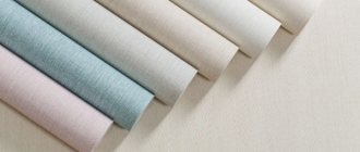
The width and length of the roll can be found on the label. According to the standard, the length is 10 m and the width is 0.53 m or 1.06 m.
What wallpaper to choose for the room?
What color should you choose wallpaper for your walls?
Color is perhaps the most important factor that subconsciously influences people's mood. How to choose the color of wallpaper so that it triggers the necessary processes in the brain that correspond to the purpose of your stay in a certain place in the house? The answers to this question have long been known.
The kitchen needs a color that stimulates the appetite, invigorates in the mornings and saturates with energy in the evenings. This is yellow. Good colors for the kitchen are beige and silver. They combine well with the energy of water. White color is also very favorable for the kitchen. It attracts a flow of positive energy. From the point of view of favorable energy, remember that kitchens with extravagant, provocative tones will be deprived of it. The only thing you can afford are bright splashes of one rich color, for example, red.
The hall needs to consciously create a friendly, peaceful environment as it gathers together. The desire to conflict will not arise when surrounded by green, beige or any other pastel color.
Deep blue color is very appropriate in an office or work area in a room. It stimulates brain function. When the eyes take in the color blue, mental work is done easily and quickly.
Beige, olive, peach are ideal tones for the bedroom, especially for those parts of it where your eyes look when you wake up. In the bedroom you can leave a bright, exciting corner of red or crimson, but it should be localized, say, on one of the walls, for example, behind the head of the bed. The point is that it will be in front of your eyes only during waking moments, it will help you tune into a passionate mood at the right moment, but it will not interfere with peace before bed.
- It's blowing from the window - what to do?
The child's psyche is a very subtle instrument. Therefore, the main colors in the children's area can be calm green, yellow, and milky. Bright stimulating colors can only be present in the play area, and even then in a very dosed form. Limit depressing purple, frightening black, exciting red as much as possible not only in the children's room, but also in any part of the house.
We've figured out the basic colors for each room. But what if you find background wallpaper of the same color boring and want more interesting color schemes? In this case, we arm ourselves with the rules of color combinations. How to choose wallpaper of two colors? Just like in clothes, for example.
A harmonious combination of colors can be achieved by adding any of the following to the main color:
- white + any existing color;
- red + green, blue, golden, yellow, gray;
- pink + gray, brown, burgundy;
- orange + green, purple, brown, light blue;
- yellow + green, golden, light green, brown;
- blue + blue, orange, red, brown;
- blue + red, gray, golden, silver, burgundy;
- purple + orange, green, golden, yellow;
- gray + yellow, black, green, blue, red, pink.
If you have difficulty with color combinations, you don’t have a table at hand, and you doubt whether this or that color matches another color, remember that nature has a universal hint. All color combinations that exist in nature are a priori harmonious. Like, for example, the orange fruit of an orange and its green branch with leaves. It's beautiful! Feel free to combine colors and create a unique style for your home.
How to choose the right wallpaper for the ceiling?
Wallpaper for the ceiling is still popular and competes with other types of “indoor sky” design. And all because this is an inexpensive way to complete the room, without limiting yourself to the usual whitewashing or painting of the ceiling. And although the most advantageous color of the ceiling is still white, you are free to play a little with colors and textures, bringing to life your own or the designer’s original ideas.
3 types of wallpaper are suitable for the ceiling, namely: foamed vinyl, structural wallpaper for painting and glass wallpaper.
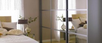
How to choose wallpaper to match the color of the furniture?
The color of the furniture and the color of the wallpaper should look harmonious. It is important to achieve the effect so that the furniture does not merge with the walls. This means that a minimum contrast between them is required.
You cannot violate the principle that says: warm tones are combined with warm tones, and cold tones are combined with cold tones. This means that furniture and wallpaper should not conflict in this sense.
If the furniture is dark, then the walls are light. Accents on the walls are also appropriate only through paintings, but not through wallpaper designs. You can't argue with that.
If the furniture is white, then there are many options. And light shaded, and dark, and bright wallpaper - everything will do. White color is universal.
If the furniture is brown, you need wallpaper in warm colors.
If the furniture is multi-colored, for example, in the kitchen or children's room, choose wallpaper in pastel colors.
How to choose wallpaper for your interior?
Remember that it is easier to match the wallpaper to the furniture than vice versa. Therefore, when starting a renovation, we dance away from the furniture in any case. Even if you haven't purchased it yet, try to imagine what it will be like (style, color) and where it will stand. Only after this can you figure out what wallpaper you will need.
Depending on whether you will decorate the walls with photographs, paintings, tapestries, you can select a wallpaper pattern. If you plan a rich additional decor, then background wallpaper is needed. If there is no additional decor, the gap can be filled with a rich wallpaper pattern.
- Top things that should not be in the bedroom
Do not forget that both the window composition and niches are important parts of the interior. When choosing wallpaper, try to imagine the whole picture. To make sure that you are doing everything correctly, try to look at your room from different angles: what will you see when entering the room from the door, and how will it look from the position of your workplace, and will everything look beautiful from everyone’s favorite sofa?
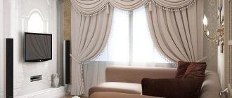
How to choose curtains for wallpaper?
It is imperative to design a window composition with an eye to the wallpaper of the room. They must be designed in the same style, and also be in harmony with each other in color and texture. In this matter, leading designers have developed certain rules for combining everything with everything. But for now we’re just gluing wallpaper, and we’ll start working on curtains, curtains, and roller blinds when we’ve completely prepared the walls and ceilings.
Is it worth saving when choosing wallpaper?
One of the common mistakes is buying the cheapest wallpaper. It is worth remembering that the better the quality of the wallpaper, the more durable and beautiful the repair you will get. Wallpaper is the basis of the room, its background, which can be either accent or neutral. In any case, low-quality and tasteless wallpaper is always noticeable, no matter what function it serves, and even expensive furniture will not save the situation.
In the store it may seem that cheap wallpaper is not so bad. However, when gluing them, you will most likely encounter many problems: they can tear, wrinkle, and highlight the unevenness of the walls. Over time, the design often fades or is completely erased, and the wallpaper peels off.
Wallpaper color and other interior details
Let's dwell on a few more details that can affect the search for wallpaper for walls by color. Often in interiors they focus not only on furniture, but also choose wallpaper to match the color of the doors . This design option does not necessarily involve the use of similar shades: it is possible to use colors a couple of tones lighter or darker.
When choosing wallpaper for walls, you can focus on other surfaces. Most often, the criterion for choosing the main shade is the ceiling. In many antique interiors, wallpaper and ceiling merge into a single composition.
How to match the color of the ceiling to the wallpaper? First of all, decide which palette will be most successful in your room: dark, light or bright, creating contrasts.
Next, analyze whether the selected shade will have a pressing effect when used not only on the side surfaces, but also on top.
If you are completely satisfied with your choice, start decorating: if desired, the ceiling can be stylized using textured materials or a glossy finish .
Attention! Wallpaper of absolutely any color will suit a standard white ceiling.
Don't forget to think about how to match the color of the curtains to the wallpaper. Curtains in the interior can imitate the background shade (differing from it by several tones) or repeat the color of patterns found in the accent areas of the room.
How to choose the right type of wallpaper
Another mistake is buying the wrong type of wallpaper. Consider the features of the room where you plan to glue them:
- You can choose any wallpaper for the living room and bedroom. Textile ones look especially interesting - they make the interior more expensive and elegant.
- It is best to glue vinyl wallpaper to the kitchen - it is easy to wash off any dirt from them, which cannot be said about their paper counterparts.
- The same rule applies to the hallway. There is a big risk of dirty shoes staining the wallpaper, so you need it to be moisture resistant.
- Sometimes wallpaper is even applied to the bathroom. Here, of course, you need to give preference to washable wallpaper; glass wallpaper is also suitable.
- In a children's room, it is most convenient to hang inexpensive paper wallpaper. Children often draw on the walls, so it won’t be a shame to change the finish. A good solution is to purchase glass wallpaper that can be repainted several times. Another interesting option is special wallpaper for drawing in the nursery. They come in three types: marker, chalk and coloring. In the first two cases, the drawings can be erased.
Chalk wallpaper is very practical not only in a children's room. For example, they can be used in the kitchen, sticking them next to the work area, and writing notes and recipes there.
Types by gluing methods
They are formed based on the type of wallpaper and the condition of the walls. There are three most common methods of gluing canvases:
- Butt. This method is effective only on flat surfaces and for dense products: non-woven, embossed, vinyl and silk-screen printing. This is his minus. And the advantage lies in the speed and high quality of the result.
- Overlapping. An excellent method for wallpaper with medium to low thickness. It can be used to hide modest defects on the walls. It is optimal for paper products. Its disadvantages are long work and scrupulous adjustment of the image. Be sure to cut off the edge and combine the two canvases.
- Image offset.
When deciding which wallpaper is best to choose, be sure to take into account what kind of pattern it has and its versions of its combination. Here are the following variations:
- Universal. The location of the picture does not matter.
- Straight joint. We glue the parts of the picture side by side at identical heights.
- Offset joint. The shift occurs in each subsequent sheet.
- Displacement + revolution. We turn every second canvas 180 degrees.
You might be interested
How to glue wallpaper correctly. The foreman shares his experience. Finishing work. Stages of finishing work. How can you save money when renovating?
How to choose the appropriate shade when buying wallpaper
Poorly chosen wallpaper can ruin the entire impression of the room. Wallpaper should look harmonious in the interior and not stand out, unless, of course, you set yourself the goal of making one of the walls an accent wall. Even when wallpaper becomes the highlight of the decor, you need to remember the rules for combining colors and the features of the room.
When choosing a wallpaper color, pay attention to:
- Room size. Wallpaper can greatly change the visual perception of space. In small rooms you should not make black walls, as the room will become even cramped and uncomfortable. It is better to choose light colors - they will create a feeling of spaciousness and enliven the room. White, beige, and light gray will help create a relaxed and calm atmosphere. These are neutral colors that are also great for creating a subtle backdrop, which will allow all the attention to be directed to the furniture. In spacious rooms, it is quite possible to hang dark, even black, wallpaper. However, you still shouldn’t decorate all the walls in this way - one or two will be enough, otherwise the situation will be tense;
- Color saturation. Wallpaper that is too bright should only be hung in large rooms and as a single accent, otherwise it will start to irritate. They can be used to decorate the wall behind the bed in the bedroom - it is rarely in sight, so bright wallpaper will not bother you.
- Lighting and window placement. North-facing rooms always lack natural light. Wallpaper in warm colors will help make them more comfortable: beige, yellow, peach, soft pink, orange and the like. Cold tones, on the contrary, will be appropriate in rooms on the sunny side.
- Wallpaper density. If you choose light wallpaper, it can often shine through, emphasizing the imperfections and unevenness of the walls. In this case, before gluing them, the surface must be painted with water-based paint.
Popular options
Today it has become popular to decorate the interior with bright colors.:
- Green and all its shades fit well into any interior style or purpose of rooms, especially in those rooms where people are engaged in mental work.
- Blue and its combinations - the sea and relaxation are associated with it, so blue tones will be good in the bedroom.
- Red wallpaper is a bold decision. When choosing them, remember: too bright colors begin to irritate over time, so it is better to choose more muted shades of red.
But still, classics always remain in fashion. Do you have any doubts that in a couple of years you will get bored with bright walls or go out of fashion? Then it’s better to hang wallpaper in warm colors. They won't become obsolete.
Selecting a suitable pattern when purchasing wallpaper
A few tips on how to choose the right wallpaper pattern:
- Use small patterns only on one wall. Do not wallpaper the entire room with such a pattern - it will dazzle your eyes.
- Dark wallpaper with a large pattern on one of the walls is a win-win way to visually lengthen a room.
- Bright wallpaper should be supported with interior items of the same color. For example, pair a red accent wall with a small red chair.
- Wallpaper with horizontal stripes expands the walls, and wallpaper with vertical stripes visually lifts them up.
Original new wallpapers
- Original new products for 2021-2022 include wallpaper with a metallic effect. The most fashionable colors are black or graphite. Metallic goes well with matte wallpaper. Designers advise using black metallic as an accent, but not covering the entire room with such wallpaper.
- Monochrome. Black and white combinations have held leadership positions for a long time. They fit perfectly into a minimalist interior and are also complemented by geometric prints.
- Waves. Wallpaper with waves can be reminiscent of Aivazovsky's paintings. Most often, they have a relief surface, which enlivens the picture and makes it three-dimensional. Wallpaper with waves is best used to decorate one wall, which will be an accent wall.
- Wallpaper 3D. This wallpaper design also continues to hold a leading position for several years.
- Wallpaper with luminescent and fluorescent effect. They glow in the dark, which is a mesmerizing sight. This type of wallpaper with a picture of a starry sky is excellent for a child’s and adult’s bedroom.
How to calculate the number of rolls before purchasing wallpaper
The final mistake is buying too many or too few rolls. To ensure you have enough wallpaper, you need:
- Calculate the total area of the room, subtract door and window openings from the resulting value.
- Divide the result by the area of the roll. It is indicated in the instructions or on the label.
- Add an extra roll. When gluing, you can ruin a certain amount of wallpaper, so to avoid having to buy it again, buy one roll in reserve.
Remember that wallpaper with patterns must be glued so that all the patterns match. Because of this, additional material will be required.
Choosing good wallpaper is not difficult, the main thing is to take into account all the nuances described in the article. If they are chosen correctly, they will definitely transform the interior and will delight the owners with beauty and quality for a long time.