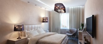
What is color for us, what effect does it have on us? This is a very important factor in our lives; it affects our health, state of mind, and relationships.
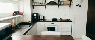
The color of the walls in the kitchen is a very important design element, on which the harmony of the entire interior will depend.
When we are at home, we spend most of our time in the kitchen. That is why it is necessary to approach the choice of colors not only for the set, other furniture, but above all for the walls of this room with all seriousness. What color is best to paint the kitchen, let's look below at what experts advise.
A competent choice of shade will allow you to set a certain mood for the room and create a favorable atmosphere in it.
Color for kitchen walls: selection rules and recommendations
Let's look at the key principles of kitchen design.
To decorate a small kitchen, you should choose pastel shades.
- A large image visually reduces the size of the room.
- Small things, on the contrary, visually make the room larger.
- Intersecting stripes imitating tartan create the illusion of constant space.
- Vertical increases the height of the ceiling, the room appears higher.
- Drawings and stripes in a horizontal image make the kitchen wider, but its height is reduced.
- Diagonally located stripes make the room more dynamic.
- Textured wallpapers look very unusual. By giving the surface of the walls new qualities, they form an auxiliary dimension. Unexpected effects are obtained from the play of shadows, color aspects, and alternation of textures.
Dark colors visually conceal and reduce the area of the room, while light colors significantly increase it.
The background for the design is created by the walls. When choosing a color scheme, be sure to take into account the height of the ceiling, the size of the kitchen, style, lighting design, and furniture. Light shades are preferable in small kitchens; they make the room appear larger.
Feng Shui recommends choosing cool or light shades, such as white, green, light yellow, beige, light brown or blue.
On a note. You should not paint the walls in rich and provocative colors, especially if the kitchen is small and you are there most of the time.
Shades of the dark color spectrum should be used for kitchens located on the sunny side.
For large kitchens, dark shades are appropriate; in this case, the room looks smaller. Cold tones are not recommended here; the kitchen will look boring and faceless. If there is little sun, there is a lack of lighting, warm colors are suitable: beige, orange, yellow. If you have a sunny side, avoid deep bright tones; in the sun they will become even more saturated.
It is not advisable to use cool colors in a kitchen that is too spacious.
Nowadays green, for example, pistachio or light green, is widely used - experts are sure that it improves digestion. Soft tones are also in fashion, white is trendy - it is suitable for any style.
In a room with walls in subtle colors, you should create one accent wall.
How to design an apron
This zone is primarily required to be practical. Therefore, any attempts to design it must be considered through the prism of healthy pragmatics and ergonomics.
One of the key trends in recent years is segmented patchwork ceramic tiles. It enlivens the space and fits well with all modern designs.
Another current method is massive porcelain tiles measuring 60x120. Covers almost the entire area, creating a harmonious feeling of homogeneous space. The most common options are imitation marble and granite. Less commonly, slabs stylized to look like a concrete base.
The classic “hog” 10x20 and 10x30 appears less and less in interiors.
If we take a break from ceramics, then to decorate the apron you can also consider:
- threw off;
- steel panels;
- mosaic based on stone or glass;
- plastic panels with decoration.
The last option is the most affordable in terms of cost, but is only suitable when you are dealing with an electric stove.
Basic rules for combining colors in the interior
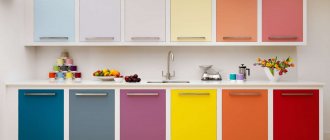
You will get an excellent design if you correctly combine all its components: the color of the walls, furnishings, design of the ceiling and floor. For example, a white set combines perfectly with red, dark red, green, peach, yellow, and blue wall backgrounds.
Classic wood furniture looks ideal in yellow-red, beige or milky shades.
Principles of color combinations.
- Milky - harmonizes perfectly with all colors, most well with blue, burgundy and dark.
- Light brown - goes well with azure, brown and milky.
- Grayish is a dull tone, but is considered basic. Perfect with rich pink, reddish, lilac, rich blue.
- Pink – chestnut, milky, yellow-green, grayish, blue are suitable for this color.
- Burgundy - perfectly harmonizes with yellowish, snow-white, emerald, blue, black, gray.
- Brown - with light azure, beige, red, emerald, beige.
- Orange - with azure, blue, lilac, light purple.
- Yellow - with blue, lilac, azure, black, grayish.
- Pistachio – with amber-brown, yellow, dark, cream.
- Azure - with scarlet, gray, orange, milky, yellow.
- Blue - with lilac, emerald, yellow, orange, red.
- Black is a multifunctional, elegant tone. Looks good with absolutely all colors.
The most optimal combination is with orange, emerald, milky, yellow and red.
It may seem that choosing a perfect color palette is not easy. Of course, this will take time to achieve the desired effect. But by using the principles described above in practice, you can achieve the desired result.
If the set is made in bright, eye-catching colors, then it would be advisable to paint the walls in calmer and neutral colors or vice versa.
Countertop: quality or style?
There are no strict rules for choosing in this case. Most often, a neutral palette is selected: gray, beige, white, black.
The imitation stone looks interesting. This option will suit any style.
Main requirements:
- good quality material;
- high performance properties;
- compatibility with apron, facades.
Brown - goes well with almost the entire palette
What color is best for the kitchen space?
In order not to make a mistake in choosing a color, many factors are taken into account. First of all, what the hostess herself wants. She needs to be comfortable, since she has to spend quite a lot of time here. If she likes everything, then the dishes will be great. It is worth considering the opinions of other family members, because everyone loves to gather in the kitchen.
You can always find the optimal solution.
Do you have small children in your family and are there problems feeding them? The right color scheme will help solve this problem. A psychologist's advice wouldn't hurt either, since some shades affect the subconscious, emotionality, and appetite.
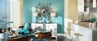
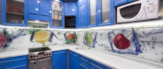
The photo shows a white kitchen set in combination with a sky-colored wall.
In small rooms it is better to use light colors, this will expand the area. It will be more comfortable with dark facades. It is also important how the windows are located. To the north, facades need warm colors, to the south - cool tones.
The color palette of the walls is considered the most important element in decorating a kitchen.
Surface preparation
washable paints should be selected for kitchen walls
The walls must be prepared for painting, and the better this stage of work is completed, the better the final result will be. So what needs to be done and in what order?
- The kitchen walls should be cleaned of dirt. You need to be especially careful when dealing with traces of fat. The old finish is removed, along with the crumbling plaster.
- Browse the space that opens. There should be no signs of mold or mildew. If there are any, then these areas are cleaned mechanically to a clean surface, and then covered with an antibacterial composition. The resulting potholes are filled with gypsum or, less commonly, cement mixtures.
- Painting the walls in the kitchen will be ideal if the layers lie on a completely smooth surface. Such a surface can be achieved using acrylic putty. Spread it evenly over the wall, let it dry and sand it well.
- To improve adhesion to the paint, the puttied wall is treated with a primer and left to stand for the time recommended in the instructions. Now the wall is completely ready for finishing work.
Color solutions that visually change the size of kitchens
It is worth noting that the design is not always consistent in one tone. Often the walls are decorated with patterned tiles, decorative plaster, or wallpaper with a pattern. If you want to visually change the footage, when choosing material, consider certain details.
The entire appearance of the interior will depend on the correct shade.
- In a small kitchen, it would be better to stick wallpaper with a small pattern - this will expand the space.
- Wallpaper with a large image visually reduces the area, for this reason it is most advisable to cover spacious kitchens with them.
- If you want your kitchen to look larger, you need wallpaper with a pattern of intersecting lines.
- The geometric vertical image “raises” the ceilings.
- For a small kitchen with high ceilings, the best option would be wallpaper with horizontal lines or an image.
- A diagonal pattern can add dynamism to a room.
- Embossed wallpaper or textured plaster can significantly change the space. Tonality will play a major role, and the right combination of color and texture will help transform your kitchen.
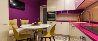
Pink always creates a warm and homely comfortable atmosphere.
Choosing the right wall colors for the kitchen
In order to choose the right range, it is necessary to take into account the degree of illumination, height and footage. Having decided on all the data, choose a color background.
Soft and refined shades make the design more sensual.
How to choose for a spacious kitchen
For large rooms, choosing a color palette is somewhat easier. Take into account your preferences and capabilities. The grayish color scheme looks calm. However, it must be “diluted” with the brightest colors. The main emphasis is on pieces of furniture.
Gray or light grey, combine striking elegance and simplicity.
In addition, it is worth listening to recommendations.
- Do not use brown, especially rich brown, in large quantities - it has a depressing effect. Yellow-green can be used to decorate a separate part of the wall surface.
- Neutral shades are best suited for decoration - it will be comfortable and warm. You can use any color palette, the main thing is that everything is proportional. Do not get carried away with dark shades, and also use a large number of cool tones.
Thanks to their restraint, such shades are a modern sign of good taste.
Which ones are suitable for a small kitchen?
What wall color to choose for the kitchen. To expand a small area, choose dark neutral shades diluted with bright elements. It is better to add silver-pearl, beige, ivory to the milky color. The advantage of milky color is its perfect combination with almost all colors.
It will undoubtedly give the room additional volume, brightness and snow-white cleanliness.
The azure palette visually increases the space, but additional colors are also needed here. Take, for example, this combination - blue walls, white ceiling, light flooring, cool-colored curtains. It is better if the wall covering is monochromatic. If you are thinking of using rich colors, for example, orange, red, it is better to decorate part of the wall or apron with them.
Various shades of orange, such as pumpkin, amber or ocher, create a very warm, rich, tonic and filled with positive energy interior.
Optimistic pistachio color with the use of vertical directions and reflective surfaces will give a feeling of lightness. But it’s worth knowing when to stop. Light shades are most suitable. It is important to choose furniture wisely.
The natural, natural and warm tone allows you to create amazing, sophisticated and attractive color combinations.
Dark colors are not recommended for wall decoration in a small kitchen. Used only when decorating elements or pieces of furniture.
Rich purple colors will add elegant luxury, bright expressiveness and originality to the design.
It is important! If the kitchen is small, there should be enough lighting.
Curtains for windows
Window decoration is essential in any interior. Thick, good-quality curtains will be inappropriate.
It is best to choose light, thin fabrics that match the rest of the interior. They do not burden the perception of space.
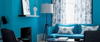
Gray color is universal
Curtains can be plain or contain prints that match the style of the room. Bright colors are rarely chosen; usually preference is given to a calm color scheme, white.
What colors should not be used in the kitchen interior?
Refrain from using colors such as dark shades of brown and black. They have a depressing effect, the room looks cramped and not entirely clean. If you want to know in advance what it will be like for you in the kitchen with such an interior, hang white sheets, cardboard or unnecessary wallpaper on the walls. After applying paint to them, leave it for a while.
By contemplating these tones every day, you will decide which one is most suitable.
That's all the wisdom for decorating a kitchen. Follow our tips and you will create a unique design.
With proper use of shades in the interior, it will be possible to most accurately convey the main idea of the room design.
Safety precautions when working with paint
Modern coloring compositions belong to the category of environmentally friendly products.
They are fireproof and do not explode. However, this does not mean that they can be worked without protective equipment, namely gloves and respirators. Paint that gets on the skin is immediately removed with water and soap. Any remaining paint should not be disposed of down the drain. During subsequent repairs, do not try to scrape the walls. You can safely work on the existing surface. Repainting is allowed within 20 layers.