Light shades
With their help, even a small, narrow room with small windows is filled with light and seems more spacious. Designers recommend furnishing the bedroom, kitchen, classic and minimalist interiors in pastel colors.
Chipboard with gray, cold beige, pearl, snow-white lamination is a godsend for high-tech style. Especially if the facades made of this material are supplemented with chrome fittings. Furniture with such a palette: milky, beige, creamy, yellow - emphasizes the homeliness, romance and vintage style of Provence, shabby chic, Scandinavian. Let's list the six most popular titles.
Karelian birch
The furniture is a delicate golden color with darker inclusions in the form of smooth lines and knots. Sometimes the design is associated with marble.
Light ash
A creamy grey-beige shade with a smooth texture. In some variations it resembles coffee with milk. Laminate flooring of this color is often installed in apartments.
Acacia
This is the name of grey, yellowish or greenish wood and chipboard material. Dark veins stand out on the surface.
Pine
White-pink or amber texture with brown streaks.
Light beech
Beige-pink surface with beautiful veins.
Milk oak
Surface with matte beige or pearl color and unique wood grain.
In addition to the listed shades, there are alder - a soft pink tone with a silky sheen, apple tree, tansau maple, spruce and pear.
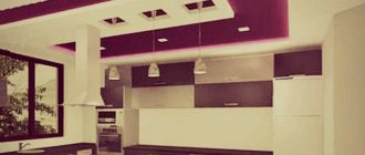
Dark furniture colors and their names
A rich, deep palette is used to create almost all interiors: classic, high-tech, modern, chalet, rustic. True, unlike pastel furnishings, it can eat up space. This doesn't mean there shouldn't be anything black or graphite in small rooms.
Such elements are quite appropriate, but they need to be reduced to a minimum or partially included in the furniture. For example, the upper part of the facades is light, and the lower part is dark. But in general, this design is appropriate only in spacious apartments with large windows. Especially if cabinets, tables and other objects are massive.
The most popular, most often dark brown color with a heterogeneous pattern. Sometimes the nut may have a reddish tint or be greenish-gray. The texture also changes - from sinuous stripes to dots and strokes.
Wenge
Such a surface can be blue-black, with a purple tint, chocolate with golden veins, or burgundy. Living wood has a richer palette than laminated material, but costs more. Wenge, like walnut, dominates the interior due to its richness. Therefore, the main background should be neutral or with small bright splashes.
Red tree
Mahogany, padauk, sandalwood, berry yew - all species have a red-brown cut with varying degrees of richness and texture. If it is wood and not imitation, the surface will darken over time.
Ebony
A common name for several breeds. Natural material or lamination with this effect can be dark brown, black, reddish, with beige stripes.
Next we will show another palette of chipboard colors for furniture with names and photos.
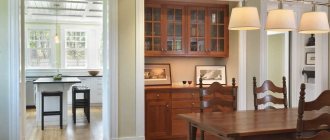
Living room decoration
Wood in the living room interior always looks very impressive and is appropriate in almost any design. If this is a Scandinavian style, then the use of light woods emphasizes the connection with nature; wooden furniture in pastel shades is suitable for Provence. Small and simple wooden details are appropriate in minimalism and hi-tech.
Stumps and large saw cuts in the interior of the living room can play the role of a coffee table and become the main focus of attention of guests. You can make an accent wall near the TV from saw cuts and pebbles; from processed sticks and branches you can make a cornice, lamp and other accessories.
Transitional shades
Intermediate tones are a compromise for small apartments. If you don’t want to make the interior white or beige, and dark things clutter up the space too much, look for something in between. Almost all suitable shades will be warm, with varying degrees of saturation. They fill the apartment with light. Furniture with this color does not look as bulky as ebony or mahogany. These are the colors:
- Cherry (reddish-red)
- Alder (beige-red).
- Rustic oak (medium brown).
We have listed all the main colors of wood and imitations for it. If we talk about chipboard and MDF with lamination, then the spread is even greater. In addition to the listed natural shades, there are green, gray, purple, with the effect of steel, concrete and titanium. Some colors of laminated chipboard for furniture with names in the photo.
Tips for choosing colors and the best combinations
In well-lit, spacious rooms with large windows, you can safely put dark things of any size. If the room is less than 17 meters, it makes sense to think about a mixed option. For example, black and white facades, where there is a lot of white. Or find reddish-brown things. They will add comfort to the home atmosphere.
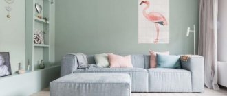
Designers advise decorating small living rooms, bedrooms and kitchens only in pastel colors. Against the background of peach, milky, blue walls, a cabinet made of light beech or ash will look almost airy.
It is easiest to combine finishes with them and add bright details to the design. In other cases, this should be done carefully so as not to overload the space. If you want to create a strict design, look for inspiration in a cool palette. In warm weather, when there is not enough sun in the home.
The interior can be roughly divided into two parts. The first includes the floor, ceiling, walls, window sills, baseboards. The second consists of furniture and decor. The background and furniture must match each other perfectly in color, as they are the most difficult to replace. It is also important not to overdo it when decorating your home, but problems with this are easier and faster to fix.
Maintaining color balance
- The more neutral the basic plan, the more massive and noticeable the setting can be. And vice versa.
- In standard apartments and modern houses without high ceilings (above 3 meters), columns and large areas, emphasis should be placed on coverings that do not attract attention without elaborate patterns. This way you will definitely avoid clumsiness.
- When choosing dark wood or chipboard, light finishing should occupy at least 60-70%.
There is an easy way to understand whether the background in the room is neutral. Imagine it is empty. Will a sofa with velvet upholstery on curved legs and a simple chair fit equally well into it? If yes, then everything worked out.
We select successful combinations
- White. This is the most win-win material. It looks good with most shades of varying degrees of saturation: soft blue, lilac, brown, red, yellow.
- Black. The classic combination is with white. A softer color scheme is achieved with pastel gray, beige, and blue. Patterns on wallpaper and floors should be discreet. Dark walls with black furniture must be complemented with light curtains, pillows, and frames.
- Wenge. Creamy, vanilla, turquoise, orange, peach wallpaper and decor are suitable for the brown tones of this wood. To blue-black and purple - pink. To all - olive, grassy green, small splashes of blue.
- Nut. Classic tandem - with snow-white or sandy walls. If the furniture has a warm undertone, warm and light shades of brown, red, blue, yellow, bottle green, and burgundy are appropriate in the room. Cold nuts can be combined with light green and blue splashes.
- Red tree. Designers advise using it with a pastel, warm palette to create a cozy interior. More original combinations are obtained with green and purple. Brown is the best companion color for mahogany. If you need to focus attention on something, add a small beige detail.
- Grey. A combination with light green, yellow on the walls, floor or textiles will enliven such a room. Brown, purple, blue, red in small quantities, pink, burgundy, white are also suitable.
How to use color wisely in an office interior to avoid overload
In company brand books, we most often see three colors: orange, blue and green. It would seem that the colors are basic, standard, but even if used incorrectly, they can ruin the interior. If you want to solve some problems, for example, stimulate communication between employees with each other, it is better to entrust the development of a design project to experienced specialists with the necessary knowledge.
If you are not yet ready to hire a designer, but want brightness, choose one shade and use it to a minimum. Take a neutral color as the main color (white, gray, black, anthracite, wood), and make individual elements bright: a sofa or poufs in the lounge area, cell numbers on lockers, chair backs. Avoid acidic shades - it is better if they are muted. This way the interior will definitely not turn out to be clumsy or overloaded.
We recommend starting with public areas: the hall, corridors, coffee points. It is better to involve professionals in the design of workspaces and meeting rooms, since these interiors directly affect the productivity of employees and the financial results of the company.
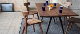
Materials for making furniture
Natural wood is a natural and ecological material, absolutely safe for humans. Furniture made from natural wood looks luxurious and rich and fits into both classic and modern interior styles. Not everyone can afford wood furniture due to its high price. Another disadvantage is its poor resistance to moisture and mechanical damage.
A more practical and cheaper, but lower quality analogue of wooden furniture is products made from chipboard or MDF. Modern furniture made from particle boards or fibreboards looks practically no different from those made from natural solid wood. It has the same natural colors and shades, which are conventionally divided into three groups: light, dark and neutral. Popular laminate colors for furniture with names can be seen in the photo.
Furniture color catalog
Attention! In the catalogs of different manufacturers, furniture colors may differ slightly from each other.
Interior design rules
If you decide to decorate the interior yourself, including various wooden coverings, you need to adhere to the basic rules:
- Three shades. Excessive use of wood in decoration can lead to negative consequences. It is better not to combine more than three wood tones in one room, otherwise the decor will lose its harmony. The combination of mismatched sets and products with completely incompatible textures looks especially unattractive.
- Accents. Materials of contrasting shades can look good in one interior. Also attractive will be a modest setting, diluted with “wood accents” - unusual parquet, ceiling beams, panels, non-standard furniture.
- Single range. No less delicate and stylish in appearance is the room, in which several components are decorated in similar shades of natural wood. This design is neutral in perception and does not have a negative impact on mood. However, all colors should be independent, and not differ by just half a tone.
- Lighting. The quality and quantity of light in a room is of direct importance for the correct assessment of a particular shade. If the room is located on the north side and there is little natural light in it, you should abandon non-contrast combinations. The transition between similar shades will be simply unnoticeable. Warm wood tones look more interesting with yellowish lamps.
Dark furniture colors
Dark shades of furniture look great in classic interior styles: classicism, empire, baroque and others. They create an atmosphere of luxury and grandeur. Typically, furniture in these colors is made massive and strong.
Dark furniture colors include:
- Nut. This tree has a wide palette of shades depending on the place of growth: from gray-green to reddish-brown. But the most popular is dark brown color, characterized by depth and richness.
- Wenge is the color of dark chocolate with black veins. This is one of the most fashionable colors today. Wenge-colored furniture looks strict and laconic, but expensive.
Furniture in wenge color
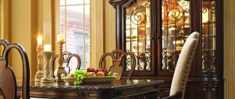
- Mahogany (mahogany). Luxury furniture is made from reddish-brown wood. Polished surfaces have a beautiful characteristic shimmer, reminiscent of the play of flame. Mahogany furniture looks elegant and sophisticated.
Successful combinations in the bathroom
When choosing gray furniture for a bathroom, experts advise giving preference to wood textures.
The gray scale in combination with wood attributes is ideal for eco-style or Scandinavian style. It is also worth taking a closer look at light gray matte and dark pearl glossy sets.
Gray furniture can become the basis for creating creative, daring interiors. It is universal and suitable for any room. The main thing is to choose the right shade and place accents.
Bright hues
For small rooms with small window openings, designers strongly advise choosing furniture made of wood or chipboard in light colors. This will make the room seem visually larger and brighter.
In the catalogs of furniture companies you can find the following light colors of furniture:
- Karelian birch. It has a yellowish tint and an exotic pattern, reminiscent of marble in texture.
- Light ash is a creamy tone with a smooth structure. The color of ash resembles coffee with milk. Not only furniture, but also flooring, such as laminate, looks good in this shade.
- Pine is a rich golden hue, warm, sunny and bright. Ideal for rooms with north-facing windows.
- Light beech. Natural wood has a pinkish-beige hue and a characteristic pattern of heart-shaped stem rings. Light colors of wood for furniture with names are shown in the photo.
In addition to the above options, there may be other light furniture fronts: pear, apple, acacia, etc. Bleached oak or any other white furniture color is ideal for a rustic Provence style or modern minimalism. White color creates an atmosphere of cleanliness and spaciousness. The white color of the furniture with names is shown in the photo.
Intermediate tones
Neutral shades of furniture can be a wonderful addition to the interior and a background for brighter accents. The catalogs of furniture companies present the following neutral tones:
- Cherry. It has a rich reddish-brown color, so it looks a bit like mahogany. Natural cherry wood is much cheaper than mahogany, but the products made from it are no less high-quality.
- Alder. It is also similar to mahogany, has a weakly expressed texture, reddish and reddish shades.
- Oak. Has a luxurious structure. Furniture made from both bleached and golden oak looks good in the interior.
Furniture in neutral colors does not attract much attention, but looks aristocratic.
Purchasing wooden furniture is an environmentally friendly and modern option for home improvement. But if products made from expensive solid wood are beyond your means, then you can replace them with furniture made from laminated chipboard. The main thing is that the shade of the laminate for furniture is identical to the natural colors of the wood. Furniture in natural wood color looks very cozy. It serves as a demonstration of the refined taste of the owners of the house.
Any wood changes color after treatment with protective compounds. Some breeds change color slightly, others greatly. Here are photographs of wood species in three forms: untreated, after coating with polyurethane varnish and after impregnation with mineral oil. All photos were taken in manual mode, at the same shutter speed and aperture in order to fully preserve color differences.