Looking through images of interiors that designers have worked on, you are unlikely to find sets of the same type of furniture there. Among professionals, it is not customary to furnish a room with items from only one set or one collection. Why? Why is different furniture better than complete furniture? Firstly, using only the same furniture is an indicator of professional timidity and lack of confidence in one’s abilities. A designer must be able to work with colors, textures, and proportions.
Secondly, the same type of elements deprives the interior of individuality, making it uninteresting, stereotyped, and faceless. Few people, for example, would dare to dress in denim from head to toe. Interiors with monotonous furniture look just as ridiculous and dull.
Thirdly, mixes are a trend of our time. Now it is fashionable to mix colors, textures, materials, styles, shapes, sizes. There is a special chic in both clothing and interior design - combining seemingly incongruous things, achieving harmonious results.
You can design your home all your life - adding something, changing something. And here you can’t do without the ability to combine different furniture.
How to decide on a color?
There are many different theories regarding which paints to use for certain spaces. At the same time, you decide for yourself which color scheme you feel best in.
For example, there are people who love their homes decorated in black, red and white. And for some, this combination has a negative effect, because it increases blood pressure and provokes the release of adrenaline.
The first question a designer asks his clients is: “What is your favorite color?” And if family members cannot come to a common opinion, the specialist tries to combine their favorite shades in a single combination and find compromises that suit the customers.
How do you know which color you like better than many others? Just choose any image that is pleasing to your eyes. Using special services, for example, Bighugelabs, you can determine the palette of each image and photograph.
In this case, the program will mix the shades and give an average result of three or five tones. You can see the accents in the original picture and use these colors in the interior.
If you don't find anything suitable, you can use the color wheel. Online services like Colorscheme help you choose harmonious combinations for monochrome, contrasting and accent palettes. In this case, you can change the degree of lightness of the main tone, darkening or lightening it.
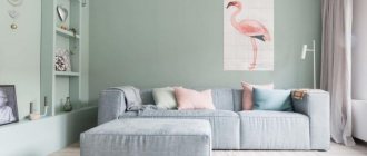
Important! In order for the interior to look professional, it is necessary that the main color occupies at least 65% of the entire space. The remaining 35% is allocated to additional shades. And about 5% of the space is allocated to accents.
For example, if your main color is chocolate and you want to use 5 different colors, then 65% will be the main tone.
In our case, it will be on the sofa, wardrobe and armchair. It will be accompanied by delicate turquoise on the walls. And use orange pillows and curtains as an accent. At the same time, a delicate toffee in the form of parquet will appear on the floor. And the cherry on the cake will be mint or mustard greens in the form of a discreet bouquet.
Furniture in the children's room
A children's room is simply created to combine bright colors with an unusual design. As a rule, the interior design is as simple as possible, but stylish. Variegated shades, non-standard shapes, chic prints and textures - welcome to the world of dreams.
Style and color
Each style has its own palette, from which you should not deviate. By introducing, for example, neon colors into a classic interior, you will get kitsch on the verge of bad taste.
Physiologically, a person evaluates an environment as safe and stable when the darkest shade is underfoot, the midtones are at eye level, and sky-white shades extend above the head.
At the same time, modern interiors indicate that designers love to play pranks and turn everything upside down. Therefore, we can find chocolate and even black stretch ceilings over beige and white floors.
So, here is a style sheet and color schemes.
| Color | Style | Combination with other colors | Suitable for: | Peculiarities |
| White | Modern, classic, modern | All | All rooms | Adds airiness and increases space |
| Grey | Provence, country, classic | Yellow, green, red, orange, black, white, purple | Office, living room, teenager's room, kitchen | Neutral color. Suitable for a relaxing time |
| Black | Art Deco, high tech, modern, loft, minimalism | Purple, white, gold, red, orange | Large living room | Visually reduces space and is associated with luxury |
| Red | Modern, high-tech, minimalism, classic, art deco | White, brown, purple, gray, orange | Living room, kitchen | Activates the optic nerve |
| Orange | Art Nouveau, Provence, minimalism, contemporary | Beige, black, white, blue, green, red | Living room, kitchen | Stimulates appetite, associated with oranges |
| Yellow | Modern, minimalism, Provence | White, grey, purple, brown, black, red, blue | Spacious living room, children's room | Reminds me of summer, the sun, and lifts my spirits. Often used for emphasis. |
| Green | Classic, country, modern | Beige, brown, white, grey, yellow | Kitchen living room, hall, children's room, kitchen, bathroom | Adds freshness to the interior |
| Pink | Modern, classic, shabby chic, country | Black, red, purple, white, gray | Children's room for girls, living room, kitchen | Pastel pink soothes, bright pink tires |
| Blue | Classic, high-tech, country, loft | White, green, red, grey, brown, yellow, black | Large living room, children's room, kitchen, bathroom, toilet, studio apartment | Adds solidity and at the same time calmness. Represents originality and practicality. |
| Violet | High tech, classic, loft | White, pink, green, yellow, black, blue | Apartment studio, bathroom, living room, kitchen, children's room, bedroom | Associated with lilac, spring shades |
| Brown | Modern, country, Provence, classic | White, red, green, grey, purple, yellow, black, orange, beige | Living room, kitchen, bedroom, corridor, bathroom, office | Creates a homely atmosphere, adds comfort and warmth |
If you follow the designers' recommendations and use color palettes that suit your style, you will always win. Use the color wheel in situations when you are in doubt about choosing a particular interior element. Better yet, trust the masters to create the project. In this case, your home is guaranteed to be decorated tastefully and in full accordance with the chosen style.
Furniture in the living room
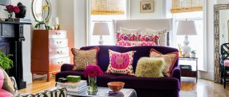
It will be great if elements of different styles balance each other, and it is better to limit the number of directions: from 2 to 4. Bright and catchy products alternate with calm and classic colors and shapes. The tandem of styles can be the most unusual: minimalism and baroque, high-tech and classic, Provence and art deco. As a rule, one style is background, and the other is used accentually.
Styles can also be “equal”: for this purpose, the room is zoned, modern furniture is placed in one part, and, for example, classic furniture in another. However, you can simply make a mix, but avoid overtly exotic styles: there is a chance that the apartment will look like a refuge for colonists.
The combination of smooth fabrics with textured ones looks great; you can experiment with prints. For example, a plain sofa and bright armchairs. Prints enliven the interior: geometry, polka dots, checks and other simple patterns are in favor, no complex squiggles or curls.
Rules for choosing colors for floors, walls, furniture and ceilings
So, we figured out which color goes with which. Next, we will dwell on the objects that are present in each room, and we will understand the principles of using certain shades.
Floor
There are several unspoken rules that should be considered when choosing a color scheme for the floor.
Light floor:
- Increases space.
- It is a reflective fabric.
- Can be used with a light shade of walls.
- Suitable for bedroom, bathroom, toilet, living room
Dark floor:
- Combines with light walls, ceilings, and dark ones. But it should be at least 1 tone darker.
- Suitable for any room.
- Bright accents look good against its background, provided there is good lighting.
- Doesn't go well with a dark door.
Walls
The walls can be made in absolutely any color. Depending on the purpose of the room used, it can be active, passive or neutral.
Active colors are an accent. They are combined either with the opposite bright color, or with a less bright, calm color.
A popular solution is walls in pastel colors. They play the role of background to the main view of the room. In this case, you can use any floor, furniture, ceiling. Since this is a universal option.
Ceiling
The ceiling is most often chosen in white or light shades. Since it is a universal color and can be combined with any furniture, ceiling, floor. Can be matte or glossy. If you want to add contrasts, it is better to add a rich color to the walls or interior items. Can be used in any room.
If the choice fell on a dark ceiling, then it is worth considering several nuances:
- A black ceiling can only be done in a large space with high ceilings. Minimum height 3 meters.
- Combines only with white and light furniture and milky colors of walls, floors, furniture
- Suitable for minimalist style
- Creates an expensive effect in a room with panoramic windows
Furniture
When choosing the color of furniture, remember 2 basic principles:
- It should be darker than the walls
- Lighter than the floor
Then you can rely on your taste and make the combination of all interior items ideal. See a photo selection of various combinations and get inspired.
On the issue of compatibility
- Plain. The furniture is made in the same color, only the shades vary. For example, if it is a brown color scheme, you can use tones from coffee and chocolate to light beige. You can make the atmosphere more colorful with the help of accessories or the design of walls and floors;
- Contrast. Combining opposite colors also looks good: if it’s difficult to decide, the color wheel will help you; the intensity and saturation of the color is at your discretion, but one must be dominant and the other complementary;
- Mixed. There is a huge scope for imagination, you are not limited in color, style, or shapes; it is important not to create an overly colorful interior, where each element will look “on its own.” Mismatched furniture looks best against a light background - white, beige, light pink, light green and other unobtrusive shades are ideal. Dark colors add special depth and mystery, but oblige you to perfect accuracy “without room for error.”
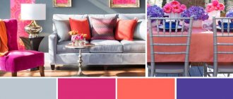
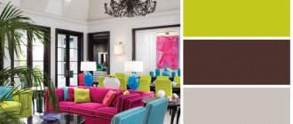
9 successful color combinations in the interior of an apartment
Factors influencing your choice
When choosing furniture, you can rely on different aspects. These are fashion, personal preferences, advice from friends, a picture of a beautiful living room seen on the Internet, etc. However, there are three fundamental factors that should be followed when choosing the color of furniture.
The first is size. If we are talking about a small piece of furniture (chair, pouf, armchair), as a rule, you can choose any bold colors. For large furniture (sofa, bed), neutral tones such as gray, black and white are best.
Furniture in stores is usually made according to this rule. However, if you are not satisfied with these color schemes, then you can make custom-made furniture.
The second factor is style. How to choose the color of furniture in the interior depends on the style. Furniture with a “masculine character” - with sharp edges and straight lines. Simple, neutral shades are best for such items. Furniture more characteristic of a feminine style, with carved wood, curved or semicircular lines. Here you can experiment with color.
The third and most important factor is the presence of wooden elements in furnishings. As a rule, many people like their presence because wood balances non-traditional color schemes and makes the interior more calm even with an abundance of colors.
Selection by type of room
The second important factor when choosing a sofa is the type of room. Here again you need to focus on psychology: is the room intended for rest and sleep or for communication and leisure? Is the color “suitable” for the residents of an apartment, house or specific room?
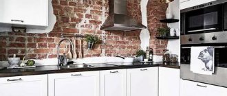
Kitchen
The main thing to consider when choosing a sofa for the kitchen is its size. Plain white or beige sofas are better suited for small kitchens: they visually expand the space. Bright upholstery may look inharmonious: like a bright spot that will be difficult to beat.
In large kitchens and especially in layouts where the cooking area is combined with a dining room or even a living room, bright sofas, on the contrary, look great: they zone the space and visually expand it.
Note! When choosing a sofa for your kitchen, make sure that the upholstery is easy to remove stains. A great option is leather sofas.
An example of harmonious zoning of space in the kitchen
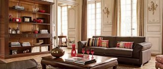
Living room
In living rooms, the sofa becomes the center around which the whole family and guests gather. Because of this, it is better to implement bold and unusual ideas in the living room: bright sofas and colors with patterns look appropriate and harmonious here. You can choose calmer options: in this regard, the living room is the most versatile room.
A successful and unusual combination of orange, lavender and white colors
When choosing a sofa for the living room, take into account the interior of the room, the amount of light in it (rooms facing the non-sunny side are best “brightened” with white furniture) and the size of the room.
A beige sofa brightens the living room
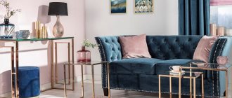
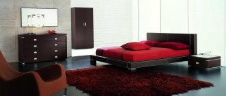
Bedroom
For the bedroom, choose sofas in neutral and soft soothing shades: beige, light brown, light gray. Often, especially if you choose a folding sofa for sleeping, darker upholstery in natural tones looks organic.
Remember that the bedroom should first of all be calm and comfortable. Brightness can be added with lighter elements than the sofa: with tulle and curtains, wall panels or paintings.
Kumo sofa bed is a great model for the bedroom
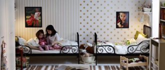
Children's
When choosing a sofa for a nursery, also consider whether the child will sleep on it. If so, it is better, as in the bedroom, not to buy sofas in flashy colors: they can interfere with relaxation.
In general, in recent years the trend of colorfully decorating children's bedrooms has been weakening. Practical considerations play an important role: too “childish” an interior will become uncomfortable for a teenager, and he will have to make repairs again and buy new furniture.
Sofa bed in a girl's bedroom
Here we have selected trending colors for 2022.
You never have to overpay
If you find furniture in a prestigious design studio that is ideal in color and style, but too expensive, you should not buy it at any cost, including taking out loans.
It is enough to photograph or remember this interior and order the production of a copy of it from some provincial furniture workshop that works according to a more affordable price list.
Setting up the kitchen
For every housewife, the mood of the household is important, and the kitchen is a big factor here. There are many design options for this space.
A small kitchen will look good in light colors. The combination of walls and furniture in light colors will help visually add space.
If there is enough space in the kitchen, feel free to make extraordinary decisions. These can be bright yellow tones, they stimulate appetite. Black and white, red, purple fittings will also look good here.
The basic rule is to choose the main color and select surrounding objects of the corresponding shade. An interesting addition would be a large drawing on the wall and some of its fragments on other objects.
Let's look at the different tones of the component parts.
- Oak. Medium brown. Expensive and durable material indicates the high status of the owners.
- Cherry. Rich red.
- Ebony. Dark color.
- Ash. The lightest wood.
- Birch. Light yellow, sandy tones with the presence of round eyes on the wood.
- Beech. Beige with pink. For romantic natures.
- Nut. Rich brown.
- Red tree. Close to cherry, but has a deeper dark color.
- Alder. Combines red, orange, bright shades. Would be an excellent option for a children's room.
- Pine. Golden wood. Beds, cabinets and cabinets in this color are most often used.
To make it more convenient and easier to choose, you can use the color combination table.
- White - harmonizes with any other, the most suitable for it are red, black and blue.
- Black also goes with almost everything, but it is more favorable to combine it with green, yellow, red and white.
- Green – refreshes the room. Combines with gold, sand, brown.
- Red is bright, provocative. It is best combined with black, yellow, green and gray colors.
- Yellow – sunny, joyful. Pairs well with blue, green, black and grey.
- Blue – calm, cold, suitable for a relaxation area. It is good to combine it with yellow, green, steel.