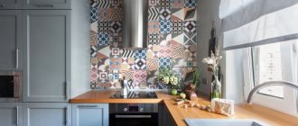
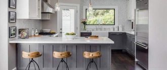
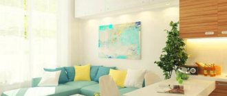
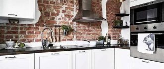
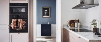
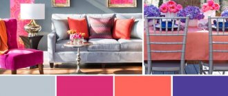
Modern designers have successfully dispelled the myth that a gray kitchen is gloomy and faceless. This color is incredibly popular in interior design today.
Firstly, gray allows you to change the interior as soon as such a desire arises, with minimal cost. All that is needed for this is to replace textiles and decorative elements.
Secondly, gray is a 100% universal color and minimizes the risk of creating a tasteless interior.
In this article we will try to consider kitchens in gray tones, the features and subtleties of their creation in as much detail as possible.
About the benefits of gray color
Photo from source: chickensmoothie.com
“Second beige” is the so-called gray color for its versatility of use. This is a kind of smooth transition and intermediate stage between black and white.
Let's consider its advantages:
— looks appropriate in interiors made in almost any style;
— always occupies a leading position in the ranking of popular colors;
- looks great in a duet with both pastel and bright colors.
Proper use of gray is the key to creating a noble and harmonious kitchen interior. Working with this color is not difficult because it goes well with all the colors of the rainbow.
And using gray as a base is an ideal solution for creating a kitchen in the following styles:
- high tech;
Photo from source: pinterest.ru Tabletop Cedar 3094/S Lavant
- loft;
Photo from source: vse-kuhni.by Tabletop Cedar 3852/P Corsica Oak
- art deco.
Photo from source: rerooms.ru Tabletop Cedar 4091/Q Damask steel
In what cases is gray inappropriate in the kitchen?
The use of dark gray should be avoided in the following cases:
- kitchen area less than 8 square meters. Here it is better to give preference to light gray shades (they will visually make the kitchen more spacious), or combine the kitchen with the living room to really increase the space;
- lack of lighting, windows facing the shady side and small size of windows - all these are obstacles to using dark gray color when decorating a kitchen interior;
— a completely monochrome design will create the impression of a cold and not entirely cozy interior.
About the role of gray when choosing a layout
If the kitchen area is small, it is very important to pay special attention to the choice of shade. For example, kitchen units whose facades are made in a dark gray shade will look completely out of place here.
Photo from source: ivd.ru Tabletop Cedar 1110/S White
Eliminating the top row of cabinets will help you skillfully “get around” this trouble. The lower modules, made in gray, will thus not cause the room to be perceived as smaller than it actually is.
Photo from source: designwiki.ru
Tabletop Cedar G015/1 Galaxy metallic
Another great option would be to use gray base cabinets with white cabinets in lighter shades. This is true for both corner, straight, and U-shaped sets.
Photo from source: designwiki.ru Tabletop Cedar 3230/S Light Sonoma Oak
Translating the ideas of two-row kitchens into reality is a rather complex process, since it is necessary to take into account not only the area of the room, but also its proportions.
Glossy or matte - which facades to choose for a gray kitchen?
The intensity of the color chosen for the design of kitchen facades is what primarily influences the choice of coating.
It is necessary to take into account that even the smallest contaminants, such as traces of dried water, will be most noticeable on glossy dark gray surfaces.
Photo from source: designwiki.ru
Tabletop Cedar 4026/Q Alambra
To avoid this effect, it is better to give preference to matte facades in a light gray shade. There will be no noticeable stains or fingerprints on them.
Photo from source: designwiki.ru Tabletop Cedar 1210/Br Diamond white
If you want to purchase a kitchen set in any complex deep shades of gray - gray-blue, gray-beige, gray-green (they usually look best), they will be most effective on matte surfaces.
Photo from source: stylebyemilyhenderson.com
Tabletop Cedar 3027/S Granite white
Facade materials
In this paragraph we will present information that will help you speak the same language with furniture makers. Are you dreaming of a gray wooden kitchen with a wood look or some other design? The following materials will help implement all ideas:
- veneer or solid wood, which are coated with paint;
- MDF board coated with enamel - in this case, a wide variety of surface types are available (matte, glossy, semi-matte). And the enamel tone can be selected according to the RAL or NCS palettes;
— MDF or chipboard boards with acrylic coating;
— MDF coated with PVC film;
— laminated chipboard;
- plastic-coated chipboard or MDF. At the same time, plastic can quite accurately imitate concrete, stone and other specific surfaces not only in appearance, but also to the touch.
Which of the above options is best?
The highest quality, but at the same time relatively expensive, is considered to be MDF coated with plastic or enamel. These materials provide great scope for the implementation of a wide variety of facade options: textured, milled, or smooth, plain.
A dark gray kitchen with a matte surface will fit perfectly into the interior of a kitchen-dining room or kitchen-living room.
Photo from source: mudryakova.ru Tabletop Cedar 3504/XX Gray granite
However, if the room is quite small, it is better to stick with gloss. Reflection of light will contribute to the visual expansion of space.
Photo from source: alkamebel.com.ua
Table top Cedar 1210/Br Diamond white
A light gray kitchen is considered a completely win-win option, as it fits perfectly into both large and small rooms.
Photo from source: archviz-studio.com Tabletop Cedar 3027/S White Granite
Photo from source: pinterest.ru
Countertop Cedar 2349/Pt Bernini Marble
Tip 10. Make the living room as comfortable and cozy as possible
The kitchen-living room, by its scale, seems to hint that it was created in order to gather the whole family and friends together. It often becomes a favorite place to relax, because there is plenty of space, as well as a wonderful atmosphere of unity with nature.
What you definitely cannot do without in such a room is a fireplace or at least an imitation of it.
Characteristics of gray kitchens in a modern style
When considering many examples, references, and photos of gray kitchen design in a modern style, one can trace the following common characteristic features:
— lack of handles on the facades of the kitchen unit;
Photo from source: italybel.by Tabletop Cedar 9022/S Whitened Oak
— upper modules reaching to the ceiling;
Photo from source: pinterest.ru
Tabletop Cedar 3230/S Light Sonoma Oak
— lack of upper cabinets;
Photo from source: kitchendecorium.ru
Tabletop Cedar 3028/S White Marquina Marble
- built-in equipment.
Photo from source: alkamebel.com.ua Tabletop Cedar 0410/S Carrara marble
By following these trends, you can create a truly fashionable interior.
Real photos
You can get more ideas for inspiration in the following video:
Gray Ikea kitchens
"Budbin" apartment in Stalin
"Budbin" with a black tabletop "Knoxhult" - a ready-made economy class set
Gray-green set "Bodarp"
Fronts without handles (with integrated handles) “Vokstorp”
Gray kitchens Leroy Merlin
"Dark gray set of the Megion series"
Gray-green facades "Paloma"
Facades "Graphite"
Read more about Leroy Merlin kitchen furniture in a separate article - go to.
About the combination of colors in the kitchen interior: gray +…
1. ... brown or beige
The combination of gray with brown or beige in one space looks very harmonious. Using shades of different saturation and warmth, you can adjust the degree of formality and severity of the created interior.
Photo from source: mykitchendesign.ru Tabletop Cedar 4948K-52 Breccia Brown
2. ... blue or blue
Blue and cyan, as well as gray, belong to the cold palette. Even if the kitchen windows face the sunny side, and there will be quite a lot of light in the space, such a palette will look quite appropriate. To avoid impersonality and boredom in design, you can use interesting textures, as well as bright accents.
Photo from source: pinterest.ru Tabletop Cedar 3028/S White Marquina Marble
3. ... yellow
This color and all the shades that are close to it - mustard, orange, turmeric - look very original in a duet with gray. But you shouldn’t get carried away with using bright details in the interior, since the presence of too many such accents can have a negative impact on the psyche - irritate. Yellow and similar shades with no more than 30% inclusion in the interior of a gray kitchen are the best option.
Photo from source: pinterest.ru Tabletop Cedar 1110/S White
4. ... green
Combinations of gray with green and its shades - emerald, light green, malachite - are incredibly beautiful! Such duets can be classified as natural, because they can be found in nature quite often. Green perfectly balances the coldness and severity of gray. It can be used when decorating dining areas, window spaces, and kitchen aprons. In addition, green can be presented in accents - indoor plants in white or black, bouquets of flowers in laconic transparent vases, and the like.
Photo from source: verbovska.com.ua Tabletop Cedar 3027/S White Granite
5. ... purple or pink
In this case, the key to success will be the measured use of purple or pink flowers as small accents. Because gray has an interesting ability to reflect colors that are nearby.
Photo from source: static.tildacdn.com Tabletop Cedar 1205/BR Diamond light gray
6. ... white or black
White color helps correct any imperfections. For example, if the interior is too dark or bright.
Dark gray facades of the kitchen unit in combination with a white countertop will create an aesthetic contrast. It is important that the walls are also light, since in this case the space will seem visually larger.
Photo from source: kitchen.mebeltrislona.ru Tabletop Cedar 1012/Cr White ceramics
A light gray background is an excellent option for a set with black facades. If you make the walls dark gray, the interior will turn out to be too gloomy. There is only one exception to this rule: if the kitchen is spacious and has large windows. This will make the combination of dark gray and black not so gloomy.
Photo from source: mykaleidoscope.ru
Tabletop Cedar 111/1 White
7. ... red
The abundance of red in the kitchen will make the interior aggressive. In order to avoid such an undesirable effect, it is better to use red only as accents, pointwise. These can be vases, pots of indoor plants, textiles, decoration of windows, seats in the dining area, small decorative details.
Photo from source: osdoors.com Tabletop Cedar 2338/S Moon metal Tabletop Cedar 2044/D Wood beam
8. ...pastel colors
An excellent option for those who prefer calm interiors without any bright inclusions. Gray in combination with delicate pastel tones will create the smoothest color transitions. It looks very beautiful and harmonious.
Photo from source: j.etagi.com Tabletop Cedar 7024/1 Marble Imperial
9. ...natural wood tones
In a gray kitchen, surfaces made of natural wood or its high-quality imitation will soften the essentially austere aristocratic gray and give the kitchen the most impressive look. This could be dining room furniture, a kitchen apron or a countertop.
Photo from source: pinterest.ru Tabletop Cedar 5140/Mn White Moon
When drawing up a design project, you need to think about the palette: what to do and what color. Each element should be noted in the plan. Clear planning is the key to creating a harmonious interior.
The following tips will also help with this:
1) White and dark should be kept in balance.
The best background for a dark gray set will be light walls and vice versa.
You should not use more than three colors, but playing with shades is quite appropriate.
Photo from source: catherineasquithgallery.com Table top Cedar 1210/Br Diamond white
2) To create bright accents in the interior, it is better to choose small objects - curtains, chairs, vases and the like.
Photo from source: t.me
Table top Cedar 9022/S Whitened Oak
3) You should initially decide what kind of interior you would like to get in the end:
— brutal in dark colors;
Photo from source: theultralinx.com Tabletop Cedar 5141/Mn Moon
- delicate light;
Photo from source: pinterest.ru Tabletop Cedar 2062/S Transylvania
- bright and cheerful.
Photo from source: best-stroy.ru Tabletop Cedar 811/1 Metallic
A few more designer secrets
Everyone wants to make their kitchen in a wooden house beautiful, stylish and comfortable - both the owners of luxurious mansions and the owners of more modest buildings. Wood gives enormous scope for imagination. If you are afraid of making mistakes, you can follow the advice of professionals:
- Natural wood is a material worth highlighting. The easiest way to do this is by choosing the right style of room - one where the tree will play the main role. This can be country music from different European countries or a design for a Russian traditional hut or mansion. In the latter case, it is better to add a Russian stove or at least an imitation of it.
- As surprising as it may sound, a bar counter will look great in a kitchen in a wooden house. Moreover, you can make it with your own hands from building materials that are left after repairs. These can be beams, boards, bars, even cuts, and so on. It will turn out gorgeous if you decorate a window sill or staircase with similar elements - this will create a special atmosphere in the room.
- If you are afraid of getting a room that is too dark, then you should choose light wood species, such as pine. But it also darkens over time, so you can use special compounds that lighten the wood and emphasize its texture. If, on the contrary, you want to get rich tones, then it is best to use stain. In addition, do not forget about sufficient and varied lighting.
- If you want to get a classic interior with smooth walls, then the easiest way to level the walls is with the help of drywall or wooden panels. You can do anything with them - paint, wallpaper, and so on.
- To better highlight wood, it is necessary to use it with other materials - for example, stone and metal. Stone can be on a backsplash, countertop or floor, while metal often shows up in the form of interestingly shaped copper or bronze light fixtures. It is better not to use gold and silver. The same goes for fittings.
- Don't experiment with the color of the wood. The best option is muted ones, which will emphasize the naturalness of the wood. Bright and saturated colors may not fit harmoniously into the interior.
How to choose a design for a kitchen in a wooden house?
How can you make a floor in a gray kitchen?
Among the options that will look most harmonious in this case, we list the following:
- materials with shades and textures of natural wood - laminate, porcelain stoneware, parquet, PVC tiles;
Photo from source: 3ddd.ru Tabletop Cedar 111/1 White
- tiles in gray shades;
Photo from source: garantanapa.ru Tabletop Cedar 111/1 White
— self-leveling floor;
Photo from source: abpol.ru
Tabletop Cedar 921/1 Kungur Marble
- imitation marble - it is better to avoid natural marble, as it is a porous material that easily absorbs dirt and dyes. It is extremely difficult to clean it from contamination;
Photo from source: wattpad.com Tabletop Cedar 2349/Pt Bernini Marble
- tiles painted in neutral pastel colors.
Photo from source: pinterest.ru Tabletop Cedar 9022/S Whitened Oak
If the kitchen is narrow, it is better to avoid decorating the floor surface in dark gray tones, since such a floor will visually narrow the room even more.
Features of wall design
Since gray is a universal color that goes well with all other shades of the rainbow palette, then, in theory, the color of the walls can be anything. When choosing, the first thing to consider is the concept.
An excellent general background for a gray kitchen set will be the walls, also decorated in gray. This could be wallpaper or paint.
Photo from source: stroy-siti.ru Tabletop Cedar 0410/S Carrara marble
If you have already purchased a dark-colored kitchen set and plan to put it in a relatively small kitchen, it is better to make the walls light. This will create a beautiful contrast, emphasize the depth of color of the headset and help visually expand the space.
Photo from source: mebel-v-nsk.ru Tabletop Cedar 1012/Cr White ceramics
If the room is large, then you can easily afford to use deeper, darker shades on the walls.
Monochrome interiors will be complemented by a variety of surfaces with different textures. Decorative plaster or embossed wallpaper, which creates its imitation, will help with this. In addition, using very simple techniques you can make walls look like concrete.
Photo from source: remoskop.ru
Table top Cedar 7093/E Concrete
Walls decorated in shades of baked milk and soft beige tones will bring additional comfort to a kitchen with gray furniture.
Photo from source: mykaleidoscope.ru Tabletop Cedar 1110/S White
Do you want brightness? In this case, it is better to make only one wall as an accent wall.
Tip 8: Choose the Ideal Layout
The corner arrangement of the headset is considered the most universal, because it will suit any room, even the smallest one.
There is one small life hack - place the refrigerator in line with the sink, and not the stove. This will create an ideal work triangle, and less and less time will be spent on cooking.
But there are other options for planning a kitchen in a wooden house:
- U-shaped - competes with the corner for the title of the most comfortable and successful layout. It is convenient because while cooking, the housewife literally does not have to take a step, but only turn her body. If you want to run the entire set along the walls, then the width of the room should be about 2.4 meters or a little more. You can place one of the “legs” of the letter P not against the wall, but as a bar counter, at the same time zoning the space.
- Island - this option is also considered one of the most convenient in large kitchens in private homes. To see this, you should turn on any American film. Actually, this is why an island is so often installed in American-style kitchens. Here it is also important to monitor the centimeters. There should be more than a meter from the island to any other surface (refrigerator, headset, wall, etc.).
- Linear is the simplest and most compact layout, when the entire set is placed along one wall. It’s compact, which is very convenient when cooking - you don’t have to go through extra steps. Often the best solution for a very small or rarely used kitchen, for example, in a summer cottage.
- Double-row - most often used in narrow kitchens with a width of no more than 3.2 m, and even better, no more than 2.5 m. The point is that the set is placed on two opposite walls. There is a lot of storage space, so the set is chosen without upper cabinets. But the downside is that there is no room for a dining table.
Apron finishing
The facade of the kitchen set, made in shades of gray, is a great opportunity to experiment when decorating the wall in the apron area.
Bright tiles with an unusual design look original.
Photo from source: houzz.ru Tabletop Cedar 3255/M Cocobolo
Also, when choosing materials and colors for finishing the apron, you should take into account the style of the kitchen. So, in a loft interior, an apron that imitates brick, masonry, or concrete would look most appropriate.
Photo from source: behance.net
Tabletop Cedar 7461/FL Redondo
Curtains and decorative elements
Accessories and textiles must correspond to the concept of the chosen design.
- blinds, roller blinds, Japanese panels, pleated panels are suitable for modern kitchens in the style of minimalism, loft, and modern;
- fabric or tulle curtains correspond to the classics, emphasizing the airy lightness of Provence and Scandinavian style;
- Roman blinds will suit any solution.
It is advisable to use silver fabric on matte walls. Floor-length curtains look harmonious with glass, metal, and chrome decorative elements. Bright paintings, still lifes, and colorful panels are noticeable against a gray background.
Expert opinion
Olga Kovalenko
Since 2010 I have been engaged in interior design and architectural design.
If the kitchen walls are plain, then curtains with a pattern and bright ornaments are acceptable. It is better to choose calm textiles for colorful wallpaper.[/expert_bq
About choosing furniture and appliances for the kitchen in gray tones
The basis of most kitchens is the kitchen set and dining area.
In the case of kitchen-living rooms, the furniture set can also be supplemented with a sofa or sideboard, if this fits into the interior design concept.
It is better not to choose furniture decorated in the same tone as the walls, since in this case there is a risk that a rather blurry impression of a large blurry spot will appear.
Photo from source: pinterest.ru
Table top Cedar 3031/Q Gray marble
If your goal is to create a monochrome interior, then against the background of gray walls it is better to place furniture, also decorated in gray, but in a lighter shade.
Photo from source: admagazine.ru Tabletop Cedar 5016/Pt Black Detroit
Multi-colored chairs or a bright sofa will add zest to the interior of a gray kitchen.
Photo from source: pinterest.at Table top Cedar 920/1 Milanese marble
The equipment can also be of any color. The main thing is to maintain a uniform design style.
If the goal is to create a continuous surface of the kitchen unit, then it is better to choose appliances whose surface is made in the same colors or “metallic.”
Photo from source: inmyroom.ru Tabletop Cedar 3852/P Corsica Oak
White appliances are an excellent solution for small kitchens with light gray cabinetry.
Photo from source: tr.chinakitchencabinets.net
Tabletop Cedar 1012/Cr Ceramics white
Black appliances will create a beautiful contrast, but it is better to install it in spacious rooms. This is especially true for black refrigerators.
Photo from source: remont.boltai.com Tabletop Cedar 7024/E Imperial Marble
Colored models will successfully dilute the monochrome.
Photo from source: pinterest.ru Tabletop Cedar 111/1 White
Reverse option: dark kitchen with light countertops
The interior of a kitchen with a light countertop looks completely different. The dark set is visually quite massive, no matter what material it is made of. Therefore, such situations are rarely decided upon. Saturated shades take up visual space, making the room smaller.
It is permissible to choose dark furniture in exceptional cases - in huge combined loft “workshops”, in tall private households, especially with second light. Then contrast with a light surface is appropriate here. However, the choice in favor of this is not justified from the point of view of practicality - any dirt will be noticeable on this tabletop, which will immediately catch your eye. Therefore, caring for it will require much more time and effort than caring for dark coatings.
A completely traditional combination of a light set with a dark tabletop is a winning option for a design in which there is no unnecessary decor, where you need to draw a dynamic, clear line, delimit several zones and make even a monochrome composition harmonious and comfortable.
About choosing a countertop for a gray kitchen set
Here's how to make a gray kitchen as stylish as possible:
- snow-white;
Photo from source: home-and-garden.livejournal.com Tabletop Cedar 1110/S White
- light gray tabletop;
Photo from source: designwiki.ru
Tabletop Cedar 4057/S Terezina
- with a surface imitating natural wood.
Photo from source: admagazine.ru Tabletop Cedar 3829/Nw Bunratti Oak
An option that will make the kitchen set as seamless as possible is a countertop that matches the facades.
Photo from source: pinterest.ru
Table top Cedar 2338/S Lunar metal
When choosing a countertop, it is necessary to take into account that dirt and water stains will be most noticeable on dark surfaces.
In general, the countertop is one of the most important elements of a kitchen unit. It is important that it is of high quality, safe and retains its original appearance, despite external influences.
These are exactly the countertops produced by the Kedr factory! These are products made from chipboard, the formaldehyde emission class of which is E1, which means they are environmentally friendly. A huge selection of decors and reasonable prices - in the “Cedar” catalog you will find your ideal countertop!
Tip 7. Think through functional areas as much as possible
Natural wood will never behave perfectly:
- it will produce resin - resin;
- dry out, become covered with cracks;
- sag and bend.
You shouldn’t worry about such little things and try to disguise them - they give the kitchen and the house as a whole uniqueness and coziness. It is better to think through the use of functional areas as much as possible.
- Fireplace (stove, cast iron stove). It must be taken into account that the walls next to the stove heat up - it is important to prevent a fire. It is better to choose stone or tile for finishing. It is important to think through the issues of exhaust hood and thermal insulation. Particular attention should be paid to the laying of the stove - if it is done incorrectly, then all the smoke will go into the house, which will not add comfort to the room at all.
- Work zone. This is where food is most often cut, so it would be logical to place a cutting area between the stove and the sink. It is important to pay attention to the apron - its material should be easily washed from grease and dirt.
- Storage. Proper storage organization will make the cooking process faster and more enjoyable. All storage, namely the refrigerator, shelves with cereals and vegetables must be located in the work area.
- Washing. The splashes that fly from the sink are especially dangerous for wood, so you need to choose the bowl very meticulously so that the least amount of drops fly off from it. Wide, but not very deep models seem to be the most optimal. There must be a plane with a dryer nearby. You can take a double sink or with a wing.
- Dinner Zone. The table and chairs should also be located at a distance from water and the stove and fireplace.
Lighting
Don't underestimate light as a design tool. After all, it can help change the visual perception of a room - highlight its advantages and hide its disadvantages.
In addition, light can even change the shade of gray and its saturation.
To prevent the kitchen from seeming gloomy, there should be as many lighting sources as possible. Therefore, one chandelier placed in the center of the ceiling will not be enough. It is important to supplement the main light with additional light, creating illumination for the work area, dining area and living room area if a gray kitchen-living room is being installed.
Photo from source: marinasvetlova.ru Tabletop Cedar 1110/S White
Tip 2. Focus on important things
It is important to draw up a kitchen plan and carefully consider the progress of repairs and arrangement of the room. Professionals remind you of the most important things:
- lighting - the more, the better, because cooking or even just washing dishes properly in the dark is extremely difficult;
- ventilation - you absolutely cannot skimp on this point, since high air humidity can harm the tree;
- work area - the work area and sink can be moved to the window to use natural light, but a refrigerator with cabinets in the corner will be quite convenient;
- communications - it is not advisable to hide them in the walls until the house has completely settled; it is best to run them along the walls, and so as not to spoil the picture, hide them in niches or cabinets;
- coating - in order for wood to last as long as possible, it must be treated with wax, varnish or other special compound.
You can now find many wood processing products on the market. Conventionally, they can be divided into antiseptic and fire retardant. Antiseptics are necessary to prevent the appearance of fungus and rotting of wood. They, in turn, are also divided into two classes:
- impregnating - necessary for primary processing, provide reliable protection;
- film-forming - creates a film on the surface, prevents rotting, necessary for finishing processing.
Fire retardants contain flame retardants, which prevent rapid fire.
