Photo: almode.ru Color combinations of walls, floors and ceilings can transform any room beyond recognition. By choosing the right shades, you can easily make the room visually lighter, more spacious and more comfortable. Change the mood and atmosphere with decorations. Create a formal living room, a strict, laconic office or a warm, gentle bedroom. We'll tell you how!
How to decide on a color?
There are many different theories regarding which paints to use for certain spaces. At the same time, you decide for yourself which color scheme you feel best in.
For example, there are people who love their homes decorated in black, red and white. And for some, this combination has a negative effect, because it increases blood pressure and provokes the release of adrenaline.
The first question a designer asks his clients is: “What is your favorite color?” And if family members cannot come to a common opinion, the specialist tries to combine their favorite shades in a single combination and find compromises that suit the customers.
Principles for choosing shades
Shades for combination are not selected randomly. To combine them, you can use several rules, which we wanted to introduce you to.
Several harmonious combinations
Principle 1 – similarity of shades
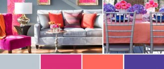
Several shades are used, but within the same range only the degree of their saturation remains different. And so that the picture does not turn out to be too boring and monotonous, minor additions of a fundamentally different color are used, which can “maintain neutrality” or be an accent. That is, one color predominates, and it will be the main one.
Let's see how it looks with specific examples:
Principle 2 – matching shades (complementarity)
Complementarity is the compatibility of colors in the spectral circle opposite each other. To determine such shades, the Swiss artist and art critic Johannes Itten came up with a conventional color wheel that designers use.
Itten Circle
If you fit a triangle, square or rectangle into it as shown in the photo, you will get a harmonious combination of shades that can be used in the interior.
Basic types of color layouts
| № | Photo for clarity | The principle of color combination |
| 1. | Contrasting triad | If the triangle is regular, the combination is called a contrasting triad - you can see its variations in the picture. |
| 2. | Complementary split | An acute triangle forms a complementary split when two colors are close to each other and there is only one shade between them, and the third is their complete opposite. |
| 3. | Square pattern | A square combines four colors equally spaced from each other. That is, they will all be complementary. |
| 4. | Double complementary | In a rectangular scheme, there are two close and two opposite pairs of colors, which is why this scheme is called double complementary. |
There are also more complex multi-color schemes that combine 5-6 shades, but you need to be careful, it’s easy to make a mistake. These schemes are used mainly by professional designers.
Five shade combination optionGallery of interiors made according to the rules of color arrangement
3
Rule 3 – opposite colors (contrast)
The contrast scheme is bright and win-win, very comfortable for vision. It contains both analogue and complementary colors, which must be very carefully placed. Everything is simple here - for each color, the contrasting color is the one opposite on the color wheel. There are also subtleties here - for example, when a warm shade is contrasted with a cold one.
Scheme of contrasts
Important! Some colors should be used with caution, as they can negatively affect our emotional background.
Psychologists have long attached labels to each color, but a plus can be extracted from every color disadvantage:
- black and purple visually reduce the space, but are ideal as an accent and add a graphic touch to the interior;
- brown in large quantities (a woody texture loved by many) drives melancholy, and without bright accents this color leads to depression;
- red promotes high blood pressure and nervous tension, but in small quantities it will make the room cheerful;
- gray is the color of sadness, but perfectly balances the most aggressive shades;
- blue – causes drowsiness, and therefore is great for the bedroom;
- blue is uncomfortable and cold, but in combination with warm shades it brings harmony to the interior;
- white can equally well both cause discomfort and lift your spirits - it all depends on its shade and quantity.
Important! These colors always require contrast, thanks to which they will sparkle with new colors and look more optimistic.
Let's see how contrasts are played out in the interior:
A special harmony is created by related and contrasting shades. Related ones include those that contain the same proportion of the main color. They are within one quarter of the circle - the 3 closest colors. Contrasting, as already mentioned, refers to opposites. The most contrasting are 3 pairs of colors: green-red, purple-yellow, blue-orange. And related-contrasting shades contain the same share of the common color that unites them. They are separated by a whole quarter of a circle - three shades.
How to deal with related and contrasting colors
Important! When arranging colors, you can use not only colors from adjacent quarters, but also from opposite ones (two pairs).
This is precisely what results in the double complementary combination discussed in the previous chapter. If only two colors are used, then they are complemented with the same ones, only either more darkened or more blurred.
Beautiful combinations of related and contrasting colors:
The table for color combinations of floors, ceilings, walls and furniture in the kitchen interior is simple and clear
The interior of the kitchen contains quite a lot of different elements that should be carefully selected for each other.
The color scheme, which can be matched to any design, should complement all the accompanying elements of the kitchen. In this situation, it is important not to oversaturate the working surface with colorful paints.
- As a rule, kitchens are made in grayish shades, with the addition of wood and chrome elements. This combination will easily harmonize with any kitchen utensils and interior elements.
- If you make a kitchen in light gray tones, coffee would be an excellent color for the floor, but the ceiling will be painted in a darker shade of gray.
- To dilute the gray look, yellow or red elements are used to paint kitchen cabinets.
Minimalism in details is important in the kitchen. This effect is achieved by adding discreet details to the interior. An example of this could be a lamp or vases with flowers, which will create a certain atmosphere.
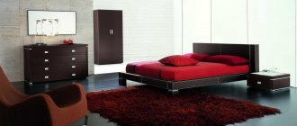
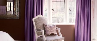
The combination of colors of furniture, walls, ceiling and floor in the bedroom interior
The bedroom is intended for relaxation and privacy of a person. The elements and colors of the final interior should create a pleasant, calm and cozy atmosphere.
Choosing paints for the bedroom is quite simple, since there is a simple table specifically for this living space.
The main color of the room is selected based on the concept chosen by the designer. Most often, bedrooms are made in a beige shade, with the addition of dark wood elements.
This combination will create an atmosphere of comfort and privacy, which is what they most often try to achieve when creating the interior in these rooms.
The walls of the room must be made in calm, preferably coffee tones. The floor is made of dark wood, which will go well with wooden inserts in furniture of the same color.
If we talk about a bedroom in bright colors, in this case there is even more variety. Most bright shades match each other both in furniture and decorative elements.
Table of combinations of shades in the interior of a hall decorated in light colors
Designers know all the secrets that allow them to tastefully decorate any room. There is a table of color combinations for the ceiling, floor, furniture and walls in the interior of a room decorated in light colors, by which they are guided.
It is a fact that different shades give the room harmony and coziness. The choice of flooring is the main task, since its structure, color and pattern are fundamental for the further selection of tones and shades of wallpaper, ceiling, choice of doors and furniture.
For the decoration of the hall, cream color and its shades, as well as yellow, are suitable. The use of light colors visually enlarges the room, improves mood and calms.
If the flooring in the hall is dark in color, then the walls and ceiling should be light, almost white. Pastel colors allow you to create a feeling of spring in your apartment.
In addition, the room becomes lighter and more spacious. A combination of three or more colors in the interior allows you to turn the room into a fairy-tale world.
Harmony is achieved by combining wood flooring and delicate shades of walls, ceilings, doors and furniture. The combination of pink, blue, lilac and turquoise shades of vertical surfaces can be diluted with yellow and orange details.
A white ceiling is considered universal in any style. Designers recommend using peach, sand and pink shades in dimly lit rooms, while in brightly lit rooms it is better to use blue, turquoise or lilac shades.
Earlier, in one of the articles, we looked in more detail at what the combination of colors could be in the interior of a hall and other rooms. For those interested, follow the link and study!
Subtleties of color combinations in the living room
To create coziness and comfort in the apartment, the designers have developed a table that indicates the subtleties of combining the colors of walls, furniture, floors and ceilings in the interior of the living room and other rooms.
An excellent option would be to combine a dark wooden floor with beige walls, a white ceiling and gray furniture. You can use a monochrome design and halftones.
In this case, shades of the same color are combined, only large surfaces are made in the lightest shades, and the furniture is chosen several shades darker.
A living room with dark walls and light floors, ceilings and utensils looks good. It is more difficult to choose a combination of shades that are almost the same from each other. In this case, a good designer will help.
To decorate the living room, you can use a combination of cold and warm colors. When choosing a palette, you need to consider which side the windows are located on.
The north side suggests warm tones and shades, and the south - cold.
Warm colors will make the room comfortable and cozy, improve your mood, but visually reduce the area. With the help of cool tones, you can visually expand the room and create a calming environment in it.
Features of matching shades will help make a small room more spacious, and, on the contrary, turn a large room with high ceilings into a neat and cozy one.
To break the rules, you need to know them
The construction industry offers such a multitude and variety of finishing materials of different shades that a traditionalist, a lover of risky solutions, and a modernist can realize the dream of a home in which you can rest your soul. You should start with visualization. Enter the room and look around.
The interior of the room can be decorated as a complex (all rooms in the same style) or detailed. The color of the floor, ceiling, walls, baseboards, doors, windows, furniture, carpeting - everything is important.
You should start with visualization.
White doors and baseboards with dark floor shades create additional air in the room and soften the accents.
Light colors and shades in the living room and bedroom will visually increase the space. There will always be a good mood, tranquility, and complete rest. In north-facing rooms, use sunny yellow.
Delicate pastel combinations of the floor, walls, and ceiling in the nursery calm, develop creativity, and pacify. It's good to play and run in the red room, but it's impossible to sleep.
When the choice of a single color design does not suit you, use the compatibility table.
The interior of the room can be decorated as a complex (all rooms in the same style) or detailed.
White furniture looks stylish and noble in a room with dark floors and walls, and a light ceiling.
In the blue and white kitchen, hunger is satisfied in small portions. And where yellow, orange and green predominate, it eats excellently.
Dark colors in the room will visually reduce its size. A dark ceiling will make the room appear lower. It is necessary to choose colors so that they do not tire, quickly become boring, or irritate.
The color of the floor, ceiling, walls, baseboards, doors, windows, furniture, carpeting - everything is important.
You should try to choose the color of the furniture so as not to end up in a gloomy room that is depressing.
Color combination of stretch ceiling
- White is a classic option for finishing the ceiling surface. It pairs well with rich black and other bright colors without drawing too much attention to itself.
- Beige is the most common color of paintings, most often chosen by customers, it calms and relaxes. The beige colors of suspended ceilings fit perfectly into a classic interior.
- Black . This versatile shade can be combined with a variety of tones. The predominance of black color on the ceiling will make the design of the room exclusive, the room will look aristocratic and stylish.
- Blue and cyan colors fit well into spacious rooms with plenty of natural light, having a beneficial effect on the human body.
- Purple has a positive effect on the cardiovascular system. However, in the interior of the room it is better not to choose it as dominant, since it visually narrows the space. Combine purple with white, yellow or orange.
- Chocolate will give a feeling of reliability and comfort to the room. It harmonizes well with warm shades and is perfect for an office or ceiling surface above a workspace in a nursery.
- Grey . Gray ceilings in any variant of their use will be an excellent addition to the traditional classics.
- Yellow has a beneficial effect on the human psyche, activates thought processes, so it will be an excellent solution for decorating the ceiling in the office.
- Red is the color of passion and fire, which is chosen by brave, decisive people. Red colors increase appetite, so it is preferable to install colored stretch ceilings in such shades in the kitchen or dining room. But in children's rooms and bedrooms it is better to avoid red, as it can cause some tension.
- Green color has a relaxing effect. A room with green ceilings will look cozy and harmonious.
Choosing a ceiling shade for each room
The choice of shade for a colored ceiling depends on the functional purpose and size of the room. Light colors are the best option for small spaces. They visually raise the ceilings and increase the volume. Dark ceiling coverings will help to visually reduce the size of the room.
Important! When choosing suspended ceilings in a color palette, remember that under the influence of natural or artificial lighting under the ceiling surface, the canvases can change their original shades. For example, blue or blue colors become noticeably darker, while green and red, on the contrary, become lighter.
Ceiling covering in the nursery
For a nursery, it is better to use calm light shades or neutral tones on the ceiling that will not draw too much attention to the child. By combining different surfaces and colored stretch ceilings, you can visually divide the room into zones, highlighting places for relaxation, study, and games.
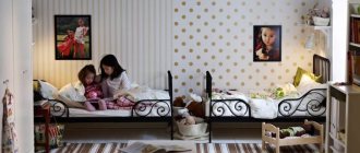
You can install ceilings in children's rooms of different colors, on which images of cartoon characters or fairy-tale characters are applied. Recommended shades are blue, green, light blue, pink and purple.
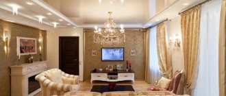
Ceilings in the living room
Most often, the living room is the most spacious and multifunctional room in the apartment. When decorating your interior, you don’t have to limit yourself to one color scheme; you can use any shades. If you decide to give preference to a plain ceiling, consider its compliance with the style of the interior. For example, for the classic direction, cream, blue or beige shades are usually used.
Modern design will be emphasized by a brighter palette of red, blue, and emerald tones.
Bedroom ceiling color
In such rooms, the walls and ceiling should be decorated with calm, light colors that will soothe and set you up for a good rest. The best option is various pastel tones. A contrast of several colors in a small room will not look very appropriate. It is better to choose different shades of the same primary color.
The main thing is that the ceiling fits organically into the style and complements the entire interior.
Ceiling in the kitchen
For the kitchen, designers recommend using glossy coatings with good reflective ability. Such a colored ceiling, where interior items will be reflected, will make the room colorful, visually increase the volume, and add color.
The shade of the ceiling surface should be combined with the color of the walls and furniture.
Bathroom ceiling color
Colored stretch ceilings are also suitable for the bathroom. But, in this case, it is better not to overdo it with the number of shades. If the room is small and has a window, the ceilings should be decorated with pastel halftones or white canvas with minor splashes of color. But for a spacious room, use any colors.
They can be emphasized with the help of well-placed lamps or LED strip around the perimeter of the room.
Ceiling in the hallway and corridor
If you decide to install colored stretch ceilings in these rooms, consider the following nuances:
- hallways usually do not have windows, so it is better to make the ceiling in light pastel colors;
- a very popular way to decorate the ceiling space in the corridor is a combination of chocolate PVC film and white sheets of plasterboard;
- Use glossy surfaces as the main canvas material, which will visually expand the hallway, raise the ceilings, and make the room voluminous.
Is gray boring or stylish?
The answer depends purely on your ingenuity - what other shades you dilute it in the interior. Gray color can really hardly be called cheerful and positive, so it would be appropriate to pair furniture made in this color scheme with blue, pink, brown, black or blue wall and floor solutions. Or vice versa - add an original black ceiling to a room with gray walls (read about whether it is worth making a black ceiling in the hallway). Or the floor. The result will be a great idea that lovers of stylish minimalism and the so-called “contemporary” can safely adopt.
Color combination of walls, floor and ceiling
The apartment will become comfortable to live in if the color combination of the floor and walls in the interior is correctly selected.
Looking at the color chart, you will notice the following.
- The contrast of a dark floor, bright wallpaper and a white matte ceiling can significantly change the height of the room. Furniture in such rooms is installed in pastel shades, in small quantities, so as not to clutter the floor.
- Using the same color in different tones gives harmony and peace. Mostly cream colors are used. In the classic style, this is the most common palette. It applies to any type of housing.
- Having chosen the floor color mahogany, wenge or chocolate for a small room, the remaining surfaces should be done in a light, almost white color. Soft colors will optically push back the walls and raise the ceiling. Absolutely white matte painting will make the surrounding volume faceless. It will completely lose its shape.
- Opposite surfaces attract, giving different sensations. Such tinting can be suitable for any room, depending on what result you want to get in the end. For a high apartment, a dark floor is ideal, the ceiling and cream walls match it. Low rooms will be lifted by a white glossy ceiling and a light floor with rich side planes.
Itten's color circle, rules for its use
Spectral colors are the colors of the rainbow, which can only be clearly identified using special instruments. The spectrum of Itten’s twelve-color circle is based on three main colors (blue, red, yellow), three secondary tones (orange, green, violet), others, and between them are transitional ones, formed if the main ones are mixed in different proportions.
Additional colors create pairs with the main ones (purple-yellow, blue-orange, green-red), being opposite to each other: if you place them next to each other, each will become as bright as possible; if mixed, you will get a dirty gray color.
Complementary or contrasting combination
Any composition is built on the principles of contrasts or nuances. Contrast is obtained from complementary tones; the effect will be stronger if the elements are repeated in several places. Maximum contrast will be obtained by combining saturated colors with pale ones. This design is perfectly readable at any distance and is used in interior design and landscape design.
A nuanced composition involves the use of shades arranged sequentially, one after another - from purple to blue, from red to orange, from yellow to green. A complementary combination in the interior gives cheerfulness and energy to those contemplating it, but an excessive riot of saturated colors quickly tires the eye.
Triad – a combination of 3 colors
A three-color composition in most cases is based on a color triangle - red - yellow - blue, a little less often - purple - orange - green. When all three colors are too bright, the design looks aggressive and dynamic, which is acceptable for a living room or children's playroom, but not suitable for a bedroom. Therefore, to create harmonious interiors, it is recommended to make one or several colors muted and light.
There is the concept of an analog triad - a combination of three tones that are very close on the color wheel - yellow - yellow-green - green, red-orange - red - red-violet and others.
A similar combination - using 2-5 colors
With this layout, tones that are located nearby are usually taken, most often two or three, less often four or five
To create a calm design, all or almost all of them will be muted - here it is important not to overload the interior with excessive colors, not to make it colorful. It is important to choose the right percentage: one or two main colors will account for up to 60-65% of the design, one or two additional colors will account for approximately 30%, the rest will be small accents
Separate-complementary combination
In a contrasting or separate-complementary threesome, not just opposite colors are used, but one main one and two located next to the one that contrasts the first. Green – red-violet – red-orange, blue – yellow-orange – orange-red, etc. Here you need to choose in advance which color will be used as a basis, and consider various options.
Tetrad – combination of 4 colors
When choosing four colors to decorate a room, one of them will become the main one, two will become additional, and one will become an accent color. The following option is allowed: one main color, one additional, two for small accents. Graphically, they form a rectangle on a twelve-color circle, variants are orange-yellow, orange-red, green-blue, violet-blue.
Square
Four tones are used, which are located at the same distance from each other, that is, at the “distance” of two “cells” of the color wheel. Example: yellow-green, blue, violet-red, orange, another option is violet, red-orange, yellow, green-blue. If the main color, which will be the most in the interior, is very bright, then the additional color is made dull, the accent colors, of which there will be no more than 10 percent, are medium saturated.
Individual colors
There are many excellent combinations for individual paints, the most popular options are:
| White | with purple-black, blue, deep pink |
| Red | with bright yellow, blueberry, snow-white, red |
| Beige | with brown, black, red |
| Grey | with blue, fuchsia, lilac, black |
| Pink | with turquoise, silver-gray, mint |
| Brown | with cream, purple, lemon, gold |
| Orange | with black-brown, emerald green, crimson |
| Yellow | with blue, lilac, black-gray, light brown |
| Green | with brown, light green, milky white |
| Blue | with gray, soft pink, faded green |
| Blue | with yellow, bright orange, white, apricot |
| Violet | with olive, golden yellow, dark green |
| Black | with red-orange, sand, anthracite gray |
Combination of floor and doors
An important role in the design is played by the color of the floor and the texture of the doors. It is a mistaken belief that they must be the same color. Depending on the design decision, these interior elements can be:
- in one color;
- in a contrasting solution;
- white or painted doors and any floors.
Made in contrast, the doors are framed with a platband matching the color of the floor, or skirting boards are used to match their texture. The furnishings and decoration in such rooms are selected to match the door panels. It fits perfectly into the overall layout.