SHARE ON SOCIAL NETWORKS
FacebookTwitterOkGoogle+PinterestVk
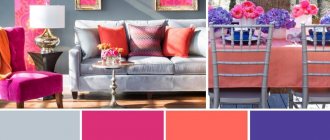
When thinking through the design of any interior, you should carefully select the color scheme. It is she who has a powerful psycho-emotional and energetic influence on a person. Therefore, it is important to choose exactly those colors that will bring harmony to the atmosphere of your home. In this process, it is necessary to correctly use the combination of colors in the interior: a table of harmonious combinations will help turn even an ordinary room into an absolutely flawless place.
Correctly selected colors for interior decor will allow you to get a festive and cozy room
How to choose colors for the interior using tables?
Colors in the interior have many abilities, the main of which is to create comfort and a favorable atmosphere for people. But the color scheme in the room can also expand or narrow the space. That is why you should be responsible in choosing colors for the interior and their combination. A table of color combinations in the interior, where perfectly combined colors are connected by lines, will be an excellent assistant in this regard.
How to correctly combine colors in the interior?
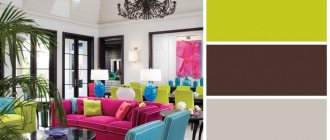
Many people wonder how to use the color combination table in the interior? Sometimes it is difficult and not entirely convenient. Below are tables of color combinations in an accessible and understandable form, where all popular shades are described. The trendy color is the main one, followed by colors that match it, which can be safely combined. An accent color will add brightness and creativity to the interior.
This table will tell you not only about the correct combination of colors in the interior, but also inform you about the meanings of some colors.
| Main color | Combines with flowers | Doesn't match with flowers | Psychology and influence of color |
| Grey | Blue, pink, brown, yellow, red, black, blue, lilac | Green, orange | Gives the room despondency and sadness |
| Lilac | Grey, chestnut, light purple | Red, orange, yellow, brown, black | Mystical, mysterious and mysterious interior |
| Violet | Light green, golden, orange, yellow | Dark green, brown, gray, red | Allows a person to calm down and find harmony of soul. Purple is the color of wisdom and inspiration |
| Pink | Brown, gray, burgundy | Yellow, orange, black | Romantic interior |
| Brown | Golden, grey, beige, pink, yellow | Chestnut, burgundy, lilac | Causes depression when spending a long time in an interior with a predominance of brown color |
| Blue | Red, grey, burgundy, gold | Green, lilac, brown | Makes the room cool, sometimes uncomfortable |
| Blue | Red, orange, blue, light purple | Golden, yellow, burgundy | Makes the interior cold; if the color blue is too much, scandals occur more often in the room |
| Green | Red, black, burgundy, yellow, orange | Grey, purple, blue | Has a calming and relaxing effect |
| Yellow | Grey, purple, brown, green, black | Lilac, blue, burgundy, pink | The illusion of sunlight, yellow color gives good mood and cheerfulness |
| Red | Blue, green, grey, gold, yellow, black | Purple, chestnut, brown | Uplifts the mood, keeps you relaxed, suitable for passionate people |
| White | Combines with any colors and their shades, as it contains all color spectrums | There are none | Instills a feeling of superiority, makes the room cold |
| Black | Red, grey, white, yellow, green | Pink, lilac, beige | Narrows the space, instills fear in a person, makes the interior mysterious |
Colors that should not be combined
On the color wheel you can see shades that are not in harmony with each other. This does not mean that they cannot be combined at all - if you want to experiment, give free rein to your imagination. To make it easier to be creative, study the most insidious combinations.
| Main color | Which ones doesn’t go well with? |
| Red | Yellow, chestnut, red-yellow, brick, purple |
| Orange | Red |
| Pink | Brown, purple, lilac, red, blue |
| Yellow | Pink, burgundy |
| Burgundy | Brown, red, purple, gold, blue |
| Blue | Burgundy, purple, lilac |
| Violet | Brick, terracotta, red |
| Lilac | Gold, pink, burgundy, red, blue, terracotta, brick |
| Blue | Pink, brown, green, brown, lilac |
| Grey | Terracotta, dark brown, beige |
How do colors combine in the interior?
The general combination of colors is presented in the tables above; now it’s time to talk about the most popular colors and how to combine them correctly in the interior.
Important! White color goes perfectly with any color, so it can be safely woven into any interior color scheme.
What color goes with gray?
Gray color has a rich hue. Many people mistakenly consider it faded and boring, because in the photo below you can see how noble the interior looks in gray, especially in combination with splashes of bright colors.
So what color goes with gray in the interior? The answer is simple - any, but the most commonly used colors are:
- Blue
- Pink
- Brown and beige
- Yellow
- Red
- Black
- Blue
- Lilac
The versatility of gray and its many shades makes it possible to implement any bright and creative design idea. Moreover, gray color slightly mutes bright and acidic colors, so with the help of this color you can easily correct a room that is too colorful. More photos of gray in the interior.
What color goes with brown in the interior?
The brown color in the interior must be diluted with lighter shades so as not to create a feeling of gloom. Brown with its beautiful shades (cinnamon, chocolate, coffee, caramel, camel) looks very noble and adds warmth and comfort to the room, symbolizing reliability, devotion and stability.
The main colors that harmonize with brown are the following:
- Golden
- Grey
- Pink
- Yellow
- Beige
- Burgundy and red
- Mint and pastel blue
More photos of brown in the interior.
What color goes with beige in the interior?
Beige color is both a cold and warm shade, which is why it owes its versatility. This color acquired cold notes from white, and warm notes from golden brown. This light color makes the interior light and calm, adding home comfort due to the naturalness of the shade.
So what color goes with beige? Beige goes well with many shades, among which are the following:
- Brown with all its shades
- Gold and bronze
- Yellow
- Pastel and bright blue
- Green and olive
- Lilac
- Red
- Turquoise and mint
More photos of beige in the interior.
What color goes with peach in the interior?
Peach color is a soft and delicate combination of yellow and pink shades. This color gives the room coziness, warmth, peace and security. The rich color of peach brings a festive mood to the home, while muted and pastel peach is calming and peaceful.
You can make the interior colder by combining pale peach with light pink shades, and peach and orange will make the room warmer. The following colors can be called the most suitable for peach in the interior:
- Brown with all its warm and cool shades
- Beige and yellow
- Pink
- Orange
- Turquoise and mint
- Blue and cyan
- Purple and lilac
- Green
What color goes with orange in the interior?
Orange color is one of the brightest and warmest colors in the interior. Even when combining it with other colors, it will not lose its richness and warmth. Orange color energizes and invigorates perfectly, so the ideal option would be to design the kitchen in orange tones, because every cheerful morning begins with this room.
The most successful combination of orange is its combination with white. This combination will be the sunniest and most energetic; moreover, this color scheme will help expand the room, which is beneficial for the kitchen and bathroom.
Advice! Orange color can be used to highlight some small decorative items. For example, you can put an orange ottoman, which will make the room look brighter and more cheerful.
The following shades go well with the radiant orange color in the interior:
- Grey
- Brown with all its shades
- White
- Red and cherry
- Blue and pastel blue
- Delicate shades of green
- Yellow
- Mint and turquoise
More photos of orange in the interior.
Do not confuse orange with terracotta, which is a mixture of red and brown in different concentrations. Terra, which is a calmer and more comfortable color, is more difficult to combine. If you still decide to contact him, then forget about artificial chemical colors and pay attention to more natural ones, the same applies to the furnishing of the room; terracotta color goes well with folk styles. Colors that will suit you: calm green or light green, lilac, blue, blue, all shades of red and brown, coffee colors (coffee with milk, cappuccino).
What color goes with purple in the interior?
Violet is a cool color of wisdom and calmness, which has light mystical notes. Scientists have also proven that the color purple has the ability to calm and pacify.
The color purple has many shades, the most popular of which are mystical dark purple, natural lavender and delicate lilac.
Purple color gives the room a noble and luxurious look, combining well with the following colors:
- White
- Gold
- Black
- Red
- Turquoise and mint
- Crimson
- Blue and cyan
- Beige and orange
- Natural yellow (egg yolk color)
- Light green
Photo of purple in the interior:
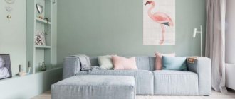
What color goes with green in the interior?
Green color suits absolutely any room and symbolizes peace. All warm and cold shades of green bring with them a good mood, a feeling of comfort and tranquility.
Green is a rich color and that is why it is considered the most difficult color to combine.
The best solution would be to combine the shades of cheerful green themselves. For example, pistachio and lime can be added to the main emerald color, which will dilute the cold color of the gemstone.
The following colors are considered the most suitable for green:
- White
- Black and brown
- Yellow
- Orange
- Gold and bronze
- Red and burgundy
- Blue and cyan
- Turquoise and mint
- Grey
Photo of green in the interior:
What color goes with lilac in the interior?
The lilac color is distinguished by its colossal tenderness and lightness and most often appeals to delicate and creative people. With the help of lilac, you can create a mysterious and mystical interior in cold colors. Such an environment is very relaxing and puts the mind into some kind of trance, which is why many avoid this color.
Most often, lilac is used in pastel colors, which look impressively delicate, as can be seen in the photo below. So the most suitable lilac colors include the following:
- Gray and silver
- White
- Black and brown
- Beige and yellow
- Golden and carrot
- Blue and sky blue
- Turquoise and mint
- Dark purple
- Fuchsia
- Delicate shades of green
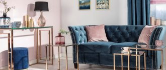
What color goes with blue in the interior?
Blue color is used to create a delicate, light and airy interior in cool colors. Even in combination with warm colors, a room in blue will not lose its cool note and freshness.
The combination of blue and white is very popular. This combination perfectly expands the space and makes the room unusually light and delicate. Most often this color is used in bathrooms.
Advice! In order not to lose the lightness and airiness of the blue and white combination, you should not add accenting bright colors, especially warm ones.
The following colors can be called harmonious with blue:
- White
- Yellow brown and beige
- green and turquoise
- Blue and mint
- Orange
- Raspberry and lilac
- Pink
Watch the video
This video lesson will show you how to correctly combine colors in the interior.
What shades of blue are there?
A wide variety of shades makes up the wide spectrum of blue. Warm colors in the interior calm and set a positive mood. Cooler shades invigorate and encourage new achievements.
Among the rich tones of the dark blue palette:
- Sapphire;
- Northern blue;
- bright ultramarine;
- Royal blue;
- cobalt.
- Indigo.
Table
Designers advise using shades of blue to create the interior of rooms with windows facing south. On a hot, hot day, this will help create a cool feeling. For the same reason, shades of blue are not suitable for rooms that are not on the sunny side.
How to choose the color of curtains to match the interior?
The choice of curtain color is of great importance for the interior. Using this attribute, you can expand or narrow the space, you can get rid of excess sunlight or add radiance to the room.
Important! Bright and warm colors help add light, while cool tones in curtains will make the room feel calmer and darker.
What to combine curtains with in the interior?
There are no strict rules or restrictions regarding the choice of curtains. They may not be combined with anything at all, or, on the contrary, they may completely merge with the interior. The tips presented below will help you decide on the choice of curtain color for your interior.
- An economical selection promises to choose the color of curtains to match the color of the furniture. After all, you can change the interior of your apartment without resorting to wall decoration. You can simply change the furniture and curtains and voila - a new interior solution is ready.
- Curtains that match the color of the walls can sometimes blend into the background. Here, for monotonous walls, it is better to choose curtains with an ornament, and for patterned walls, it is better to choose curtains without a pattern, although this rule does not always work.
- The current version of the selection of curtain colors states that you can match the color of the curtains to the color of the largest item in the room’s interior. For example, you can combine the color of the curtains in the bedroom with the color of the bedspread.
- Neutral selection of curtain colors (sand, beige, cream) will always be relevant, especially if the interior is designed independently.
- Color combination is a technique where the pattern on monotonous curtains echoes other decorative elements.
- Window in the foreground . This option for decorating a room involves focusing attention on the window and curtains; here you should choose bright and non-plain curtains.
- Monochrome design. Here the curtains should be as close in tone to the color of the room as possible. It is not necessary to choose a color that completely blends with the walls; you can take a different shade of the same color or add a little ornament.
Tips and tricks
- The minimalist style in a room can always be diluted with floral curtains, but the main thing is not to overdo it.
- Small rooms should be equipped with small curtains with a minimum amount of ornament and pattern.
- Complex textured curtains are only relevant for large rooms.
- The brighter the color of the walls, the calmer the curtains should be.
- Playing with contrast will make the room interesting. For example, beige curtains will suit brown walls.
- The simpler and smaller the curtain, the more expensive the fabric from which it is made should look.
Watch the video
In this video you can see many interesting ideas and combinations of curtains with the interior.
Character of color: warm and cold tones
Some colors evoke associations with summer and the sun, others with coolness, wind, ice cubes, and sea breeze. The first ones will be warm, and the second ones will be cold.
Warm colors contain more yellow pigment, cool colors contain more blue pigment. To understand the principle, the Itten color circle can be divided into two parts, as shown in the photo. In one sector there will be warm tones, in the second - cold.
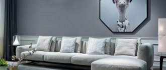
There is a third group of shades - neutrals. Examples: black, variations of gray, white. Such tones do not evoke associations with yellow and blue, and therefore do not have a conventional thermal color. But they serve as an excellent base for combinations of shades. There are several ways to create a stunning interior with neutral colors.
Scheme for determining cold and warm colors on a circle
How to choose the color of the floor in the apartment?
A lot depends on the choice of floor color, because the play of colors and light can distort different shades and make the room visually larger or smaller, darker or lighter.
Below are several floor color options with a detailed description of all the effects each shade has.
- White floor will add brightness to the room and symbolize conciseness and purity. Most often, floor coverings of this color are used in small and dark rooms in a minimalist style.
- A gray floor makes a room calm and noble, but it must be very carefully combined with other colors in the interior. It is important to remember that a gray floor goes best with black and white interiors, as well as yellow.
- Yellow and beige floor the interior will add warmth and comfort to the room. This is the most versatile floor color that matches any type of interior.
- Orange and red floor makes the room bright and warm, but it is important to remember that this color is highly reflected and transferred to other surfaces in the room. Therefore, it is worth maintaining a warm tone in the interior of the entire room.
- Brown flooring represents confidence, stability and security. The only disadvantage of a floor covering of this color is the absorption of a large amount of color. But in general, this floor is universal for any interior, especially in country style.
- Black floor in the interior it creates an aura of wealth and mysticism. It must be used very carefully, especially in combination with bright colors. Black flooring is most often used in modern interiors and very rarely in classic ones.
How to choose the color of the laminate to match the interior?
Laminate has a wide range of colors and different patterns. You can choose a board that looks like wood, or you can make a stone floor using boards with this pattern.
Laminate flooring can look very strict and noble, or it can give the room a playful country style. Below are several laminate options with a description of all the effects they have on your dream apartment.
- White and gray laminate Most often used in apartments where the style of minimalism or Provence predominates. Rustic simplicity prevails here, which is perfectly complemented by laminate flooring.
- Light wood laminate is perfect for rooms with windows facing north. This floor finish will add warmth and tranquility to the room, suitable for any type of interior.
- Brown and red laminate adds warmth to the room and is perfect for interiors in autumn colors. But it is important that the room is abundantly illuminated, because dark floors take away light. These floor colors are very relevant in Gothic and Baroque styles.
- Black laminate gives the room a magical mystique. To prevent such a coating from absorbing too much color, it is most often combined with white walls. The styles of minimalism, high-tech and modern are simply unthinkable without such luxurious and elegant contrasts. Glossy black laminate will prevent strong light absorption, but will add charm and luxury to the room.
Watch the video
This video shows several beautiful options and examples of floor and door color combinations.
The best gray combination ideas for different rooms
The stereotype that gray is only suitable for decorating office space is long gone.
And today, all kinds of shades from this range are increasingly used in various residential and non-residential premises.
Living room
A gray living room is one of the most stylish solutions, especially if you dilute it with a red or blue-green accent in the form of one chair, textiles or other elements of interior filling and decor.
Kitchen
A classic gray kitchen - why not, especially if you decorate the facades with panels and use environmentally friendly materials such as wood, natural stone and porcelain stoneware for its finishing.
Bathroom
You can decorate a bathtub in gray tones not only with large-format marble or other stone tiles.
For example, loft-style sanitary facilities with a free-standing bathtub and rough decorative plaster or tiles imitating raw concrete look very interesting.
You should know!
If desired, gray can be diluted with bright facing bricks for interior work or you can come up with your own non-standard solution.
This can be a combined coating of different textured materials, the use of textiles or color spots in the form of paintings or wall panels.
How to choose the color of doors in an apartment?
Interior doors should delimit the interior space, and they should do this harmoniously. It is a very difficult question about choosing the color of doors if all the rooms are made in different colors, but for all problems you can find solutions that are listed below.
- Neutral door The natural color of the wood will suit any interior and will not disrupt the integrity of either the corridor or individual rooms.
- A white door is perfect for a modern interior, because white can be combined with any color combination. This door is also universal for any repair.
- Dark or light doors in cool shades will perfectly complement the minimalist style in modern interiors.
- Dark wood doors They look great in modern interiors and bring fashionable contrast and richness to the apartment.
- Artificially aged white doors are perfect for apartments decorated in country and Provence style.
- Choosing doors to match the color of the floor is a controversial issue. It’s good if the floors are the same throughout the apartment, but what if not? You can always find a general optimal solution, for example, doors that are several shades lighter. You can also decorate the doorway in the same color as the baseboards, which will give the effect of integrity.
- Choosing a door color to match the color of the furniture. You can easily make the doors resonate not with the floor and walls, but with the furniture. for example, if the room has dark furniture, then you can safely install dark doors against the background of light walls.
- Doors to match the color of the walls. This solution can be used if the furniture and floors in the house are all different colors, but the walls are made in the same tone.
Tips and tricks
- Doors do not have to match the color of the floor and walls.
- You can choose a door of any color, but support it with platbands and baseboards.
- You can install doors and windows of the same color in any interior and not try to tie together the completely different colors of each room.
- The door can be of any texture and color; it does not have to fit the interior perfectly. There is nothing wrong with the door standing out slightly.
Watch the video
This video material will tell you how to choose the right door color to match your interior.
What you need to know about choosing a gamma
Let's start with the theory. According to the basics of color design, there are three colors in any interior: base (or base), complement and accents. As a percentage, it looks like 60 - 30 - 10, where the majority is occupied by the main color, a little less by the additional color, and the smallest part by accents. This does not mean that the palette of combined colors in the interior consists of only three tones; there may be more. Then they split up within the group.
The main ones are usually the finishing of the ceiling, floor and walls. Additional colors are added by furniture, which can also become an accent. Details, textiles and metals often act as accent colors. This distinction is arbitrary; in fact, designers are experimenting with the presentation of colors.
Design: Ariana Ahmad
Design: Elena Sidorina design studio
Design: Sveta Khabeeva
- Colors in the interior
10 interior colors that designers prefer
The second principle that follows from this rule concerns your favorite color. Many are ready to paint the walls in their favorite bright blue or green. But after a couple of years, they begin to regret this decision, and then the time comes for another renovation. Our advice: choose a more neutral palette as a base. It can be greenish or blue, but it is better to choose calmer, muted colors within their framework. You definitely won't get tired of them. In addition, when selecting paints, you should take into account the area and size of the room. Not all colors look good on a large area, for example, on a wall. You can find out with the help of paints.
Design: Ariana Ahmad
Design: Evgenia Lebedeva
Design: Smart Interior Design in collaboration with Olga Louis
Design: Sveta Khabeeva
We propose to consider two approaches to colors in the interior. The first is monochrome, fashionable today.
- Decoration
5 of the most unfortunate color combinations that cannot be used in the interior
How to choose the color of a sofa to match the interior?
The sofa is the king of the living room, because it is on it that the most attention falls and it is the largest item in this room.
Choosing the color of a sofa is a responsible process, the tips listed below will help you figure it out.
- Monochrome option. This plan of action involves placing in a monotonous living room the same monotonous sofa, which matches the color of the walls and furniture, but is a slightly different shade.
- Neutral sofa. If the walls are painted in calm shades such as beige, gray or cream, then an excellent option would be to place a sofa in the same calm shade, only in a different one. For example, beige walls with a gray sofa.
- Neutral sofa in a colored interior. Surrounded by fairly bright walls, you can place a sofa in a very calm color, such as beige or gray. This way you can maintain balance and not oversaturate the room with flowers.
- A colored sofa in a neutral interior will create the only bright spot in the room, which is very popular in the Art Nouveau style. For example, a red, pink or green sofa will look great in a beige room.
- Bright sofa in a bright interior . This solution looks very juicy and unexpected. For example, a yellow or red sofa can stand against the background of blue walls, which will make the room incredibly colorful and positive.
Advice! The color of the sofa can be supported by other interior items: lamps, poufs, flower pots or vases.
Popular color combinations of gray and white
There are many win-win color combinations with gray, among which white contrast deserves special attention. A good example of this is a bedroom with gray walls and white plank floors.
Those rooms also look great in which one wall is perfectly flat (gray), and the second acts as its contrast (white), and even received a textured coating or decor (brick or moldings).
Alternatively, all this splendor can be decorated with a spectacular artistic painting, highlighting an entire wall for it.
Color in the interior according to Feng Shui
There is no specific canon of what the color of a huni or bedroom should be according to Feng Shui, since each color has its own energy and impact, therefore the choice of color depends on what you want to achieve. For example, the color for the bedroom can be chosen according to the criterion of insomnia; if you have such a problem, then dark red, burgundy, brown, and dark green are best suited. If everything is fine with your sleep, then choose lighter colors, beige, cream, peach.
It is better to avoid white color in large quantities, since among eastern peoples it symbolizes death.
Bright red or orange colors in the kitchen will encourage appetite, but if too much of these colors can cause aggression. It's better to use them as accents. It is also better to avoid dark, depressing colors. According to Feng Shui, kitchens should be light and spacious, build on this and make interesting accents.
It is better to balance the hallway, it should be neutral, so if your entrance is too light, feel free to use muted, dark shades, but you should not completely darken the room, it is better to choose a standard cream or beige as the main color. If the hallway is dark, on the contrary, try to use light colors, and just add light sources.
There are many feng shui tips for home improvement, you can divide the entire space into zones, career, family and fame zone, each zone should have certain color accents, career-blue, fame-red, family-green.
Correctly decorating a room according to Feng Shui is not difficult, but sometimes following all the rules leads to absurd decisions, so do not forget about common sense.
Bathroom in blue tones
The most popular color used in the bathroom is blue, and for good reason, because it is the color of rivers, lakes and seas, and it creates a stunning marine atmosphere in the bathroom. Thanks to blue shades and the current variety of coatings on tiles, you can turn the bathroom into a real relaxation area and get maximum pleasure and relaxation from water treatments, as well as aesthetic pleasure.
Beautifully tiled bathroom
Blue is also good because it goes perfectly with white. Therefore, with a white sink, pipes, bathtub and ceiling, you can decorate the walls with blue tiles, panels or waterproof paint. At the same time, if you use tiles with a pattern, then you need to cover two-thirds or half of the entire wall with them, otherwise it will create a feeling of heaviness, and besides, this technique will help to visually enlarge the space.
Classic lovers may be interested in the black and white design - here.
A nautical theme will make the room more fun and attractive.
Accessories in azure shades will help add brightness and originality; rich colors will look very impressive on a white background.
Cool arctic tones in a gray and white bathroom
Small mosaics in the interior will look very unusual and stylish. Decorated in a sky blue version, it does not weigh down the space and looks bold and picturesque.
Wall cladding with mosaic tiles
Room decoration
The gray color in the interior is selected according to the function and configuration of the space.
Kitchen
A gray kitchen interior will help you concentrate entirely on cooking - a classic gray facade, countertop or finish will concentrate your attention. And the room in a modern style will resemble restaurant kitchens, where everything is clear, concise and made of metal.
A standout tile backsplash in an all-white kitchen.
Modern kitchen in dark gray.
Living room
As a rule, the size of the living room allows you to implement shades as close to black as you like. Play with a light palette of gray colors in the interior in order to make the room as neutral as possible from an emotional point of view, or play on contrasts by painting a separate wall, or all of it, in graphite color, and select furniture in pearl shades. Add a couple of bright touches and the necessary amount of lighting, and neither you nor your guests will remain indifferent to the interior.
Light gray walls in the living room interior.
Bedroom
The bedroom is the place where relaxation after a hard day reaches its maximum. That is why you should opt for soft, calm shades of gray instead of alarming dark ones. You can add a little color in textiles or make everything monochrome - your right.
Introducing a bedroom in black and white – decorated in a harmonious style.
Silver wall in the bedroom.
Credit: @
Purple is a companion color in a velvet bedroom.
Children's
The psychological characteristics of this color allow it to be used in the rooms of overly restless children - gray will slightly straighten out their emotional background. However, do not overdo it - to avoid getting a boring design, dilute the design with bright, cheerful colors - red, yellow, green, pink or blue.
Introduce gray into the nursery with caution.
Credit: @
A cozy corner in the children's room.
Bathroom
The choice of gray color in the bathroom interior directly depends on the area of the space: the smaller the square footage, the lighter the tone of the materials. It is advisable to use mirror surfaces and white splashes to diversify the design. This color is very practical - minor stains are hardly noticeable on it.
Natural stone in bathroom finishing.
Cabinet
Concentration is what a person needs at work. And the presence of gray in the interior of this room will be the best way to promote mental activity. The businesslike, and even slightly office-like, atmosphere will put you in the right mood. And the minimalist style will eliminate the possibility of being distracted by foreign objects.
Workspace in soft colors.
Accessories
The implementation of gray color in the interior involves playing with both shades and texture: stonework, fur throws on furniture, dry bleached wood as an accessory or iron beams under the ceiling
Bright accents
When choosing a combination of bright colors and gray in the interior, do not be afraid of mistakes - any “live” and rich color will enliven the space without dissonating with the basic tone.
But try not to overdo it with color - red, for example, being an extremely active shade, in large quantities can begin to bother and “harm” the eye. Make a choice in favor of burgundy, wine or brick shades if they are expected to significantly predominate in the interior. Panels, vases, floor lamps, textiles and even living plants - everything will be used.
A bright sofa and a standout painting on a gray background.
Credit: @
A couple of “juicy” spots diversify the interior.
Textile
Gray textiles in the interior will soften the brightness of the background colors and add nobility to the atmosphere as a whole. Heavy velvet curtains, silk bed linen or fluffy carpet pile - these little things add up to the comfort and overall emotional background of the entire room.
Graphite curtains stand out against the white trim.
Pearl curtains and fluffy carpet to match the furniture.
Lighting
Gray a priori belongs to the “dark side” even in its brightest manifestation. Therefore, any gray interior requires light accompaniment - natural in the daytime (this requires wide, preferably not curtained, windows), and artificial in the evening (lamps, chandeliers, LEDs, etc.). Mirror surfaces and gloss will help expand the walls and illuminate the space.
Dark colors require decent lighting design.
Furniture
Gray furniture in the interior always looks expensive and elegant, regardless of the design style. Even against the backdrop of bright, flashy tones, the furniture looks dignified and “grown-up”, softening the boldness of the surrounding colors with its neutrality.
Luxurious dark sofa in a studio room.
Furniture in elegant ethnic style.