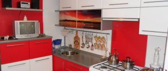
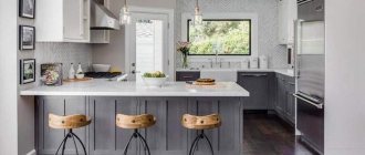
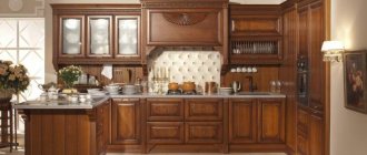
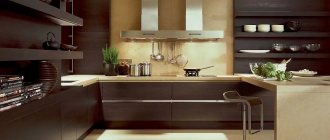
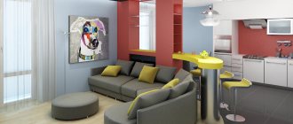
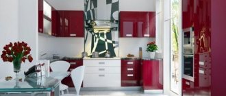
Even now, in our extremely dynamic times, the black and red duet in the interior is perceived ambiguously. For some it is too dark, for others it is too provocative.
For those who love risk and do not tolerate rules, this is the most correct decision when decorating a kitchen. However, even quiet melancholic people can afford to experiment with the color scheme of the space.
The main thing is to remember the obvious benefits and hidden dangers of this choice.
- A room made in this color scheme will always look stylish;
- A charge of additional positive energy is guaranteed;
- The room will seem warmer than it actually is, especially if the kitchen faces north or northwest.
Simplicity and sophistication
If you decide that your kitchen should be only red and black and nothing else, you should decide on the choice of style. Unfortunately, this color scheme will somewhat limit your options.
You will have to forget about pretentious modernism and classicism; the Victorian style and Biedermeier are not for you either. But you have a huge selection of modern design solutions.
1 Minimalism: color is everything
This style arose at the dawn of the twentieth century. The main thing is simplicity of shapes and lines with a minimum of expressive means. Simple geometric shapes, straight lines, natural materials. Zoning of the room is carried out, if possible, without additional partitions due to the play of light.
The main condition for maintaining style is the functionality of the kitchen layout. Modern minimalism is characterized by precise modeling of space down to the millimeter using only necessary items.
This style is characterized by the use of the play of light as an additional design tool.
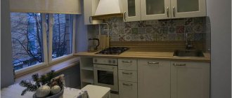
Even a small kitchen in a Khrushchev-era building, decorated in a “minimal style,” will look like a masterpiece of design art. You just need to correctly calculate the amount of red and black, and also choose the right background.
2 New wave – combining the incompatible
This is a fairly new direction in interior design, which emerged in the second half of the twentieth century. Initially, it was a fashionable trend in music, painting and cinema. From there it smoothly flowed into architecture.
A characteristic feature of this style is the combination of technical innovations and ethnic motifs. However, this style is very laconic. According to this stylistic concept, the space should expand from the “epicenter of the explosion.”
By the way, this may not necessarily be the center of the room. A very bright wall that attracts attention, the fronts of kitchen furniture, or an island can be such a center. In this case, considerable attention is paid to the selection of the basic background, and the details fade into the background.
The furniture should be low, rough, curved lines, as if flowing. What is important is that preference is given to design with a minimum of prints. If it’s a color, then by itself.
3 Japanese style
Interest in Japanese style is not new. Sushi and rolls have long been firmly established in our diet. And after them came the desire to decorate the kitchen in this exotic style.
The fundamental principle of this direction is simplicity, a minimum of furnishings and clear organization and functionality. However, when choosing this style to decorate your kitchen in black and red tones, remember the symbolism of these colors in Japanese culture.
Black was originally a masculine color, the color of warrior clothing, and also the color of death. The color red symbolizes security, prosperity, family prosperity and power.
Therefore, in Japan, many temple complexes are red, but the interior decoration does not involve the intensive use of these particular colors. After all, a home should promote peace, tranquility and merging with nature. If there are too many aggressive colors around, achieving perfection will be more difficult.
4 More expression
As strange as it may sound, the most emotional style – expressionism – can be suitable for decorating a kitchen in a red and black combination. Only one important condition is that self-confident, liberated and independent individuals can afford to choose such an interior.
For a family with children, this design direction is contraindicated - it can have too strong an emotional impact on the fragile child’s psyche: children can be capricious when in such an environment, be hyperactive and will often get sick.
For those who have no barriers, this style is best suited. The philosophy of this direction is to create more emotions. Parts of the interior have an elaborate shape, changing the perception of space and objects in it.
Traditionally shaped kitchen cabinets will go well with a fancy bar counter or oddly shaped upholstered furniture. Lamps will also help achieve the desired effect.
Combination with other colors
If you consider it necessary to complement the furniture with a third color, then all shades of white are optimal for this. This technique will smooth out the drama of the contrasting red and black combination. In a large kitchen of modern design, splashes of metallic gray can be successfully used.
Combination of facades
- White.
- Beige.
- Cream.
- Creamy.
- Ivory.
- Natural wood of any shade.
- Frosted or clear glass inserts. This “weightless” material will make the kitchen more elegant.
- Texture. Different textures will be an attractive addition to the contrasting color combination.
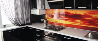
- Photo printing. An advantageous addition that attracts attention is a bright, large pattern on the upper or lower facades. Try to choose a design that matches the theme of the room.
Photo: Stylish and modern red and black kitchen design
Who's the boss in the house?
The choice of interior style will depend on which of the colors of this red-black duo will be dominant. More often than not, the leading part is performed by the red one.
It is a dynamic color that attracts attention even in small quantities. Dominant black will create a too gloomy atmosphere if not balanced with an additional neutralizing color.
When decorating a room, it should be borne in mind that this color combination is self-sufficient and completely excludes the use of any elaborate fittings, curls and stucco molding - only simple, strict lines.
The red-black duet can vary: black top - red bottom, red top - black bottom, the main thing is to maintain balance. Many designers advise achieving balance by incorporating a background color. For example, like in this photo.
Accessories
If your desire to get a red and black kitchen is great, but purchasing a bright set or changing the background color is not yet planned, try to diversify the existing decor with contrasting accents of the magnificent duet.
Anything will do: a lamp with a red lampshade, bright curtains with black monograms, rich sofa cushions and other textiles. Decorative plates, elegant vases or unusual bottles will cope well with this task. You can try to get closer to the splendor of a red and black interior by resorting to colorful vinyl stickers that will look great on the refrigerator and other light-colored surfaces.
red accessories
The third one is not superfluous
The choice of background color for a black and red kitchen should be approached very carefully. Milky white, cream, pearl gray, pearl ash and ivory are appropriate here. These tones will visually increase the space and soften the harshness of the dominant duo.
A black and red kitchen looks very good in this solution: white and black floor made of ceramic tiles, milky white walls and ceiling, black matte fronts of lower cabinets, glossy fronts of wall cabinets (some can be combined with frosted glass inserts).
The apron can be either one of the dominant colors (in contrast) or a background tone with a two-color ornament or pattern.
When choosing a countertop as a work surface, keep in mind that it should contrast with the facades for balance. The dining table and chairs are preferable to a neutral color, but never an additional fourth color.
With this interior color scheme, significant attention is paid to the selection of kitchen utensils and accessories.
Cooking utensils are preferably chrome plated; tableware can be either traditional white or red and black. It is important to remember that it should create a single ensemble, but not look tacky.
Lamps also play an important role in kitchen design.
Depending on the chosen style, this can be spotlights, matte milky-white balls or small crystal lamps (a crystal chandelier that is too massive will be completely out of place).
Decor, lighting
The more dark spots there are in a room, the brighter light sources are needed. The luminous flux is recommended to be warm - it slightly softens bright colors, but does not distort them. Each zone is illuminated separately; decorative lighting is placed around the perimeter of the unit, floor, ceiling, and placed inside glazed cabinets. All significant elements are highlighted individually.
If red and black are used only as accents, then it is better to decorate the rest of the space in white or gray.
Fresh flowers and herbs with red or almost black leaves and flowers - begonia, poinsettia, coleus, basil, etc. are often purchased as original accessories. There is little useless decor here - it is completely lost on the red background.
Lighting also plays a big role in such an interior: the better the room is lit, the more restrained and cozy the room will look.
Modern style
Black is an excellent background for such an extraordinary color as red. Thanks to it, bright, rich shades will look even more impressive and non-trivial.
The black and red kitchen in a modern style is distinguished by its consistency. It contains clear geometric shapes, without curves, monograms, or stucco.
The most popular solution is red top and black bottom. If you are afraid of such bold experiments, consider decorating the bottom with a rich color and covering the fronts of the upper cabinets with frosted glass doors.
Shiny glossy sets of such shades harmoniously combine with metal fittings and accessories, including chrome.
Arranging such a kitchen in a modern style is not so easy, because you are dealing with two extremely active shades. Each of them is self-sufficient, so it is important to maintain perfect harmony.
Including additional colors is unacceptable. The only exception is white. Use it as background.
But these colors allow you to experiment a lot with textures: matte and glossy, chrome and mirror. Rough surfaces look very impressive.
In modern spacious kitchens, the red and black palette can also be used in the design of the dining room.
How to combine furniture?
Intense red and black match each other perfectly.
A kitchen set in such uncompromising shades will add passion and at the same time respectability to the atmosphere. The distribution of the range depends on the wishes of the owner: red furniture will serve as an excellent accent for a dark kitchen, and a dining area in black tones will add solidity and solidity to the interior. Glossy facades that reflect light will add brightness to the kitchen, while matte ones, on the contrary, will mute the richness of the selected colors.
The photo shows a scarlet corner kitchen-dining room with a dark ceiling. Instead of a table, a bar counter is used as zoning.
There are many ways to combine the red and black palette: for example, installing garnet-colored facades with black inserts. Charcoal-colored household appliances fit perfectly into the scarlet interior: stove, hood and refrigerator.
The photo shows a black acrylic tabletop framed by a red set, diluted with chrome parts.
It is much easier to decorate a spacious kitchen with red and black, but what should the owners of Khrushchev-era apartment buildings and studios who are in love with such an active color combination do? To create a bold and expressive interior in a small room, you should avoid small details that split up the space: free-standing bedside tables and open shelves with dishes. Instead, designers recommend ordering furniture exactly to size, using gloss to reflect light and built-in appliances to save space, and decorating the top with red and filling the bottom with black.
The photo shows a small kitchen with lingonberry accents. The graphite color adds depth to the room, and undecorated plastic windows help unload the space.
In classic interiors
A black and red kitchen can also be equipped with classic interior solutions. Pretentious Baroque, Empire and Rococo will look most impressive and unique in rich burgundy and cherry shades.
The golden finish will add additional aristocracy to the surroundings. This can be exquisite stucco molding on facades, fittings, frames of lighting devices, and decorative elements.
Do you want to surround yourself with nature and naturalness? Mahogany opens up unlimited possibilities in expressing your own ideas and fantasies. It is able to accurately convey the sophistication and richness of luxury of a classic interior style.
A more laconic and simple solution is a kitchen decorated in warm red shades with minor splashes of black. An excellent example of such an interior is shown in this photo:
Heavy curtains interspersed with golden threads will help complement the refined and sophisticated interior. The color of the canvas should be selected so that it combines effectively with the shade of red used in furniture or wall decoration.
Selection of material for the body and facade
Black and red kitchens made from chipboards look impressive . They consist of thin shavings glued together with a binder solution. These shavings are the result of processing wood and wood waste. Furniture manufacturers and consumers are attracted by the low cost of chipboards.
However, they have an impressive appearance, are easy to assemble, and are resistant to water and steam. The service life of a kitchen made from chipboard is about five years. For reliability, it is recommended to cover the chipboard slabs with an aluminum edge - it protects the facades from splashes of water and steam.
Another material for making a kitchen is MDF boards . They have a more durable structure and are made from environmentally friendly raw materials. The service life of a kitchen made from MDF is about 15 years; the facades do not fade under the sun and retain their attractive appearance.
In terms of strength, MDF is not inferior to furniture made of natural wood , which costs several times more. One of the most popular kitchen finishing options is painted MDF boards. With the help of paint, the material acquires a matte or glossy surface.
See also:
All about green kitchen furniture and wall color
Black kitchen design with dark facades
About the golden kitchen
In addition to the body and facade, it is important to pay attention to the choice of countertops . For their production they use:
- Solid natural wood : birch, pine, oak, larch. The wood has a pleasant structure and increased strength. The disadvantages of the material include high cost and special care using gentle detergents.
- Artificial stone - acrylic or quartz agglomerate. It has an attractive appearance, is easy to maintain, and shock-resistant. Excellently imitates natural stone, but has low heat resistance.
- Natural stone , such as granite or marble, is durable and environmentally friendly. The disadvantage is the high cost.
Glossy or matte kitchen set
The glossy set is suitable for decorating kitchens with an area of 13-20 square meters. m .
Gloss is able to reflect light, so the space seems a little larger than it actually is. The effect will be enhanced by mirror surfaces and glass doors. You can get a glossy effect by covering it with acrylic plastic or PVC film. The materials not only give the facades a solemn appearance, but also protect them from water. Caring for a glossy kitchen is easy; just wipe the surface regularly with a soft sponge and glass cleaner.
Important! Combined kitchen sets are in demand: matte bottom and glossy top. Such kitchens look unusual, especially if you complement the interior with themed decor.
Matte black and red kitchens are found in spacious and sunny rooms . It brings coziness and makes the kitchen more homey. A matte red kitchen with a black countertop looks original. Thanks to the porous structure, hand and food marks are less visible on matte surfaces. Take care of such furniture using cleaning products without aggressive components.
Small kitchens
By saturating a small kitchen too much with bright colors, you will make it even smaller. Therefore, the first rule that should be followed when decorating small spaces is not to overdo it.
Red is best used in doses, as accents. This way you won’t overload the surrounding space, but will add a touch of sophistication, energy, and uniqueness to it.
Look for red chairs, dishes, textiles, decorative elements, and household appliances. You can use this shade to decorate one of the walls or a work apron.
If you want a red kitchen set, that’s no problem, but it’s better to use a neutral tone when decorating the walls. The ideal solution would be white.
Black can be used to decorate the floor or work apron. You can look for a dining table and chairs in this color.
A glass table with a black top would be ideal for a small kitchen in a modern style.
It can also be used when arranging glossy stretch ceilings. Everything in the kitchen will be reflected in them, like in a mirror. In this case, the ceiling as such will not be visible at all. Properly selected lamps will help add sophistication.
Wallpaper for a black and red kitchen
When decorating the walls, you should use light neutral tones that will balance the aggression of red and black. For such a kitchen, plain-textured plain wallpaper in gray or beige tones is ideal, which will highlight the advantages of the main background and its dominant place in the interior.
To make the kitchen look more comfortable, the contrast of colors in it must be minimized, using a muted shade of red and calm tones of white when decorating the walls of the room: the color of baked milk, pearl, cream, caramel.
This combination will ideally fit both into a laconic interior in the styles of minimalism and hi-tech, as well as into styles whose distinctive features are looseness and freedom (for example, avant-garde and retro).
You should avoid decorating walls with wallpaper with large patterns or ornaments: in this case, clumsiness and excessive congestion of the design cannot be avoided.
To divide the room into zones, which is most important for studio kitchens, you can use a combination of wallpaper of different colors.
Also in such a kitchen, the wall design looks original, combining wallpaper and textured decorative plaster.
Advice! Remember that the smaller the kitchen space, the more light colors should be present in the interior. Since red and black colors visually reduce space, when decorating walls, try to use calm, light colors as much as possible.
In a private house
A red and black kitchen would also be ideal for those who want to decorate a rustic kitchen in their private home.
Colorful facades and patterned curtains will be effectively set off by white trim. To decorate the floor, you can use light-colored laminate with the rich texture of natural wood.
For a private home, it is not necessary to use scarlet shades, because red can be completely different, ranging from dark cherry to bright crimson.
It is worth choosing the right shade based on the dimensions of the room. For large spacious kitchens with an area of more than 20 square meters, you can use bright red facades in combination with a black glossy countertop.
The black and white palette of small rooms should definitely be diluted with white. This will make the kitchen brighter and more spacious.
Choosing a red and black kitchen is one of the most risky and responsible. It takes considerable courage and a sense of proportion, color and form to adequately decorate the interior of a room in these colors. It's like dancing tango - passion, rhythm and desperate courage give birth to harmony and a real work of art.
Features of choosing a headset shape
For lovers of unusual interiors, designers suggest choosing a radius kitchen set . Rounded and smooth elements look original and with their help create bold and unique interiors. Radial facades are used to equip floor cabinets, worktops, and wall drawers.
They make kitchens to order , according to individual measurements. Such furniture is also suitable for kitchen-living rooms, where the radius kitchen acts as a zoning element.
For kitchens no more than 15 square meters, choose a linear or corner layout . The advantages of the first option are compactness, ease of assembly and affordable price. The advantages of a corner kitchen are its convenient location, drawer capacity and interesting appearance.
Particular attention is paid to island kitchens , where the island takes center stage. It is both a work area and a dining area. The island is brought into the center of the room. For convenience, a sink, washing machine, and freezer are installed in it.
Important! The shape and size of the dining group are chosen based on the area of the room and its features. For small rooms, use bar counters, folding tabletops or transformers. If space allows, a dining group made from an oval or square table, soft sofas or armchairs would be an excellent option. The color and texture of the dining area should be in harmony with the furniture and decoration.
How to make your kitchen unique with details
A kitchen in red tones requires the use of this color in only a few interior modules. This palette can be seen in the organization of the ceiling, wall surfaces, floors, furniture and modest decorative items.
Linear kitchen Source yandex.uz
The kitchen apron is decorated in red; this is acceptable when space is limited. Main materials: ceramic tiles, tempered glass. The facing of the apron is complemented by tiles with decor: with images of dishes, textiles, lampshades, flowers.
Dark bottom and light top Source remnox.ru Combination with gray in the kitchen interior Source nusantarafood.me/
Cool shades are also suitable: burgundy, cherry, lilac-pink. Furniture is chosen with glass and metal inserts. Open cabinets and translucent facades are suitable. For such furniture, a tabletop made of stone or wood is selected. This softens the expression of red.
Black and red kitchen Source dekor.expert Corner set Source italstroy.ru/
The dining area is decorated in red: for example, chairs with ruby backs or a table of the same shade are suitable.
Light curtains in neutral shades match the “juicy” tone. When using pale red tones, it is allowed to choose floor-length curtains a couple of shades darker.
Selecting a dining area in the kitchen Source postroika.biz
Color option Source www.aaryainterior.com/ Curtains in the kitchen with a balcony door Source yandex.com
What furniture and appliances to choose
The red and black facades of the kitchen set harmonize well with the traditional colors of household appliances. Built-in appliances look beautiful, creating a monolithic and unified feeling of the layout. A dark oven or microwave harmonizes well with the background of glossy facades.
The refrigerator can also be the color of the main colors of the combination. A standard white refrigerator is used only if this color is found on the work surfaces, apron or countertop. Otherwise, the refrigerator will stand out strongly from the general background.
The kitchen table can be dark in the shape of a circle or rectangle. Glass will add a mirror shine. Chairs are chosen to match the table. Dark colors are diluted with red upholstery for chairs or a leather sofa.
Such a different red color
Avant-garde cafe styling
There are a great many shades of this cheerful and bright color. And the features of its stylistic and lighting design depend on which red color is preferred in the interior design of the kitchen.
It is important to take into account the fact that the color red has an exciting effect on the psyche. A black, white and red kitchen can throw many people off balance. In addition, it has been proven that in rooms with a predominance of red color, household injuries - cuts, wounds, abrasions - occur more often.
For example, instructions for the design of domestic premises during the USSR did not recommend the use of red in the decor of kitchens and bathrooms. Therefore, it is advisable to mute bright colors with more restrained dark tones or diffused lighting.
What sensations and emotions do the red range of colors evoke?
Noble burgundy
Lighting in kitchens with such an interior should be bright and formal
This rich and rich color pairs perfectly with wood carved inlays and gilded accessories. A wine-colored furniture set will add royal chic and splendor to the kitchen.
Important. Dark burgundy in combination with black should only be used in large rooms. In cramped kitchens it creates a “pressing” and gloomy feeling.
Sunny orange
Country style kitchen
This color should be used extremely carefully, especially in combination with black decorative elements. Because you can create a mournful feeling.
The kitchen interior in orange tones looks harmonious with light caramel shades. Black accessories should be strictly dosed and used mainly in the decoration of household appliances.
Read also the article about orange kitchen interior.
Scarlet, pink and crimson
Good mood kitchen
These colors suggest the presence of only minor black accessories in the interior design. It is better to give preference to contrasts based on pearl gray or ash pink shades in the decor. This kitchen interior lifts your spirits and inspires optimism.
Important. When choosing a scarlet or crimson color scheme for the kitchen, the lighting should be diffused and soft. Because shadows cast from lamps can completely distort the color palette of a furniture set and decoration.
Floor and ceiling decoration
A very bold and colorful combination is a floor lined with glossy or matte dark tiles. This will add additional pomp and luxury to the design and emphasize the richness of colorful nuances.
The best solution would be to use high-quality linoleum or laminate made to look like wood: the structure will prevent slipping, and the pattern will hide minor dirt.
A ceiling painted in red looks very relevant, but in this case you need to be prepared for the walls to look lower than they actually are. To zone the area, it is possible to paint the ceiling above the work area in a milky tone or dull light brown, and keep it red above the rest area.
Choosing a tabletop, designing an apron
- Tabletop made of natural (artificial) stone, white apron.
- Red countertop, white apron.
- The apron and tabletop are made of black and white plastic, imitating the color of zebra skin.
- White countertop, red apron.
- The apron and tabletop are in shades of white (beige, light gray).
- Chocolate apron, metal table top.
- Backsplash made of red and black tiles laid in a checkerboard pattern, white countertop.
- Mosaic backsplash and countertop.
- Apron made of tempered glass with photo printing, tabletop in gray or white.
- White apron with red ornament, white tabletop.
