The kitchen interior, decorated in red and white colors, is a bold and original idea. This option is suitable for people who do not follow stereotypes and are not afraid to realize their own fantasies.
The white and red interior will always invigorate in the morning, and in the daytime it looks elegant and solemn. There is no shame in showing off a kitchen in these colors to guests; it looks modern and unusual.
The main thing when arranging a room is to correctly determine the proportions of red and white colors, not to go too far with scarlet elements, so that the kitchen does not look cheap and vulgar.
Features of working with a color palette
Red is an ambiguous color. It attracts attention, but few people decide to add it to their home interior. For a bedroom or living room, it may seem overly aggressive, so a red corner kitchen becomes the only place in the house where such a color palette will look relevant, rich and interesting.
Taking into account the rules of color psychology, many luxury restaurants add shades of red to their premises because it stimulates appetite, looks expensive and stylish. You need to understand that monochrome red is not suitable for decorating the entire room. This color is best used as a bright accent, but nothing more.
It’s better if it’s kitchen facades, floor tiles or furniture, but definitely one thing. An excess of red will have a depressing effect on the psyche, and many decorative elements will simply be lost against its background.
Visually, the red color scheme “warms” the interior and makes it richer, which is important for kitchens that face the north and lack a lot of natural color.
At the same time, this palette seems to “bring things closer”, making them deeper and more massive, so in small kitchens it is necessary to carefully use red.
Facade materials
Not only the color plays a role, but also the service life of the set, its ability to withstand moisture and temperature changes, which depends on the material of the frame and the facade of the kitchen furniture.
MDF facade set
It consists of a wood-fiber panel and is homogeneous; relief and coating can be made on it. Kitchen facades are covered with enamel, film, and plastic. MDF has high strength, resistance to moisture and temperature.
Solid wood
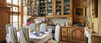
Not suitable for a small kitchen set, since the set is not only heavy, but also bulky. The wood is treated with antifungal agents and varnish, and can be sanded to remove chips. The kitchen set is decorated with pilasters, cornices and carvings. May lose color, requires careful handling, is not produced in a round shape.
The photo shows solid wood furniture in a spacious kitchen of a country house with a country house interior.
Plastic
Applied to MDF or chipboard panels. This is a durable set that will not lose its shape or scarlet color. The red facade with aluminum inserts and glass increases the service life of the headset.
Laminated chipboard
The kitchen set can be glossy or matte. The choice of design allows you to make the red facade of the set look like mother-of-pearl, chameleon. Easy to clean, does not absorb moisture, you can make bent shapes. Susceptible to fading in the sun, does not tolerate impacts and cuts.
The photo shows a laminated facade in a crimson shade, reflecting light. The mirror reflects the window, which makes the kitchen brighter.
Choice of shades
When working with red, it is advisable to immediately decide on suitable shades. They are divided into cold and warm tones, with each group having its own advantages and disadvantages.
Thus, shades with notes of orange, brown and yellow are perfect for rooms facing the northern part. They will create a cozy space filled with warmth and subdued brightness. But a palette with the influence of blue or purple looks good in rooms where there is no shortage of natural light.
Not every amateur can tame classic red and bright scarlet, since even experienced professionals do not always cope with such a task. Burgundy and cherry shades look good in almost any interior. They are much softer, more noble and simpler, which makes them relevant both for finishing the ceiling and walls and for furniture.
Decorative elements: choosing curtains
If the plans include curtains as a bright accent, then at the initial stage it is important to pay attention exclusively to high-quality materials. The fact is that textiles, when exposed to sunlight, tend to fade and lose their original brightness. For this reason, it is important to choose fabrics that are dense and natural in composition. For the shadow zone, translucent materials are well suited, which will create an airy effect and let in even the rare rays of the sun.
The choice of shade palette greatly depends on the overall design and layout of the room. Dark and rich shades are not suitable for small kitchens - they will make them even smaller and darker.
If the interior already has enough bright colors, then it is not advisable to add red curtains to the kitchen. An excess of color will make the room look vulgar, and it will be psychologically difficult to be there. With monochromatic and neutral wall decoration, richly colored curtains with various patterns are acceptable. If the walls have bright patterns, then it is better to stick to plain options with a simple texture.
Wall decoration - wallpaper and painting
On specialized forums, you often find a request for a red kitchen: how to choose the color of walls, wallpaper and ceiling, since such a color scheme is difficult even for specialists in the field of interior design.
Psychologists have already proven that the abundance of red in a room leads to a depressed psychological state and even irritation, so pure red in the decoration of walls and ceilings is used extremely rarely and mainly by professionals.
In terms of a bright palette, it is better to focus on furniture and accessories, and decorate with classic neutral and calm shades so that a red kitchen in the interior gives exclusively positive emotions. Among them, the following colors are justifiably popular: ecru, light gray, beige, white, soft green, coffee and shades of natural wood.
A beautiful small red kitchen will sparkle with new colors if you decorate the walls with black and white wallpaper with an extraordinary print. They will not distract attention from the main bright accents.
It should be noted right away that a red kitchen with black walls, although in many respects a classic solution, is not suitable for all rooms. It all depends on the size of the room and the preferences of the owners, since the kitchen will be quite dark and to some extent gloomy.
The exception is large spacious rooms, where it is permissible to use an entire wall, which is covered with bright wallpaper with a clear pattern, as an accent along with the kitchen unit. For example, photo wallpaper in the dining or work area if an apron does not fit there.
In the case of a light-colored set and a desire to highlight the walls, you should adhere to the following recommendations:
- One wall is red, the rest are covered with contrasting wallpaper. It will become a place for a dining area, where there are open shelves or decorations in the form of interesting paintings and photo frames;
- Colored wallpaper with patterns similar to those on the kitchen set;
- Wallpaper or special plaster of red color, where the same patterned motifs can be seen as on the apron.
It is advisable to keep wallpaper and furniture in the same style, since modern wallpaper with a bright pattern is unlikely to be combined with a classic carved set made of natural wood. Just like high-tech furniture cannot be supported by luxurious classic wallpaper with painted monograms.
Choosing the right combination of red and white when creating an interior
For a large room, the predominant red color will visually bring objects closer, which will give the room coziness and harmony. But too much bright color can increase blood pressure and cause aggression in communication.
In this case, it is important to find a balance in shades, for example, make white the fundamental color. A light, small kitchen will seem larger and more spacious, and bright red accents will add zest to the decor.
Let's consider four main combinations of red and white design, each of which gives a certain perceptual effect:
1. The red bottom of the kitchen and the white top is a winning composition, as it will not look boring. Contrasting tones look good on a glossy set. A two-color option will allow you to harmoniously maintain the overall style of the kitchen and add presentability and effectiveness to the room. It is important to find a smooth transition of colors from one to another so that they complement each other and do not look intrusive.
2. Red top and white bottom. This option makes the atmosphere weightless and visually expands the walls. It is better to choose dark colors for the tabletop and chairs to give harmony to the overall impression. Sharp contrasts can be avoided by choosing more neutral tones, for example, using a muted red tone.
4. Experiment with color by adding black. All three colors complement each other perfectly, but designers do not recommend using more than three colors. The presence of black should be evenly distributed around the entire perimeter. We select light wallpapers so as not to overload the composition; plain gray ones with an even texture are best suited.
5. Notes of gray will advantageously dilute contrasting shades , since gray is a universal color. This color will allow you to choose an interesting color scheme for the project.
Ceiling decoration
A red ceiling is a real challenge for apartment owners. It is extremely difficult to use it in the interior, but with well-chosen furniture, appliances and decorative elements, it will become a wonderful decoration of the room and the pride of the owners. This can be a suspended or painted ceiling, mainly with a matte surface.
Gloss, too flashy texture in combination with red color will give a simply unbearable look, from which even a true lover of extravagance will get tired.
With this solution, it is important to support the ceiling with other elements in the interior, but they should not be so noticeable. It is unacceptable to immediately use the finishing of walls, ceilings, furniture, floors and aprons in this color. It is important to stop in time and choose a single element that will serve as the basis for the entire design.
Let it be small accessories, curtains at most. In particular, small photo frames, vases, paintings. Sometimes it is better to leave only one element, which will become the basis of the interior design.
To make it easier to decide on the style and color scheme of the room, designers advise looking at photos of a red kitchen on the Internet. There are enough examples of interesting interiors in red light, so there shouldn’t be any difficulties.
Types (glossy, matte)
Based on preferences, the red set can be glossy or matte; you can also combine the type of facades, for example, make the top glossy and the bottom matte.
Glossy kitchen set
Reflects light, is suitable for any kitchen, can be cleaned, but is also easily soiled by hand marks.
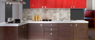
The photo shows a red glossy corner set in a rectangular kitchen with a gray kitchen apron and countertop.
Gloss in red tones is combined with a matte floor covering and work surface to avoid oversaturation of gloss.
Matte red set
It looks discreet, does not show fingerprints, is suitable for a classic style, and can be combined with matte and glossy floors. Discreet and familiar appearance of the facade.
The photo shows a matte kitchen set with a glass splashback with a print and neutral Austrian curtains.