14.02.2022
2341 0 6 min.
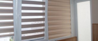
A muted green walnut shade that is usually found on store shelves
, has a practically therapeutic effect on the body.
It is not too bright, so it does not excite the nervous system, but at the same time it is not oppressively dark, as they say, just right. At the same time, pistachio color is perfectly complemented by other shades of the natural palette.
In general, it’s good no matter what.
What do delicate green colors usually go with?
Combination of pistachio and blue
This is an unusual combination that evokes thoughts of summer, vacation and the Crimean coast.
Two rather bright colors interact interestingly with each other: the coolness of blue refreshes the warmth of pistachio. However, they can “argue” a little, so it is better to “add” another, more neutral shade to this pair. For example, light colors such as milky, grayish, beige are ideal for this role.
The magic of mixing paint colors
The color gets its name from the nuts, whose shells are cracked to reveal a pleasant green color. The palette varies from brown-green, slightly withered to a joyful light color. It is worth understanding what shade you need to get in the interior. In any case, certain colors of paint will be required, and the question of how to get a pistachio color will be solved in practice.
The palette ranges from brown-green, slightly withered to a joyful light color!
What is needed for work:
- color sample (interior photo, piece of wallpaper, illustration);
- paints: blue-green, yellow (ochre, terracotta);
- brush; paper;
- palette for mixing paints;
- glass of water.
Secure the sample in the middle of the Whatman paper. Start mixing paints. Gradually adding color, carefully mix until smooth and paint near the sample. By varying the amount of one color or another, color saturation, texture density, strive for a perfect match with the selected sample. Write down the proportions of mixed paints; to paint the walls you need to know the exact dosage of each color . Enjoy the process, because the walls in your house will be painted in your favorite shade. Make several samples from light pastel to dark rich colors.
Related article: What paints to mix to get a peach color
If the speed of getting what you want is more important to you, then visit a hardware store. In the paint and varnish department, you will be offered pigments, mixing them with the base color to create the desired pistachio color for walls or other surfaces. With this approach, you can vary the intensity, density, and compatibility with other shades.
The easiest selection option is to purchase ready-made, graded paint in the required volume. You should choose a shade according to the ral palette. By examining the proposed palette, it is easy to understand what saturation and density of shade you need for your interior, and choose color combinations in the design of the room. Take a closer look at catalogs that contain photos of interiors using the selected palette.
The easiest selection option is to purchase ready-made, graded paint in the required volume!
Combination of pistachio and yellow
The pistachio shade itself comes from a combination of green and yellow.
, therefore, such an alliance is more than logical and harmonious. In the interior with green and yellow shades, comfort, coziness and warmth reign even in the coldest winter.
However, it is important to understand that if the room’s windows face south, too warm or even hot a combination will make it stuffy.
This psychological effect can prevent you from enjoying a beautiful interior and make you think about buying a fan.
Features and impact on humans
Pistachio color in the interior is one of the few warm undertones of green.
It’s easy to guess that it got its name in honor of the “lucky nuts” - pistachios. Like the color scheme of the nuts themselves, shades of pistachio color vary from light to dark, and can go warmer or cooler. But all these variations still have a common feature: a yellow undertone. After all, to get a natural color, you should mix 5 parts green and 3 parts yellow.
Varieties of shades:
- Light pistachio color. It is obtained by adding 20-30% white color to standard paint. Pale pistachio color is suitable as a background and can be used in decoration and furniture.
- Dark pistachio color. The same 20-30% is added to the main one, but in black color. The deep tone is ideal for accents, textiles, and accessories.
- Gray pistachio color. Too much gray can look dirty, but when combined harmoniously, the result is a pleasant cool undertone.
- Yellow-pistachio. Warm, sunny, pleasant shade. The ratio of ingredients is approximately 5:5. Ideal as a replacement for green in northern rooms.
- Green-pistachio. The latest representative of the palette: the ratio here is not 5:3, but 7-8:3. It is somewhat reminiscent of the color of green tea, perfectly soothing and relaxing.
Pictured are shade options
The interior in pistachio tones turns out neutral, promotes relaxation and stress relief. Even too much color will not look too much, so it is acceptable to create a monochrome design using different shades.
Combination of pistachio and rose
A delicate pink bud and a bashfully hidden pistachio nut are a curious pairing.
This could be the love of a lifetime, or, on the contrary, it could be a designer’s worst nightmare. Therefore, it is very important to choose the right tones so that life in such a dollhouse does not turn into hell.
Sconce Sonas, white
1790₽
Sconce Sonas, white
1790 ₽
Pistachio bathroom
Fresh and elegant design will also come in handy in the bathroom. The brightness of such a finish depends entirely on the size of the room: in a small bathroom, calm colors are used as a small accent, while a larger room is decorated with brighter tones of tiles or mosaics, cabinet fronts.
Pistachio interior style
Green color in any form is already a practical success in any interior,
because it gives freshness and brings freedom to space. Therefore, pistachio can be used in most styles. How does it interact with their characteristics?
Psychologists' opinion
The popularity of pistachio color is explained by the fact that this shade neutralizes anxiety, pacifies and is a symbol of safety and reliability. This is confirmed by professional psychologists. And those who live in the “pistachio environment” cannot but agree with this.
Pure pistachio shade is a panacea for irritation and anger, it smoothes out negative emotions and can even put you to sleep.
Among the golden-green walls, people of all ages display qualities such as friendliness and openness. However, if there is a dissonance of compatibility in such an interior, the color can set a person in an anxious mood, cause a melancholy mood and increase suspicion and apathy.
Research by scientists confirms that all shades of green have the ability to actively control the nervous system and have a positive effect on all subsystems of the body (heart, blood vessels, lymph, immunity).
Psychologists believe that well-chosen colors in the interior create an area of absolute relaxation and comfort.
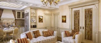
Classic style and pistachio
Nobility and luxury are integral companions of the classical style.
Pistachio perfectly interacts with them not only as an accent detail, but also as the main background. However, in the second case, you need to make the shade as neutral and inactive as possible.
Dublin corner sofa, 220×130 cm, gray
69250₽
Dublin corner sofa, 220×130 cm, gray
69250 ₽
Furniture and textiles
Sofas, armchairs and chairs in a light green shade look restrained and strict. The feeling of respectability increases many times over if pistachio-colored items are placed in large-format rooms.
Furniture for the kitchen and living room in Baroque and Empire style looks great. The combination of strict and patterned wooden legs with soft backs and seats in a rich golden-green shade fits perfectly into rooms with any texture or color of the walls.
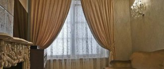
Pompous details of classic curtain decor, such as lambrequins, cascades, jabots, molds, ties, swags, are magnificent in all shades of muted green. Contrasting shades are usually used to decorate the edges. You can experiment with white, dark brown, beige.
So what does pistachio color go with? Often prints and shapes have a much greater influence in shaping style than ideal color combinations.
Ecostyle and pistachio
Ecostyle is closest to nature than anyone else.
This means that pistachio, as a directly natural and natural color, will fit perfectly into his concept.
It will not even mind being diluted with materials such
as wood, stone, bamboo, cotton and linen.
Natural materials
Lovers of naturalness highly value muted green interior backgrounds. They are ideal for placing:
- wooden, bamboo panels;
- stone;
- leather, fur;
- jute, rattan, cork coverings;
- reed, reed fabric.
Olive and pistachio colors perfectly complement natural wallpapers, plasters, sisal, siagrass, and coconut fiber coatings. Combinations of walls painted in a golden-green shade and floral wallpaper made from arrowroot, nettle, and golden flower look beautiful.
To decorate a bathroom with natural materials, use pistachio-golden or olive-colored ceramic tiles. Against its background, bathtubs, sinks, and functional furniture made of oak, teak, and cypress wood are placed.
In the kitchen you can successfully “play” with white. Against the background of a golden-green hue, it will look aged.
If you use brown or gray natural cladding, as well as furniture and accessories decorated in Provence style, you will get a charming country corner.
Provence and pistachio
Delicate provincial style goes perfectly with pastel colors, to which a pistachio shade can be added.
You can add white color to it and then it will become very delicate, as if faded in the sun.
Add wicker chairs to the interior in green colors
- and now it is ready to conquer the hearts of Provence lovers.
Interior decor
If finishing materials and furniture create the mood, then decorative items make the room truly stylish.
In domestic interior decor stores, the easiest way to find these items is in golden-green color:
- creative clocks, mirrors;
- different-sized panels for photographs;
- caskets, baskets, boxes;
- vases, bottles;
- flower stands, flowerpots;
- figurines, candlesticks;
- aroma lamps;
- pillows, bolsters;
- pedestals, racks, consoles;
- fireplace portals, boxes.
Things will be worse with the search for bookends and mannequins. You will have to take these untinted and paint them yourself.
Today, the most fashionable pistachio-colored interior decor is considered to be huge Cameroonian hats made of dyed feathers and the so-called solar mirrors.
If you have the opportunity to spend a lot of money, the best interior decoration in green tones can be dishes made of onyx or jade. A handmade golden-green stained glass screen will bring special beauty to any living space.
Hi-tech and pistachio
This is an option for those who want to combine nature with high technology.
High-tech is characterized by the use of all sorts of newfangled electronics, and the pistachio color prevents the interior from turning into the interior of a spaceship.
At the same time, it is not necessary to bring the shade to pastel : even a pronounced pistachio will look good.
At the same time, it is not forbidden to add a few more bright colors: pink, orange, etc.
Shades
The color of pistachio in the interior is a harmonious background for natural wood.
Today, designers actively use various accessories in soft green shades of varying degrees of saturation in the design of different styles.
Pistachio is successfully used in the formation of Victorian and colonial styles. And in combination with the color of golden green and white, it can be successfully used in high-tech or pop art style rooms.
Combination of shades
Typically, designers do not limit themselves only to pistachio tones when decorating the interior. Avoid merging surfaces and use different colors.
White
The universal white color can soften the richness of the tone and bring into the room a calm, pleasant atmosphere filled with homely warmth. For small rooms it is important to use pistachio furniture and white trim.
Grey
This color brings prestige in a classic style. Light gray in combination with pistachio elements will give a mysterious atmosphere, and thick, rich gray will add contrast and depth.
Black
The composition is not suitable for all rooms, as it looks bold, even a little aggressive. Black tiles or a sink in a pistachio kitchen will add rigor and originality to the design.
Orange
The gamma with cheerful “orange notes” will give the room a cozy and warm, cheerful atmosphere. The color of pistachio in this case serves to mute the bright orange.
Brown
Finishing materials made of wood in brown shades in combination with pistachio naturalness will emphasize the fusion with nature. Brown upholstered furniture looks good against the background of pistachio walls and floors.
Violet
Compositions of violet, lilac and pistachio add uniqueness to the interior. Such a memorable design seems to “breathe” with pleasant coolness and envelops you in a mysterious atmosphere.
Turquoise
The color of turquoise gives the room uniqueness, unusualness and refreshes even the most dull interior. The success of the combination lies in the harmony between the cold notes of pistachio and turquoise.
Pink
These two colors make it possible to achieve excellent results in interior design. It is best to use pastel colors in furniture and decor.
Not recommended combinations
Calm pistachio will be lost against the background of bright green. A duet with a marsh color will make the room gloomy and gloomy. In a dark room with pale blue walls, the delicate shade looks dull and dirty. Designers do not recommend combinations with acidic and poisonous tones.
Hallway in pistachio color
It’s not hard to guess how important the hallway is in an apartment.
This is the first space you come into when you enter the house.
Pistachio interior is an excellent solution for the hallway. You can add gold or copper accents to this color
- then the interior will become even more interesting.
Pistachio children's room
For a child's room, pistachio tones will be one of the best solutions. The color calms and energizes, relieves stress and gives strength.
- It all depends on the environment and lighting.
- The color of a bright walnut can be used to decorate walls, cabinet fronts, carpets, armchairs or sofas.
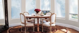
Kitchen in pistachio color
Pistachio cuisine is the ideal solution no matter what.
Green color has a stimulating effect on the psyche and increases appetite and mood.
The interior of a kitchen in a modern style in pistachio color is often found in the interiors of houses, so it cannot be called rare.
In addition to the pistachio shade, there are a variety of surfaces:
mosaic, stone, wood, tile, etc.
Which styles are best to use?
Since pistachio comes from the pastel palette, the first use that comes to mind is Provence. When you hear the phrase “pistachio kitchen,” you think of rustic motifs, light carved facades, wooden countertops and retro-style appliances.
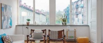
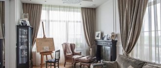
The photo shows a green wall in a modern living room
Creating a modern interior requires a cooler tone, especially when it comes to the walls: an admixture of gray makes the soft pistachio more noble and interesting.
The furniture is predominantly monochromatic; light edging is allowed as decoration for soft sofas or armchairs. Combine light green with white and black. You can use wood as a material for finishing floors or making furniture.
The classics are usually combined with beige or noble brown. For example, green walls, sand chairs, mahogany sideboard. Prints or designs on wallpaper, upholstery, and textile decorations are acceptable.
If in the classical direction pistachio can lead, then neoclassicism relies on neutral beige and white. Accents can be green: curtains, carpet, sofa cushions.
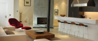
Living room in pistachio color
The family spends the most time in this room; as a rule, guests are greeted here.
This means that you need to choose a color for the room
so that it matches the character of the household.
The interior should not irritate; it is best to choose calm, non-flashy colors.
This way you can achieve harmonious colors and furniture arrangement.
White is the best color in this case.
It goes well with pistachio, diluting it.
You can also make pistachio an accent color in a beige interior.
To do this, you just need to put a sofa of this shade in the living room.
Carpet Antique Ink 160x230 cm
28300₽
Carpet Antique Ink 160x230 cm
28300 ₽
Such different walls
People began to use paints in emerald and light green shades for interior decoration quite a long time ago. Among them were both absolutely harmless specimens and deadly ones, more than half consisting of arsenic.
Today, having chosen a golden-green tone, the walls of the room can be decorated using:
- textile, paper, liquid, vinyl, non-woven or glass wallpaper;
- alkyd, oil, water-dispersion paints;
- stone, wood, bamboo panels;
- coverings made of reed, reed, rattan, jute, cork.
It is better to use pistachio-colored wallpaper in plain colors or decorated with white, yellow-golden patterns. For the kitchen and living room, it is permissible to use photo wallpaper with a suitable color palette.
Contrary to the standard idea that pistachio wallpaper is unacceptable in the bathroom, like any other, however, their washable non-woven samples are actively used to cover rooms with high humidity in many American and European homes.