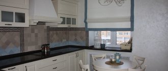
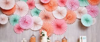
The kitchen should not only be beautiful, comfortable and functional, but also cozy. Only then will it become a favorite place for the whole family, where it is so pleasant to get together over a cup of tea and discuss plans for the future. Various decor can achieve this effect - stylish decorations, textile stands and paintings.
Using a painting to decorate a wall in the kitchen Source design-homes.ru
Functions of the painting
Psychologists have long proven that paintings can have a beneficial effect on the human psyche. They are used to maintain the status of the owner of the house, but most often they are used to create a harmonious interior design, in which they become the finishing touch. The main tasks performed by a painting in the kitchen include:
- decorating the wall and adding personality to the room;
- emphasizing the overall style of the kitchen;
- creating comfort;
- completion of the design solution;
- filling the room with positive emotions;
- bringing luxury into the interior.
Still life in the kitchen Source design-homes.ru
Photos
Using your own photos to decorate free space is another interesting trend. Even photographs without frames with a creative approach will create a unique composition.
- Especially those that remind you of pleasant moments in life.
- The sunrise, the sea in the rays of sunset, the smile of a child will remind you of pleasant moments in life over morning coffee.
Photo paintings for the kitchen can be made from any photographs - landscape, still life, flowers. It has become fashionable to use a simple line to which photographs are attached with staples and can be changed frequently.
Popular paintings for the kitchen
Not just any painting is suitable for this room. The following topics would be relevant:
- still life;
- composition depicting plant elements, fruits, flowers;
- portrait;
- abstractionism;
- Modular pictures;
- drawings on plates;
- paintings made by hand.
Kitchen decoration with a portrait Source dizainkyhni.com/
Graphic arts
Graphics are printed on different materials - wood, plexiglass, metal (suitable for retro-style dining rooms). The simple shape, economical pastel colors and light background on which the images are printed ensure that they are an elegant decoration that matches the ambience of the kitchen.
An additional advantage of the graphics will be thin frames that emphasize the character of the image. Glass paintings are popular because they are easy to clean.
Flower and fruit compositions
Pictures for the kitchen depicting ripe and juicy fruits, which are beautifully arranged on a platter, plate or large tray, are an ideal option. Although some prefer to decorate the wall with a picture of melons or a blooming garden.
Whatever pattern is chosen, it is important that it is in harmony with the kitchen set and wall decoration. For example, if the room is decorated in green, yellow, orange, it is worth considering the image of apples, citrus fruits or other exotic fruits.
Pictures in the kitchen, placed in a vertical position Source www.remontbp.com/
Fastening
The collage can be secured to the wall with double-sided tape. If you place paintings and photographs on shelves or on a chest of drawers, it will be easier for you to change the composition to suit your mood.
And don't limit yourself to picture frames on the wall. If your exhibition is constantly evolving, use shelves for pictures. You can display new masterpieces on them without drilling into the walls.
Place your favorite decorative items and souvenirs on the shelves, hang mirrors, lamps and clocks.
For original wall decoration, you can use wall panels.
Still lifes
Those with conservative views often choose still lifes that depict flowers in an antique vase or fruit in a basket or on a plate. At the same time, it is important to pay attention to the fact that the composition shows the compatibility of the design with kitchen utensils.
Still lifes painted with oil paints are considered the most valuable. They look very elegant and expensive. Suitable for decorating kitchens in classic or modern styles.
Kitchen design in green tones Source kitchenguide.su
Five elements
In Feng Shui there is the concept of the theory of five elements. Our whole life is subject to their interaction. These are earth, water, wood, fire and metal. One energy flows into another, supporting or destroying it. There are direct (supportive), reverse (oppressive) and control (destructive) cycles.
- Direct cycle. Wood supports combustion, Fire burns everything and turns it into ashes, that is, the earth. The earth is the birthplace of metal. When melted, the metal becomes liquid. Water promotes tree growth.
- Reverse cycle. Fire burns everything wooden. A tree absorbs water as it grows. Water spoils iron (corrosion). Metal weakens the earth by being born in it. Earth can put out fire.
- Control cycle. As the tree sprouts, it depletes the earth. The earth absorbs water. Water extinguishes fire. Fire melts metal. A metal ax cuts down a tree.
- How to apply Bagua to the kitchen. Draw a kitchen plan, indicate the cardinal directions using a Lo Pan compass or a regular compass. And transfer the Bagua grid with all the designations to the plan. Now you will understand which areas in the kitchen exist, which can be left untouched, and which should be corrected.
Abstraction
For those who find still lifes banal and portraits boring, designers advise choosing abstract drawings. This is an art direction that can easily fit into the interior of any room, including the kitchen, regardless of the style in which it is made. An original ornament or a set of geometric shapes can be depicted here.
Such designs are often chosen when decorating a room in modern directions. It is also recommended to consider abstraction for those whose kitchen is decorated in high-tech, modern, loft, fusion, or minimalist styles.
Modular painting in the kitchen interior Source picsis.ru
DIY ideas
You can add a fresh touch to the design of your favorite kitchen with your own hands. To do this, you don’t have to have an art education or spend a lot of money on buying tools. A stylish work of art can be easily made from available materials!
Will add a fresh touch to the design of your favorite kitchen
Product panel . The object applique fits perfectly into the design of this room. Cereals, dried fruits and vegetables, coffee, spices and much more are used for this. Such a natural panel will look not only stylish, but also very appetizing. Let's try to build a panel with spices and coffee. All you need is an evening of free time and desire. Use and combine whatever dried products you have on hand. These can be dried peppers, citrus peels, cereals, pasta and coffee.
Composition from buttons . Many people have a box of multi-colored buttons lying around at home that do not find their use. It can be fixed! Draw a pattern of an object on plain cardboard - it could be a tree, a butterfly or a cat. Line the entire space with buttons. You can combine colors or put them together differently. This requires absolutely no artistic skills, just glue, patience and free time. When finished, select a frame and hang it on the wall.
The frame must fit into the overall style of the room
An entire wall is a work of art
Applique of dried flowers . Such applications look unusual and fit perfectly into the kitchen. The only thing that is required of you is to dry beautiful leaves and plants in advance in the autumn. Make a sketch on paper. Glue the necessary elements on top - buds, twigs, blades of grass and leaves of your favorite color.
Collage . The option requires the least effort. You just need to find colorful photographs on the Internet that will fit into the style of the room. You can choose something from your personal archive, such as a portrait photo session of the whole family or wedding photos. Next, you need to print them on a wide-format printer and beautifully arrange them in a baguette.
Panel made of wine corks . Many people keep wood corks from wines and champagnes at home, others work in a bar and can easily get the necessary material. In any case, even a small number of traffic jams can complete the picture. Prepare rectangular plywood of the required size and liquid nails. Arrange them so that there is no free space left. The difference and different shades of wooden corks are not a hindrance - the product will turn out even more original.
Modular (segmented) picture
A modular or, as it is also called, a segmented picture, is not a single whole, but separate parts (segments) of one picture. Based on the number of modules, paintings are divided into:
- diptychs – consist of 2 parts;
- triptychs – have 3 modules;
- pentaptych – 5 segments;
- polyptych – contains 6 or more fragments.
The panels with parts of the picture are not connected into a single whole, but are located at a small distance from each other. However, this does not prevent us from perceiving it as something holistic. A modular painting will look best on glass. To apply a picture to it, two-color painting or photo printing is used. To create a background, a special film is applied to the reverse side.
Original works made with oil or acrylic paints are very expensive. Printed versions don’t cost much, but they look no worse than their exclusive counterparts.
The advantage of using a modular picture for the kitchen is that it can fit perfectly into any interior, as it is available in different themes. Still lifes, landscapes, images of flowers and fruits will look perfect in this room. Due to the fact that the modular painting does not have a frame, it will not weigh down the space.
Decorating a green kitchen with a modular painting Source mr-build.ru/
The main thing you need to pay attention to when choosing such decor is that it should be in harmony with the overall interior of the room. Usually, the fragments in it are arranged vertically. But, if the goal is to visually expand the space, they can be placed horizontally or diagonally.
Photo frames
It is very important, when using photographs in the interior, to choose the right frame - photo frames. It is better to determine the color and material of the frames based on the color scheme and interior style of the room.
Examples:
- modern styles allow the use of colors, black and white, plastic and metal;
- rustic style prefers wood tones;
- the yellow frame against the background of the interior in blue tones is a real decoration of the apartment;
- white frames look organic against the background of black and red colors.
It is better to combine large frames with small ones. Such combinations look elegant and very interesting. For example, in one composition you can simultaneously use a large frame for a baguette and several small frames and a mat.
Handmade frames look dignified and unusual. To create them, just buy blanks in the store and add shells, buttons or some other decoration that the designer will be inspired by his artistic imagination. And be sure to add a piece of your heart.
You can also make your own unusual frame that is attached to the corner of the room. To do this, you need to cut out two empty frames on one side, and then connect the remaining halves in a protruding or recessed corner of the room. This homemade frame can decorate the interior of any apartment.
Large frames can accommodate multiple photos of the same event. For example, weddings, childbirth, travel. This frame is perfect for bedroom decoration.
Posters and drawings on plates
An excellent option for decorating the kitchen would be paintings on plates. Firstly, the drawing will be able to decorate the room, and secondly, the decor will remind you that this room is intended for preparing and eating food. When hanging them on the wall, it is important to observe the principles of harmony:
- The decor is chosen so that it fits harmoniously into the room, fits in size and shade.
- Plates must be placed symmetrically.
They can be combined using round and square products. To give a dynamic look to the room, they are hung in ascending order from door to window. If the interior is made in country or Provence style, they should depict berry or flower arrangements. The shade and subject of the painting placed on the plate should be in harmony with the textiles (curtains, carpet, towels).
The realism of the poster pictures provides a kind of “presence effect”. Most often they are very large and can even completely cover the wall.
Using abstraction in kitchen design Source mykaleidoscope.ru/
Lighting
Light itself is not a decorative design element, but it is very important for decor, as it enlivens the space, highlighting the various shapes, textures and colors of interior items. Smart lighting can completely transform your home.
Light also affects a person’s mood and emotional state.
Wall lighting sets the rhythm and emphasizes the composition of the interior. Directional lighting draws attention to the room's distinctive features and enhances decorative elements.
Types of framing
Regardless of what is depicted in the picture, it needs a high-quality and attractive frame:
- Modern interior allows the absence of frames on the picture. In this case, it is necessary that the canvas be voluminous and well fixed to the frame. Most often, a picture without a frame is used if there is only one. If there are a lot of them, it is better to choose suitable frames that match the style of the room.
- The laconic frame is a simple design in monochrome colors (black, white, brown, gray). This allows you to focus attention directly on the picture. The ideal option would be in the style of hi-tech and minimalism.
- Artsy elements. Paintings with complex frames (swirls, decoration with stones and rhinestones, voluminous inserts) fit ideally into some areas. Such options are in harmony with the classical style, modern, art deco. Although, when choosing such framing options, you need to take into account that the kitchen is a room in which relief surfaces can become a problem for the housewife, since dust, grease and other contaminants will accumulate on them. And due to the specifics of the room, they will have to be washed very often.
- Original options. You can also decorate the frame yourself. The simplest option would be to use craquelure varnish, which will create original cracks on the surface. Another way to decorate is appliqué. You can use coffee beans, cereals, beads, small shells, etc. for it.
Eco interior Source medium.com/
Bagua
Bagua or Lo Shu square is a table of nine segments corresponding to different cardinal directions. It has south, east, north, west (main directions), southeast, northeast, northwest, southwest (additional directions) and center. The Bagua grid is superimposed on the plan of the home as a whole or the room separately. In our case, this is the kitchen.
Feng Shui bagua grid
Posting rules
Pictures in the kitchen can be hung in different directions - vertically, horizontally, diagonally or even chaotically. If the kitchen is made in the Provence style, you need to choose small paintings of different sizes and place them in a chaotic order, making sure that the room is not too overloaded.
Symmetry
The composition of paintings that are placed in a symmetrical order looks interesting. They are hung at the same height, at a short distance from each other. It is important that the plot is on the same topic. This arrangement is suitable for any style. High-tech is characterized by symmetrical placement of paintings of different shapes or sizes.
Before placing paintings, you need to visually determine the center of the wall. Draw a straight line horizontally or vertically from this point and place all the paintings. Depending on the chosen axis, you can visually increase or expand the space. The horizontal option is suitable for those who have a small room but with a high ceiling. Vertical is recommended for those who want the kitchen to appear higher.
Large painting for the kitchen Source topdom.ru
Tip 10. Don't forget about safety precautions
Under no circumstances should you hang paintings directly above a gas stove - the slightest spark may be enough to set the painting on fire. The exception is glazed paintings in a glass frame. However, make sure the glass is fire resistant.
And in general, a frame in the kitchen is almost a must-have.
Even glazed pictures in wooden frames should not be hung next to the sink. Gradually the frame will swell and deform from the constant influence of moisture. And there’s no talk of ordinary ones - not even a month will pass before the picture deteriorates.
Height detection
Paintings in the room play an aesthetic role. Therefore, designers advise hanging them at eye level. But, for the dining table area they make an exception - they are placed higher or lower. At the same time, it is important that they do not interfere when standing up, especially if there are protruding elements that can be caught on.
It is also worth paying attention to the following nuances:
- If you need to hang pictures on different walls, you should choose a placement that will not look careless. The bottom edges of the frame should be placed at the same level.
- Those who like a large number of small-sized drawings are advised to place them near the eyes. An option is when they are hung a little lower. This way you can see what is shown there.
- If, on the contrary, you need to place large canvases, then their lower edge should run along the middle line of the wall.
- Above the dining table, they can be placed below the eye line. However, they should not touch the tabletop closely. You should also not hang pictures directly above the work surface or hob.
Wall decoration with plate paintings Source posuda-gid.ru/
Master class on making spice panels
The main components of the spice panel are products, so it will fit perfectly into the kitchen decor. Prepare the following items for work:
- baking paper;
- cardboard;
- frame;
- PVA glue;
- Double-sided tape;
- decorative paper;
- spices, cereals, coffee beans, tea, peppers, beans, etc.
On a bright, green background
Let's start the process:
- First of all, we draw up the base. Cut out a rectangular shape from paper and cardboard that will fit the size of your existing frame. Glue the paper to the cardboard and let dry.
- Get ideas for composition from photographs on the Internet. According to your idea, stick several pieces of light and dark decorative paper, as well as pieces of double-sided tape. A dark shade of paper will help highlight dark elements, while tape will be needed for larger details.
- Generously spread PVA on the areas of the paper and sprinkle them with various spices. Don't skimp on the ingredients! Wait ten minutes and shake off excess ingredients from the sheet. Make sure they don't mix with each other.
- Glue bay leaves, cinnamon sticks and peas separately. Press them firmly so that the glue “seizes.”
- After all the grains and spices have been distributed and the painting has dried, insert it into the frame and hang it in the chosen place.
DIY kitchen panel
Surprising loved ones
Matching the painting to the style of the room
When choosing a pattern, it is important to consider the interior of the room:
- Landscapes depicting the beauty of nature and still lifes are suitable for classical cuisine.
- An image of food can benefit an interior in a country or Provence style. In this case, you can use panels using the textile patchwork technique. Images of wildflowers and scenes of village life would also be appropriate here.
- Contemporary creativity should be used in a modern interior. It is recommended to choose futuristic compositions or abstract drawings here.
- For the avant-garde, canvases painted in pastels or watercolors are used. But, since the style can be called “flashy”, you need to choose neutral subjects that will soften the pretentiousness of the interior.
- High-tech and loft can be complemented with abstraction or a futuristic pattern placed in an aluminum frame. A black and white image of a metropolis will look beautiful in a loft-style kitchen.
- Pop art is bright, so you can hang colorful drawings made by children here.
- Retro or vintage style will look good with a bright poster, collage or photo painting.
- The expression of Art Nouveau should be emphasized with a stylish canvas.
- If the kitchen is made in the art deco style, designers advise choosing a photo print with a pattern in the style of the 20s of the last century.
- Images of geometric shapes with strict lines are suitable for modernism.
- Baroque can be complemented by a wall panel with a gilded frame, which depicts scenes from the Middle Ages.
- The room in Italian or English styles is decorated with engravings depicting hunting scenes or ancient castles.
The most important thing is that the owner of the house likes the piece of art. Otherwise, it will turn out to be a meaningless decoration.
Brick wall in the kitchen Source roomester.ru/
Classic charm
Traditional style that many people like. Strict and laconic, with natural colors. Luxury and grandeur in simplicity of form. Typically, for such a setting, one medium or large painting is chosen in a beautiful frame made of noble wood.
Landscapes and still lifes best complement the classical style. You can use reproductions of paintings by famous artists.
The main secrets of choosing a painting and where to place it
In order for the room to have a harmonious appearance, when choosing and placing paintings in the kitchen, it is important to adhere to the following rules:
- Don't forget about balance when composing your composition. When choosing canvases for a wall composition, you need to maintain balance. For example, if a large and bright group of images is hung at the top, it is important to place small pictures of a similar range below to balance the overall look.
- The canvases must match the interior of the room in style and predominant shade. At the same time, in any kitchen you can use images on a culinary theme in the appropriate style. To navigate the color scheme, you need to pay attention to the shade of the kitchen set, textiles, and wall decoration.
- All paintings should have a common theme. They may have different sizes and be placed in different orders, but the idea, style or color scheme in the drawings should be the same.
- The kitchen wall and the canvas must have corresponding dimensions. A large painting will look better on a large wall and vice versa. If the canvases are hung on a rectangular area, then the shape of the frames should be elongated.
- You need to hang pictures in an area that is well lit, avoiding placement in direct sunlight. If they are placed in the shade, all colors will be muted and this will interfere with the perception of small details. It is important to find a place in the room where the image will be clearly visible or place additional lighting above it. For dark kitchens it is better to choose large designs.
- Determining the form of the composition. Most often, square or rectangular picture frames are used, placing them symmetrically. This option is suitable for a strict minimalist interior. But for those who want the composition to look casual, it is recommended to hang it in a chaotic manner. It looks especially impressive in Provence, shabby chic or rustic styles.
- Photos placed in frames, small-sized pictures, can be placed on a small, narrow shelf.
Color selection
Refusal of kitsch in favor of harmony is the basic rule for choosing colors. Color photographs combined with frame designs look more natural and beautiful in a child's room. Compositionally, it can be a staircase to the top with fixed stages of child growth. A stylized window on the wall with a selection of colors will decorate the hallway and kitchen.
Photos of the same size in a row look original, forming something like a border against a light background. In the bedroom you will need themes with lyrical motifs, in the kitchen: flowers and still lifes.
Black and white
Retro photographs or black and white photographs, framed in classic frames, with symmetrical or random placement on the wall, will undoubtedly become the main element of the interior and bring unique originality to it.
Animal images
When it comes to images of animals, birds, fish and insects, it is worth adhering to the rule of positive and negative emotions. So, for example, cute kittens, bunnies or puppies, swimming swans, goldfish splashing in clear water, funny monkeys or beautiful fluttering butterflies, an eagle flying over the mountain peaks - these are pictures with positive energy. But a wolf howling at the moon, a hunting tiger, fighting lions, a scary shark or a huge spider are not the best choice for the place where we eat.
Collage
A collage of plates with all kinds of designs is a great idea to add new colors to your kitchen interior
Plates can be used either separately or together with frames
Collage is one of the most interesting ways to present photos. The collage perfectly decorates kitchens, bedrooms, and living rooms. It is very easy to do it yourself by combining a number of photographs with one frame.
It is best to create a collage for the kitchen from photographs with food, dishes, and culinary themes. However, travel collages are also good for the kitchen. In this case, it’s good to combine the photo with a map of the place you managed to visit. The collage in the living room is made up of family photographs from the archive, where modern photos juxtapose with ancient ones. A collage for a nursery can be thematic and tell about a certain stage of a child’s life - kindergarten, 1st grade, graduation.
