As you probably already know, Pantone has announced two main colors of 2021 - the calm gray Pantone 17-5104 Ultimate Gray and the optimistic yellow Pantone 13-0647 Illuminating. As the Institute's experts explain, these shades symbolize strength and hope; their combination speaks of perseverance and inspires. And we have already asked Russian designers their attitude to new trends.
Colors of the year 2021, according to the Pantone Institute. Photo: press service.
Colors of the year 2021, according to the Pantone Institute. Photo: press service.
One gray color can look gloomy - it needs to be diluted with something. There is a reason to use yellow together with gray: it fills the house with “sunlight”. By increasing the percentage of yellow in the interior, you can “add more sun.” And another advantage of this combination is its unconditional elegance.
But, in fact, it is unlikely that anyone will adhere to the declared 2021 shades exactly. After all, there are so many shades of gray, so many different shades of yellow.
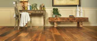
Paint from the Earth Tones collection, Chanterelle, Designers Guild.
Photo: press service.
Paint from the Earth Tones collection, Chanterelle, Designers Guild.
Photo: press service.
Paint from the Earth Tones collection, Chore Lichen, Designers Guild.
Photo: press service.
Paint from the Earth Tones collection, Chore Lichen, Designers Guild.
Photo: press service.
And in general, the combination of gray and yellow is actually not such a discovery: it has already proven itself in a modern interior, and in a variety of styles: from classic to minimalism. Let's see what problems designers solve when using this color scheme.
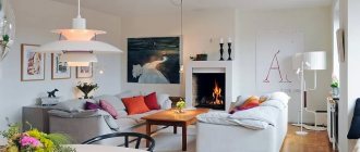
Interior in the style of "urban chic"
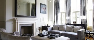
The windows of this apartment offer a magnificent view of Moscow, which is why the author of the project, Alla Shumeiko, decided to design the interior in the “urban chic” style. I wanted to connect the interior and exterior so that the interior would enhance the impression of the cityscape. Laconic rectangular shapes and dense gray color, chosen as the base, meet the task: this is the symbolism of the city. “The gray color itself looks harsh, so I diluted it with gold,” explains the author of the project. “The result is a subtle, balanced combination.” And let’s add that the result is a timeless interior, which today has acquired new meaning and new relevance in the light of the color philosophy 2021.
Living room in a Moscow apartment. Bright armchairs in golden saffron color enliven the wall plane, painted in a rather dark shade of gray. On the wall is a painting by Andrei Remnev “Strelka”. Author of the project: Alla Shumeiko. Photo: Mikhail Stepanov.
Living room in a Moscow apartment. Bright armchairs in golden saffron color enliven the wall plane, painted in a rather dark shade of gray. On the wall is a painting by Andrei Remnev “Strelka”. Author of the project: Alla Shumeiko. Photo: Mikhail Stepanov.
Gray shades as an ideal background for interchangeable accents
Speaking about the incredibly successful combination of gray and yellow, it should be noted that there are several variations of combining these colors. One of them, which designers most often use, is to create a dark background, against which cheerful accents in the form of individual vases, lamps, sofa cushions, etc. look especially attractive.
This combination not only looks the best (though there are some amazing room designs that feature a variety of sunny hues), but it also makes it easy to change your home decor to suit fashion trends.
At the same time, choosing deep shades of gray, used mainly to create a warmer and denser space, they can be combined with pastel and expressive tones of yellow.
But in the case when the main background is delicately light, it is recommended to pay attention to a bright palette. Otherwise (not necessarily, but maybe) the room will look pale, expressionless and monotonous.
Laconic and not boring apartment
The owners of this apartment themselves asked designer Olga Solnyshkova to decorate the interior in gray tones. But at the same time, they wanted sunshine, an atmosphere of warmth and joy. Olga came up with an idea of how to do this: you need to add golden-yellow accents, and the space will acquire an optimistic “mood.” She chose light gray as the main shade; it is complemented by a complex and very delicate yellow: in the living room it is a large carpet and a floral arrangement. (In the bedroom the “percentage” of yellow is higher - there is a yellow carpet and curtains.) In addition, objects made of golden brass are used as decorative accents.
Living room in a Moscow apartment. The interior seems enveloping and slightly shimmering. The secret of this effect is that the designer used several noble light shades of gray and yellow.
Author of the project: Olga Solnyshkova. Photo: Sergey Ananyev.
Living room in a Moscow apartment. The interior seems enveloping and slightly shimmering. The secret of this effect is that the designer used several noble light shades of gray and yellow.
Author of the project: Olga Solnyshkova. Photo: Sergey Ananyev.
Fragment of the bedroom.
Author of the project: Olga Solnyshkova. Photo: Sergey Ananyev.
Fragment of the bedroom.
Author of the project: Olga Solnyshkova. Photo: Sergey Ananyev.
Additional colors
Yellow-gray can be combined with:
- White. It is a universal color, creates contrast and lightens the space.
- Black. Makes the living room more dynamic, deep and noble.
- Brown. It complements a calm image and brings it closer to nature due to its naturalness.
- Blue. Used mainly on the south side to cool the room.
- Green. Just like blue, it gives the living room a natural look, close to nature. Fills the space with harmony and energy.
- Violet. The living room becomes glamorous and bohemian, attracting the eye and exciting the psyche. Suitable for creative people.
- Red. It is used in individual details, to concentrate attention on them, just a few items are enough.
Apartment in an old house
Many generations of the same family lived here: the owners’ great-grandfather received this four-room apartment even before the revolution as one of the leaders of the Tryokhgornaya manufactory. The apartment, by modern standards, has unfortunate proportions: very small rooms with very high ceilings. Something had to be done about this. The author of the project, Natalia Guseva, “expanded” the space with the help of mirrors, broke the walls with moldings, concealed the height with high cornices and, of course, worked with color. To create an impression of lightness, she chose a combination of light shades of yellow and French gray. As a result of painstaking work, the proportions fell into place, a competent combination of shades added air, and the classic style received a modern interpretation.
Living room in an old house in Moscow. The project uses different shades of yellow, from pastel walls to bronze-golden curtains and mustard vases.
Author of the project: Natalia Guseva. Photo: Sergey Ananyev.
Living room in an old house in Moscow. The project uses different shades of yellow, from pastel walls to bronze-golden curtains and mustard vases.
Author of the project: Natalia Guseva. Photo: Sergey Ananyev.
Fireplace area in the living room. The gray color in this project is warm, it gives the interior softness and comfort.
Author of the project: Natalia Guseva. Photo: Sergey Ananyev.
Fireplace area in the living room. The gray color in this project is warm, it gives the interior softness and comfort.
Author of the project: Natalia Guseva. Photo: Sergey Ananyev.
Yellow curtains in the living room
Yellow curtains for the living room are an excellent choice that is pleasing to the eye. For a small living room, light shades of yellow are suitable. If you need to visually increase the height of the room, then choose curtains with vertical patterns, stripes, and ornaments. Curtains are sometimes combined with white tulle - this is an excellent tandem. It is important to decide on the curtain material according to the main parameters: density, transparency, wear resistance and choose a suitable natural or artificial fabric.
Functionalism in the nursery
The laconic design of this room could have looked simply boring if the author of the project, Alexey Golub, had not introduced an active, optimistic shade of yellow into this functional space. With him, gray is by no means “gray” (in the sense of banal and dreary). It would seem that such a simple solution as a shelving unit with yellow sections should have required some other decorative support in the interior. But he copes well alone.
Apartment in St. Petersburg. Children's room.
Author of the project: Alexey Golub. Photo: Ivan Sorokin.
Apartment in St. Petersburg. Children's room.
Author of the project: Alexey Golub. Photo: Ivan Sorokin.
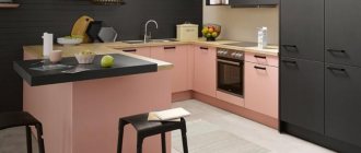
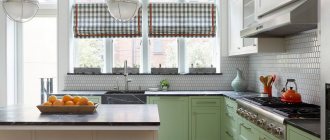
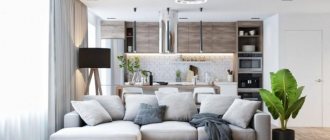
Yellow living room combined with kitchen
Since apartments and houses do not always have sufficient space, owners resort to various types of redevelopment and combination of rooms. One of the most popular and justified solutions is combining the living room and kitchen. When redeveloping or merging, the issue of zoning becomes very relevant. In this case, the yellow color is just a godsend: bright, stylish and contrasting, it very clearly sets the necessary boundaries and accents in the interior of the living room combined with the kitchen.
Yellow is the main one
The concept of this children's room is based on a combination of wallpaper and curtains from the same collection. The classic ornament in the Rococo spirit is made using the engraving technique; Because of the shading, it looks gray rather than black. The background is a ringing, joyful bright yellow. It is close to the yellow that is fashionable today, although the decor uses an absolutely classic theme. The cabinets and wide cornice are the same shade. The result: the room seems to be filled with bright sunlight in any weather. The graphic, elegant pattern of wallpaper and fabric allows you to avoid any deliberate democracy (which could happen if, for example, you used only paint of the same yellow color).
Children's room in a Moscow apartment. Authors of the project: Natalya Bazhenova, Olga Kulbachenko. Photo: Sergey Morgunov.
Children's room in a Moscow apartment. Authors of the project: Natalya Bazhenova, Olga Kulbachenko. Photo: Sergey Morgunov.
Yellow furniture for the living room
Purchasing yellow furniture for placement in the living room is a bold and bright decision. We are accustomed to the fact that furniture usually comes in conservative wood colors when it comes to cabinets, shelves, tables, and cabinets. However, yellow furniture is an incredibly effective design move, very unusual and attractive. The same rich and bright impression is caused by yellow upholstered furniture - sofas and armchairs - which attract the eye and undoubtedly lift the mood.
Yellow and blue living room interior
The interior of the living room, made in yellow and blue, is a very delicate and sophisticated combination. This option creates a favorable and balanced atmosphere in the living room thanks to the combination of warm yellow and cool blue. The design looks great with a soft blue ceiling and walls in tandem with yellow upholstered furniture. The interior is no less beautiful, in which the main color is yellow, and the furniture and interior items are blue or dark blue.
Living room in yellow-green color
Incredibly fresh and filled with vital energy, the yellow-green color combination is perfect for living room interior design. Combinations of rich shades of yellow and green look bright and impressive, while combinations of more muted tones of the chosen color duet are harmonious and elegant. You can combine cold shades with warm ones: cold as the main color for decorating walls, ceilings and floors, warm shades for use in details and interior items.
Features and influence of gray color
For a long time, gray was undeservedly considered boring, faded and mediocre. It was preferred only by rare connoisseurs, although fashion periodically took its toll. At the beginning of the 19th century, it was worn by discreet aristocrats, while more flashy shades were considered vulgar and vulgar.
Shades of gray are one of the most diverse from pale whitish to sparkling metallic, dark graphite, charcoal, taupe taupe or gray-blue monsoon. Thanks to gray, the whole fashionable ash palette appeared, like the popular dusty rose.
In ancient times, the color gray was closely associated with the god of time and maturity, Saturn. These are the robes traditionally worn by monks in various religious traditions. Gray was associated with justice, moderation and spirituality. Another common meaning is power, because it is not for nothing that the concept of “gray eminence” exists in Europe.
In interiors, gray color still helps to concentrate, calm down and put thoughts in order. Thanks to this effect, in folk medicine it was even believed that staying in a gray environment relieves stress, inflammatory processes, and helps fight infections.
Gray color represents balance and pragmatism, which is why it is often used in the design of classrooms and offices. It helps to maintain a clear mind during any strong experiences, be it frustration or intense joy. In color therapy, it is believed to be beneficial for patients prone to panic attacks.
In design, gray color is also very practical, because it easily combines with any light, dark or bright shades. In this it is not inferior to the classic duet of black and white. And it acquired a new life in modern interiors, such as high-tech, which gravitate towards metals, chrome, mirrors and gray gloss.
But the cozy Scandinavian style also found a use for gray. Here he creates a neutral and calm background for bright details, accessories, expressive textiles and pleasant little things.
Turquoise color in the interior: 100 photos and design ideas
Luxurious drapery
One of the most excellent decoration elements in a bedroom are curtains. They enhance aesthetics, soften the visual effect and add luxury. Gorgeous gray-yellow curtains will be a great way to highlight this combination, and will also add coziness to the room.
Black and white photographs correspond to the general style
Magic palette
Silk curtains and a velvet headboard will add chic
Consider choosing curtains with geometric prints that reflect mid-century style.