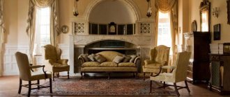
The fifties of the twentieth century certainly have their own incomparable style. It’s like coming to visit your grandmother and plunging into the cozy atmosphere of her apartment: with high-quality furniture, a crystal chandelier, numerous carpets, elegant dishes in an oak lacquered sideboard, paintings and figurines. Meanwhile, this style has a very specific name and is found not only in the interior, but also in the architecture of that time. So, meet Stalin's Empire style.
The Stalinist Empire style, as is generally clear from the name, was introduced by Joseph Vissarionovich Stalin. The date of its appearance is interpreted differently by theorists: some believe that this style began to develop in the 1930s, others associate its formation with the fifties, believing that other styles previously dominated, for example, they talk about Art Deco of the Soviet period and about the style of post-constructivism.
Stalin's Empire style embodied the features of the French Empire style, characteristic of the 19th century era (namely, the reign of Napoleon). In addition, it contains echoes of Baroque and Classicism. Theorists consider this style to be an alloy that seeks to convey and combine at the same time a monumental spirit, luxury and at the same time a lack of excess. Such elements, incompatible at first glance, formed a completely characteristic style that today cannot be confused with anything else.
History of style
This style originated in the USSR in the mid-30s of the 20th century. Initially, the Empire style was a pompous, majestic architectural style that arose in France during the time of Napoleon the First. In the 30s of the twentieth century, such luxurious, monumental buildings began to be built in the Soviet Union, when J.V. Stalin began to rule the country. In the 50s, such architecture began to be sharply criticized, considering it an excess that was unacceptable for a Soviet person, and after Stalin’s death, all the projects started were sharply simplified, eliminating decor as much as possible, and in some places sharply reducing the total area and ceiling heights. Multi-room apartments were mostly given over to “communal apartments”, in which several families lived at the same time, using a common kitchen and bathroom.
Pre-war period
The period from 1935 to the beginning of the Great Patriotic War in 1941 is the heyday of Stalinist architecture during the period of victorious Bolshevism. The central event of the new state, which existed for only 20 years, was its birth - the October Revolution. Therefore, the pathos of the communist dream permeated the entire artistic life of the Red Empire. Architectural research of this time is characterized by maximum internationalism. The Soviet Union positioned itself at the forefront of progressive humanity, so borrowing from all world cultures (primarily Western) was ideologically natural. Stalin viewed the victory of the revolution as the end of history. The USSR was supposed to become the embodiment of all the best achievements of world culture. Sometimes the authorities communicated their wishes even more directly - with government decrees on the “need to study the European heritage.” Moreover, historical styles were divided into desirable and undesirable. Among the latter was, for example, Gothic - “due to the tendency of forms to infinity.”
All-Union Central Council of Trade Unions building (1936, architect Alexander Vlasov)
The architect managed to suffer with this project - the order arose at an unfortunate moment in the change of eras. Initially, Vlasov developed a constructivist project, but suddenly the preferences of the Soviet government changed. Officials now wanted to see exclusively neoclassicism. In an attempt to please, the architect tried as many as eight construction options. The final one was inspired by Vlasov's journey to the ruins of Pompeii. The building of the All-Russian Central Council of Trade Unions is unusually light and lyrical for Stalinist architecture. It evokes thoughts of a southern Italian city by the sea, rather than the capital of the harsh Red Empire.
House on Mokhovaya (1935, architect Ivan Zholtovsky)
The house on Mokhovaya marked a turning point in Soviet architecture; it was nicknamed “the nail in the coffin of constructivism.” Built in the classical style, Zholtovsky deliberately contrasted the building with the then fashionable avant-garde. He wanted to use the example of this building to demonstrate the artistic advantages of the classics. According to contemporaries, Zholtovsky said: “I am performing with classics on Mokhovaya, and if I fail, then I will fail the principles of classics.” The building itself is reminiscent of the buildings of the legendary Italian Renaissance architect Andrea Palladio, especially revered by Zholtovsky.
Residential building of the People's Commissariat of Defense (1936–1946, architect G. P. Vorobyov)
Like all the most beautiful buildings of that period, it was erected not for “mere mortals,” but for the elite, in this case the military. The special contingent of residents was taken into account at the design stage - the house has many convenient functions that are not typical of ordinary houses of those years built. For example, the apartments here are huge, and their windows face both sides (that is, the sun always hits each apartment, no matter which side it shines from), which is very rare for Moscow houses. The original layout of the house also included rooms for servants and “back” staircases in the hallways.
Mayakovskaya metro station (1938, architect Alexey Dushkin)
The capital's Stalin-era metro is rightfully considered the most beautiful in the world. “Mayakovskaya” with its interior, made in an art deco style uncharacteristic for the USSR, is one of its pearls. For the first time in the Moscow metro, the columns and arches of the station are finished with polished corrugated steel. The vault is decorated with smalt mosaic panels placed in niches, made according to sketches by the artist Alexander Deineka in Leningrad. Theme: “24 hours of the Soviet sky.”
Central Theater of the Red Army, now the Theater of the Russian Army (1940, architects Karo Alabyan, Vasily Simbirtsev and Boris Barkhin)
One of the most pompous buildings of the era, similar to a temple of a non-existent religion. The building is a vivid example of classical trends in architecture, as the axial pyramidal composition of the building, colonnades and sculptural design tell us. The building is framed by 96 columns 18 meters high. The theater is equipped with the largest stage in Europe, which allows you to stage battles with tanks and cavalry. According to legend, during the Great Patriotic War, German aviation used the five-pointed shape of the building as a landmark.
Characteristic features of the style
A standard “Stalinka” apartment consists of three to five, less often two or six to seven separate rooms, a kitchen with an area of seven to fifteen square meters, a huge living room, and a spacious hallway. One-room apartments were built extremely rarely, and in three-ruble apartments two rooms were sometimes adjacent. All rooms have ceilings more than three meters high, vertically elongated windows facing one or two sides, and in some places there are bay windows. Typically, such housing is located in the “historical” center of a large city - the view from the windows is appropriate.
Apartment design from the time of Stalin combined individual features of Baroque and Napoleonic Empire, neo-Gothic and Art Deco, classicism and modernity. The thick walls of houses of this era were made of red or white brick and other non-combustible materials, and the buildings themselves had at least two floors, an abundance of stucco, and real columns. The doors here are also quite high, often double-leaf, the walls are decorated with profile cornices, and the wide “front” stairs are decorated with carpet runners.
In another way, “Stalin” buildings were called “full-size apartments” or “full-size in houses of the 50s.” Not only residential buildings, but also theaters, departmental buildings, metro stations, sports facilities, and universities were decorated luxuriously and on a grand scale. City buildings were grouped into entire ensembles; the architects of that time tried to use all the achievements of construction and fine art. The principle “the more the better”, gigantomania and optimism were in effect everywhere.
Examples[edit]
- Stalin's skyscrapers. The construction took a long time and with difficulty, and was completed after Stalin. Actually: From what was built: The building of Moscow State University.
- The building of the Ministry of Foreign Affairs.
- Hotel "Ukraine" Radisson Royal Hotel Moscow. It was already completed under Khrushchev. Due to the fact that in 1955 the decree “On the elimination of excesses in design and construction” was adopted, in the lower part of this hotel, according to a friend of the author of the edit, “looks like a large Khrushchev building.”
- Hotel "Leningradskaya". It was also completed under Khrushchev, and a year after the completion of construction, in 1955, two architects of this building were deprived of the title of Stalin Prize laureates, and one of them, in addition, was removed from the post of architect. Now, ironically, it is part of the hotel chain of American capitalists.
- Residential building on Kotelnicheskaya embankment.
- Residential building on Kudrinskaya Square.
- Administrative and residential building at the Krasnye Vorota metro station.
- Administrative building in Zaryadye. It was not completed due to the death of Stalin. However, a stylobate was made, on the basis of which the Rossiya Hotel was built.
center is like that. Well, not so high-rise, of course, but the overall impression... “This city looks like an abandoned stadium when crazy old people still come to it. They all think that a football match is about to start. And the pier here was made for giants. She looks as if ships were supposed to be approaching her all the time and giants were supposed to come ashore from them.”
Features of the color palette
The colors of the interiors of the first half of the 20th century are very modest, practically devoid of bright colors. The furniture chosen is predominantly dark, the walls are pastel shades, the carpets are red-brown, the doors between rooms are white, with multi-colored glazing.
The most suitable color combinations:
- linen with mahogany;
- agate gray with terracotta;
- marsh with woody orange;
- antique azure with beige-red;
- lavender with dark brass;
- pale gold with chocolate brown;
- bluish-green with beaver;
- protective blue with light chestnut;
- mustard with iron gray;
- emerald with brick;
- brown-orange with khaki;
- coral with cream;
- creamy yellow with violet-black;
- dandelion with opal green;
- ocher with silver-pink.
Even a monochrome interior allows for bright color accents - curtains, pillows, carpets, paintings on the walls.
Imperial decor: richness and sophistication
No less important element than furniture and decoration is decor. It is this that gives the interior a finished and holistic look. Decorative elements should also correspond to the imperial style and be luxurious and splendid. It can be:
- marble, silver or gilded boxes and candlesticks;
- mirrors in massive bronze or gilded frames;
- fine porcelain tableware;
- watches made of wood or bronze;
- paintings in gilded frames;
- vases made of expensive materials;
- antique figurines.
The paintings may depict battle scenes or important historical events. Massive crystal chandeliers and sconces with bronze candelabra and imitation candles are ideal lamps for Empire style interiors.
Empire style in the living room interior
The windows in such rooms are decorated with forged cornices, curtains made of light fabrics and multi-layered heavy curtains with draperies, wide folds, lambrequins, tassels and fringe. The current color is purple curtains with gold trim, which matches the imperial shades.
The solemnity and pomp of the Empire style make it appropriate in interiors that should look respectable: residences of politicians, offices of bank management and reputable companies, luxury hotels.
Interior design in Empire style - video
+ Similar styles:
- › Baroque style in the interior
- › Interior in Versailles style
- › Rococo in the interior
- › Renaissance style in the interior
voice
Article rating
What materials to use when decorating rooms
Finishing materials are used exclusively natural:
- stone – mainly granite, marble;
- wood - oak, pine, spruce, cherry, hornbeam, walnut, Karelian birch, etc.;
- metals - bronze, brass, steel, silver, etc.;
- crystal;
- ceramics;
- gypsum.
The floors are usually laid out with parquet, arranged in a herringbone pattern, but not common for the entire apartment, but for each room separately. The walls are decorated with stucco panels, half-columns, plaster brackets, caissons, corner details, textured niches, etc. The ceiling must have a stucco rosette for a chandelier, the same intricate ceiling cornices, and other similar decorations. The doors are made of wood, plywood, have panels, handles painted with gold paint, and platbands with 3D carvings. They match the color of the floor covering or are painted with white oil paint.
The floors in the bathroom and kitchen are laid out with ceramic tiles, less often - with natural stone, mainly red-brown colors, and the walls - with light tiles, richly decorated with plant patterns; a narrow contrasting border is allowed.
Winners' architecture
Victory in the Great Patriotic War radically changed the direction of state ideology and, as a consequence, architecture. The ideas of the communist International were replaced by the restoration of the Russian Empire with a clearly expressed Russian national character. During the war, Stalin quickly realized that traditional patriotism unites people much more powerfully than abstract Marxist doctrines. Without appealing to the national feelings of the Soviet majority, it was almost impossible to win.
The international situation also stimulated Stalin to mobilize the patriotic sentiments of the masses. Soon after the end of the war, the confrontation with yesterday's allies England and the United States grew with increasing force. The Cold War began. The Soviet leadership, led by Stalin, was seriously preparing for World War III on the European continent - this time against the victorious powers. In addition, having seen Europe with their own eyes, Soviet soldiers were no longer so willing to believe in Soviet myths about the “decaying West.” Therefore, a campaign against “adulation to the West” was launched quite soon in cultural life. Soon, the persecution of “cosmopolitans” began, with poorly hidden anti-Semitic overtones.
Architects responded sensitively to the new government request. Instead of borrowing from purely European classics, the focus of the architects shifted towards Russian classicism, baroque and national motifs. The buildings as a whole acquired a much more ceremonial, triumphant image. The amount of decor and stucco has increased to the limit. The buildings turned into stone banners of victorious historical Russia. The buildings listed below best tell the story of this period.
VDNH
Some VDNKh pavilions are real pearls of Stalinist architecture of the imperial post-war period. They have more in common with the baroque palaces of European monarchs than with Bolshevik themes. The quantity and quality of jewelry has reached its peak. Pavilions often resemble works of jewelry enlarged to the size of a building. Often, classicism in them skillfully absorbs folk ornaments of the republics of the USSR, represented by pavilions. Moskvich Mag wrote more about them in an article about VDNKh. Here is a list of the main pavilions of the post-war period, all built in 1954: No. 1 “Central” (architects Y. Shchuko and E. Stolyarov), No. 67 “Soviet Press”, former “Karelo-Finnish SSR” (architects F. Rekhmukov and A. . Reznichenko), No. 66 “Soviet culture”, former “Uzbek SSR” (architects F. Rekhmukov and A. Reznichenko), No. 58 “Agriculture”, former “Ukrainian SSR” (architect S. Polupanov) and No. 18 “Belarusian SSR "(architect A. Zakharov).
“Red Houses” (1952 , architects D. Burdin, M. Lisitsian and G. Melchuk)
A good half of the even side of Stroiteley Street is occupied by massive eight-story red residential buildings. They appeared here in the early 1950s, almost simultaneously with the Moscow State University high-rise building, which is located nearby. Like other houses in the Stalinist Empire style, they are richly decorated with stucco, but their main highlight is the color, which is unconventional for Moscow buildings. In that era, there was a lot of experimentation with the production of ceramics for cladding buildings. Georgian engineer Alexander Melia came up with red tiles, which were used to cover these facades. Alas, Melia’s tile (it was named after the inventor) did not take root in the capital. For the southwest of Moscow, beige and pink tones of facades are much more common. Only three more houses were built in this style in the city.
Semicircular buildings on Gagarin Square (1950 , architects Evgeny Levinson and Igor Fomin)
The construction of the square was planned back in 1939, but due to the war it was completed only a decade later. This semicircular composition with two towers decorated with sculptures forms the majestic gates of Leninsky Prospekt. This is perhaps no coincidence: both architects are from the Northern capital.
Komsomolskaya metro station (1952, architects Alexey Shchusev and Pavel Korin)
“Komsomolskaya” is the most pompous station of the Moscow subway and the apotheosis of the Stalinist Empire style. The creation of the station project was entrusted to the patriarch of Soviet architecture, the great chameleon Alexei Shchusev, who succeeded under any regime and worked in all styles in turn. He is also the author of the Mausoleum and the Kazan Station, under which the station is located. The artistic component of the station was handled by the artist Pavel Korin, with whom Shchusev had worked on the design of the Marfo-Mariinsky Convent in Moscow even before the revolution. The ceiling of Komsomolskaya is decorated with eight mosaic panels made of smalt and precious stones, dedicated to the struggle of the Russian people for independence.
Furniture selection
The furniture chosen is luxurious, high-quality, massive, mainly made of natural wood (oak, walnut, rosewood) and metal. It is often varnished and decorated with 3D carvings and mosaics. These are cabinets with carved “crowns”, convex sideboards, round or oval dining tables, leather chairs and sofas with high backs, heavy wooden chairs with turned legs, beds with balls or peaks in the corners. Wood carving is welcome here both in the form of complex plot bas-reliefs and simple “geometric” designs. Overlay slotted elements made of valuable wood are acceptable. In addition to natural or artificial leather, various fabrics are used as upholstery material - plain or with floral patterns.
Furniture in the Stalinist Empire style: tables, chairs, bookcases
Furniture, as a rule, was made of dark wood - walnut or oak. Furniture made from mahogany looked luxurious. The table in the Stalinist Empire style was often lacquered, usually decorated with crystal vases, which simultaneously served both decorative and practical functions.
The rooms were equipped with tall bookcases, usually with glass doors. A grandfather clock made of dark wood is another detail typical of the Stalinist Empire style. There could be a coffee table in every room, but not from metal or glass, as in our time, but from wood, and its legs were often lavishly decorated with carvings. The walls were predominantly decorated in light pastel colors.
A round table was installed in the dining room, and massive chairs around it.
To give the interior a cozy atmosphere, white tablecloths, massive curtains, figurines, candlesticks, and crystal vases were used. Sideboards were decorated with high-quality dishes, often made of light porcelain. You can give your room an empire style using silverware.
Lighting
The main lighting fixture of this era is a luxurious crystal chandelier located in the middle of the ceiling. Later, similar structures were made of plastic, which significantly affected the appearance and durability of the device. Individual areas were illuminated by floor lamps, often with textile shades decorated with floral patterns and fringe. Wall sconces, usually styled as torches, were mounted on bronze figured brackets above the kitchen table and bed. The workplace was illuminated by a table lamp with a greenish shade on a flexible base. In the children's room, in addition to the main light, there were small night lights, plugged into an outlet, decorated with stone or plastic. In modern times, the design is complemented by LED lighting, which, with the right approach, will not at all disrupt the basic style.
Hotel “Ukraine”
The next high-rise is no longer a residential building, but a hotel. Its construction was completed in 1957. The house became the second tallest (34 floors, 206 meters). It is from here that Kutuzovsky Avenue, opened at the same time, in 1957, begins, around which one of the most prestigious districts of Moscow was subsequently formed. The name of the hotel was given by Khrushchev, who ordered the conversion of two side buildings into apartments, of which there were almost 250 in the end. Famous residents: director Sergei Gerasimov and writer Anatoly Rybakov. The entrances look very ordinary.
The hotel amazes with its luxury. In 2010, it was reconstructed and transferred under the management of the famous international company Radisson. Now its official name is “Radisson Royal, Moscow”. Luxury here is felt in every centimeter of space.
The ceiling is decorated with a plafond with a diameter of 10 meters called “Festival of Labor and Harvest in Hospitable Ukraine.”
The collection of works of art that has remained here since Soviet times is impressive: there are 1,200 paintings in it alone. For example, in the hotel you can see the famous diorama “Moscow - the capital of the USSR,” created for the New York exhibition in 1977.
The minimum cost of a night at the Radisson Royal is 8 thousand rubles, and the most expensive of the 497 rooms, the presidential suite with an area of 370 square meters, will cost almost 339 thousand
Selecting textiles for window decoration
Window draperies are chosen to be dense, heavy, creating a solemn atmosphere. They have several layers, a large number of folds, fringe, and tassels. In the bedroom, blackout curtains are preferred, protecting the sleeper from the morning sunlight; in the kitchen - shorter, lighter ones. Doorways are decorated with the same curtains as the windows and tied with golden cords. Fabrics are preferable to natural, plain, calm colors or sharply contrasting with the color of the walls. It is advisable that the curtains match the color of bedspreads, carpets, and other indoor textiles.
If there are several windows on one wall, they are decorated with one common curtain, covering almost the entire wall completely.
New decree from above
During the 30 years of his rule, Stalin completely subjugated the architecture of the USSR. The appearance of all new buildings and cities was due to the will of one person. This system, which he himself created, played against Stalin’s legacy soon after the leader’s death in 1953. Khrushchev, who replaced him, pursued a course of total condemnation of Stalinism. The culmination of this process was the famous 20th Congress of the Communist Party, which plunged even communists from neighboring states of the socialist camp into amazement. Part of the de-Stalinization process was a complete revision of views on architecture. All the virtues that had been attributed to Stalin's buildings for 30 years were now declared embellishment and megalomania. Soon the famous decree “On the fight against excesses in architecture” was issued, which formally changed the entire appearance of the future USSR. The developments of the banned constructivists for decades again triumphed, already within the more mundane and functional framework of the architecture of developed socialism. But the principle set by Stalin remained unchanged: the architecture changed because the main man at the top, essentially the tsar, wanted it that way.
And yet history tends to fade over the years. The names of many rulers (or state criminals) today are simply a collection of sounds. Once a cause of fear and awe, their faces are now just a picture on tourist magnets. And the legacy in stone and concrete is long lasting. Walking through Rome today, are we outraged by the fact that the Colosseum or the Pantheon was built by slaves? Today these are simply outstanding buildings. Something similar awaits Moscow.
Photo: Vladimir Zuev
Room design examples
The total area of a Stalinist two-room apartment is about 30 meters, a four-room apartment is about 60 meters, a seven-room apartment is up to 160 square meters. The more rooms there were, the more spacious each of them became.
What kind of premises were there:
- kitchen;
- one or more bedrooms;
- cabinet;
- living room;
- bath or shower;
- restroom;
- hall;
- pantry.
There were no dressing rooms in those days - clothes were stored in built-in closets and storage rooms. For children's bedrooms, special furniture, with the exception of a crib, did not exist at all - for these purposes, the smallest rooms were chosen, where they placed a crib, a simple cabinet, a table with a chair, a box with toys, and a bookshelf.
Apartments of the Stalinist era are replete with high built-in wardrobes, which house most of the things, so there is a lot of space in the rooms for books and decorative elements.
Living room
The area of the Stalinist living room is from 16 to 30 square meters. The ceilings and partly the walls are richly decorated with stucco, in the middle there is a multi-tiered crystal chandelier. Along one of the walls there is a wall cabinet, in which there are always many thick books with neat “spines”, and in the glazed sections there are beautiful ceramic dishes, a tea set for six to twelve people, and many porcelain figurines.
The main decoration of the living room is the TV; it is placed on a stand with four cone legs or a wall console decorated with stucco. In the center of one of the walls there is a floor or hanging clock with a chime, richly decorated with carvings; on several others there are paintings in the spirit of rough “Soviet realism”, decorated with heavy frames. Without fail, there is a sofa covered with luxurious drapery, complemented by a pair of armchairs and a carved dressing table. All furniture elements are united by a patterned carpet that occupies most of the room. Photo wallpapers depicting a mid-twentieth century cityscape are also acceptable.
If possible, the principles of symmetry should be observed with respect to the compositional center of the room - fireplace, TV, sofa, painting, etc.
Kitchen
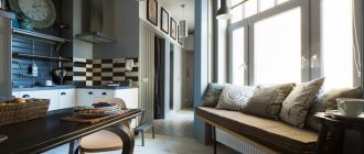
The kitchen of the Stalinist Empire style has an area of 7 to 15 meters. There is usually no kitchen set as such, there is only a not very spacious sideboard with dishes, table linen, and a low round refrigerator. The worktop is made of natural stone or oak; underneath there are drawers, sections for silverware, and various kitchen utensils. A few household appliances are placed on any horizontal surfaces. The dining area is decorated with a dining table covered with a fringed tablecloth; chairs are also draped with removable covers. Crystal fruit bowls, potted foliage plants, and heavy metal candelabra are placed in prominent places.
Bedroom
The average area of any bedroom is about nine meters. A single or double bed is located in the center of one of the walls, the headboard is decorated with stucco moldings, next to it there are one or two bedside tables or a carved dressing table with a valance in the color of the curtains. The shelves above the bed are decorated with black and white photographs in wooden frames and small figurines made of copper or bronze. There is also a small glossy two-door wardrobe, which at that time was locked with a key, or less often - a forged chest for storing linen and various “belongings”. Beige-brown wallpaper with stripes or floral patterns will complement the chosen style. Be sure to lay a carpet on the floor; if desired, it can be supplemented with a wall carpet.
If the room seems cramped, place a large mirror opposite the window, which, by reflecting light from the window, significantly expands the space.
Office-library
It was believed that everyone in the USSR read, so every family had a lot of books. A study with a desk was usually combined with a library, which consisted of solid wood shelves up to the ceiling. Sometimes they hid the surfaces of all the walls, and in order to get the desired book from the top shelf, you had to use a stepladder or a special wooden stand with two or three steps, because the ceiling height was often about four meters.
In the modern version, there may be a little less books, and the desk is replaced by a computer. On open shelves there are plaster or bronze figurines, stylized for that era. A map of the Soviet Union, a red flag or an image of the coat of arms is hung on the wall.
Hallway
This room is decorated no less luxuriously than all the others. There is herringbone parquet or real marble on the floor, dark patterned wallpaper combined with wooden panels on the walls, stucco molding and a ball lamp on the ceiling. From furniture, a carved trellis, a wooden wall or metal floor hanger, a small couch combined with a shelf for installing a home telephone are appropriate here. The carpet will also fit in with the theme.
Stepan Lipgart
Architect
“Stalinist architecture, which is a great source of inspiration for me, is distinguished primarily by its quality. In 1918, Moscow was returned to the status of capital. Therefore, it began to be built accordingly - not as a provincial city, but as the main city of the country. The best people and materials were used to create the image of the new capital.
I grew up in Moscow and studied architecture in the early 2000s. At that time, Stalin’s buildings looked extremely expressive to me against the background of the vague architecture of the Luzhkov period or the gray late Soviet buildings. Already at that time I began to perceive Stalinist architecture as something good.
As the years passed, already working in St. Petersburg, I realized that the incredible quality of Stalinist architecture had nothing to do with Stalin personally or even with the Soviet system. These houses were designed by talented people who began their journey even before the revolution. Or they learned from those who worked under the tsar. The same St. Petersburg Academy of Arts, which gave the USSR so many eminent designers, has a history of almost two centuries. But it so happened that by the early 1930s a large number of brilliant masters ended up in Moscow. And they gave the capital the paramount quality that we see today.
Stalin's buildings are based on the classical ancient school. That is why it became a classic thousands of years ago, as it corresponds to the basic characteristics of the human body and eye. It is harmonious, stable and has optimal proportions. Therefore, by default it is pleasant to a person. After all, no matter what technological progress humanity has achieved, we still have the same eye and the same body. And if the average person is asked to choose a classic building or a modern one, then in his heart he will want the classic one. Another thing is that modernity imposes its own standards. So, personally, I think that today it is good and natural to design classical architecture.”
Elements of Stalinist decor, accessories
The decorative elements of the Stalinist Empire style are very original - five-pointed stars, a hammer and sickle, images of ears of wheat tied with a ribbon, laurel wreaths. These are voluminous plaster or carved panels depicting ordinary working people, enthusiastically working for the benefit of a great country. On shelves, tables, and other prominent places there are bronze, wooden, porcelain figurines or sculptural groups of ideological orientation. There are also bas-reliefs with lions, as well as inlays with paintings of socially significant events.
How to choose for different rooms
Empire furniture requires a spacious room; with modest dimensions, it is advisable to decorate the house in a different style.
For the living room, where you plan to receive guests, it is very important to maintain splendor; this can be achieved thanks to massive furniture with luxurious decor, finishing that emphasizes pomp and idleness. In the 19th century, beauty was a priority, so you can see that imperial-style furniture is distinguished by ornate decor and regular lines
In the process of choosing furniture (it doesn’t matter whether the living room or other rooms are being decorated), you need to pay attention to its appearance: it should look as if it was intended for the emperor
When choosing furniture for an empire style interior, it is important to know what features it should have. Bedroom wardrobes must be made of expensive wood and be impressive in size (the minimum width is 130 cm)
Often mirrors are built into cabinets, and their design also includes beautiful curly handles. Beds are usually massive, and their headboards are attractive with their carvings or upholstery.
Often in bedrooms the bed is covered with a canopy (it must be made of the same material as the upholstery of the head of the bed), and ottomans are also placed in the room. Mirrors and a crystal chandelier can hardly be called furniture, but these are decorative elements that play an important role in creating an Empire style. Dressing tables also look very elegant in women's bedrooms.
Do not forget about the decorative elements that emphasize the luxury of the decoration: elegant porcelain dishes, ancient Roman figurines, paintings in gilded frames, mirrors in bronze frames. All this should be in a visible place in the living room.
Color scheme in the interior
The Empire style loves to combine pastel colors with gold. For a contrasting interior, it is permissible to use several saturated shades.
Blue color in the office will help you feel more confidentSource rehouz.info
Let's consider the psychological impact of color on a person:
- Gold is a symbol of authority, prosperity, and material wealth. The main color when decorating an Empire style room. The golden hue develops logic, increases self-esteem, and contributes to the conclusion of successful contracts and profitable deals.
- White - symbolizes peace, purity, honesty. White visually enlarges the space, fills the room with freshness and perfection.
- Silver helps to concentrate and restores strength.
- Brown - the color evokes a feeling of security, gives confidence, and is able to smooth out a conflict situation. Symbolizes reliability and stability.
- Red, burgundy, wine, terracotta - saturates with powerful energy, charges with optimism, encourages action.
- Blue, light blue - cool tones fill the room with airiness and lightness, treat headaches and insomnia. Blue dulls the nervous system, reduces excitability, develops discipline and organizational skills. Blue promotes speech development and abstract thinking.
- Purple is a symbol of creativity and inspiration. Develops intuition, helps make plans, implement ideas.
- Beige - gives tenderness, romanticism, sympathy, sentimentality. The color has a calming effect, as does the entire pastel palette.
White, gold and brown - looks stylish in the kitchenSource rehouz.info
When decorating an Empire style room, gold is a must. Saturated shades are used mainly in details: furniture upholstery, curtains, bedspreads, tablecloths, pillowcases, rugs. Pastel colors are suitable for decorating walls, most often milk, ivory, beige, cream, white.
Sometimes the interior is done in red colors; red in this case symbolizes victory and the spirit of battle. Source www.topdom.ru
Stucco molding in the USSR: ups and downs
At all times, the development of architecture, as well as almost all other types of culture and art, depended on many different factors: first of all, economics, politics, and ideology.
And it should be recognized that this influence did not always have a positive result. Rather, it’s the other way around. Unfortunately, this conclusion is fully applicable to the history and fate of Russian architectural stucco decoration. Moreover, in the era of socialism, which overtook our country in 1917.
Over the last century, stucco has been disastrously unlucky several times and for various reasons. Although, it should be noted that during this period there were simply triumphant times for her.
It's all about the color
Empire style is, first of all, luxury. Therefore, colors in this style need rich, bright, but at the same time calm and proud. Classic of the genre - gold. This is a symbol of power and wealth, so you can feel free to use gold trim as decoration.
As base colors in the Empire style, it is best to choose noble, rich colors: blood red, deep blue, sky blue or white. However, you should use color combinations carefully. To avoid getting avant-garde instead of the Empire style, you need to keep the premises in a certain color scheme, avoiding tricolors. The walls, floor and ceiling should be in harmony with each other.
Features of the Empire style in the interior
In the Empire style, walls play an important role. They occupy the lion's share of the room's space and attract attention even at the entrance. Therefore, silk or brocade fabrics are most often used as wall decoration.
Empire style in the interior
Empire style design idea
Walls
Considering the progress achieved in modern interiors, expensive fabrics can be replaced with textured coatings that imitate woven materials. Wallpaper decorated with African motifs or military-themed symbols will look best. If you need to create a more formal atmosphere, you can use textured wall coverings with a simple, monosyllabic pattern.
Also, the walls, when decorating rooms in the Empire style, are usually decorated with blind arcades, Roman columns, medallions, frescoes and bas-reliefs. Artistic decorative elements decorating the walls must certainly intersect with military themes. Large mirrors are a must.
Empire style in the interior of the room
Empire style room design
Modern apartment design in Empire style
Ceiling
The ceiling is no less important. To design it, you also need to use only natural and expensive elements. A large crystal chandelier should be placed strictly in the center. Around the main part, the ceiling is decorated with gilded stucco. The color is most often white, but you can take liberties and use milky or light beige materials for painting.
Floor
If we are talking about the Empire style, then the choice of floor coverings is not very large. You can use either mahogany parquet or marble mosaics, with motifs from Greek or Roman artwork.
Window
Windows, depending on the purpose of the room, can be decorated with silk curtains or multi-layered heavy fabrics with fringes. The color palette of the curtains should be in the style of imperial palaces - purple, red base with gold embossing and edging.
Empire style in the interior
Empire style design idea
Furniture
Empire style furniture is heavy objects made of mahogany, decorated with carvings and gilding. The surface of furniture in an Empire style interior is always smoothly polished, the legs are most often made like lion paws, Egyptian sphinxes or Roman columns. When choosing furniture for a modern living room, it is best to give preference to antique samples.
Rooms decorated in an imperial style will be perfectly complemented by antique chests of drawers, sideboards, round tables, and elegant couches with soft shapes. By the way, the Empire style acquired smooth features after adaptation to the Russian public. The French, called upon by the nobility, decorated the estates of the nobles, softening the military-triumphal forms of the French style.
Empire style in the interior of the room
Empire style room design
Modern apartment design in Empire style
Finishing materials, textiles, furniture
When choosing materials for the Empire style, preference should be given to natural representatives: rosewood and black wood, mahogany, marble, silver, bronze, gilding, porcelain, crystal.
The strict forms of furniture are enlivened by gilded finishing. Source www.topdom.ru
All furniture in the Empire style should be made of the same type of wood, well polished and massive - this will emphasize the sophistication of the room. Oak, alder, umnini, bokota, grenadil, and sandalwood are suitable for production.
Elements decorating furniture can be not only gold, silver fits perfectly into the imperial style. Source www.topdom.ru
Examples of suitable furniture:
- glass display case for antique dishes, luxury drinks;
- a small “recamier” ottoman with decorative pillows and a curved back;
- sofas, armchairs with carved elements;
- pillows embroidered with gold or silver threads;
- large cabinets with right angles, symmetrical bronze plates;
- bookcase with trellis;
- an antique chest of drawers on twisted legs in the shape of swans, lion paws, columns, sphinxes;
- round or oval table, with beautiful table settings;
- artificially aged sideboard;
- carved, desktop;
- high back chairs;
- bed with a large, painted, gilded headboard.
Gilding around the perimeter of the bed and its headboard looks good against the background of white walls. Source www.topdom.ru
For the Empire style, curtains made of thick fabric with interesting drapery are suitable. Curtains are decorated with tiebacks, tassels, fringe, frills, and multi-level lambrequins. It is advisable to upholster upholstered furniture with jacquard fabric with floral patterns, symmetrical stripes, and monograms.
A repeating pattern on the wallpaper and upholstery of the sofa creates harmony in the room. Source www.topdom.ru
Finishing materials must correspond to high cost and pomp:
- Elite parquet with a complex pattern and marble mosaic tiles are suitable for the floor.
- The ceiling is almost always painted white or ivory. In the center they decorate with a rosette made of plaster, along the perimeter - with stucco molding with ornaments.
- Fabric drapery is suitable for walls: silk, brocade, velvet. You can use textile wallpaper; the width of seamless patterns reaches 3.5 meters. Aged wooden panels on the walls will look beautiful.
Wallpaper with symmetrical, vertical stripes is suitable for the walls in the dining room. Source www.topdom.ru
Empire style in the interior is an atmosphere of wealth and unquestioning power. In such a room it is easy to feel like the emperor of the world.
For an Empire style bathroom, gold-plated faucets and towel holders are selected Source www.topdom.ru
