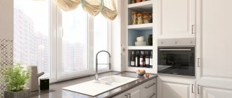
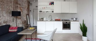
Many housewives strive to make the kitchen interior so that its color scheme does not get boring and does not irritate the eyes after a hard day at work. Designing a kitchen in gray tones is an excellent option for creating a stylish and unobtrusive interior.
Gray doesn't mean boring! The basic gray color deserves attention for its versatility, practicality and combination with almost all colors. Particularly worth noting is the laconic combination of gray and white. The presence of these two shades in the interior will fill any room with fresh air.
Gray kitchens: pros and cons of color
“Gray is the second beige.” This is the golden mean between black and white, but the versatility of this color is not always beneficial. Let's see what advantages and disadvantages there are in using gray in kitchen design.
pros
- universal base: ideally combined with bright and pastel shades;
- suitable for almost any style;
- always in fashion.
In skillful hands, it can make almost any kitchen noble and harmonious. It is easy to work with and combines with all shades of the color wheel. That is why designers often use it as a neutral base for creating beautiful interiors in loft, high-tech and art deco styles.
Minuses
There are not many cases when it is better to refuse gray, but it is important to know them.
- Dark gray is not recommended for use in a small kitchen (up to 8 sq.m.).
Light gray, on the contrary, can visually expand a small space.
- Dark gray is undesirable when the kitchen has poor natural light due to small windows or a shady side.
- A monochrome interior can look cold and uncomfortable.
Gray has a huge range of saturation and has many shades - graphite, platinum, marengo, etc.
The right shade and its intensity are the key to success. We’ll talk in more detail below about how to use gray correctly to reveal its best properties.
Walls and floors
In a gray and white kitchen, the colors of the walls and ceiling should be bright. A light ceiling will optically enlarge it and add shine to the lighting. In turn, a gray ceiling will make the room visually lower and the kitchen will seem overloaded. A dark ceiling can be chosen by people who have a high ceiling level.
For the floor, the play of colors looks similar. Bright colors will optically enlarge the room, giving it all the lightness and optically brightening the interior. This solution is ideal for small spaces where gray color can optically reduce the space unnecessarily. In addition, it should be remembered that such surfaces are much easier to keep clean.
When choosing a wall color for gray kitchen furniture, it is worth combining it with bright walls on a contrasting basis, thanks to which the furniture will stand out against the background of the wall, creating an elegant duo. In case you choose gray walls, you should pay a lot of attention to lighting and brightening up the interior with a variety of bright accents.
Another interesting idea you can use to introduce gray into your kitchen is to have a gray and white checkerboard tile floor. This floor is ideal for Scandinavian style kitchens.
On the market you will find household appliances in both white and gray colors. Gray or stainless steel appliances are ideal for white furniture. Such household appliances will be the perfect visual contrast for the furniture, creating a seamless atmosphere. If you don't want to have too many visible appliances, you should choose a refrigerator or built-in dishwasher. White appliances are also available for those who want to keep everything a pop of color.
Introducing colors into a gray and white kitchen is one way to refresh and enliven the interior. Every time you can add fabrics or accessories in the hottest colors of the season. Gray and white are the perfect natural backdrop against which all the additions will immediately stand out. Also, don't forget to introduce too many colors into your interior as it can cause unnecessary chaos.
Layout features
Does gray color play a role in choosing a layout?
Designer tips
Irina
Irina Polyakova is the founder of an interior studio, architect and interior designer. The main area of work is kitchen design
Shade can really be important when the size of the kitchen is very modest. For example, if the design concept involves dark gray facades, which are undesirable for a small space, then eliminating the top row of cabinets may be a compromise. Thus, dark shades only in the design of the lower tier of the set will not affect the visual perception of the size of the room.
Another solution is a combination of a gray bottom and a light top for a corner, straight and U-shaped kitchen.
The idea of a two-row kitchen is difficult to implement, as it will require taking into account not only the size of the room, but also its proportions. To prevent the space between two dark rows of cabinets from turning into a narrow portal, decorate the apron in light colors.
Watch a review of a beautiful U-shaped kitchen in the video :
Shades
With the help of a balanced combination of gray shades and the correct application of their gradation, it is possible to create an inspiring interior.
Light gray tones
Light gray tones, characterized by a certain smokiness, are very often used to decorate elements such as an apron, countertop or floor covering.
Truly elegant and rich is the silver color scheme, which allows you to create a festive atmosphere in the room. This shade creates a beautiful contrast with dark and light wall decoration, and also harmonizes with any texture.
Warm gray tones help set a certain tonal direction for the room. They make the interior softer, calmer and more refined.
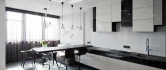
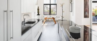
The photo shows a kitchen interior with a two-row parallel set in a light gray shade.
A similar gray palette is used to create a light and calm design, both in classical and modern styles. Furniture fronts in light gray design are perfectly combined with gold, silver fittings, white oak, stone or marble countertops.
Dark gray kitchens
The black and gray kitchen is distinguished by its special style and laconicism. This color scheme will not look boring in a glossy finish, giving the interior a rich gloss and visually expanding the space.
Dark anthracite and graphite tones add depth to the decor and fit best into spacious rooms.
The photo shows a kitchen set with matte graphite-colored facades.
Silver elements in the form of a stainless steel sink, faucets, handles, lamps or various jars and utensils with chrome lids are very beneficially combined with a dark gray kitchen.
Matte or glossy - which facades to choose?
The choice of matte or glossy finish depends on the intensity of the color. Even minor dirt such as water marks will be more visible on the dark gray glossy surface of the facades, which is very impractical for the kitchen. But gloss can highlight light gray facades to their advantage and will not show fingerprints or stains.
Designer tips
Irina
Irina Polyakova is the founder of an interior studio, architect and interior designer. The main area of work is kitchen design
Complex, deep, and dirty shades look better on a matte surface. For example, gray-green, gray-blue and gray-beige color best reveal matte smooth facades
Materials for the manufacture of matte surfaces of kitchen furniture
The furniture industry uses moisture-resistant materials that can withstand temperature changes and high humidity.
These include:
- MDF with matte film coating;
- MDF painted with silky matte enamel;
- Solid wood with gray wood grain.
Color combinations
Is it necessary to dilute gray with bright accents? In fact, monochrome design can be not boring. Shades of different intensities can be used, but thanks to the combination of different textures, the interior will not be pale and boring. For example, smooth matte facades can be complemented by a floor with a marble pattern or a concrete apron.
Brickwork from light to bright red shades will perfectly complement a monochrome interior.
To make a gray interior more interesting, one small bright detail is enough - a tabletop, an apron, a chair, curtains and even one bright refrigerator, for example.
You can combine colors only within the facades. For example, blue top and dark gray bottom.
When combining facades of different colors, do not forget about an important rule: use dark shades in the lower row of furniture, and light shades in the upper row, so that the furniture does not visually overload the space.
The most spectacular combinations are with red, yellow, orange, emerald, and purple. Let's look at interesting combinations separately.
With yellow
Yellow and similar colors (turmeric, orange, mustard) are an ideal pair with gray as a bright accent.
Don’t get carried away: an abundance of bright details can be annoying. Add no more than 30% bright colors to the overall neutral background.
With brown and beige
Gray and beige work well together within the same room. Beige can have varying degrees of saturation, and its warmth will make the interior less formal and strict.
Gray can be successfully combined with both pastel and dark shades of brown. The most successful option for adding brown would be to use wooden surfaces in the design of the apron, countertop, dining table and chairs.
Taupe kitchen
Designer tips
Irina
Irina Polyakova is the founder of an interior studio, architect and interior designer. The main area of work is kitchen design
The mixture of these two colors gave the world a new complex gray-beige shade, which is now at the peak of popularity.
Gray-beige set Light gray set on a brown wall with a brick apron
With blue and blue
Blue is as cold and strict as gray. But this does not cease to be an ideal match if the kitchen or kitchen-living room has large windows and a lot of natural light. To prevent the interior from seeming boring and faceless, dilute this duet with a bright accent or select materials with an interesting texture.
A dark gray set combined with a bright blue sofa. Light gray walls bring in more light
Blue top and dark gray bottom headset
When mixed, these colors also give an unusual, beautiful gray-blue hue.
Set with gray-blue bottom and white top
A bright and even shiny blue on the splashback can be a great complement to dark gray facades.
The blue tint will not add contrasts to the interior: when paired with gray, it merges and forms a monochrome interior. It is recommended to dilute this duet with white or beige.
And if you need to add mood, then you can use yellow, orange, coral or carrot colors in small quantities.
With pink and purple
Despite the fact that purple and its shades (pink, lilac) are ideal for placing accents, they must be used in very measured doses.
Gray reflects neighboring colors, and a kitchen that has too much pink or purple can give the impression of a solid bright spot.
With green
The combination with green and its shades - emerald, light green, malachite - deserves special attention. This combination is often found in nature. Therefore, green, like no other color, is able to balance the coldness and severity of gray.
Designer tips
Irina
Irina Polyakova is the founder of an interior studio, architect and interior designer. The main area of work is kitchen design
Bright green curtains in the kitchen-living room or a bright light green apron can change your idea of gray and appreciate it. Houseplants in white or black pots will help add some green color to the interior.
Mixing these two colors creates a beautiful gray-green shade that looks impressive in the design of smooth matte facades.
With white and black
White will always correct the severity of gray and will save you in any situation when you need to dilute an interior that is too dark or too bright. For example, a white countertop will refresh dark gray facades and create a beautiful contrast, while light walls can make the room more spacious.
Black will contrast effectively against a light gray background.
Paired with dark gray, it looks brutal, but darkens the room too much. For a spacious kitchen-living room with large windows facing south, this fact is not scary.
The combination of gray and black is most often used in the loft style.
A kitchen with a black apron and glossy dark facades is impractical, but impressive and beautiful
With a tree
Surfaces with shades and textures imitating natural wood soften the cold aristocracy of gray, thereby making the interior softer and more harmonious.
A tabletop, apron, dining table or floor can be made to look like wood.
With red
Red in large quantities and against a dark background can look aggressive, which is undesirable for the interior. But small inclusions in the design of chairs, flower pots or curtains can enliven the interior.
Pastel shades
Are you afraid that a bright accent will upset the color balance in the interior? Then combine pastel shades of yellow, red, blue and any other color with gray. The interior will be calm, without harsh contrasts, with soft color transitions.
Light gray is ideal for a small kitchen, as it visually expands and refreshes the interior.
Finishing
The choice of finishing materials for the kitchen space must be approached with special responsibility.
- Floor. The most common coatings in the interior are ceramic tiles, parquet or laminate. Linoleum is also an excellent option. Quite often, floor finishing is combined in the kitchen, for example, the work area is laid out with tiled material, and the dining area is decorated with a warmer wood covering.
- Walls. For walls, it is appropriate to use wallpaper with an unobtrusive pattern or plain canvases for painting. A rough texture will effectively shade gray surfaces, for example, brick, concrete or natural stone.
- Ceiling. In ceiling cladding, ordinary painting, stretched fabrics, multi-level plasterboard structures with built-in lighting, slats or plastic panels can be used. In terms of color, it is recommended to give preference to white shades. The light ceiling plane against the background of gray wall decoration visually looks much higher.
- Apron. The apron area in the interior is finished with small mosaics in a steel color scheme or tiles in the shade of wet asphalt. Gray cabinets will look unusual in combination with an apron lined with brick or its imitation. A luxurious solution is to use materials in the form of marble or painted tiles with ornaments.
The photo shows a kitchen in gray and white tones with an accent backsplash decorated with red boar tiles.
For doors, choose panels with a pleasant wood color, such as gray oak. These designs do not overload the interior and become an excellent addition to any design project.
Gray in different styles
The versatility of gray lies not only in its ideal compatibility with other colors, but also in its ability to decorate the interior in almost any style. There are certain areas where gray is most appropriate.
Loft
A gray kitchen set with both smooth and paneled fronts will fit perfectly into the interior of a loft-style kitchen.
Dark tones look brutal. But if the kitchen is small, then you should give preference to light-colored facades or dilute the dark bottom of the set with a white top.
Metallic facades against a red brick wall. An unusual and bold combination - just in the spirit of a brutal loft
Minimalism
Monochrome gray combined with white and black creates an ascetic space that does not need to be supplemented with bright details. Its only decoration can be complex textures like wood, stone, marble and other natural surfaces. In order not to disturb the order and rigor of a minimalist kitchen, it is better to give preference to facades with integrated (hidden) handles.
Gray wood kitchen
Neoclassical
Neoclassicism in gray tones is an excellent alternative to beige traditional interiors with massive furniture. A strict gray set will be decorated with elegant classic gold handles - antique brass, bronze, forged, etc.
Room tour of a neoclassical kitchen in the video below:
Provence
Pastel shades of gray are ideal for interior design in Provence style. Dusty and slightly faded tones in combination with lavender, olive or pale pink will become a style-defining color scheme.
American style
Another modern take on a classic. The traditional design of the set with facades with frames and panels in gray color will fit perfectly into a spacious U-shaped or island kitchen.
Features of white and gray colors
Pure white color has an exceptional character: depth and exceptional purity, to a certain extent sterility, order and solemnity. Gray is an ambiguous tone. It has the color of dust, a shade of ash, and notes of graphite, pearl, and stone. It looks completely different with a metallic, gloss or matte finish. Pay attention to the character of gray curtains: matte fabric seems dirty, invisible or neutral, a little shine makes them elegant, inclusions of darker threads make them stylish and luxurious.
The photo shows a glossy white and gray kitchen.
The gray-white combination is characterized by neutrality, conciseness, restraint, and dynamism. It is difficult to clearly describe the interior in these colors. The design can use a duet of shades both in the facades of the set and in the decoration of the entire room.
The white-gray palette can be both warm and cool, so it is almost impossible to recommend it for a certain type of kitchen, because the shades can contain notes of lilac and yellow. The choice of details mainly depends on the gamma of gray: curtains, furniture, trim, decor.
Gray kitchen interior design
The success of any interior design project depends on how harmoniously the finishing materials were selected in color and style. Let's talk about what finishing options for a gray kitchen will be the most successful, as well as what role curtains can play.
Decoration of walls, floors and ceilings
The design of finishing materials should be selected at the design stage. At the initial stage of planning a renovation, it is recommended to draw up a project that will indicate what color each interior element should be. This is the only way to create a harmonious color scheme.
Here you can consider the following recommendations.
- Stick to a balance of dark and light shades . For example, if the set is dark gray, then it is better to decorate the walls in light colors. And vice versa. Do not use more than three colors at the same time in the interior. And at the same time, it is not forbidden to play with their shades.
- Determine what kind of interior you want in the end : calm, in pastel colors, or brutal, bright, cheerful? Based on this, choose colors of appropriate saturation.
- For very bright accents, choose non-volumetric objects - curtains, vases, chairs, etc.
A white matte ceiling is always a universal solution. If there is no need to highlight it from the general background, then you should give preference to the win-win option in all cases.
You can focus on the ceiling if the height of the room allows. You shouldn’t choose flashy bright shades for it, because even a gray textured concrete insert in a suspended structure, complemented by a beautiful lamp, can attract attention.
As for floor finishing, the following options will be most successful for a gray kitchen:
- parquet, laminate, porcelain stoneware or PVC tiles in a natural wood shade;
- gray tiles from light to dark shades;
- light poured floor;
- marble-effect tiles (natural marble is impractical for the kitchen);
- tiles in pastel neutral tones.
Do not use dark gray shades for finishing the kitchen floor: they visually narrow the room.
For wall decoration, you can choose any color depending on the design concept:
- Gray wallpaper or paint is an excellent overall background. Choose light shades for small kitchens or when you need to create contrast against dark furniture;
In a monochrome interior, wallpaper can be embossed, imitating decorative plaster. And from gypsum plaster, using simple techniques, you can make an imitation of concrete.
- beige walls or white with a slight warm tint will add warmth and comfort;
- You can make only one wall bright;
Yellow walls against the background of dark facades attract attention, and the absence of upper cabinets allows you to make a small kitchen visually freer
- Wallpaper with a pattern is also suitable, for example, floral or with a graphic pattern.
Light gray set against a background of floral wallpaper. In the apron area the wall is covered with tempered glass
Tabletop
The ideal universal tabletop for a gray set is wood, light shades or snow-white.
An unusual option is a thin tabletop to match the gray-beige set.
And if you want bright colors, then you can place the main bright emphasis on this detail. As, for example, the designers of the “Housing Question” program did it in the project in the photo below.
Dark shades for countertops are impractical, as they immediately show water stains.
Apron
Gray facades allow you to be bolder in choosing your apron design. Bright tiles or skins will help make a bright accent.
Depending on the style of the kitchen and the overall color scheme, a textured apron imitating stone, brick or concrete can look interesting.
An apron with a small pattern will always look good with neutral facades.
A universal solution is light hog tiles and pentagonal tiles. With contrasting grout, these backsplash options look very stylish.
Curtains and textiles
Curtains traditionally set the mood of the interior. Bright short curtains, roller blinds or Roman blinds in rich yellow, red, blue, green tones can look great with a gray kitchen.
If the accent is already any other element of the interior, then it is better to choose curtains in the general color scheme of the room: light or dark gray.
Designer tips
Irina
Irina Polyakova is the founder of an interior studio, architect and interior designer. The main area of work is kitchen design
In addition to curtains, kitchen towels, upholstery of dining chairs, curtains on kitchen cabinets or doorways can play a role in the design.
Arguments for"
- Neutral color is the basis for any color. With gray, white and any bright shade that highlights the right things look advantageous. Household appliances of any color scheme are suitable for the kitchen.
- The combination of these colors is universal. It doesn’t matter whether the top or bottom of the room is white. It must be remembered that in small rooms a light tone should prevail. In large rooms it is better to use dark paint.
- A combination of the incongruous. Against such a background, objects even of unpredictable colors look impressive. Moreover, the shades will not sparkle and shimmer tastelessly, but will create a cozy atmosphere. In such a room there is always room for experimentation.
Furniture and appliances
The main elements of the furnishings of most kitchens are a kitchen set and a dining group. In a spacious room or kitchen-living room, a sofa and sideboard can be added. It is undesirable to choose furniture that matches the walls so that the interior does not merge into a solid monochromatic spot.
To highlight a set, sofa or chairs against the general background in a monochrome kitchen, choose their design a tone darker or lighter.
If you want bright colors, then you can focus on a bright sofa or multi-colored dining chairs.
The dining table is usually chosen in light colors or wood. A black base with a light or wooden tabletop will also be a good solution for a gray kitchen.
The gray set harmoniously combines appliances of any color in the same style - both built-in and free-standing:
- gray facades and metallic appliances form a single monolithic ensemble;
- Black appliances can play in contrast with light gray facades. For example, a glossy refrigerator will stand out very effectively against a light gray background;
- white appliances will look good with light gray facades in a small kitchen, as it visually looks easier in the interior;
- Colored appliances will dilute the decor of a monochrome kitchen.
Harmonious combinations
The neutrality of the gray-white palette allows you to combine these shades with any others. And the overall character and mood depend on the final composition:
- Gray and white colors are harmoniously combined with brown shades. Chocolate, honey, natural wood in any palette will make a white-gray interior warmer and more comfortable. This is a common combination in the style of contemporary, Provence, classic, etc. Modern design is increasingly being designed in such a warm and at the same time neutral palette. In this combination, minimalism usually reigns, when walls in white colors merge with furniture, facades and other structures, the interior turns out to be light and almost weightless. Parts such as the floor, countertop and apron can be brown. As a rule, there are no curtains in such an interior.
The photo shows a gray and white kitchen with a wooden countertop.
- The gray and white palette harmonizes with the black and graphite shade. Of course, the solution turns out to be quite boring and monochrome, but a few bright accents will improve the situation. This design is most often used in modern trends.
- The beige color scheme blends organically with the gray and white decor, as does the brown color. But the lighter palette has a more elegant and neutral character, which makes the white and gray interior even more restrained and sophisticated. This could be the color of curtains, upholstery of upholstered furniture in the living room, finishing of the dining area.
The photo shows the design of a white and gray kitchen and dark beige trim.
All other shades - bright and rich, pearlescent and catchy - are used in accents, decoration, and decor. Of course, they can also act as a background in spacious rooms, but then these colors will set the character.
Lighting and backlighting
With the help of lighting, you can not only adjust the perception of the size of the room, but also change the shade and degree of gray saturation. A lack of artificial light will make the kitchen gloomy. Therefore, even at the renovation planning stage, it is necessary to consider lighting for each zone.
In addition to the main central light source, additional lighting is required for the work area, dining area and living room (if the kitchen is combined with a room).
For central lighting, choose diffused light fixtures. Diffused light will make the gray color softer and the atmosphere more comfortable.
Let there be light
The presence of one lamp in the middle of the ceiling in the kitchen will narrow the room. An excellent solution is to have several lamps:
- central lighting;
- lighting of work surfaces to comply with safety regulations;
- lighting the table for eating, which not only helps to bring the fork to the mouth, but also creates comfort and beauty;
- lighting the bar counter (if available) using long lamps suspended from the ceiling.
- Electrician's recommendation! The placement of lamps must obey a strict rule: power 20 W for every 1 m2 of ceiling.
The type of lighting is selected depending on the room. In a small room, the lamps should be small in size.
Spots work great in the kitchen. They are attached to any surface and, in addition to lighting, decorate the kitchen environment.
LEDs are a design trend, as well as powerful energy savings and durability in use. The light of such devices is natural, does not dazzle, and is very comfortable for the eyes. Cool light is used above the desktop, which concentrates attention.
Decor
The right decor will help make a cold gray kitchen cozy and homely warm. Small colored details diversify the interior: bright picture frames, colored wall clocks, decorative saucers, plates, home flowers, beautiful dishes in display cabinets.
In a small kitchen there is always a risk of going overboard with too many decorations and overloading the space. There are two rules to follow here.
- It is important that the decor is simple and at the same time effective.
- “Less is better, but better” - another golden rule that will save the interior from clutter
In a large kitchen and kitchen-living room in a classic style, a fireplace will be a beautiful decorative element.
Original apron
A kitchen apron or skinali can play first fiddle to the unobtrusive gray and white accompaniment of other kitchen design elements. Moreover, in the wall above the work area you can either combine colors and textures already used in the interior, or add completely new ones that will attract all the attention.
In gray and white kitchens, any original aprons look advantageous: glass with 3D images and rich photos, lined with tiles, mosaics and bricks, inlaid with natural stone or mirrored.
Real photos
You can get more ideas for inspiration in the following video:
Gray Ikea kitchens
"Budbin" apartment in Stalin
"Budbin" with black tabletop
"Knoxhult" - ready-made economy class set Gray-green set "Bodarp"
Fronts without handles (with integrated handles) “Vokstorp”
Gray kitchens Leroy Merlin
“Dark gray set of the “Megion” series Gray-green facades “Paloma” Facades “Graphite”
Read more about Leroy Merlin kitchen furniture in a separate article - go to.
What curtains are suitable?
Silver curtains will help complete the interior in an original way. For a kitchen with facades decorated with glass inserts and chrome fittings, blue curtains are suitable. In a light gray room, canvases in ash tones would be appropriate.
For a dynamic and bright design, you can hang rich turquoise, pink, orange canvases on the windows and decorate the decor with colorful pillows, chair covers, towels, tablecloths and other textiles.
The photo shows the interior of a gray studio kitchen with windows decorated with light curtains.
What material to make a gray kitchen floor from?
A gray kitchen floor can be made from a wide variety of materials, but it is recommended to give preference to the most practical ones, namely:
- laminate;
- linoleum;
- floorboard;
- parquet;
- tiles.
As you know, laminate is MDF plates impregnated with special resins. Their paper outer covering is laminated with a special varnish, making the panels resistant to abrasion. Laminate flooring is quite easy to install, and this floor looks very beautiful. However, along with its advantages, laminate also has its disadvantages:
- this material is not completely environmentally friendly;
- exposed to moisture;
- high-quality laminate is expensive.
The weak points of linoleum are the same as those of laminate, however, these shortcomings are largely compensated by the huge variety of this material, which allows you not to limit your design imagination when decorating a room. Linoleum is also quite easy to care for. The combination of these characteristic features turns linoleum into one of the most popular floor coverings.
The safest from an environmental point of view, as well as the most wear-resistant materials, are parquet and floorboards. Certain disadvantages are associated with the fact that these floor coverings are quite expensive, and in addition, they are difficult to install. The last argument obliges you to contact specialists in case of laying such a floor.
As for gray tiles, contrary to popular belief, they are suitable not only for finishing the bathroom and toilet rooms, but also for the kitchen and hall.
Recommended articles on this topic:
- Children's room design
- Bedroom interior
- Interesting apartment interior ideas 2022: 50 + photos
Gray kitchen apron: which option to choose?
view album in new window
In the photo: Designer interior with a formal dining room and panoramic windows
Next, we will look at interior design projects with gray kitchen aprons made of porcelain stoneware, marble, glass and other interesting materials. Let's start!
Lilac kitchen with gray composite stone backsplash
view album in new window
In the photo: Fashionable wall decoration in the interior
A chic solution with an apron and countertop made of composite stone.
Gray marble-like porcelain tiles in the design of the apron and countertop
view album in new window
In the photo: Small corner kitchen with designer interior
A great example of laconic finishing in a small room.
Gray kitchen apron made of natural stone in the interior of an attic kitchen
view album in new window
In the photo: Small kitchen without upper cabinets
A very stylish solution with a geometric finish.
Gray marble-like porcelain tiles in floor design
view album in new window
In the photo: Small room with designer decoration
A classic version of finishing in porcelain tiles imitating white and gray marble.
Designer panel in gray, beige and black tones for the hob area
view album in new window
In the photo: Luxurious glass panel for an apron
An incredibly beautiful example of a glass panel for the design of a classic kitchen.
Steel-look apron in the interior of a modern kitchen-dining room
view album in new window
In the photo: Fashionable apron for steel/metal
And such an apron is perfect for loft, contemporary, industrial, minimalism and modern styles.
Gray-yellow onyx apron in the interior of a townhouse
view album in new window
In the photo: Living room with fireplace in a townhouse
Luxurious onyx finish looks great in an eclectic interior.
Glass splashback in gray for an elegant, bright kitchen
view album in new window
In the photo: Glass sliding doors with beveled mirrors
An excellent solution to add gloss to the interior.
Gray marble-like porcelain tiles with white veins
view album in new window
In the photo: Cozy living room interior with pastel accents
Porcelain stoneware is a material that is universally suitable for the image of a fashionable apartment.
Mirrored apron for interiors in a modern style with art deco elements
view album in new window
In the photo: Stylish kitchen design project
A trendy solution with an art deco mood. Your guests will be amazed!

