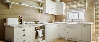
Dark colors are used quite often when decorating kitchens, but, unfortunately, not everyone knows how to properly introduce dark shades into a particular interior, although, in fact, it is not at all as difficult as it might seem. A correctly selected apron in one of the many dark shades will not only decorate and elevate the kitchen, but also give it a touch of intimacy and at the same time respectability.
Dark in design
Depending on what colors are used in the overall color scheme of the kitchen interior, dark wall panels will look completely different. They can either blend in with the color of the furniture set or walls, or sharply contrast with them. And there can be so many options for playing halftones that it’s impossible to list them.
What can be the main types of combinations in terms of contrast and lightness relative to the main shades in the interior of a kitchen with a dark apron?
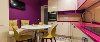
- Tone on tone. The color of the apron exactly matches the shades used for the walls and furniture. Does this mean that such a kitchen will definitely turn out to be gloomy and boring? Of course not. After all, if you play on the difference in textures, then all the interior details will look completely different. And correctly placed bright or light accents in the form of dishes, furniture, small household appliances and the like will help to further diversify such an interior and make it richer in color.
- Playing on halftones. There can be a lot of options for such a design, for example, the panel itself can be made of tiles in different shades of the same color, which will also be repeated in the color of the furniture or walls.
- Bright contrast. Involves the use of additional colors as well as shades that are contrasting in lightness or saturation.
Important! It is advisable not to make too sharp contrasting combinations in classic and similar style interiors. But for Modern and High-Tech, such combinations are more than appropriate.
Stylistic kitchen options with a black countertop
The cooking room is an isolated space that can be decorated in any style. To make the interior of the home look like a single whole, the details of the overall composition are repeated in the kitchen with a dark countertop. Monochrome design looks beautiful in several ways.
Loft
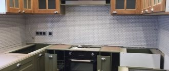
The industrial style manages to harmoniously combine a white background and dark details. Whitewashed masonry or brick-like tiles echo the color of furniture facades. Black is appropriate not only for countertops, but also for:
- hoods;
- panels of household appliances;
- lamps.
Industrial style in monochrome Source dizainexpert.ru
Bright kitchen in an industrial style Source yandex.by
To dilute the monochrome, designers recommend lining the apron with red brick and protecting it with thermal glass. As a floor covering, a gray or beige laminate under a natural board looks luxurious. If you need to play with a white-black composition, then use a chess tile.
Loft details in the apron area Source yandex.by
Classical
An elegant, expensive interior benefits from a monochrome design. Dark stone is used to cover not only the tabletop, but also the entire work surface and dining furniture. The light facades of the set are decorated with carvings, and there are voluminous moldings on the ceiling. Household appliances are hidden under stylized panels.
Elegant black and white room Source chateaudevaisselle.com
Classic with black countertop Source remoo.ru
The white and black checkerboard tiles look beautiful on the floor. If the room is large and combined with a dining room, then use glossy liquid options. The kitchen apron is made either in a contrasting dark color or in the same tone as the main background.
Cozy classics in the kitchen Source news.21.by
Scandinavian
Due to the white design, the room seems huge and free. They use a furniture set of strict lines and without unnecessary decor. Using matte and glossy surfaces, designers correct the shortcomings of the room. A black countertop in a bright kitchen will become a bright spot. The facades of household appliances use a combination of primary colors.
Cold kitchen design Source housesdesign.ru
Aprons are made to match the walls or made gray. Natural wood will help dilute the sterility of the Scandinavian style. Warm brown on the floor brings a homey feel to the room. In the dining area, white, cream or delicate ash are appropriate.
Black countertop in a cold room Source yandex.ua
Application styles
An apron in dark shades can be used in many interior styles, although, of course, not all. The most suitable ones would be:
- Baroque. An apron in dark shades with a baroque ornament applied to them looks especially good, and the color of the pattern can be either contrasting or almost merging with the apron itself. Aprons made of dark marble with lighter large veins on the surface will also look good in this style. And, if desired, you can choose a dark apron with a photograph printed on it for the baroque interior.
- Classical. In the interior of this style, both plain panels and those with an image will look good. Aprons in dark brown or black are especially good for this style, although blue, wine red or emerald green are also suitable.
- Art Deco. Kitchens made in this artsy and original style can be decorated with dark aprons. At the same time, when choosing a material, you should give preference to tiled or ceramic tiles. This will further add historicity to the interior and make it look like the kitchens of the early 20th century.
- Gothic. For this style, some gloominess in the interior is not a drawback, but an integral part of them. An apron in dark tones, such as black, dark cherry or dark lilac, is just what you need for the Gothic style. And the materials for making this design detail can be tiles or mosaics, natural and artificial stone, dark wood. It is also acceptable to use skins in a Gothic interior, however, the design on them must correspond to the general mood and contain “Gothic” motifs.
- Retro. For aprons in this style, dark colors such as dark brown, cherry, dark gray and black would be appropriate. And they themselves can be either single-color, perhaps with some interesting, not too catchy texture, or with an applied photograph or drawing in a similar style.
- Modern. For this style, bright, contrasting combinations of light furniture and walls or walls and an apron of any dark shade will be very good. You can also play with color contrasts, for example, by placing a black apron in an interior designed in shades of cherry.
- High tech. This style is characterized by technicality and a metallic sheen. An apron of black or dark gray colors will fit very well into such a kitchen interior, either one-color and perfectly smooth in texture, or with an abstraction image, wild animals or a city at night printed on it. It would also be very nice to complement such a panel with bright lighting.
Interesting article: Elegant kitchen backsplashes made of white tiles, as well as 5 more popular colors!
Important! In fact, there are many more styles where you can successfully fit a dark apron. But there is no point in giving any specific general recommendations on them, since it all depends on what the overall color scheme of the kitchen will be, as well as on whether the apron itself will be one color or with some kind of pattern.
Minimalism
Monochrome design is often used for a laconic style. The lack of unnecessary decor is compensated for by the play of contrasts. A small room is decorated in light colors, and dark colors are used for the countertop and apron area. In a large room, black flows onto the facades of furniture and household appliances.
White kitchen with black elements Source rehouz.info
To make the kitchen more cozy, a third color is introduced into the minimalist design. Gray or brown laminate flooring adds a warm feeling. Use a lamp, a print on the wall or a picture frame as a bright detail. A dark pot with live greenery is placed on a black tabletop.
Light and dark in a laconic design Source decorfacil.com
High tech
A technological style will help to play up the contrast of basic colors. A laconic interior with glossy facades, a dark work area and glass in the apron design. To prevent the design from reminiscent of minimalism, they use stone, prints with a three-dimensional effect and unusual fittings. LED lighting highlights niches, cabinets and floor units.
Original monochrome Source akuhnja.com
Dark in a light interior
An apron in dark shades in a light-colored kitchen will look like a bright accent spot. Moreover, it can be the same color as the walls or furniture set, although darker, or a different, similar or even contrasting shade.
Depending on the main color scheme of the interior, we can recommend the following combinations of shades:
- White kitchen. A dark apron of absolutely any shade will suit it, with or without a pattern, textured or smooth.
- Kitchen in ecru or light beige. In such an interior, a dark brown or black apron would be especially good. A combination with cherry or dark gray and dark green is also possible. But it is better to avoid blue color, as it does not go well with warm pastel colors and it would not be easy to fit it into such an interior.
- Pink or light peach kitchen. Good combination options are cherry, brown, gray and black. For cool shades of pink, a combination with dark lilac is also acceptable.
- Pale light green shade of the kitchen. A dark green apron will fit especially well into it. But dark brown, black and dark gray will also be good.
- Pale blue overall color of the interior. An apron in blue or dark blue would be especially good, but it is acceptable to use black or cool dark lilac.
- Light lilac or light purple kitchen. The ideal apron color for her is dark lilac. Cherry is also suitable for a warm primary color scheme, and blue for a cold one. The contrast of light lilac with black or dark gray will also look interesting.
Important! If you don’t want to create too obvious a contrast between the overall light color of the interior and a dark apron, then you can opt for a model with a photograph of light colors that are close to the main shade.
When are dark colors contraindicated?
A small kitchen area is not a contraindication for dark shades, contrary to popular belief. But a small window can really play its fatal role. Please note that dark kitchens look most impressive in rooms with large windows. But this does not mean that such shades should be abandoned altogether. Use them as complementary and accent pieces.
If there is not enough sunlight in the kitchen, dilute the interior with light shades. The less light, the more light there should be in the overall proportion.
Black
Like white, this color is universal and can be combined with almost all other shades.
Its positive aspects:
- A black apron will fit well into almost any interior.
- It looks respectable and elegant.
- Allows you to create the most striking contrasts, such as black and red or black and white.
- Most images printed using large format printing or simply drawn by hand look good on the black surface of the panel.
- An apron of this color goes well with both regular and colored lighting.
Its negative sides:
- When you use too much black in your kitchen design, the interior may turn out to be somewhat gloomy.
- Black hides most textures and makes them unnoticeable.
- On a black apron, any speck will be visible better than even on a white one.
- On the surface of such a panel, stains and streaks from a rag or brush may be noticeable after washing it.
- Absorbs light and visually makes the kitchen smaller than its actual size.
Advice! A black apron can be painted with paint used for slate boards. This will allow you to use it as a kind of reminder for those relatives who forget, for example, to go to the store on time. You can also write down recipes on such a board, which is very convenient: you don’t need to use a cookbook while cooking, since the recipe will be right in front of your eyes.
Brick apron
There are several options for brick aprons: laying with artificial stone, brick, or fiberboard, on which a film with a brick image is applied. Despite the fact that preference is given to natural materials, artificial ones are also widely used.
The surface texture of such an apron is of great importance. In order to increase space and not absorb dirt and grease, it is recommended not to choose a coarse-grained texture. This is typical for Provence, country and loft styles. Also often used in Scandinavian variations.
Lilac
This color in its pure form is rarely used for kitchen panels. But, as a background on which photo printing is applied, especially with views of night cities, it is used very often. Lilac and purple give the kitchen a slight air of mystery, and its unusualness makes the interior truly interesting.
Interesting article: Elegant color combinations of countertops and aprons for the kitchen
Positive sides:
- It looks surprisingly beautiful and at the same time unusual.
- Creates a special mood, evoking thoughts of space and eternity.
- Suitable for many interior styles.
- Pairs well with other warm and cool shades.
- Photo printing with images of flowers or landscapes looks good on lilac panels.
- Perfectly emphasizes the aerial perspective.
- In combination with lighting it creates the effect of infinity of space.
Negative sides:
- In the understanding of many people, lilac and, in particular, purple, are associated with mysticism.
- This color is not easy to fit into the interior of both warm and cold shades, which is why the optimal “partner” for lilac and purple would be some neutral, achromatic shade: white, black or gray.
- It looks most successful in modern styles, not historical ones.
- A dark purple apron in a kitchen of the same or darker shade will look somewhat gloomy.
Important! Dark lilac and purple are colors for everyone. For most people, they look too unusual and extravagant.
Designing an apron from tabletop material
Here we mean MDF or chipboard material. In terms of price and quality, this is the best option. This material is a panel 6-10 mm thick and 3 meters long. On one side it is covered with plastic, which is also applied to the tabletop itself. It is specially designed for such loads and is a practical solution. Let's look at the features of this material.
- Installation is carried out by the people who install the kitchen. In this case, you can do without leveling the walls.
- If necessary, such a panel can be easily removed.
- It is easy and simple to care for the panels.
- It is possible to choose the same color as on the countertop.
- Low cost compared to tiles and glass.
Grey
Essentially, gray is nothing more than a toned down shade of black and goes well with most other shades.
Positive sides:
- Universal: suitable for almost any interior.
- Creates a feeling of permanence.
- Balances out too bright shades.
- Creates not too pronounced contrasts when combined with any other lighter or brighter shades.
- Well reveals the texture of the material and makes its appearance more attractive and interesting.
Negative sides:
- An excess of gray can make the interior monotonous and boring.
- Doesn't go well with shades of similar lightness.
- Needs adding bright color accents.
- Many people associate dark gray with the color of wet asphalt, cloudy skies, rain and puddles.
- For some people, gray color can cause depression.
Advice! In order to dilute the monotonous gray tone of the apron, it is better to apply a photograph to it or use materials with a pronounced texture to make this kitchen design detail. And for gray mosaic or tiled wall panels, a good solution to this problem would be to use tiles of different shades of gray, differing from each other in lightness.
Color combination of apron and kitchen facades: choose colors to suit your taste
A kitchen apron in colors such as shades of orange, peach or ripe pears creates a positive mood in the composition. They warm the kitchen interior and are associated with summer and sun. Such colors of the working wall stimulate the appetite and encourage a feast, so it is recommended to choose rich designs for people who want to make the interior more expressive. If you choose orange and red colors for the kitchen, then it is advisable to choose white or cream cabinet fronts; against such a background they will look more harmonious.
Don't be afraid to experiment with colors, liven up your interior beautifully and give it an original character. Check out this inspiring gallery of colorful kitchens. Green, yellow, red, orange. You can have each of these colors in your kitchen. Choose the one you like best and instead of the generic white or calm beige, this time choose a bolder solution. Colorful kitchen furniture and a backsplash will look really interesting.
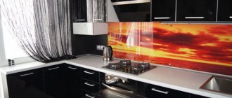
Cherry color
The cherry color of noble red wine is not very often used for kitchen aprons, and, as a rule, if it is found on them, it is in the form of images of cherries.
Positive sides:
- It looks bright and interesting.
- Along with sapphire and emerald, it is a noble shade. This apron gives the kitchen a touch of respectability and luxury.
- Pairs perfectly with most warm and achromatic shades.
- The combination of cherry with white and black or dark brown is very similar to the classic red-white-black combination, but without its excessive brightness and contrast.
- Fits well into most styles.
- Brings a touch of drama to the interior.
Negative sides:
- Unlike most dark colors, it can look somewhat aggressive in the kitchen interior.
- It can be hard on the eyes, especially if the color of the backsplash is bright cherry.
- The dark cherry shade of the apron can look gloomy.
- An excess of this color does not depress some people.
- It can visually weigh down the kitchen interior and give it a touch of excessive pretentiousness.
Advice! Cherry-colored aprons will look better against a light background of furniture and walls. If you place this interior detail in an interior that is darker in overall tone, it can create a feeling of some gloom and increased anxiety.
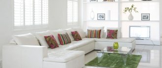
Curtains and decor
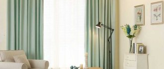
Textile design occupies a special place in design. You need to choose a style and fabric for curtains based on the style of the interior and the tasks that they must solve.
In a classic kitchen, curtains, in addition to their main function of protecting from bright light, play an important decorative role. The high cost and status of a classic interior will be emphasized by curtains or a lambrequin made of dense fabrics with a rich texture - velor, velvet, gabardine, jacquard, etc. They can be combined with light organza or tulle curtains. If the window is located next to the kitchen work area, then long curtains will have to be abandoned in favor of short curtains with tiebacks, Austrian or Roman styles.
See also 110 of the most stylish ideas for curtains for the kitchen
In a modern interior, curtains can be abandoned, especially if the window is small, the room does not have enough daylight, or if the style requires it. For example, the Scandinavian direction, hi-tech or minimalism allow for the complete absence of window curtains or almost invisible roller blinds, simple transparent or translucent light curtains without excessive decor.
Curtains can perform different functions:
- The role of a bright accent. For example, curtains of a beautiful deep shade - wine, ocher, emerald or blue - will stand out effectively against a dark gray background.
- Protection from bright light and comfort. If there is no goal to focus attention on the curtains, but curtains are still necessary (not only to protect yourself from the bright sun, but also from prying eyes in the evening, if, for example, you live on the first floor), then you can choose curtains in the main, dark colors of the interior.
- Dilute the muted color scheme. Light curtains can be the very detail that will add air and light to the interior so that it does not seem too gloomy and gloomy.
Not only curtains, but also other textile elements will help diversify and soften the interior - tablecloths and table runners, napkins for cutlery, pillows on kitchen chairs. Rough textiles made from large-weave fabric with a complex texture look especially beautiful in a dark interior.
Moderate and correct decor will emphasize the effectiveness and status of the interior. Textured and textured surfaces in the design of finishing materials and furniture, bright accents in the form of small details such as jars for spices, pillows on chairs, tablecloths, and an interesting layout of tiles on the apron will serve as decoration in themselves.
The decor can be unusual chandeliers, pendant lamps with bronze, forged, glass or crystal elements.
Wicker furniture and accessories will add coziness and warmth to the interior - napkins for cutlery made of jute or seaweed, baskets, etc.
Photo
See 10 more photos of dark aprons in the kitchen below:
Brick apron on the wall
Both original and brick tiles always look beautiful and create a modern ambiance, so you should consider it as a kitchen wall material. You can leave the brick in its original color or paint it. The material must be impregnated to make it resistant to moisture and dirt. A brick work wall looks great in rustic, industrial, modern and classic interiors. A brick apron will go well with facades made of both wood and colored MDF.
Useful video
Watch the video with modern aprons for the kitchen below:
You should be especially careful when choosing a dark kitchen apron. After all, this rather large detail in the design of a room can weigh down the interior, making it gloomier or more alarming. Whereas a correctly selected apron will only emphasize their contrast with the lighter colors of the main color and, if necessary, slightly muffle, elevate and make the overly bright shades of the walls and kitchen furniture less striking.
Small dark kitchen
There is a stereotype that dark colors are strictly contraindicated for small spaces. But it is not always the case. If there are no problems with natural light in the kitchen, and dark is used in doses and diluted with light shades, then the interior will definitely not suffer in any way, and will even benefit. In addition, dark colors can create visual effects and visually expand the space.
For example, an accent black wall creates the illusion of endless space, and a black apron looks like a portal, deceiving perception and dissolving the boundaries of the room.
Technical features when choosing an apron
When choosing an apron, the size of the room is of great importance. The larger the kitchen, the less equipment there will be on the countertop, and on the apron you can choose any ornaments and small motifs. If the area is small, be prepared for the entire table to be filled, and the apron itself to be covered with railings and objects on it. As a result, he will have minimal or no designs.
Apron size range
The height of the apron varies from 50 to 65 cm; determine this parameter yourself, starting with what will be most convenient. Everyone's height is different, and height preferences also vary. If the hood is domed and not built-in, the trim must be extended by another 20-30 cm.
This is an important point if you want to order tempered glass, which will cost more. Or, if you prefer, cover the piece with another material before pulling it out and attaching it nicely to the glass.
The apron must run along the entire perimeter of the kitchen unit, and not just behind the hob and sink. First of all, it's cuter. And secondly, in these places there is always a danger of getting dirty or dirty with splashes of grease. And if there is no material that is easy to clean, all the beauty of the kitchen will fade in a year at best. If the sink is in a corner, extend the apron to the adjacent wall; this area is always the dirtiest.
Kitchen apron: what is it and what is it for?
The backsplash is the part of the wall that borders the countertop below and the kitchen cabinets above. Its main function is to protect the wall from splashes of water when washing dishes, greasy steam and high temperatures. It also reduces the number of kitchen design elements. Only a small part of the wall can be covered with cladding.
Fully protective finishing is generally not a cheap option. If there are no cabinets and shelves, you can decorate up to a height of 1-1.5 meters or up to the baseboard. It all depends on the style and room. When decorating, you can also consider adjacent walls.
Installation of a kitchen apron
The decision on how to install the lining depends on the selected material:
- Surfaces such as stone, decorative shawls or mosaic designs require more than just expert help. In this case, leveling and plastering the walls will become a mandatory stage of repair work.
- For panels made of plastic, MDF and some types of tiles, no pre-treatment is required.
In other cases, the amount of preparatory work will depend on the quality of the wall cladding, the presence of structural defects and the presence or absence of a complex pattern on the apron.
The apron above the hob is an extremely important element of the kitchen interior. Decorative coating not only performs a practical function, but also plays an aesthetic role, emphasizing the features of the style.