Yellow color belongs to warm shades and is associated with summer and the sun, causes a feeling of warmth and absorbs negative energy. It is believed that yellow is a positive color, an uplifting mood, a charge of vigor. Such color possibilities are usually played out in the interior. But you can also overdo it with cheerfulness if it is too intrusive. Therefore, it is worth considering not only the possibilities of yellow, but also its side effects.
Psychology of yellow
Yellow is not “friends” with everyone. If you are an optimistic person by nature, prone to adventure, easy-going, yellow is definitely your color. It will be a logical addition to your little world, which materializes your home.
For people prone to depression, yellow can become the color of oppression. A special rich yellow that suppresses other colors in the interior.
Light lemon in a children's room is not the best option for melancholy, delicate natures
And psychologists also say that if you overdo it with yellow in the interior, it can affect the change in criticality. This means that a person who has been in such a room for a long time will begin to find fault with himself and others. There is an expression “there is no place for oneself”, it is typical for a person to find himself from a calmer environment in a disturbing, active yellow room.
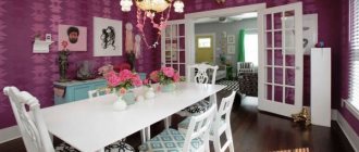
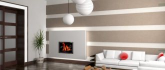
White and yellow living room
Designers recommend using this beautiful combination of colors as follows: if the room is well and sufficiently lit naturally and is located on the sunny side, then we use white as the main color, and yellow for placing accents and individual elements or interior items of the living room. If the room is located in the shady side, then vice versa: yellow as the main color, and white for spectacular interior items.
Yellow wallpaper in the interior
The color yellow has a huge gradation of shades, and this circumstance must be used wisely. Yellow, surprisingly, can be cold, can turn into golden shades, or can become a retro mustard color.
Just yellow wallpaper, without any color combinations - a bold step. Therefore, dilute them with at least paintings on the walls, for example, in thick white frames. Or choose other color combinations.
Yellow can be combined with a variety of colors to achieve interesting effects.
Yellow's best partners:
- Yellow plus white . This is a classic that is appropriate in virtually any interior. White gets along well with absolutely all shades of yellow.
- Yellow plus beige . And this is an option for those who want to create a very warm room. Although this is not so bad, considering that beige shades soften the activity of yellow.
- Yellow plus brown . Another classic combination that helps make a room in these colors energetic and dynamic. It also affects the perception of the room, the interior of which in such a range becomes more mature and respectable.
- Yellow plus blue . There is a game of contrasts going on. By choosing faded shades of these colors, you can create a very soft, gentle, calm atmosphere in the room. A good option for a room for growing girls.
- Yellow plus burgundy. This tandem influences the creation of a luxurious, majestic environment. But the furniture should also match - expensive in appearance, with curves and other design tricks.
Combination options
Yellow color goes well with many other tones. By choosing certain pairs of shades, you can create great contrasts and focus attention on the details. Combination options:
- Yellow and white can be called a classic combination that suits any space. Variations of the white-yellow combination are possible in cold and warm colors, which makes them multifunctional.
- Yellow and beige add warmth and liveliness to the room. The beige tone implies a certain “calming” of the main tone, without affecting the sunshine and lightness.
- Yellow and brown - helps to add dynamism and solidity to the space. The combination matches perfectly with wallpaper in the bedroom or living room. The choice of this variation is indispensable when dividing a room into zones.
- Yellow and burgundy - used to emphasize the elegance and richness of a space.
- Yellow and blue add contrast and unusualness. The combination of yellowish tones with blue emphasizes the creativity of the owner’s style.
- You can choose plain yellow wallpaper or striped wallpaper. Various color combinations will help emphasize the cozy environment in the room.
What color furniture will go with yellow wallpaper?
Again, you need to start from the specific shade of the wallpaper. For example, wallpaper closer to gold is combined not with the color of the furniture, but with its design.
For yellow walls, white furniture is considered an almost win-win option. Milky color and other shades of white always look very cozy against the background of yellow walls, while being restrained, subtle, and interesting. And white takes on a little of the brightness of yellow, calming the atmosphere.
Furniture that also goes well with yellow wallpaper:
- Noble brown;
- Soft green and all light shades of this color;
- Beige tones;
- Soft and faded blue color;
- Not very large quantities of dark chocolate, close to black.
Gold wallpaper requires furniture to match - classic design, expensive and massive
The color of coffee with milk is another partner of yellow wallpaper. This combination looks very stylish. For example, such a sofa against a yellow wall is soft, cozy, tasteful.
Advantages and disadvantages
Wallpaper in yellow tones has a number of advantages:
- Wide range of tint compositions;
- Yellow color can be cold or warm depending on the scale used;
- Yellow wallpaper combined with light colors brings relaxation, calm and comfort;
- In the presence of golden tones, a person’s potential increases and tone rises;
- They have calming properties;
- Used in various rooms.
The disadvantages of canvases made in yellow include:
- With an excess of yellowness, a person becomes intolerant and critical;
- Bright colors should be used sparingly;
- The color belongs to the group of easily soiled wallpapers.
If you correctly combine shades and match them with furniture, then a room with yellow wallpaper will bring only joy and positivity.
Yellow wallpaper: color book
This pun can be used to approach the theme of gradation of yellow flowers. There is a famous book by Charlotte Gilman, “The Yellow Wallpaper,” which involuntarily gave rise to a surge of interest in yellow wallpaper. And their choice is very interesting, given the huge selection of yellow.
The color brass (yellow, turning into gold) will perfectly fit into a very rich interior.
Yellow gradations:
- Pearl. Delicate color, white with a yellowish tint. For rooms where you need to create an atmosphere of peace and an optimistic view of the future.
- Fawn . It is a pale yellow color with a pink tint. It can be used in a vintage interior, where it will be “at ease”.
- Lemon . It is a cool yellow with a light green tint. A good option for arranging small rooms.
- Canary. A bright yellow color, appropriate for a nursery, but not in very large quantities.
- Straw . Light yellow shades are a good option for a cold small room.
- Saffron . A brownish-yellow color that doesn't have to be overpowering.
- Narcissus. Warm yellow, a spring color that goes well with other shades of spring primroses.
- Mustard . This is what dry mustard looks like. It’s very good for a retro-style interior, in an aristocratic setting.
And there is also corn, amber, tobacco, cream, sand... When choosing yellow wallpaper, you may encounter the “eyes run wide” effect. Don’t forget to evaluate the available data: furniture, textiles, room size, which side this room faces.
Yellow wallpaper (video)
Yellow wallpaper will always have many fans, because they carry a positive beginning, a desire for new achievements, and bold plans. This color is good for any room, both in the kitchen and in the bedroom it will be appropriate. Play with shades, choose interesting combinations and enjoy the created environment.
Good luck with your choice!
Black and yellow living room
Yellow color is rich in rich, bright, delicate, beautiful shades: gold, lemon, mustard, canary, fiery and many others. And all these shades go well with the absolutely opposite, serious and rather gloomy black color. Such a sharp contrast gives this combination a special chic and sophistication. For such a combination, proper planning and zoning of the room with the right choice of color for each zone is important. Also, designers still recommend using white or pastel shades in this combination to reduce contrast, which can cause a negative reaction.
The yellow color in all its manifestations and combinations is truly beautiful; such a warm color creates a special warm and comfortable atmosphere everywhere. By choosing yellow for the unsurpassed and unique design of your living room, you have taken a clear and confident step towards magically transforming your home interior into a beautiful oasis of true positivity, inexhaustible optimism, incredible energy, vitality and sunny mood!
Kitchen-living room in Scandinavian style and a cheerful yellow sofa. And a chair. It was thanks to the chair that our designer saw in Ikea that this interior appeared. Everything is very simple and concise. Light shades and bright accents in the interior of a small apartment add a special charm and make the room visually larger. And the customers, who were so fun and relaxed to work with, were very pleased.♥️
Yellow wallpaper in the interior (photo)
Related article: Standard dimensions of interior doors - height, width, thickness
Notes of joy and enthusiasm
You can use yellow as a background or just as a rich accent, you can do both. This approach to color will appeal to those who love a palette of sunny, joyful colors: from lemon to dark yellow, which are reminiscent of the beginning of dawn.
Bold stripes of bright color in combination with other colors besides black will become an extremely interesting option. But you can only leave rugs or sofa cushions with such sunny colors.
Choosing a tone
Have you decided to decorate the room in one color? You can achieve this result in two ways: choose inexpensive plain wallpaper in a ready-made shade or choose paintable wallpaper, the design of which can be periodically changed depending on your own preferences.
Advice: if you want to mask the joints, as well as prevent the possibility of color distortion on individual roll sheets, choose paintable wallpaper.
Beautiful plain wallpaper can be matched to almost any style. In modern designs, such as hi-tech or minimalism, it is better to give preference to light or calm, cold shades.
Warm colors are typical for rooms decorated in Provence or country style. Bright and rich colors are a characteristic feature of oriental themes, and restrained shades are characteristic of classical and provincial design trends.
The right choice will depend on many factors
Therefore, when choosing plain wallpaper for the living room, kitchen, bedroom and other rooms, pay attention to the following features and parameters: durability and durability of the material, the nature of the surface (embossed or smooth), texture and color scheme
The range of wallpaper coverings is quite large, but not everyone is able to choose the right option for rooms with specific conditions.
For example, in the kitchen, where the walls are exposed to moisture and steam, you can use vinyl plain wallpaper for the walls. The main feature of vinyl plain wallpaper is the ability to clean it, so your walls will retain their appearance for a long time.
Non-woven plain wallpaper is also highly wear-resistant and durable. It will be a little more difficult to clean such walls, but the wallpaper will protect the surface from mechanical damage, and the relief texture, characteristic of most wallpaper of this type, will emphasize the stylish interior design.
If the issue of quality is not a priority for you, specific factors do not threaten damage to the wallpaper during operation, and you do not expect a long service life, you can purchase plain paper wallpaper.
Such coatings have many more design features, and thanks to the simplicity of the structure, you can easily stick such coatings to any walls in the house.
Tip: another advantage of paper wallpaper is environmental friendliness, so plain wallpaper of this type is ideal for the bedroom and children's room.
In addition to quality parameters, pay attention to the appearance of the coatings. Colored plain wallpapers can have a matte or shiny structure, shimmer in the sun or reflect glare
Choose the appropriate option, focusing on your own preferences, as well as the purpose of the room: for example, wallpaper that blinds the eyes from excessive light will be inappropriate in the office.
The texture of plain wallpaper also plays an important role. They can be smooth or embossed, made in the form of fine crumbs or rough, and also imitate natural surfaces.
The textural features of the selected materials should reflect the specifics of the interior design.
The price of plain wallpaper will depend on the quality and texture of the material: the minimum cost of such coatings is about 700 rubles.
How do they affect a person?
On the one hand, yellow is bright enough to be a background, because it activates the psyche. Yellow, from the point of view of Indian philosophy, is the color of social activity, self-realization; it is more suitable for the dining room and living room than for the bedroom. In the bedroom, yellow can be in a muted pastel tone or as part of a pattern.
Yellow wallpaper is a great design idea for a room with a rich palette. These coverings will help create the impression of a sun-filled room and eternal summer. And decorating a room in natural colors - the color of a green meadow or a sunny forest clearing - will lift your spirits.
When using shades of yellow, it is important to use 2-3 tones, because a 2-color room design with incorrectly selected tones can become depressing for the psyche, and if there are too many bright shades, it will be difficult to relax in the room
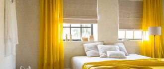
Yellow bedroom lighting
Designers confirm that yellow is an excellent antidepressant in poorly lit rooms. Rooms to the north and west look good in light shades. This does not require an abundance of additional light.
It is permissible to get by with a central chandelier and several zonal light sources. In a south-facing room, lighting fixtures are usually used only at night. Here you will need a minimum number of backlight points.
Yellow color for the bedroom: pros and cons
The joyful yellow color rarely finds opponents. The shades of the sun touch you and charge you with positive energy. Color is often chosen for the following abilities:
- lifts the mood, produces vigor;
- encourages action and activity;
- improves brain function;
- facilitates awakening and concentration;
- conducive to calm, confidential conversations;
- relieves fatigue, minimizes negativity, dispels bad thoughts.
At the same time, the yellow interior of the bedroom must be done thoughtfully. The excessive presence of bright colors excites the mind and does not allow one to calm down or get ready to relax. The predominance of yellowish tones risks causing anxiety and sleep disturbance. This is especially true for bright, monochrome designs.
Beautiful design ideas and options
If you like bright contrasts, then you should decorate the wall behind the bed in the bedroom with wallpaper with black floral patterns, and paint the rest of the walls with dark red tones. Hang silver or gray curtains with black stripes in such a room and place a bed with black and white linens and a tall green headboard. The combination will turn out to be very interesting and non-trivial.
In a bright room with milky wallpaper and an equally light ceiling, light curtains in a soft brown shade will look organic. They can be hung on a simple soft green or pistachio cornice. Place in such a room a light bed with a soft chocolate blanket and pillows, as well as live plants in snow-white vases.
Against the background of laconic snow-white wallpaper, thick long curtains in a pale chocolate shade with darker floral prints will stand out effectively. They should be hung on round metal curtain rods and placed next to light pictures with dark brown wooden frames.
If you want to bring not two, but three interesting colors into your interior, then you can turn to double-layer curtains that combine taupe and blue shades. Hang them over translucent white tulle in an all-white room with a white ceiling and light cream floor. Place a dark brown leather sofa in such a room to support the dark material of the curtains.
In a kitchen or dining room with soft milky walls, a pure white ceiling and an equally light tiled floor, you should hang translucent cream curtains on a contrasting dark curtain rod in a dark gray shade. In such an environment, light chairs with wooden legs, a glass table and a wooden set in creme brulee color will look great.
Dark thick curtains will look amazing in an ensemble with purple wallpaper decorated with floral patterns at the top (for example, sakura branches). Place natural wooden furniture in dark tones and soft chairs with velvety chocolate upholstery against this background. To prevent the ensemble from seeming too dark and gloomy, the ceiling should be decorated with white materials and snow-white metal ceiling lamps should be used.
And passionate and sensual colors are best combined with calmer and neutral tones, especially when it comes to the bedroom. For example, thick red curtains made of velvety heavy fabric will look organic against the backdrop of soft peach wallpaper. A chest of drawers and a cabinet made of mahogany or wild cherry will find their place in such a room. As for the bed, it should also be made of natural solid wood and decorated with good quality cherry-colored bed linen.
Thick red curtains will look impressive in a bedroom with patterned black and white wallpaper, black seamless flooring and a dark bed complemented by a burgundy blanket and pillows. Such an interesting interior should be completed with a forged dark chandelier, a white fluffy carpet and pompous chairs with white curved armrests.
In an interesting modern style, plain wallpaper in classic and neutral tones is most often used. For example, this could be pale gray wallpaper and simple straight white curtains with geometric contrasting patterns. It is better to hang them on a chrome cornice and place a small white chair with a high back next to it.
Thick yellow curtains will look impressive against the background of white wallpaper in a spacious living room. Place light, futuristic-shaped chairs in front of the window opening and decorate them with black and white decorative pillows. Complete the ensemble with live plants, a gray small sofa and white bookcases.
Priorities when choosing furniture
The color of the sun harmoniously combines with shades of different scales. A yellow bedroom with dark furniture looks expressive. Objects in both black and dark brown shades look elegant.
The use of furniture in yellow tones is justified only when the background is made in neutral colors. If color dominates everything, it will spoil the impression of the interior.
A yellow bedroom with white furniture looks organic. The solution is most relevant for small spaces. When choosing the material for furnishings, it is better to choose traditional wood.
The presence of items with forging elements cannot be ruled out. Items made from rattan will also be successful. It is better to exclude plastic and glossy shine.
Rules for color combinations
When choosing the best companions for him, consider the important rules for creating color combinations.
- Several shades (no more than three!) of the same color are always perfectly combined with each other. In the interior of an apartment, it is better to “dilute” them with neutral tones - for example, white, beige, gray.
- Using colors that are most harmoniously combined with each other.
- A combination of contrasting colors - for example, blue, black.
- Combination of nearby colors - green and orange are adjacent to yellow in the color wheel, but it is better to combine their non-pure shades with each other: for example, with ocher and orange or with yellow-green and green. This combination will not “cut” or irritate the eye.
Let's try to consider the most favorable color combinations.
An ideal color combination involves using no more than 3 shades of the same color
To choose the right color, you can use the color wheel
You need to work with yellow color carefully
See alsoSteampunk in the interior: history, features, photos
Elegant pairing with brown
This combination can be considered classic - for decorating a dining room or kitchen. A “warm” and cozy interior is relaxing, conducive to a family holiday and breathes well-being and stability.
This tandem is best used for a large room, where the floor, furniture and interior items made of wood look harmonious against the background of lemon-colored, light walls. You can use a caramel shade for the background, wood for furniture, juicy notes as an accent.
See alsoRed color: advantageous combinations in the interior
Brown, beige
A harmonious picture will be obtained by combining yellow with beige or brown that is similar in spectrum. A design in light colors is good for a poorly lit bedroom. Soft beige harmonizes interestingly with active yellowness.
If you use brown, you will get a great yellow bedroom in a classic style. Due to the calm but elegant colors, the room will receive the sophistication and comfort of a home environment.