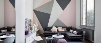
How to choose wallpaper for the living room?
The most important thing in choosing wallpaper for the living room is that it matches the interior style of the apartment or house. It is better to choose wallpaper for the living room that is more elegant than for the bedroom or children's room, without going beyond the scope of the apartment's interior design.
We have already written in detail about the types of wallpaper and their differences, but now let’s talk about choosing the color of the wallpaper.
Light wallpaper expands the room
If the apartment (or maybe an office) is small, then this can be corrected with the help of color: choose light colors from the color scheme for the interior design. After all, a bright room visually seems larger.
The same color scheme will help “fill with light” those rooms that face north.
Light wallpaper, which is used to cover both the ceiling and walls, can effectively cope with these tasks.
What else is worth paying attention to?
In addition to the above aspects, when choosing wallpaper for a room, you should focus on other universal factors. Regardless of which room you want to wallpaper, analyzing the following circumstances will bring you closer to finding the right wallpaper.
Room size
The size of the room is a very important factor in determining the wallpaper pattern. With larger rooms, you have more choice and more freedom in choosing a theme. The situation is different with small rooms . Here you need to be careful that the wallpaper pattern does not visually make the room smaller. Beware of too large compositions visible on wallpaper, and follow the rule: the smaller the room, the clearer the pattern.
Illumination level
This is a key aspect when you want to choose dark colored wallpaper. In dimly lit interiors (for example, those facing north), dark wallpaper can make the room gloomy and unpleasant. Otherwise, it is better to use wallpaper in lighter shades. White will reflect light rays and distribute them evenly throughout the room.
Availability of furniture and accessories of a given shade
If you choose wallpaper that will be combined with furniture or accessories, it is worth considering what shade it is. An example is the color gold . Currently, it is one of the most fashionable shades in the interior, which is why it is used in wallpaper motifs, as well as in furniture and accessories.
Psychological perception of color
It has been proven that different colors affect us in certain ways. For example, shades of red can evoke aggression, anger and a negative attitude, while colors of green have a calming atmosphere. This is worth remembering when choosing shades of wallpaper, so that you feel comfortable in your rooms not only physically, but also mentally.
When choosing wallpaper, remember that colors play a key role. The universal rule for choosing them is to take into account the type of room . Pastel, light colors are better suited for bedrooms and lounges. Wallpaper in bright colors is best suited for areas such as the kitchen and bathroom. In small interiors it is worth abandoning contrasts, because they optically reduce.
Purpose of the room and wallpaper design
Wallpaper must match the room for its purpose . When choosing wallpaper for your bedroom, a food print probably won't work. It should be remembered that in addition to relatively universal motifs, there are also wallpapers dedicated to specific rooms. The best solution is to choose neutral patterns.
Palette of light shades for wallpaper
What wallpaper tones, most often used in interiors, belong to the light palette?
- Olive in combination with golden color, mint, light green and lavender tones are very relevant.
- Classic - noble ivory, light beige, and boiling white, which is an excellent background for bright furniture.
- Light lilac and pale blue shades will add airiness to the room: they are great for decorating walls in a children's room and bedroom.
- A light pink-peach tone on the kitchen walls will promote a pleasant appetite and soulful tea drinking.
- Delicate pistachio color will remind you of unity with nature. And pastel yellow wallpaper will fill the room with warmth.
In all cases, for small rooms and rooms facing the north, warm shades are desirable: this way you can avoid uncomfortable feelings. If the rooms are large or “southern”, then it’s a good idea to choose, on the contrary, cool shades.
With the help of wallpaper in a light palette, you can, as mentioned above, recreate a particular interior style. For example, Scandinavian, classic styles, Provence style and others.
Secrets of successful design
The peculiarity of pastel wallpaper in light shades is the ability to fit them into any interior . However, many argue that using light-colored wallpaper on the walls is not only impractical, but also boring. We are ready to dispel both of these myths. Even in interiors where the walls are constantly exposed to external influences, and stains on the wallpaper appear with frequent regularity, you can glue suitable materials.
The range of modern wallpaper products is filled with coatings with moisture-resistant properties, the ability to be washed and wet-cleaned, high strength and resistance to abrasions, so you no longer have to worry about maintaining the appearance of your walls.
As for the boring design in light colors, such an interior can be “saved” by using unusual shades (for example, pistachio or mint) or adding bright inserts on the walls , as well as in accessories and textile elements.
Several more techniques will allow you to refresh and enliven the interior:
- It is not necessary to use light-colored coatings to decorate all the walls in the space. Try alternating light and bright shades or wallpaper with large patterns that catch the eye . If light backgrounds help expand the space, then large ornaments in bright colors, on the contrary, will narrow the walls, so be sure to take this fact into account when planning your future design;
- even the most ordinary wallpaper in delicate shades can look impressive and elegant if you choose the right texture for the wall coverings . Relief motifs, rough coatings or scenes with glossy and pearlescent tints will add zest to even the most standard interior;
- Although light wallpaper can improve the perception of an insufficiently lit space, too much light in the room can contribute to the opposite effect: bright glare will be blinding, and the interior itself will not be cozy. Therefore, use the optimal number of lamps , and decorate walls with excessive lighting in darker and cooler colors;
- The combination of wallpaper shades plays an important role in this design. Light colors allow you to use almost any contrast , since they look quite harmonious next to dark, bright or pastel shades on the walls.
Advice: when choosing a shade for the interior, consider not only the lighting and size of the space, but also its purpose. For example, it is not advisable to glue wallpaper with large bright patterns in the bedroom, but in the living room such coverings will look stylish and harmonious.
For some interiors, you can choose thematic wallpaper or realistic photo wallpaper: for example, in the kitchen, put up white wallpaper with fruits, in the bedroom - with flowers, in the living room - abstract scenes, etc.
extremely important to correctly guess the details of the style of the future design . If the room is decorated in an old style (classic, baroque, retro or Provence), do not choose wallpaper with strict patterns or realistic images. Floral themes, geometry or polka dots would be appropriate in such interiors.
More modern styles (modern, high-tech, minimalism, urbanism, etc.) can be emphasized with the help of abstract and dotted motifs or use plain wallpaper with bright inserts.
Light wallpaper for Scandinavian style
This interior style, now especially popular, is distinguished by a small set of primary colors. You can count them on your fingers: white is the leading one, as well as black (contrasting), gray and wood color.
In Scandinavia, walls are decorated with natural materials or simply painted white. However, Scandi style options allow the use of wallpaper for walls and the addition of shades. And this is a vivid illustration of the excellent decoration of rooms with light wallpaper.
Most often, when arranging a room in a Scandinavian style, they choose the following tones:
- White,
- Lactic,
- Light beige,
- Ivory,
- Bleached grey,
- Pearl,
- Powdery pink,
- Olive.
These colors are harmonious, for example, in the following combinations.
White or milky colors on walls, ceilings and furniture are a Scandi classic.
Gray smoky walls are complemented by white furniture and wooden floors.
Olive-colored wallpaper goes harmoniously with white wood furniture.
A bedroom with powder pink and light beige wallpaper on the walls, a white ceiling and a bed of the same color will look good.
Light textured wallpapers and coverings with minimalist patterns fit perfectly into the interior. Sometimes the option of using liquid wallpaper is considered for the living room. Light-colored photo wallpapers are also partially used in wall decoration (for example, with graphic patterns, images of deer, imitation of tree bark).
Features of the choice of ornaments
Before you decide on the right wallpaper for your walls, you should think about which patterns will work best in your interior .
The harmony of perception of a given theme can depend on many factors: the size and shape of the room, its color palette, the degree of lighting, layout, style of furniture and accessories.
So that after gluing you are not disappointed with the result, pay attention to the following features in advance:
- Since ornaments on the walls attract attention and create accents, decide on the main purpose of their use . If the purpose of the pattern is to create dynamism and rigor in the design, choose patterns with sharp corners and orderly placement of elements. If wallpaper with patterns needs to soften your design, choose wallpaper with smooth, rounded and calmer patterns;
- if the ornament that you like has elements in the form of vertical and horizontal lines, make sure that such motifs will have a positive effect on the perception of your room . It’s no secret that vertical stripes raise the ceiling, and horizontal stripes expand the walls, so use such patterns to your advantage;
- Pay attention to the peculiarities of alternating fragments of the ornament. The smaller and more frequent the drawing, the stronger its effect on the mood and perception of space. However, large ornaments will also affect your interior: in a small room they will create a cramped effect;
- One of the main features characteristic of such wallpaper is the ability to mask imperfections and unevenness of the walls . Therefore, think in advance in which part of the room they will best cope with this task.
When buying wall coverings with ornaments, consider their color, as well as the nature of the pattern . For example, cool shades (gray or blue) will make the room more fresh and spacious, warm colors (yellow, pink) will emphasize the spring atmosphere, bright colors (red, orange) will add dynamics to the design, and dark shades (black, brown) – emphasizes the restraint of the interior.
Remember! A room decorated with wallpaper with dark patterns should be well lit. In the absence of large windows, use lamps stylized in accordance with the design theme.
Please note that such wallpapers, as a rule, include several colors at once - and they all must be in harmony with each other .
White wallpaper with ornaments is considered a universal option - they are suitable for every room. Dark wall coverings with patterns are best used in spacious rooms not intended for recreation. In interiors such as a bedroom, kitchen or bathroom, it is better to use light wallpaper with ornaments.
Light wallpaper for Provence style
In the decoration of the French countryside style, natural materials prevail. But wallpaper is also applicable for walls. And only pastel colors. For example, lavender colors are held in high esteem.
- Light wallpapers with floral motifs and striped coverings are also very popular.
- They can be glued individually or combined with each other.
- “Floral” wallpapers are also good in combination with plain coverings.
- Checkered wallpapers of a light palette are also used.
Light wallpapers are also good in other interior styles: for example, in a rustic country style or in one of the modern color trends (where matte “whitened” coatings in pastel shades are a priority).
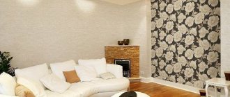
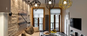
Types of wallpaper for the living room
When choosing wallpaper for your living room, you should pay attention to their quality: a wide range of prices allows you to find coverings within different budgets, but the savings are not always justified.
- The simplest are paper sheets . They are easy to stick on. The durability of the finish depends on the thickness of the base and cleaning features, since paper wallpaper is not wear-resistant. Their characteristics do not include moisture resistance, but this is not required in living rooms, you just do not need to wipe them with a damp cloth. The variety of decors and colors in this category is endless, especially since they can be both embossed and embossed.
- Vinyl coverings on a non-woven basis are denser wallpapers that help to slightly level the surface of the wall . The pattern is applied using different technologies. Silk-screen printing creates unique classic designs. Silk threads in the structure of the top layer of wallpaper also create fancy patterns.
- Fiberglass sheets have a “ventilation” system and are durable and strong . But the decor of such coverings is unambiguous - they are embossed, but without obvious ornamentation. The color is applied by the owners themselves, since such wallpaper is used only for painting. You can only repaint them so many times - gradually the relief becomes clogged with paint.
- Metallized canvases are non-woven wallpaper with an aluminum layer as thick as foil - up to 0.2 mm . An embossed design is applied to this surface. The color of such materials corresponds to the entire range of valuable and noble metals - these are shades of gold, platinum, bronze, copper, silver. Their durability matches the strength of alloys. In addition, wallpaper of this type does not fade or deteriorate even in rooms with high humidity.
The photo shows the interior design of a living room decorated with metallic wallpaper.
- Liquid wallpaper is a dry mixture of cellulose, silk fibers and dyes, as well as additives from metallized threads, mother-of-pearl, and minerals . The materials are diluted with water and applied to the walls. The composition already contains anti-mold agents. Externally, such coatings resemble plaster.
- Natural wall coverings - bamboo, jute, textile wallpaper . The basis is the same non-woven fabric, which makes it easy to stick the canvas to the surface. The finished finish does not fade, does not emit harmful substances, and has heat-insulating properties.
Almost all types of materials can be found in neutral and light colors, except, perhaps, metallized ones, the range of which is limited to a certain extent. The choice of palette depends on various parameters - style, lighting of the room, its size, personal preferences.
Light wallpaper on the ceiling
A fairly popular solution for decorating the ceiling is to cover it with wallpaper. This is due to both the affordable prices for this type of material and the wide variety of its types:
- Paper,
- Vinyl,
- Non-woven,
- Textile,
- Glass wallpaper,
- Liquid,
- Photo wallpaper.
Thanks to this abundance, you can not only choose the “right” material for any room (for example, waterproof vinyl for the kitchen), but also decorate the ceiling to suit different tastes (for example, create a “blue sky above your head” using photo wallpaper).
As for the color scheme, the top of the room is usually decorated in light colors to avoid a “pressing” feeling (especially if the room is small).
White wallpaper for the ceiling is a universal option for many style solutions. They seem to add air to the room and make it taller. It is believed that a white ceiling goes well with beige walls, dark wooden floors and gray furniture.
Light wallpaper on the ceiling and walls combines perfectly with the dark colors of the floor, baseboards, and doors.
Light, delicate tones of the ceiling and walls look harmonious with the same doors, furniture and wooden floors.
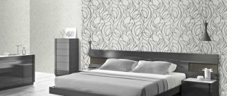
Types suitable for the bedroom
Paper. Single-layer or double-layer. The drawing is applied as a printout on printing devices. Such wallpapers do not tolerate humid environments well and have average durability (3-5 years).
Sold in a variety of colors, patterns and styles. The photographs below show a bedroom design with light paper wallpaper.
Non-woven
A mixture of cellulose and polyester. Their main drawback is the chemical component in the composition. Beautiful in appearance, durable, can be washed carefully (can withstand moderate humidity).
- However, it is not recommended to glue a bedroom, a room for sleeping and relaxing, with wallpaper containing polyester.
- However, for those who decided to paint a similar look in their bedroom, the photographs below show examples of what is the best wallpaper to stick in a bright bedroom.
Vinyl
The second most popular wallpaper for bedrooms after paper.
- Essentially, it is paper wallpaper protected by a second layer of polyvinyl chloride, which acts as a protective layer from mechanical damage and moisture.
- At the same time, they are quite environmentally friendly. You can apply any designs to vinyl (the principle is similar to photo wallpapers) - that’s why they are often used for bedrooms.
- The photo below shows which wallpaper is best to choose for a bright bedroom.
Vinyl tolerates moisture well. The fact that they can be washed is perhaps their greatest advantage. Keeping the walls clean is a must to give a clean, tidy and comfortable look to any bedroom.
Light wallpaper is not boring
It is wrong to think that light colors make a room “empty” or boring. A variety of modern materials can, on the contrary, give such a home a very attractive look. You just need to try to “fit” them harmoniously into the interior.
So, the use of light wallpaper with drawings and ornaments would be original. In this case, you need to “keep in mind” the following patterns.
- Large patterns visually reduce the size of the room, so they are more suitable for larger spaces.
- Horizontal stripes make the room wider, and vertical stripes make the room taller.
- Openwork images on the walls go perfectly with stripes in the decor (for example, with striped pillows).
In addition, you can successfully decorate a room by “playing” with textures. After all, wallpaper today is presented in this regard in a very diverse way: smooth, rough, shiny, matte, glossy and others.
However, when using, say, rough surfaces, you must remember that the colors on them will definitely look brighter than on a smooth canvas. And, conversely, on smooth wallpaper the colors look lighter. Glossy coatings can look different: it all depends on the lighting.
And, of course, we must not forget about design using accessories, namely the combination of colors. In a house where bluish wallpaper is used, bright red details will look completely different than in combination with light beige wallpaper.
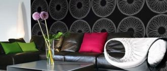
Colored wallpaper
Colored wallpaper in the living room will add mood to the room and refresh the atmosphere. You can use any shade, based on its effect on the psyche, but choose your wallpaper carefully. Wallpaper should not be the first thing in the room; it is just an addition to the interior.
Red wallpaper
An exciting and aggressive color. Bright red wallpaper in the living room is difficult to use, since the shade attracts a lot of attention and is irritating. Color attracts all attention and makes the room smaller. It is recommended to use red wall color in coral, burgundy, wine, and terracotta shades. Red goes well with gray, gray-blue, yellow and muted green.
Blue wallpaper
The blue color of the walls is calm and relaxing. Blue wallpaper in the living room takes away some of the natural light, so we recommend that you use blue shades in combination with light wood, white, gray, yellow and green tones.
Green wallpaper
The green color of the walls is perfect for decorating living spaces; the color evokes only positive emotions. Green wallpaper in the living room has an anti-stress effect. Recommended to be combined with brown, orange, blue, white and black. Adding red accents as decor will add expressiveness and freshness to the interior.
Yellow wallpaper
Light and bright color in the palette. The color yellow is associated with joy and sunshine. Yellow wallpaper in the living room interior goes well with white, black, gray, green, red and brown. Pure yellow in large quantities can cause fatigue.