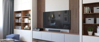
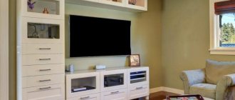
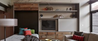
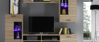
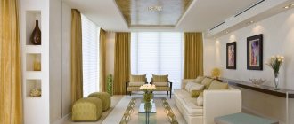
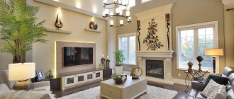
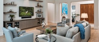
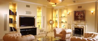
Choosing stylish cabinet furniture for the living room is 90% the key to success. After all, this is the largest piece of furniture in the room, which will attract the most attention. In addition, usually a TV is placed in the slide, which means that views will be directed in this direction. We have collected stylish and original options that are trending in 2022.
Minimalist slide
Over the past few seasons, one of the most stylish trends in interior design has been the pursuit of minimalism. This topic also included slides for the living room. What are they? These are completely closed shelving (so that there are no unnecessary details in the room) without handles.
The composition looks more complete if the TV is not recessed inside the cabinet, but is located on the same level as the doors. If you choose a minimalist slide to match the wall, it will visually expand the space. This is especially true for living rooms up to 15 square meters.
Classic
Until now, classics are most often used to design living rooms. And this is not surprising. The style creates a very cozy and relaxing atmosphere. In addition, the classics can rightly be called the most solemn style, so it will be pleasant to receive guests in such a living room.
Nowadays, a lighter version of the classic is in fashion, so light-colored furniture is more common. Dark massive slides are suitable for cottages; in an apartment I would like to see a more sophisticated option.
Also, the distinctive features of the classics include an abundance of glass, symmetry, the presence of figured cornices and decorative panels, doors with panels and interesting handles made of heavy metal.
If you don't like white furniture, take a closer look at the models in café au lait color. In 2022, he firmly conquered the pages of fashionable glossy interior design magazines. The color is as versatile as possible, pleasing to the eye and very cozy.
White slides have their own advantages. There is no other color that also “saves” space. Even such a large piece of furniture as a wall-sized slide will not look bulky if you choose white.
In general, open shelves also make furniture lighter, but the important point is what you fill them with. In classics, every detail is important, so you need to think in advance what items will end up on the open shelving.
It is better that they are in the same style and similar colors. How can you recognize the interior created by the designer at a glance? The shelves in it will be half empty. After all, the task of the slide is to become not just a storage place, but an interior decoration. Ideally, things should occupy no more than 30-40% of the total open space.
Choosing color and material
Another important point is the choice of material and color of your wall. Slides for the living room are made of wood, MDF and chipboard.
Furniture made from natural wood is very expensive. MDF is a medium-priced furniture material. Chipboard material is most often used and is most accessible to most buyers.
The slide wall in the interior should be completely compatible with the style of the entire apartment. The color of the wall should be in harmony with other interior items. The living room is a place where the whole family gathers to relax, a place where guests are received, which means everyone should feel comfortable here.
It is possible to add a cozy atmosphere to the room using classic shades of furniture. Colors that are close to natural are considered classics.
Using multiple colors allows you to create stylish compositions. You can choose the most compatible colors from the photo of the wall of the slide in the living room.
White color gives lightness to the entire room. White is often used as a base color. It goes well with many colors.
Pastel colors are suitable for creative people. Such walls do not attract unnecessary attention.
Bright colors are great for people with an active lifestyle. When choosing furniture in these shades, the main thing to remember is that the color is not too aggressive.
A wall slide in the living room is a necessary piece of furniture!
Slides with fireplace
Could there be a more cozy element in the living room than a fireplace? I think no. Nowadays, real wood-burning fireplaces are used extremely rarely, and gas and electric fireplaces can be built into furniture. This will not harm the slide or the equipment.
At the moment, the location of the fireplace under the TV has become a classic. For the composition to look organic, their sizes should be approximately the same. The TV can be a third smaller because it is located higher. But it is better not to purchase a fireplace that is too small: it may simply get lost against the background of the entire wall and not produce the desired effect.
By the way, the slide under the fireplace does not have to be made to order. Many manufacturers offer ready-made models along with fireplaces. This is much more convenient, since the sizes of fireplaces vary greatly. And you don’t have to waste time on selection.
As for the fireplace itself, the more natural the fire in it looks, the cooler it will be. Don't chase brightness. Let it be better not so noticeable, but more realistic.
Wall with computer desk
Simple and functional solutions are suitable for large private houses and small apartments. A wall in the living room with a computer desk will help organize the space.
It is difficult to imagine modern life without the Internet. A person is forced to spend a lot of time at the computer, so it is necessary to arrange a work corner.
Part of a furniture wall can serve as such a place. It allows you to create a comfortable and functional space. Care should be taken to ensure that there are no unnecessary objects on the table surface when working. Good lighting must be provided. Capacity and compactness make such a system an indispensable piece of furniture.
Symmetrical models
As we mentioned above, symmetry is one of the hallmarks of classics. Nowadays it is extremely difficult to find symmetrical wall models for the living room. Every furniture designer wants to bring his own original details, so the appearance of the models becomes more and more complex.
If you are a follower of the classics, it is better not to experiment with asymmetry. Attempts are rarely successful. Playfulness can be introduced with the help of interesting objects on the shelves and more free placement of upholstered furniture.
For those who like more unusual models, slides are suitable, in which the shelves differ slightly in width and height on different sides of the center. In general, multi-level shelves are a separate big trend for 2022, which we will discuss in more detail below.
Asymmetry
Designers emphasize the modernity of the model precisely with the help of asymmetry. If classic models could have been found in the same form even among your grandparents, then asymmetry is a fairly fresh trend.
To facilitate the design, shelves are often placed on only one side, and the other is decorated with a decorative panel. Thin wooden slats and marbled materials are especially relevant.
You can also make the design more airy if the bedside table is hung on the wall. You can provide lighting and in the evenings it will seem as if the slide is floating in the air. This move is almost as spectacular as a fireplace.
It is better to make blank walls either in light or very dark colors. Intermediate options may be too reminiscent of office furniture and look bulky. By the way, the trend is wood with a clearly defined pattern - veins, knots, irregularities.
If you place the TV inside the slide, you need to make sure that there is a visually free area around it. Shelves located too close, especially if there are a lot of them, will distract from viewing and create visual noise.
Modular
This already mentioned type of slides is the most practical type of such furniture. And all this because the modules (shelves, cabinets, etc.) can be swapped and get the most optimal and convenient option. If a modular wall-mounted wall with a wardrobe is installed in the living room, then after some time you can modify the configuration of the furniture and “refresh” the interior of the room.
Multi-level shelves
The same trend that we mentioned above. Different heights and widths of the shelves help make the furniture more interesting; there will definitely be something for the eye to grab onto. This also sets the dynamics and the interior looks more alive.
Again, before ordering such furniture, clearly imagine what you will place on the shelves. They are usually quite narrow, so they are not very functional. That is, arranging your home library in this way is not the most brilliant idea.
Items must fit the dimensions of the shelves. A vase that takes up only a quarter of the cell will look bad. A bouquet of flowers can save the situation. Likewise, a part that occupies the entire volume of the shelf will most likely spoil the overall appearance. Write in advance where you can place which piece of furniture. You may have to make more than one rearrangement.
Slide + table
Often in small apartments, the living room also serves as an office. In this case, the table can be combined with a slide. This is a good idea only in one case - if you live alone. In all other situations, your loved ones will most likely greatly interfere with your work. Especially if everyone gets together to watch TV. In addition, from a psychological point of view, it is more comfortable to sit with your back to the wall, and not to the center of the room.
Options for decorating a wall slide
Depending on the design features, slide walls have different contents.
Models made of solid wood, decorated with carvings and beautiful fittings, look very attractive and expensive.
Shelves
Almost always present in any style headset. The attribute partially, and in some cases completely replaces cabinets. The open design of the shelves looks more advantageous and allows you to place a lot of things on them, from photo frames, vases, figurines, to designer boxes and caskets with various small items.
A slide with hanging shelves looks airy and stylish
Technique
Not only cabinets and shelves of unusual design can act as decorative elements. A good solution is to use technology. For example, a TV, stereo, coffee machine can be the same decorative elements. This option is especially relevant for studio apartments, where the kitchen is combined with the living room. Owners often purchase a miniature display for dishes in a living room with glass doors to visually expand the room.
A slide with a built-in bio-fireplace looks incredibly stylish and fashionable.
Other options
Entire complexes built into the set are also used as filling. This includes a retractable ironing board, a bed with a lifting mechanism that transforms into a closet.
A functional transforming slide, combined with a bed or sofa, will be the ideal solution for a small room
Slide with wardrobe
Another option, possible only in small apartments. If the area allows you to move the wardrobes to any other place, be sure to do so. They look completely out of place in the hall.
When there are no other options, try to make your cabinets as inconspicuous as possible. Choose furniture without handles, light colors; you can make the cabinet not the full height of the wall. As a last resort, you can make the remaining components of the slide lighter and smaller.
Corner
It is preferable to place slides of this type in large rooms, especially those with a square configuration. In small apartments, such a wall will look too massive and therefore inappropriate, since the corner section will “absorb” the space on both sides at once, visually reducing the already small size of the room.
Owners of spacious living rooms, even choosing a furniture option such as a corner wall-mounted wall with a wardrobe, can easily solve the problem of filling an empty corner. You can also purchase such slides for a medium-sized hall, if this is not the only room in the apartment.
Freestanding models
Just a few years ago, only free-standing models were available for sale. Now designers are striving to decorate the entire wall. But this does not mean that the slides have disappeared from sale.
How to recognize a stylish model? Geometry is trending. If it seems that the slide consists of figures that are found in Tetris, you can take it. Plus, those same models are usually painted in three colors: no more, no less.
What then indicates outdated models? Patterned glass and mirrors, large metal handles, contrasting combinations: beige and brown, light gray and wenge, a large number of small cupboards, closed and open shelves. Such slides will definitely not take root in your living room! All options below are obsolete. If they don’t seem terrible now, they will definitely start in 1-2 years.
By the way, many free-standing models have a back panel on which the TV is usually mounted. If the panel does not reach the ceiling, the solution can be called an anti-trend. The exception is when its tone-on-tone color matches the color of the wall.
If we talk about what is more relevant - glossy or matte surfaces - the answer will be unequivocal: matte is now in the top. Gloss is found in kitchen facades, but practically does not appear in living rooms. A glossy slide will fit well only into very restrained interiors in muted colors. Bright glossy surfaces will not come back into fashion anytime soon.
If you have a large wall, the slide should be commensurate with it. You should not choose models that are less than 50% of the total volume of the wall. Options that occupy almost the entire wall always look better. It feels like the furniture was made to order.
Design Features
When choosing a wall for the living room, it is important to pay attention to the design of the product. It should not only please the eye, but also fit well into the stylistic concept of the interior.
There are universal models that are suitable for any environment, but it is a good idea to familiarize yourself with the requirements for a particular style.
Classic interior
For interiors in a classic style, traditional walls are most suitable. Naturalness and nobility, strict shapes and lines: the main characteristic features of such products.
Usually these are straight models, but other variations are possible that meet the general style requirements.
Modern
A product suitable for the interior of this style is usually made in contrasting colors. The composition includes completely different sections. Often one gets the external impression that the subject is unusual and contradictory. At the same time, he remains noble in appearance.
High tech
The wall for a high-tech living room is often unusual in appearance. This is a strict but streamlined product.
- The contrast of colors, as in the case of Art Nouveau, is replaced by the presence of neon lighting.
- The format of the item can be original and arousing interest.
- Usually there are no open shelves, and the facades are made in gloss.
Minimalism
There are no large cabinets here. The wall is often divided into modules. The presence of open shelves will be the exception, not the rule. The items are of good quality, but lack obvious luster. Simplicity of lines and lack of bright colors will become the norm for this style.
Making the right choice of wall for your living room is easy. The variety of options is puzzling only at first glance. Understanding the nuances of design will make the task much easier.
Walls with hidden TV
For those who watch TV extremely rarely and pay great attention to detail, a sliding door would be an excellent option. She will be able to close the TV at all times when it is not in use.
Also, when the TV is pushed forward, shelves are often placed around it. But so that the details do not distract from viewing, they are located behind closed doors, in the center of which there is a special hole for the TV. If you plan to use them frequently, carefully check the equipment's fastening.
Cabinets
The first question you need to ask yourself before choosing furniture for your living room is: what function should it perform? To be additional storage space, room decoration or just a traditional element? In the latter case, you can completely abandon the slide in favor of a cabinet.
Often there is simply nothing to put in a large pile and closed cabinets remain half empty. Or rubbish begins to accumulate in them, which is no better. If it seems to you that there is not enough space in one cabinet, it can be supplemented with a hanging cabinet or a narrow shelving unit.
When comparing solid slides and models consisting of several elements, the main factor is the size of the room. In a small living room (up to 15 square meters), a set of several pieces of furniture would look better. In a large space, a single slide covering the entire wall will look more advantageous.
What is a “wall” in the classical sense?
“Walls” can be sold in the form of already fully formed sets, or in separate modules, the required set of which and their quantity are determined by the customer directly at the time of purchase. Sections can have different depths and lengths. They may have glass display cases designed for dishes, modules with a bar, TV stands, sections for open or closed storage of books, drawers for storing linen. They also often include cabinets. The walls may differ in configuration, size, and the material from which they are made.
The main advantage of the “walls” is their spaciousness: you can find a place in them for almost any item.
The disadvantages include:
- high cost;
- difficulty of assembly;
- limited options for product compositions;
- insufficiently efficient use of the useful volume available at the wall, which, as a rule, occupies the entire space from the floor to the ceiling;
- bulkiness;
- when purchasing, the need to know exactly all the dimensions of the room and take into account its configuration (even with a minor error, serious problems may arise with the placement of the elements that make up the wall, especially for owners of a small apartment).
Shelving
Nowadays, many people are abandoning the TV, replacing it with a computer screen. This transforms the approach to decorating a living room. Because in the first case, the TV is the main object of attention, and in the second, you need to choose a new accent.
The rack will cope with this role perfectly. To enhance the effect, you can add lighting and create a thematic selection of parts on the shelves. Don't get carried away with too many family photos, 1-3 is enough. You can dilute them with interesting photographs without people, posters or paintings.
Also, travel souvenirs often look too colorful. But you can try to select them in the same color scheme, style or from the same material. But the crystal or sets on display are a relic of the Soviet era.
Books always look great. The library-living room is the most cozy room in its essence. If you have a rich collection, it would be a good idea to add additional lighting to the shelves - highlighting such valuables is a pleasure.
The accent can be not only the contents of the shelf, but also the shelf itself. For example, due to an unusual color. Everyone is accustomed to the fact that shelving is usually made either in white or in the color of natural wood. Choose a color that is not the most common for furniture - and the original, memorable living room is almost ready!
The shape of the rack may also be unusual. An option for the most daring is to place a TV on an open shelf. By the way, a translucent shelving unit is a very good solution for zoning a kitchen-living room.
Wall constructors
A trend that is now actively coming into fashion is slides that seem to be made up of different parts of a construction set. If you like a similar model, you can safely take it: this style will not go out of fashion very soon.
To summarize, I would like to list the main parameters for choosing a wall or slide (as you prefer to call it) for the living room. For small rooms, light models consisting of several elements are suitable. In larger ones, full-wall cabinet furniture will be more relevant.
The trend is geometric, multi-level shelves, combinations of three colors, asymmetry, brevity, lack of handles, matte materials. At the same time, the classics are eternal! And most importantly, first of all, do not start from fashion, but from personal preferences. This makes it easier to find the perfect option. Find modern sliding wardrobes in the hallway using the link.
Tips for choosing colors
It’s easier to choose a color if you know its effect on the interior:
- Brown. Gives a feeling of fundamentality and heaviness. This is why it is so common in older Renaissance styles. Combines with any warm and soft tones. It contrasts with all cool shades.
- Black. It is believed to negatively affect the interior due to bad associations. In fact, it is an ideal tool for highlighting accents. For example, black furniture in a white interior looks impressive.
- Grey. A good choice for pastels and whites. As an accent it is worse than black, but at the same time its effect is softer. It is not so radical, so it is better suited for light designs.
- White. Necessary in small rooms, as it visually enlarges the room. White furniture will appear less heavy if placed in a tight space.
