Opinions about chocolate-colored curtains are divided: some consider them too boring, others believe that the brown color improves the appearance of the room.
A couple of centuries ago, the color of chocolate was considered a symbol of prosperity. It was introduced into the interior of luxurious palaces and estates. The average citizen could not afford items made in a chocolate shade.
Now the fashion for brown color in the interior is actively gaining momentum.
Pros of brown curtains
Let's consider several advantages that distinguish brown curtains from fabric solutions of other colors:
Versatility. Chocolate color is considered non-staining. Stains and imperfections on it are not noticeable, as, for example, on beige fabric. Chocolate is a good background solution. It does not attract much attention, is not colorful and is considered neutral.
Psychological effect. Experts say that in a room, complemented by chocolate curtains, there is a feeling of peace, tranquility and security.
Protection from direct sunlight. A great option is to hang chocolate curtains in the bedroom.
Why should you choose brown shades for the interior?
Chocolate is a shade of brown. And the attitude towards it throughout the entire existence of mankind has been ambiguous. Judge for yourself:
- In Ancient Greece, brown belonged to the goddess Hera and signified fertility, earth and wood.
- In Ancient Rome, it was intended for slaves, while the rich and noble were forbidden to wear it.
- In Ancient Egypt, these were shades of birth and life.
- For Christians, brown means the power of Satan, carnal pleasures and passion.
- For adherents of the Muslim faith - destruction, decay, decline.
- In the Middle Ages in Europe, brown clothing symbolized suffering and hopelessness.
- In Russia, these shades were worn by rich and respected people.
Even today, people who are prone to depression and are psychologically exhausted prefer brown in clothing. Young people do not choose him. However, the shade differs from shade to shade and correctly selected items can produce a completely different impression.
It is worth noting that northern peoples and countries prefer to use warm colors. In the interior they are associated with the warmth of wood and sweetness. In fact, chocolate color is neutral and can be warm or cool.
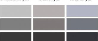
It has many shades:
- lactic;
- chocolate ice cream;
- warm;
- light brown;
- black chocolate;
- chocolate biscuit and others.
In addition, there are many similar shades of cocoa and coffee.
Rules and tips
It is unacceptable to introduce wallpaper of the same shade into the interior or to “overload” the room with other dark colors. The wrong approach to decorating will create the impression of dullness.
Read here: Turquoise curtains in the interior - 70 photos
It is not recommended to hang chocolate curtains in small rooms: visually they will “narrow” even more. The chocolate shade should not be cold. Too strict a tone is allowed only in the office.
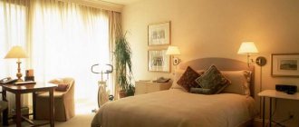
Curtain in the bedroom
Chocolate-colored curtains in the bedroom will be needed by those who spend a lot of time in crowded buildings, who have to talk and communicate a lot, and who are in noisy rooms. Such people often want to be in peace and quiet, to relax not only with their body, but also with their soul.
Bedroom
Chocolate-colored curtains in the bedroom interior will create positive emotions and sensations:
- Relaxation and relaxation.
- Peace and stability.
- Filling with new vitality.
- Feeling of pleasure and bliss.
By the way, if, according to the Chinese teachings of Feng Shui, the curtain is located in the east, in the family and health sector, it has an impact on strengthening health and relationships in the family.
You should carefully select shades.
Dark curtains perfectly absorb sunlight and allow you to have a good rest during the day before the night shift. But if the bedroom is small, then dark colors will visually reduce the space.
Combination options
The design of chocolate curtains will become interesting if you combine several shades at once.
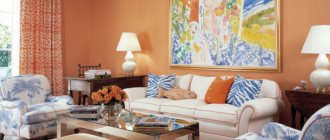
Chocolate and white. The transition between two opposite tones can take place vertically, horizontally or even diagonally. Coffee with milk is an all-time classic.
You should not add a pattern to the curtains; plain panels of these colors do not need additions.
Chocolate and beige. It is advisable if the chocolate pattern is applied to a beige background. Patterns, inclusions and applications of both basic and additional shades are allowed.
Chocolate and blue. The unusual combination suits the interior, which contains blue elements. It is better if the lighter material is located between pieces of dark fabric. Brown in this case may have a slight green tint.
Wenge color for curtains
This is the common name for a rare type of wood extracted from a tropical region. It produces a durable dark brown material. Often used to make flooring, furniture or doors.
The material looks aesthetically pleasing and can withstand loads. Black veins form additional shades.
- Wenge color is valued for its noble appearance, which is due to its depth and richness. It reveals new shades that perfectly complement the interior design. Of these, you can notice burgundy or purple. In a living room or bedroom with good lighting, dark brown curtains are suitable.
- For small rooms, the brown color on curtains appears in the form of patterns, designs or edging. A large dose of brown visually reduces the space, which negatively affects a small room. Brown double curtains will help you decorate the window beautifully. If desired, they can be supplemented with tulle.
- An elegant way to diversify your home interior includes three canvases in the window opening. Two dark shade curtains on the sides, followed by light curtain options. Inside there is a transparent tulle in a pastel shade.
To dilute the dark color, it is recommended to use thread curtains. Add white or cream mesh tulle, playing with contrasts. If the furniture has a similar wenge color, it is better to use dark or light shades for curtains.
However, matches are allowed with the color of the doors or a narrow cabinet placed on a light background of the wall. This looks especially impressive when the door is on the opposite side of the curtains.
Many people wonder what to combine brown curtains with? This can be done with both large and small objects. In the first case, a sofa or a piano looks decent, combined with brown curtains. In the second case, it is appropriate to complement the window opening with various decorative elements or textiles (pillowcases, pillows, bedspreads).
Another effective technique for designers is to combine the color of curtains with other colors in the home interior. For example, brown resonates well with similar colors on walls, furniture or floors. Professionals maintain balanced views when adding wenge color - no more than 15% in the interior.
- However, in the world of interior design, everything is quite subjective. Some people are quite happy with a lot of dark shade in their office or hall.
- Moreover, achieving light balance is achieved with the help of artificial lighting.
- Others, on the contrary, avoid dark tones, turning their room into a real rainbow.
In this case, you should trust the point of view of experts. From a psychological point of view, dark shades are not depression stimulants. But an increased dosage in a monochrome interior will only worsen the situation.