Photo: design-homes.ru Do you adore nature, long walks in parks, fragrant lawns and lush tree crowns? This all seems to breathe green color, so popular in modern interiors. It is filled with harmony and tranquility, and can be used in any room and in any combination. Let's tell you more!
Why do we love green so much?
So familiar to the human eye, many associate it with nature. The forest thicket, tree leaves and soft grass are something that is so rarely seen when living in a concrete jungle.
Surrounded by a natural palette, we feel more comfortable and cosy. Creating such an atmosphere in an apartment has become simply necessary in the modern rhythm of life. When you come home after a hard day at work, a properly selected palette of walls and furniture helps you quickly calm down and set yourself in a positive mood.
Any room can be decorated in green colors. In the bedroom, muted shades of green will have a relaxing effect, helping you better prepare for bed. In your home office, they will improve productivity and concentration. They can also fit organically into small spaces - hallways and bathrooms. And they won't look gloomy in the absence of natural light.
General recommendations
- If you don’t want to experiment and take risks, you should give preference to natural shades that will never go out of fashion and look really light and comfortable.
- The easiest way to implement this color in decoration is painting, since wallpaper or other finishing materials do not always convey the tone that is needed.
- Green will look authentic in styles such as Scandinavian, eco, classic, country, Provence, which put comfort and unity with nature in the first place.
- To complement the “green” direction, it is recommended to use only natural materials for furniture and decor.
- The same shade will look completely different in matte and glossy versions.
The green color itself is neutral and does not require special attention. Even the brightest, acidic tones do not look too aggressive and are easily “covered” by using additional shades.
Main shades
Light green
The juiciest tone, looks very fresh and cheerful.
Instagram @mayav.interiors
There is no need to create a completely light green interior. Most often, this tone is used to create neat accents. If you use it to decorate all the walls, the surfaces may give yellowish reflections on furniture and flooring.
Instagram @arca_designspb
Instagram @polyakova.biz
Instagram @mayav.interiors
Instagram @mayav.interiors
Olive
A pleasant and serene shade that many associate with warm countries and holidays on the seashore.
Instagram @bureau.slovo
Olive can be used to safely paint all walls or highlight large functional areas - the muted tone will not get boring over time. It will help create an atmosphere of calm and tranquility in the room, just like in a bright, achromatic space. But compared to the basic white or beige, olive will look more interesting and will emphasize the refined taste of the owner.
Instagram @interiors_dd
Instagram @yad.design
Instagram @interiors_dd
Instagram @bureau.slovo
- Colors in the interior
If you're tired of white: 4 colors that can be used as a base for your interior
Pistachio
Another warm tone - it is a little lighter than olive, but more muted than light green.
Instagram @olga.design
Pistachio color in the interior looks calm and not provocative, but still constantly attracts attention. It practically does not change depending on the lighting: it looks the same both in natural light and when the lamps are on.
Instagram @yad.design
Instagram @pm__design
Instagram @pm__design
Instagram @olga.design
Mint
The tone of purity and coolness harmonizes well with all pastel colors - powdery, beige, peach, etc. Most often, mint is used to decorate a bright room as a base tone.
Instagram @boytsova_design
It visually “cools” a room with windows facing the sunny side and looks good in both modern and vintage styles - Provence, shabby chic, etc.
Instagram @mayav.interiors
Instagram @boytsova_design
Instagram @boytsova_design
Instagram @mayav.interiors
- Colors in the interior
Mint color in the interior: how to apply and what can be combined with (52 photos)
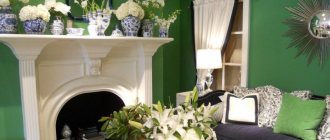
Emerald
The most unusual and mysterious color. In certain lighting it may have a slightly blue tint, like the gemstone of the same name.
Instagram @shpak_jenya_interior
In dark designs, it is used to add a bright accent and maintain a noble concept. Next to black and anthracite shades, emerald color in the interior looks the most advantageous, fully revealing its beauty.
Instagram @marina_podyacheva
Instagram @olga_at_home
Instagram @shpak_jenya_interior
Light green walls
The pure green color of the walls, or rather its light spectrum, will add cheerfulness and cheerfulness to any room. Kindness and openness make this color scheme most suitable for arranging bright interiors.
We recommend reading:
- Panels for wall decoration: stylish and modern wall design options. 130 photos and videos of the use of decorative panels
Walls in the nursery - bright design ideas and nuances of decorating walls and ceilings for the nursery (120 photos and videos)
- Decorating the walls in the kitchen - interior design and DIY wall decoration options (125 photos and videos)
As you can see in the photo of walls of a similar green color, they are best combined with blue, purple or white. Neighborhood with red is also acceptable.
This design is equally appropriate for both the kitchen and the living room. It can also be used to decorate a nursery or bedroom.
The combination of green in the interior with other colors
Watch our video about successful color combinations:
Or read on for more details.
White
White slightly neutralizes the bright tone, and olive and emerald look especially impressive next to it. In combination with mint, you get a pleasant and soft interior that helps you relax better and visually makes the room more spacious. This combo is especially popular in Scandinavian style.
Instagram @shatokhina_buro
It is interesting to use not only pure white, but also decorated with some kind of texture, for example, a veined pattern of marble or stone. All together, this greatly resonates with the concept of naturalness, reminiscent of a forest or mountain landscape.
Instagram @devyashina.design
Instagram @voloshina_design
Instagram @shatokhina_buro
Black
Black harmonizes with all shades of green, enhancing their brightness. And they enliven a dark design, eliminating its gloom and isolation.
Instagram @mayav.interiors
The smaller the area of the room, the more carefully you need to use this combination. The optimal solution is to dilute it with a light palette. This could be furniture, decor, textiles, etc.
Instagram @rindes_studio
Instagram @mayav.interiors
Instagram @alexey_volkov_ab
Instagram @pistolenko_design
Grey
An elegant and win-win combination for any room. Gray is a wonderful background against which even bright accents look restrained and laconic. Wall decoration in this palette does not irritate the eyes and looks quite neutral.
Instagram @bodes_studio
Despite the fact that this combination seems simple to implement, the tonality of gray should be selected carefully. For emerald green, cooler tones are suitable, and with mint and pistachio, gray with a warm undertone is in better harmony.
Instagram @tsaunya_design
Instagram @alexey_volkov_ab
Instagram @bodes_studio
Instagram @alexey_volkov_ab
Pink
A soft and delicate combination that is reminiscent of spring and a fragrant bouquet.
Instagram @trachmarina.design
In the bedroom and nursery, light shades of green are taken as a basis, combining them with pastel versions of pink - light coral, peony, etc. This palette looks elegant and calm, helping you to relax better. For other rooms, you can use brighter and more saturated combinations with green color in the interior. For example, emerald and fuchsia.
Instagram @prosvirin_design
Instagram @trachmarina.design
Instagram @artis.interiors
Instagram @interiors_dd
Red
Being nearby, they emphasize each other's richness. Designers use this bold combination for interiors of temperamental and creative individuals who are open to experimentation.
Instagram @tsaunya_design
Also, many people associate red and green with the New Year and Christmas holidays. They resemble the main attributes: a Christmas tree with scarlet toy balls, holly, pine wreaths with berries, etc.
Instagram @valovision
Instagram @tsaunya_design
Instagram @tsaunya_design
Brown
Another classic tandem that underlies eco- and other styles, where naturalness and naturalness come first.
Instagram @pugachevich_studio
In the photo, the green interior with brown details seems especially pleasant to us, because it is a natural combination. That is why all shades of green look so organic with furniture made of solid wood and veneer, popular wooden slats and wood-effect flooring.
Instagram @polyakova.biz
Instagram @bodes_studio
Instagram @olegkurgaev_design
Instagram @pugachevich_studio
- Colors in the interior
What colors does brown go with in the interior: 10 best options
Blue
It is included in the base of mint and emerald. Together with blue, they create a beautiful play of halftones, so this combination can be used as a base for designs in a cold palette.
Instagram @ostrovskayamarianna
Light blue or sky blue will help make the space feel light and airy. They will add peace to it, cool your emotions and calm you down after a hard day. To prevent the room from seeming dark, it is better to use this combination in small proportions or dilute it with white, beige, gray and other neutral tones.
Instagram @bodes_studio
Instagram @olga_at_home
Instagram @ostrovskayamarianna
- Apartment
Blue apartment interior: 30 stylish examples and best combinations
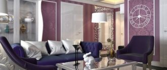
Violet
It will create a magical and expressive combination that takes on a different character depending on the specific tones.
Instagram @design.vera_sheverdenok
Pastel colors are often used in Provence style interiors - mint accents and a small bouquet of lilac lavender. It looks very gentle and light. Another thing is deep purple and emerald. They convey a completely different mood and look impressive and noble together.
Instagram @krasikova0405
Instagram @idealhouse55
Instagram @design.vera_sheverdenok
Yellow
Yellow will make up for the lack of light in the room on a cloudy day or cold season.
Instagram @svoi_design
If you complement this combination with warm shades of wood, you will get a very soulful and cozy interior. And white furniture and decoration will make this composition fresher and “cool down” the blazing yellow.
Instagram @interiors_by_gamak
Instagram @interiors_by_gamak
Instagram @svoi_design
- Colors in the interior
Decorating the interior in yellow colors: 4 universal tips and the best combinations
Orange
Another bright and energetic combination that will also brighten up the interior of the room on the shadow side. And if the sun is shining outside the window, such a palette will sparkle with fancy colors.
Instagram @alexey_volkov_ab
Many people associate it with contrasting autumn colors, when on some trees the leaves have not yet changed their pigment, while others have already turned gold.
Instagram @prosvirin_design
Instagram @daryakos_design
Instagram @voloshina_design
Instagram @alexey_volkov_ab
- Colors in the interior
Orange color in the interior: how to apply and what to combine with (51 photos)
Furniture selection
It has already been said above what green walls are combined with in the interior, so there are no restrictions when choosing furniture. This applies not only to color schemes, but also to materials: products can be made of wood, plastic, metal, glass and other things. Of course, it is important to maintain balance in everything.
Don't be afraid to experiment. A huge green palette allows you to choose the perfect shade for any room, so that a designer sofa, purple bathroom, chest of drawers with a floral print or a wrought-iron table look appropriate and stylish. Creating a visual design project will help you think through the details in advance and check “working” combinations.