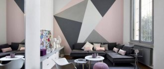
The combination of green and purple in the interior only at first glance seems unusual and in some ways even revolutionary.
Until recently, more traditional color combinations were used in interior design, but bold experiments by modern designers have expanded the general public’s understanding of what is possible and acceptable.
If in living nature the combination of purple and green invariably causes delight, then why not transfer it to the interior of the bedroom, living room, kitchen or library?
Advantages of violet-green colors
Purple-green colors in the kitchen interior
Often the first associations that arise when mentioning the violet-green color scheme are associated with a lavender field, a cozy sunny lawn with wild irises scattered here and there, violets on grandma’s windowsill, luxurious thickets of clematis in a local park, etc.
This perception determines a positive attitude and a feeling of freshness.
By varying the ratio of green and purple, designers achieve completely different effects: sometimes such a room is warm and cozy, sometimes fresh and invigorating.
Sometimes you want to curl up under a warm blanket and enjoy your favorite book, sometimes you want to unleash vigorous activity and break all records for hard work.
Therefore, when decorating a room, you should definitely take into account personal preferences and the main purpose of the room. You shouldn’t ignore the fact that there are many options for classic shades of green and purple, which will significantly expand your options when choosing decor.
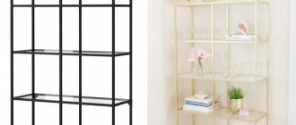
Floor and ceiling decoration
If the housewife decided to decorate the floor in a purple shade, then the walls and ceiling can be of any color, but at least 1 tone lighter than the floor. You can paint the surface in almost any room. If there is good lighting, bright accents stand out beautifully against its background.
When choosing a purple ceiling, you should familiarize yourself with some details:
- a rich ceiling can only be created in large areas with high ceilings;
- a bright ceiling is suitable for a room decorated in a minimalist style;
- This ceiling looks harmonious with white, beige furniture, caramel, milky walls.
When decorating a floor or ceiling in a purple shade, the room will create the effect of high cost, aristocracy and a sense of style.
For which rooms and style directions is the combination used?
Lush, summer greens with bright splashes of purple are ideal for decorating a child's room. If for an adult the combination of two rich shades may seem too tacky and boring, then the child will be delighted with it!
An emerald fleecy carpet will turn into a forest clearing, and lilac, eggplant, and lavender butterflies on light green walls will complement the effect.
Often a green-purple combination is chosen for girls’ quarters. If pink is appropriate for little girls, then adult girls are more impressed by purple or lilac.
These shades are distinguished by tenderness, purity, femininity, but at the same time they lack excessive sweetness, pomposity and immaturity. Interspersed with green accents will help diversify the perception and refresh the room.
The trendsetters of the Provence style were not spared the successful combination of purple and green in the interior. The warm summer in the French countryside, with its lush vineyards and spacious lavender fields, has smoothly migrated into the interior of living rooms, bedrooms, kitchens and bathrooms.
As a rule, to decorate rooms in the Provence style, pastel, soft, watercolor colors are chosen - delicate violet, muted greenery, delicate fragrant with a tint of heavenly azure.
In the living room, the walls are often decorated with pale purple decorative plaster with a volumetric effect, furniture with green upholstery is placed and the overall color is complemented with decorative elements of a floral design. In the kitchen, one of the dominant colors is used for painting the walls, the other for the furniture.
Don't forget that lavender is often used to make aromatic oils, soaps, shower gels and other skin care products and water treatments. Using this analogy, designers generously use shades of purple to create a calming atmosphere in the bathroom, diluting delicate lavender with unobtrusive, eye-pleasing greenery.
This applies not only to tiles and sanitary ware, but also towels, washcloths, soap, bottles of gels and shampoos and, of course, wall images of a thematic nature.
Why do we love green so much?
So familiar to the human eye, many associate it with nature. The forest thicket, tree leaves and soft grass are something that is so rarely seen when living in a concrete jungle.
Surrounded by a natural palette, we feel more comfortable and cosy. Creating such an atmosphere in an apartment has become simply necessary in the modern rhythm of life. When you come home after a hard day at work, a properly selected palette of walls and furniture helps you quickly calm down and set yourself in a positive mood.
Any room can be decorated in green colors. In the bedroom, muted shades of green will have a relaxing effect, helping you better prepare for bed. In your home office, they will improve productivity and concentration. They can also fit organically into small spaces - hallways and bathrooms. And they won't look gloomy in the absence of natural light.
How to combine correctly
Since the green-purple combination represents a whole range of possible options, it would be advisable to consider the most successful combinations. Among the most commonly used shades of purple, we highlight the following:
- Classic purple. This option is complemented favorably by the muted green of autumn grass, an unobtrusive shade of lime or pistachio, as well as the color of copper that has turned green with time. This duet can be diluted with yellowness in all the richness of its manifestation - from a calm sand color to a bright sunny color.
- Lavender. Varieties of green such as marsh or pistachio shade well. Brass, green tea or olive look no less advantageous in combination with lavender. Delicate peach, the color of whipped cream or yellow-brown tones will help to shift the accents a little.
- Lilac. Similar to lavender, this option looks great when combined with marsh or chartreuse. In addition, you can safely choose olive, khaki, gray or yellow-green. The most commonly chosen intermediate colors are ivory, light gray, sand or cream.
- Pervanche (a variant of purple, close to blue). This is a rather complex color, for which it is difficult to choose greenery that emphasizes its advantages. The most acceptable tones include olive, brass or muted grassy. For a layer, gray, juicy peach or brown are suitable.
Despite the proposed options, you should not take them as the ultimate truth. Sometimes the most successful solutions are born as a result of the most daring experiments and combinations of incompatible things.
Much also depends on the lighting of the room, its parameters, as well as your personal preferences and ideas about beauty.
How to choose colors for the interior using tables?
Colors in the interior have many abilities, the main of which is to create comfort and a favorable atmosphere for people. But the color scheme in the room can also expand or narrow the space. That is why you should be responsible in choosing colors for the interior and their combination. A table of color combinations in the interior, where perfectly combined colors are connected by lines, will be an excellent assistant in this regard.
How to correctly combine colors in the interior?
Many people wonder how to use the color combination table in the interior? Sometimes it is difficult and not entirely convenient. Below are tables of color combinations in an accessible and understandable form, where all popular shades are described. The trendy color is the main one, followed by colors that match it, which can be safely combined. An accent color will add brightness and creativity to the interior.
This table will tell you not only about the correct combination of colors in the interior, but also inform you about the meanings of some colors.
| Main color | Combines with flowers | Doesn't match with flowers | Psychology and influence of color |
| Grey | Blue, pink, brown, yellow, red, black, blue, lilac | Green, orange | Gives the room despondency and sadness |
| Lilac | Grey, chestnut, light purple | Red, orange, yellow, brown, black | Mystical, mysterious and mysterious interior |
| Violet | Light green, golden, orange, yellow | Dark green, brown, gray, red | Allows a person to calm down and find harmony of soul. Purple is the color of wisdom and inspiration |
| Pink | Brown, gray, burgundy | Yellow, orange, black | Romantic interior |
| Brown | Golden, grey, beige, pink, yellow | Chestnut, burgundy, lilac | Causes depression when spending a long time in an interior with a predominance of brown color |
| Blue | Red, grey, burgundy, gold | Green, lilac, brown | Makes the room cool, sometimes uncomfortable |
| Blue | Red, orange, blue, light purple | Golden, yellow, burgundy | Makes the interior cold; if the color blue is too much, scandals occur more often in the room |
| Green | Red, black, burgundy, yellow, orange | Grey, purple, blue | Has a calming and relaxing effect |
| Yellow | Grey, purple, brown, green, black | Lilac, blue, burgundy, pink | The illusion of sunlight, yellow color gives good mood and cheerfulness |
| Red | Blue, green, grey, gold, yellow, black | Purple, chestnut, brown | Uplifts the mood, keeps you relaxed, suitable for passionate people |
| White | Combines with any colors and their shades, as it contains all color spectrums | There are none | Instills a feeling of superiority, makes the room cold |
| Black | Red, grey, white, yellow, green | Pink, lilac, beige | Narrows the space, instills fear in a person, makes the interior mysterious |
Best ways to use it
Lilac and green in the bedroom
As already mentioned, purple and green in interior design should be used with extreme caution and taking into account a number of nuances.
As a rule, in spacious rooms it is allowed to use both colors in equal quantities.
If living space is limited, which is not at all uncommon in apartments with a modern layout, it is recommended to take one shade as a basis and complement it with fragments of another.
Here are some common room design options:
- Quite often, designers resort to the following technique: they paint three walls in a light green, olive or lime tone, and for the fourth they choose one of the purple options. This solution allows you to show your imagination in the selection of decorative elements, adhering to the given color scheme.
- The technique of introducing accents of contrasting colors is often used. In such an interior, one dominant shade completely prevails. For example, a purple bedroom can be refreshed with splashes of green: put a table lamp, lay out a small oval-shaped carpet, decorate the walls with paintings, and decorate the pouf and pillows accordingly.
- Another winning way is to place green and purple accents in a room done in subdued colors. In this way you can significantly enliven a white, cream, white, sand or gray interior. Green and purple vases, floor lamps, wall pictures, armchairs, poufs, pillows, and decorative elements can transform a room, achieving a stunning effect and creating a feeling of freshness.
Decorative elements often include handicrafts, paintings, posters, tapestries and wall hangings with floral motifs. Particularly popular are images of irises, violets, lilacs, lilies and lavender.
Room interiors
The following useful tips will help homeowners make room decoration in purple-green tones a winner:
- Choose no more than 2-3 primary colors and 2 more shades. You can combine green and purple with yellow, brown, white or cream. You can also additionally choose a couple of tones of green and purple. A larger number of colors will make the interior tacky.
- Minimal “scatter” of shades in the room. You can either concentrate one color in a certain area of the room or dilute it with splashes. But before implementation, evaluate the selected project as a whole: it should not be too colorful.
- The presence of green and purple colors in furniture and decor. If only the finishing is done in the chosen range, then the decor will seem alienated (chosen from another interior). The selection of furniture, textiles and decor in appropriate colors will guarantee the integrity of the design.
Living room
In a spacious hall, the decoration should be made of light green or purple and complemented by minor dark patterns (or inclusions) in the chosen range. Living room textiles can be brighter and stand out. So, in a light purple spacious room, the presence of bright green and lilac pillows, light green curtains and a light green rug will create an unusual combination. To organize a comfortable recreation area and spend leisure time, it is recommended to choose a set of a sofa and a pair of armchairs (or ottomans) in a light purple color. Near them you can place a coffee table with a glass top. Also, a fairly simple option for introducing the chosen color scheme into the hall would be to paint the walls in a monochromatic light green color and install furniture, choosing textiles in a dark purple color. Living dark green plants would also be appropriate in such a room.
Bedroom
In the children's and adult bedrooms there are quite a few options for implementing the purple-green color scheme. The most interesting solutions are the following:
- glossy light purple ceiling + very light green wallpaper (almost white) + beige upholstered furniture and purple textiles;
- white ceiling and floor + dark purple curtains and sofa + swamp walls and textiles on the bed;
- light green wall decoration + beige furniture + purple inclusions (pillows, bedspreads, paintings and a rug on the floor);
- white trim on three walls (+ green wall behind the head of the bed) + green curtains + purple bed and rug on the floor;
- purple decoration of three walls (+ photo wallpaper with green patterns behind the head of the bed) + beige furniture + green curtains;
- dark purple wall decoration + glossy lime ceiling + yellow and green textiles and furniture.
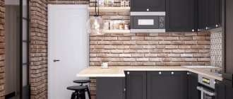
Kitchen
The right solution for a bright and original kitchen decoration would be to choose lilac as the main finishing color. The set and furniture should be selected in a bright green design. For cabinets and cabinets, glossy facades will be preferable. Light color finishes will create a calm atmosphere, colorful furniture will add liveliness to the interior. It is recommended to pay special attention to the selection of textiles and design of the apron. If desired, the owners can lay out the kitchen apron from purple tiles with soft purple patterns. A plastic panel with images of purple flowers (violets or irises) with green leaves will also look good. As for the curtains, they can be slightly darker than the decoration itself (so as not to blend in with the walls) or be similar to the facade of the selected set.
Bathroom
In a small room, you need to select the color scheme of the design very carefully. We recommend choosing finishes in marsh and lilac colors. Warm colors will create a special coziness and ensure comfortable water procedures. At the same time, laying white flooring and choosing white sanitary ware will help prevent a small bathroom from becoming dark. Against the background of rich tones of wall decoration, they will look really advantageous. If desired, only one wall can be made lilac (or marsh). Vertically dividing lilac walls with swamp stripes is also allowed. Or you can make this division horizontal, thus dividing the wall into two equal parts or highlighting one of the colors at the bottom 1/3 of the wall. The presence of patterns on the selected finish is contraindicated: they will add confusion to the created design.
Study
To create a favorable working atmosphere in your own office, it is recommended to make the predominant color not purple, but green. So, the walls can be covered with marsh or dark grass wallpaper. Dark green curtains will help complement the design. The furniture you choose should be dark brown in color. But you should look for a sofa and armchair in purple or lilac colors. Another design option would be a combination of marsh and purple against the background of a predominant brown. In this format, the office may look like this: brown flooring (a leather sofa and chair, wardrobe and desk are purchased in the same color), marsh wallpaper with dark purple patterns. You can also choose brown wallpaper with light green patterns. But then leather furniture should be decorated in a lilac color.
Hallway
For the hallway, as well as for the plumbing room, you should choose soft colors. The right solution would be to decorate the walls in a grassy color scheme. Regular painting of surfaces or pasting of grassy wallpaper with dark green patterns is allowed. But the installed wardrobe, bench or chest of drawers should have a very dark purple color. Then the combination created will look original. True, for such a room it is better to create bright ceiling lighting (spotlights or flat ceiling chandeliers). Another option for decorating the front room is to paint or wallpaper the walls in a marsh color and install a banquette, chest of drawers and wardrobe in a lilac color scheme. Warm tones will complement each other, so when entering a house with such an entrance hall, both household members and guests will feel a favorable homely atmosphere.
Purple-green kitchens: design options
Purple and green kitchens are a popular trend at the moment. More and more housewives are turning to furniture stores and kitchen furniture manufacturing companies with the intention of purchasing just this option.
When decorating a kitchen in this color scheme, the following solutions are most often used in practice:
- Zoning space using two contrasting colors. This option is especially relevant for a kitchen combined with a living room. For the cooking area choose light green, olive, pistachio shades, and for the relaxation area - lilac or lavender.
- Green panel furniture with a purple tabletop. Contrasting vertical and horizontal lines with contrasting colors will help visually expand the space.
- Lilac walls, kitchen furniture in herbal shades, purple dishes and accessories. Light walls go well with richer decorative elements and richer colored cutlery, and the set acts as an effective contrast.
Lilac textiles: texture matters
The purple tint in textiles is an excellent solution for creating coziness and comfort in the home. Sofas, armchairs or chairs decorated in lavender tones are pleasing to the eye. They relax and make you want to sit down or lie down.
You can experiment with chairs, completely wrap them in lilac upholstery or partially paint them. If the interior of the room is restrained and monochrome, then eggplant or lavender chairs will add zest and complement the composition. If you introduce a dark and rich color, it will not violate the seriousness of the design and rigor.
Purple shades in the interior will not be annoying if you purchase bedspreads, rugs, high-pile rugs, bed linen and curtains in this color.
Don't be intimidated by this color when creating a design indoors. There are many shades; with the right combination with other tones and choosing a specific area or objects that can be decorated in purple colors, the room will have a solemn, festive, cozy atmosphere.
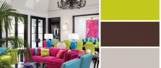
Green-violet colors in the living room interior
In classic living space layouts, the most spacious and bright room is traditionally allocated to the living room. This solution allows the designer’s imagination to run wild and realize the most daring combinations of green and purple in various proportions.
As a rule, when decorating a living room, not two basic shades are used, but a fairly wide color spectrum.
A large, luxurious living room in a Victorian or Colonial style with quality furniture and wide windows will look great in blueberry salad. A noble, rich shade of purple will serve as a dominant feature in such an interior, and a light green shade will add a refreshing touch.
Blueberry textiles and carpet in the living room perfectly echo the light purple wallpaper on the walls, the beauty of which is emphasized by paintings depicting a pine forest or birch grove.
If you set your priorities in reverse order and make the living room green, this option will be especially appropriate if you have a panoramic view from the window - hilly terrain, park, forest belt. This way, the room will serve as a natural extension of the greenery outside the room. Violet splashes will create a spectacular contrast.
What styles use the combination?
The purple-green design combination is not suitable for every style. You should choose the optimal direction among the following options:
- art deco; Light purple trim with dark purple patterns combined with dark green furniture will create a restrained and original interior.
- modern; Light purple/green and a lightened second color will help create a comfortable environment in the house.
- classic; Dark green and dark brown as the main colors, as well as light purple furniture and textiles will help maintain a classic design in any room in the apartment.
- urban; Allows a combination of grass and lilac as the main colors. Light gray or light coffee can be used as additions to them.
- Oriental. A predominant bright purple or violet-blue with small splashes of lime and gold will help create a real oriental apartment. But decor, furniture, and textiles for this area should be selected as carefully as possible.
Combinations of green and purple in the bedroom interior
The bedroom has a special place in every house or apartment. Here we regain strength after a busy day at work, remain alone with ourselves, and spend our leisure time in a relaxing environment that promotes relaxation.
The interior of the room must correspond to the temperament of the owners and meet their idea of \u200b\u200bthe aesthetic component. Therefore, you should approach the design of your bedroom with all responsibility:
- For a calm, balanced person, soft, blurry tones are suitable. Pastel shades of green and purple in any combination will serve as a win-win option.
- For passionate people and creative individuals, designers offer bold combinations of bright, rich tones. Particular attention should be paid to textiles: curtains, bedspreads, bed linen.
- Adventurous notes will appeal to lovers of the East. In such a bedroom you can play with the shimmer of two precious stones: emerald and alexandrite. Satin, silk and chiffon will come in handy in interior design.
As practice shows, the combination of purple and green colors suggests a lot of variations, each of which finds a worthy embodiment.
Varieties of lilac color and their use
A wide variety of lilac shades allows you to choose the required tonality for each interior design option. You need a romantic setting, an atmosphere of tranquility, or it is important to emphasize the luxury and sophistication of the interior - just choose the right shade. There are deep violet shades, lavender and lilac tones, purple and violet, plum and eggplant, amethyst and indigo colors.
Unusual living room design Source sv.decorexpro.com
Lilac is one of the variations of the color purple. The percentage of red, blue and white tones in its composition allows you to obtain pale and bright tones, lavender and amethyst variations, and blue-lilac shades.
If we talk about interior styles, then:
- Lavender is the best color for Provence style.
- Russian Art Nouveau allows the use of iris shade in its interiors.
- Rich and bright shades are suitable for modern dynamic styles such as hi-tech, pop art and fusion.
- Ethnic oriental styles - Moroccan, Indian or Arabic - are unthinkable without the mysterious purple color.
Green and purple in the hallway
Many homeowners make the serious mistake of paying attention to the design of the living room, bedroom, kitchen and bathroom, but underestimating the functional importance of the hallway. But it is from this room that the acquaintance with the house begins and the first impression of its inhabitants is formed.
It is in the hallway that we find ourselves when we return from work in the evening and strive for peace and a meeting with loved ones and family. The combination of green and purple in the interior of the hallway seems especially successful: it can lift your spirits from the first seconds, bring a feeling of freshness and remind you of warm summer days even on the most stormy days.
The dominant role when decorating a hallway is most often given to purple. The gradation effect is wonderful when dark eggplant gradually turns into light lilac, visually expanding the space.
An original splash of greenery is often achieved through lighting fixtures. Greenish light from sconces, spotlights or lamps will add comfort.
No less interesting is the alternation of glossy and matte surfaces in the hallway. The glossy light green ceiling goes well with the decorative purple plaster on the walls.
Matte ceiling structures in pistachio shades harmonize wonderfully with shiny fuchsia wallpaper.
In addition, do not forget about the use of contrasts when zoning space. If the hallway smoothly transitions into the living room, it is worth separating one functional area from another using an appropriate color scheme.
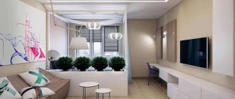
Kitchen-living room interior with lilac walls and furniture
In this room, the designer managed to perfectly combine royal purple with soft chocolate color. Chocolate shades are more present in the kitchen and living room areas. For the facades of the upper cabinets, we chose the color of coffee with milk, which helps create harmony and comfort. A playful mosaic on a kitchen apron will be a great way to wake you up in the morning.
Two opposite walls in the sleeping area were covered with purple textured wallpaper. Since this area is located in a corner, good lighting was required. A huge chandelier in the form of a suspended round lampshade and LED strips along the contour of the suspended ceiling allow you to create different lighting variations.
The rest of the living space ceiling has rows of spotlights. A modular sofa with chocolate upholstery is a modern solution to the problem of sleeping space. A couple of meters away there is a living room, a table and 6 chairs.
Color of the year 2022 - Ultraviolet
In 2022, ultraviolet 18-3838 Ultra Violet was recognized as the main color. In history, ultraviolet is associated with mysticism. It symbolizes the galaxy, the future and new technologies, self-expression, creativity.
The new color scheme is based on the fashion collections presented at New York Fashion Week.
The new palette features various shades of this color that can be used for interior design. Among them are:
| Pink Beighton Road 18-2527 TCX | Baysenberry Pink 19-2431 TCX | color crimson glow 19-2432 TCX | magenta festival 19-2434 TCX |
| bright purple 18-3025 TCX | clover flower color 18-2320 TCX | Wine Purple 18-2929 TCX | deep orchid color 18-3022 TCX |
| purple orchid color 18-3027 TCX | lilac meadow color 18-3230 TCX | bright violet color 18-3339 TCX | Byzantine purple 19-3138 TCX |
| Mallow Purple 19-2924 TCX | phlox color 19-2820 TCX | gentle and romantic lavender 14-3207 TCX | grape juice color 19-3230 TCX |
| sparkling grape color 19-3336 TCX | sunset purple 19-3424 TCX | hyacinth violet color 18-3331 TCX | Dahlia Violet 18-3324 TCX |
| amaranth color 19-2410 TCX | magenta purple 19-2428 TCX | potion purple 19-2430 TCX | dark purple 19-2524 TCX |
| purple heart color 18-3520 TCX | royal lilac color 18-3531 TCX | royal purple 19-3620 TCX | passionate violet shade 19-3223 TCX |