» Yellow » Sand color, combination with it in clothing and interior. Photo
Sand color is a soft and attractive shade between yellow and beige. It goes well with other colors in clothing and interior design. Photo
Sand color is midway in tone between yellow and beige. It reminds us of beaches with warm sand that goes well with turquoise water and coastal greenery. Calming, warm, unobtrusive, it puts you in a positive mood. Like all natural paints, it has a complex structure. It includes yellow, red, blue, gray, white. A slight predominance in the yellow side sets a cheerful tone, blue and red give confidence and intelligence, and white and gray components give moderation. Thus, sandy signifies contentment with life and confidence in the future.
In addition to the semantic load, the color itself is very aesthetic. Those close to the beige tone can be classified as basic colors, those that are more yellow are independent, however, they will also perform a partial function of neutral colors.
Sand color – what is it?
- A soft and attractive shade between yellow and beige is sand. It harmonizes perfectly with other tones of clothing, is very warm and calm, and improves your mood. The following shades of sand color can be identified: Light sand – light sand under the rays of the sun. A very delicate shade, pastel and light.
- Classic sand - complex and soft, almost neutral. Popular in safari style.
- Yellow-sand – sunny, soft and pleasant. Belongs to the yellow spectrum.
- Sand gray is a warm gray shade that differs from the main variations of this color.
- Sand Beige is a soft medium beige tone with hints of yellow. A very common shade of this range.
- Brown-sand – looks incredibly luxurious.
Varieties of sand palette
As a rule, three types of sand color can be distinguished:
- The grayish tint belongs to the cold range. It is associated with tranquility, representing the colors of nature. This design is used in minimalism and other eco-styles. In interiors, grayish-sand color is most often combined with cream tones; small inclusions can be made with bright representatives of the palette.
- Yellow, closer to gold, represents warm sand colors. Paints of this tone are often used in bedrooms and children's rooms. They are very popular as they represent joy and positivity. In interiors it is recommended to combine golden sand color with white.
- The beige shade is light and calm. It is ideal for rooms whose windows face north. Thanks to this decoration, the space becomes visually lighter and warmer.
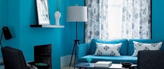
In the living room
Warm decoration in the living room creates coziness and allows you to practically use every corner of the room. It is recommended to use brown or light brown as an additional color. They are suitable for furniture and textiles. For example, in a spacious room with a “sand” finish, a sofa, shelves, and a coffee table in light brown tones will look good. You can also choose champagne or cream colors as a base. With them, golden brown will look appropriate and will help visually expand the room and make it more spacious. To highlight recreation areas, you can use light olive or light salmon textiles. To highlight the design in contrast, it is recommended to use rich colors: turquoise, golden, olive.
What styles does it suit?
Neutral color is ideal for any stylistic direction. After all, it can be used as a base or a discreet addition. Suitable for the following styles:
- high tech. The optimal color for the direction will not be the pure color of sand, but its colors: bronze, copper. The presence of such glossy inserts on the facades and stretch ceilings will emphasize the originality of the direction.
- country. Kind and warm country music is the best solution for the home. Its basic design can easily be done in a golden brown color or its colors.
- chalet. A discreet chalet would not be complete without a splash of pastel colors. It will look good with wood decor or trim.
- Art Deco. Pastel colors are suitable as a base. But to dilute it in art deco is brown or black.
- classical. The use of golden-brown pastels as a basis for classics makes it easy to play with exquisite furniture and decor.
- minimalism. Lightened pastel colors are a good finishing option for minimalism. As an addition, you can use brown or dark brown.
Brown sand combined
Brown sand is also a shade of beige: dark, warm. He's even more attractive than the previous one. Complex, medium-bright shades next to it have a glowing effect. Very feminine and luxurious. Included in the basic wardrobe for all occasions.
Read also: How to open a Techcom intercom without a key
It can be combined with shrimp, coral pink, coral red, copper, red, amber, yellow-brown, protective, brown-green, sky blue, cobalt, brown-violet, eggplant, dark chocolate, papyrus, black.
General concept
We all love summer very much, with its warm and good weather, bright scorching sun and pleasant, gentle breeze. It’s a pity that summer passes quickly in our climate, so I really want to leave it in my memory, or even better, take it with me. Sand-colored wallpaper pasted in the apartment will help to refresh pleasant memories of a wonderful time of year.
Sand color is one of the basic shades of beige, which is recognized as the most universal color after white.
In the interior of rooms, sand color can be combined with both light and dark tones. It looks great with burgundy, brown, black colors, and also harmoniously combines with white, yellow, and other shades of beige.
The most popular sand tones
Sand color has a large variety of different shades, which significantly expands the scope of its application (you can choose from both light and dark).
When decorating interiors in residential premises and apartments, it is better to give preference to warm and neutral tones. Due to their versatility, they can be combined well with different colors and decorative elements.
The most popular shades of sand include:
- Sunny golden sand.
- Light beige.
- Wet sand with a gray tint.
- Straw shade.
- Cappuccino shade.
- Baked khaki.
In interior design in apartments and private houses, as a rule, calm, neutral tones are used because they create a feeling of coziness and comfort, and, at the same time, look elegant and presentable.
It is recommended to use white or golden beige as decoration for ceilings and walls. Straw and coffee milk are used in most cases when decorating pieces of furniture.
Popular shades of beige
The range of tones of this color is quite noticeable - from linen to rusty beige. Beige includes creamy and champagne colors, “white pearls” and “pistils of unripe corn.”
Shades can be yellow, pink, gray and brown, as well as peach, green, purple, orange. They are divided into neutral, cold (more gray) and warm (more yellow).
All this is important to know, since color nuances affect perception.
Organic stylistic combinations
Sand color is often associated with oriental style. When choosing a beige shade, the emphasis should be on oriental prints and elements; the room looks decent with framed paintings and vases. A sofa in an oriental interior should be low, and its legs must be decorated with carvings.
- An abundance of small pillows is welcome. Only too bright shades are not used - blue or rich red, this violates the harmony of the beige interior. The living room will be completely transformed if you lay a real Persian carpet on the floor.
- However, sand shades can also be used in classic styles. This opens up wide possibilities for using a rich palette of colors. The sand color in such interiors turns into a neutral color, for which you can choose a wide variety of colors. You can choose wallpaper or wood paneling for the walls to match the beige color.
Design ideas
Beige wallpaper is universal, it is suitable for different rooms. You can add some zest to your interior by putting some design tips into practice.
- In the bedroom, paste beige wallpaper with flowers above the head of the bed.
- The living room will be decorated with beige-hued wallpaper with golden splashes and mother-of-pearl. It will look solemn and luxurious.
- A good solution is to combine plain wallpaper and patterned coverings (or another tone) in the living room, choosing an accent wall for the latter. Large patterns will suit an accent wall in a large living room.
- A beige accent wall with imitation brickwork will look great in the kitchen. For this room, a good option would be to choose non-woven wallpaper.
- Large rooms with beige walls will be combined with natural wooden furniture.
- In beige rooms, tones are very important. The furniture should be somewhat lighter than the floor, but at the same time darker than the walls.
- The beige wall covering is harmonized with mint-colored curtains, as well as chocolate and milky tones, with silver or gold-colored details. If there is an ornament on a beige wall, you should hang plain curtains, without any patterns. On the contrary, if the wallpaper is without a pattern or relief, then curtains with ornaments look better.
- The recreation area should have calm tones. They zone the space by sticking wallpaper of different structures.
- It is better to cover a children's bedroom with beige coverings with patterns, animal designs, and natural motifs. The room should be complemented with brightly colored textiles and toys of the same catchy colors.
To make beige wallpaper “play” in the living room, multi-level lighting is used.
Sand-colored manicure
Nail art, in which sand-colored nails are made, is of high interest among fashionistas. It looks very impressive and natural. Popular nail design options:
- French manicure;
- monochrome design;
- matte manicure;
- sand design in combination with other shades;
- sand nail art with drawings, rhinestones, appliqués;
- sand manicure with elegant patterns.
What goes with it?
The soft and warm color goes well with any colors: catchy, dark, pastel. In the interior they complement and emphasize each other.
The most beautiful and sophisticated additions to light colors include:
- blue, turquoise. Considered a classic option. Reminds me of the sun, summer, sea. Suitable for styling rooms of any size. Ideal for creating nautical decorations.
- brown, light pink. This range highlights the sophistication of the design. Brown emphasizes the light color of the sand, and pink eliminates the blandness of the style.
- black, cream. The presence of minor black inclusions sets off similar colors. This option is applicable even for small rooms.
- light brown, dark green or olive. The gamma is perfect for a neutral style. Ideal for offices and halls.
- carrot, light pink or salmon. A simple tandem allows you to create a light and warm design. In such a room you will always feel comfortable.
Features of beige wallpaper
Beige color, as defined in dictionaries, is light brown, having a grayish or yellowish tint. It is sometimes described as a cross between light brown and yellow. To better understand what it is like, you can imagine the color of unbleached wool.
Types
There are several types of sand:
- Sandy golden. This is a warm shade that looks like straw. He is unobtrusive. It is very cozy and is liked by many people who willingly use it in their interior.
- Sandy with a grayish tint, which is considered cold. It looks like khaki or a very light café au lait, or a rather cool shade of beige. Similar tones are often included in interior design in the style of Swedish minimalism or rustic, eco-minimalism, similar trends based on natural earthy colors.
In our area, owners are more likely to prefer beige and brown shades than completely sand or this sand and white. Modern houses in the West are often decorated in sand and white tones, which looks simple and comfortable. If you add white to sand with a golden tint, it will turn out nice and you can choose materials in such colors that are not expensive. If you prefer more strict combinations in the interior, then you will be pleased with cold sand with gray and the addition of baked milk or cream.
Suitable for Sandy:
- Tenderness of cream.
- White clarity.
- Wood in cherry shades.
- Linen.
- Stones with beige tone.
- Copper or bronze.
- Candy colors: toffee or caramel. Rust color.
- Accents on mother-of-pearl or objects, bronze or bronze finishes are good.
- A little orange wouldn't hurt.
Not suitable for Sandy:
- A pinkish shade of gray and brown.
- Aluminum with steel.
- The stones are blue or with blue.
- Furniture or objects made of wood with a pinkish tint.
- Too bright accessories.
- Lots of black in interior design.
Originality for a long time
To all the advantages of decorating a room with beige wallpaper, you can add one more point. Due to the friendliness of beige to other colors and shades, it is sometimes possible to introduce new tones into the interior, making it more fashionable.
At the same time, the perception of the situation will not deteriorate, and the room will remain stylish, original and modern at all times.
Sand color matches
Sand color goes well with many colors. His preferences lie in a group of complex tones (like himself). It contrasts well with cool tones and can complement pleasant warm ones. He likes medium contrast: wear light tones and not very dark ones. Neutral tones pleasantly set off both its tone and warm structure.
There are 10 palettes with 5 shades for you.
Color combination: sand and pink - this tone loves delicate light shades, both warm and cold. The combination balances on the verge of a light, reverent image and a soft, relaxing look. Example: a pair with pale pink, royal pink, pearl pink, lilac pink, lilac.
The combination of sand and red is a bombshell, but still a very aesthetic pairing. You can often find a combination of the main color with burgundy. Saturated red tones look with sand - contrasting in brightness and lightness. Consider a combination with scarlet, Chinese red, red-orange, terracotta, carmine.
The combination of sand and orange is a combination of related shades, but within this pair you can see both the contrast of the bright spot and the light. The more complex the orange tones, the more interesting the combination. Try combining sand with mango, orange-coral, golden-copper, pumpkin, red-orange.
The combination of sand and yellow is a combination in one color scheme. With their help you can achieve gloss, shine, depth and volume relative to the main color. For this you can use the following tones: vanilla, apricot, mustard, amber, yellow-brown.
Sand is combined with warm shades of green to form a pleasant, sunny natural palette. Greens, for the most part, are complex shades; moreover, the colors that form them in a different proportion create sand, so they fit well together. Combine the color of sand with chartreuse, yellow-green, olive, marsh, brown-green.
Sand is combined with cool shades of green based on thermal and light contrast. With tones such as pale grey-green, wormwood, emerald, malachite, dark emerald, the base shade looks calmer and warmer than otherwise.
The color combination: sand and blue is one of the most pleasant, since it is what is associated with a tropical beach: turquoise water, blue sky. This is a pronounced cold-warm contrast, and in the case of blue, light resonance. Take note of interesting combinations with gray-blue, thrush egg color, dark turquoise, Prussian blue, dark blue.
The combination of sand and purple should be considered from the point of view of complementary colors: yellow is complementary to purple. This same couple is more pleasant than the shrill founder of the contrast. Lilac and purple shades, such as lilac-lilac, amethyst, purple, blackberry, red-violet, will be interesting.
Combination of sand and brown . Brown is a close relative of sand. If the latter is replaced, we will get a yellow-brown color scheme. The basic color easily combines with almost all tones of yellow-brown, gray-brown, red-brown, and medium colors in this range. For example, we have selected: oak color, yellow-brown cappuccino, umber, oak color.
The combination of sand with white, gray and black is a classic palette where the color of sand is brought to the fore. Moreover, all the selected shades are cooler than ours, therefore the thermal contrast will work. An example of a combination with cream, taupe, taupe, anthracite, black.
Complex combination with sand color
Home textiles for beige living room
Textiles soften the strict lines and fit wonderfully into the overall calming atmosphere of the beige living room. It can be:
- cozy blankets, bedspreads and tablecloths;
- woven and knitted napkins;
- rugs, decorative pillows;
- drapes and light curtains.
It is not necessary to choose products in beige color, although gradient tints of different shades of the same color are in fashion today. Textiles in soft pastel colors complement the warm, delicate palette. And bright, rich colors serve as atmospheric decor that enlivens the interior.
Application
Sand colors will be appropriate in any room of the apartment. They will bring harmony and peace to every room, illuminate it with their light and add warmth.
In the living room
Warm decoration in the living room creates coziness and allows you to practically use every corner of the room. It is recommended to use brown or light brown as an additional color. They are suitable for furniture and textiles. For example, in a spacious room with a “sand” finish, a sofa, shelves, and a coffee table in light brown tones will look good. You can also choose champagne or cream colors as a base. With them, golden brown will look appropriate and will help visually expand the room and make it more spacious.
To highlight recreation areas, you can use light olive or light salmon textiles. To highlight the design in contrast, it is recommended to use rich colors: turquoise, golden, olive.
In the bedroom
Using warm colors of golden brown will help make the bedroom comfortable and cozy. It is advisable to give preference to lightened pastel finishes. Interspersed with black or dark brown will help highlight its sophistication. For example, the owners will be able to cover one wall with cream wallpaper with dark contrasting patterns. Decorate the rest in light colors
To highlight the bed as the main interior element in a pastel finish, you can use textiles with blue or yellow patterns.
Or you can simply decorate the sleeping bed with sofa pillows in turquoise and pumpkin colors. It is recommended to buy canvases chosen for windows in colors that match the pillows and other textiles. You can also zoning a room by combining pastel and bright colors.
A small cream or light brown partition will help to beautifully separate a bright relaxation area from a quiet work area.
In the kitchen
In the kitchen, golden-brown color will look perfect in glossy facades. They will emphasize his special warmth. Be sure to install a set in this color in a room located on the north side. The presence of warm colors will ensure the creation of comfort. But it is not recommended to choose finishes in similar colors: in the absence of a high-quality hood and infrequent cleaning, its appearance will quickly be ruined.
It is better to give preference to decorative accents. Light translucent curtains and golden-brown tulle will emphasize the neatness of the window.
This coloring of a corner or dining area will facilitate comfortable tea drinking and meals. An interesting solution would be to install a light brown set and decorate a kitchen apron made of mosaics in the color scheme of sand. The beautiful work area of the tabletop can be complemented by mosaic vases for fruits and sweets in appropriate colors.
In the nursery
Champagne finishes are ideal for a newborn's nursery. Furniture should be selected in light brown colors. For the room where the girl lives, the following colors should be used: champagne, salmon, light salmon. If it is on the south side, you can use the following colors: cream, lilac, light lilac. For the room where the boy lives, you can combine golden brown and olive or turquoise colors.
A universal solution is a combination of champagne or darker colors and orange, yellow. Teens may like combining cinnamon or caramel with white and burgundy.
When choosing yellow and orange colors, you should choose lightened colors. Otherwise, the created environment will not help the child concentrate on learning and relaxation: he will be too excited.
In bathroom
The champagne color is perfect for decorating all the walls in the bathroom. Tiles of this color will make even a small room bright and warm. Caramel is also good for this task. But it is recommended to combine it with white and brown. Brown is ideal for framing a ceiling or dividing a room horizontally. To do this, you should choose thin borders.
Placing the curb 10 cm below the walls will help raise the height of the walls. The rest of the walls and ceiling should be painted white.
A combination of dark brown and light colors will help divide the room and highlight the shower area. If champagne is in tandem only with white color, you need to highlight the plumbing fixtures. To do this, it is recommended to choose models with bronze, brass taps and valves. The furniture can be installed in white with bronze or brass fittings.
A variety of beige sofa models for the living room: how to make the right choice
The beige interior looks elegant and solid, so living rooms and combined rooms are often decorated in this palette. A light, neutral backdrop makes it easy to use different accents and accessories. But the choice of furniture is usually still based on the overall composition of the design - stylistic canons, design features, and the mood of the interior.
Among the general rules, there are a few nuances:
- The classic model is a formal sofa with armrests and a curved backrest on the same graceful legs. The back of such a sofa is often decorated with carvings and gilding, as is the upholstery - with patterns or embroidery.
- The English sofa is a luxurious product with rich armrests and the same backrest. Usually in such a sofa the upholstery is stitched with buttons covered with the same fabric. Similar models are also suitable for classic interiors.
- Modern furniture looks more laconic and less pompous - these are simple geometric shapes of straight, corner, C- or U-shaped sofas. Additional details in these are only pillows, which can stand out with the upholstery and be accents in the decor or remain in the same color as the upholstery.
Another selection parameter is the size of the model: the sofa should be proportional. Products that are too large are inappropriate in small rooms, as they will not leave room for free movement and a feeling of comfort.
And for spacious living rooms, it is simply impractical to choose a small sofa. Of course, there is an option when several identical small sofas are used in the room, arranged in a certain way to create a special atmosphere, but this is a matter of personal preference and design style. As a rule, this solution is chosen for social pastimes, when guests are often received in the house, and at a high level. That is, in this case, it is necessary to leave people the opportunity to maintain distance, while a large and cozy sofa is a place for family and friendly gatherings.
The design of a living room with a beige sofa will look elegant in any case, it is only important to choose the optimal combinations. For example, a leather product would be appropriate in almost any style, except for rustic styles, of course. In classic and English interiors, velvet and velor upholstery with large floral or ornate patterns, as well as stripes, are also used. In modern interiors, plain fabrics are more preferable.
And for the Provence style, a sofa upholstered in small flowers is suitable. For country and most other styles, natural textiles are chosen, despite the fact that modern fabrics for the manufacture of such items are practical.
In bathroom
The champagne color is perfect for decorating all the walls in the bathroom. Tiles of this color will make even a small room bright and warm. Caramel is also good for this task. But it is recommended to combine it with white and brown. Brown is ideal for framing a ceiling or dividing a room horizontally. To do this, you should choose thin borders. Placing the curb 10 cm below the walls will help raise the height of the walls. The rest of the walls and ceiling should be painted white. A combination of dark brown and light colors will help divide the room and highlight the shower area. If champagne is in tandem only with white color, you need to highlight the plumbing fixtures. To do this, it is recommended to choose models with bronze, brass taps and valves. The furniture can be installed in white with bronze or brass fittings.
Types by layout mechanism
| View | Description | Mechanism | Photo |
| Sofa book (click-clack) | The backrest is fixed in three positions: lying, half-sitting, sitting. The click-clack model has adjustable side parts. | ||
| Eurobook | The mechanism is simple and reliable. The seat extends and the backrest falls in its place. There is a linen drawer under the seat. | ||
| Accordion | The sleeping place is divided into three parts and folded according to the accordion principle. | ||
| Roll-out | The mechanism does not require any distance from the wall. The lower part of the seat rolls out and pulls the rest of the structure along with it. | ||
| Cot | The folding mechanism is recessed into a niche under the seat. There are two types: French and American. The general principle is the same, the difference is in the transformation of the back. | ||
| Dolphin | When unfolded, the mechanism “emerges” from under the seat; to do this, you need to pull the lower part. |
In the kitchen
In the kitchen, golden-brown color will look perfect in glossy facades. They will emphasize his special warmth. Be sure to install a set in this color in a room located on the north side. The presence of warm colors will ensure the creation of comfort. But it is not recommended to choose finishes in similar colors: in the absence of a high-quality hood and infrequent cleaning, its appearance will quickly be ruined. It is better to give preference to decorative accents. Light translucent curtains and golden-brown tulle will emphasize the neatness of the window. This coloring of a corner or dining area will facilitate comfortable tea drinking and meals. An interesting solution would be to install a light brown set and decorate a kitchen apron made of mosaics in the color scheme of sand. The beautiful work area of the tabletop can be complemented by mosaic vases for fruits and sweets in appropriate colors.
Sand color in the interior
The interior in sand tones is rich, sunny and rich. In general, the gamma will always be warm, it will give the feeling of bright weather, even if there is bad weather outside. It's always a good mood, peace. If you have a cold room, then sand will be a good solution for its decoration, as it enhances the feeling of warmth. It will not be cold not only psychologically, but also physically. If the room faces the south or is always hot in it for some other reason, then the color will enhance this feeling, maybe even to the point of unpleasantness.
VIEW COMBINATIONS WITH SIMILAR SHADES (click on color)
Sand color (HTMLSand color (Sandy) Matching color types Spring colors Summer colors Autumn colors Winter analogous colors Similar colors Opposite color (Pale greenish yellow Pale green Brilliant greenish yellow Brilliant greenish blue Brilliant green Rifle green yellow green Deep greenish yellow Deep green Dartmouth green Alizarin red Bleu bottom red purple deep red brown deep red orange Deep red purple Deep red Indian red chestnut Chinese red (Cinnabar) Luminescent red Delicate very light it is very pleasant is very warm it is very long lasting the shade is very noble we will get very festive terracotta is very close
deepphotoyellowishpalegrayishwallscrayolapurplethingsonlymoderatereddishresponsefieldhairpantsolivegreenishshoesdressskirt
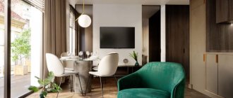
Luxurious dining room of a large house
In the interior of an apartment, two color forms of this tone are most often used:
- Golden sand color, reminiscent of straw, is a very warm and cozy tone.
- Grayish-sandy color, reminiscent of pale coffee with milk, quite cold and fresh tone.
If we consider sand tones from the point of view of their influence on a person, then we can say with confidence that they are not perceived by people in any way. The neutral sand color of the walls is always perceived calmly, does not tire, bother or bother people.
Colors of this color scheme are perfect for older people who value home peace and comfort.
The sandy color of the walls allows you to create a calm, melancholic interior, which may seem boring to modern, impetuous young people. Therefore, wallpaper in this color is best suited for balanced adults who prefer stability and tranquility in all aspects of life.