Beige has a special place in the palette: it is considered a basic neutral shade that goes with most colors. He has a calm energy. According to Feng Shui, beige is considered the embodiment of stability and comfort. It is often found in the environment and is close to the color of human skin, so it is familiar and does not attract attention to itself.
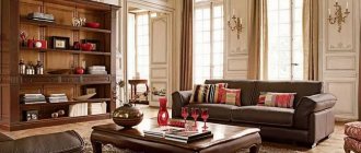
photo: Harmonious combination of beige color in the living room interior
Important: Beige is not an independent color. Even a monochrome interior requires the use of different shades, otherwise all surfaces will merge.
photo: Accent walls are a great idea for an interior in beige tones
Shades that can be classified as beige:
- Ivory (ivory).
- Sand.
- Cream.
- Opal.
- Light coffee.
- Caramel.
- Wheat.
photo: Several shades of beige were used to decorate this living room
Beige color: psychology, characteristics and perception
The correct choice of color in the interior is a very important point. The mood and well-being of people in a room with a predominance of any shade depends on this. The beige color symbolizes calm and comfort. More often it is background, so it is used when decorating walls, textile elements, and ceilings. It can also be used in any sector of the room. Many people associate its shades with naturalness.
Beige furniture and decorative elements are chosen by lovers of a classic look who value tranquility and comfort. The emotional perception of this color changes depending on the saturation and location of the painted surface. Beige ceilings excite the mind, walls radiate warmth, and floors create the impression of constant stability.
Beige is the natural color of many animals and natural landscapes. It is neutral, non-oppressive and elegant at the same time. All its shades are perceived as pleasant, conducive to dialogue.
Advantages and disadvantages of using color in the interior
With the help of beige color, designers try to emphasize the sense of taste of the owners of an apartment or house. A classic shade will help hide construction defects. You can make a room an object of pride only with the right combination of colors used. Before you bring your original ideas to life, you need to compare the positive and negative qualities of each shade. Beige color has the following advantages:
- Neutral classic. It’s pleasant to be in such a room, the interior is conducive to relaxation, casual conversation, relaxing and calming;
- Combines with all shades. Looks great with natural wood, olive, blue, gray, gilding;
- Can be an excellent background for any decorative elements, does not distract attention;
- There is no such thing as too much beige; it is impossible to oversaturate a room with it.
The main disadvantages include its enormous popularity and prevalence. It will not be possible to surprise guests with such an interior.
It is boring and monotonous, many associate it with laziness, stupidity, and inaction. In poor lighting it can look dirty, like an aged clean tone.
Beige yellow
Yellow fills the interior with light and warmth. It has an invigorating effect and improves mood. But it is not recommended to use too much of this range in the interior, so beige is usually used as the main color, otherwise the design may turn out to be too “overheated”.
The amount of yellow should be at the level of 20-30%.
It is ideal to use beige curtains, armchairs, ottomans or decorative elements.
Variety of shades
Beige color is not an independent shade. Harmony can only be achieved by using several colors. To prevent the surfaces from merging, it is necessary to create accent areas. There are about a thousand shades of beige. All of them are divided into subgroups:
- Lilac;
- Gray;
- Neutral;
- Brown;
- Pink;
- Peach;
- Yellow;
- Green.
Using color in different interior styles
Interior design with beige is difficult to ruin. Moderate tones will fit perfectly into any design style. Cool shades are suitable for finishing walls and ceilings. Light colors include textiles, window and door openings. A bright accent is appropriate in small inclusions (patterns on wallpaper, figurines, etc.). Beige color is a win-win option for the following basic styles:
- Classical. Soft shades look great against a backdrop of understated sophistication. They visually expand the space and make the lighting more expressive. A combination of different textures is allowed, a combination of beige with gilding and silver;
- Country. The style closest to nature is based on convenience and comfort. The finishing is done in light colors. To emphasize naturalness, decor with rough shapes, untreated surfaces, and careless plaster are used;
- Minimalism. Beige design will look good in rooms of any size. It is better to use cool shades. Their diversity is not welcome. The emphasis can be on textures and decorative elements;
- Eclecticism. You can combine completely inharmonious details. Beige will be more appropriate than ever. Bright accents and catchy textures will look great against the background of all its shades;
- Naturalism. A combination of only natural shades is allowed (pistachio, blue, brown, yellow). The beige representation imitates natural surfaces. Only natural materials are welcome;
- Provence. Warm, neutral shades are suitable. Beige is the traditional color for this style. It harmonizes perfectly with natural stone and natural wood. One of the best backgrounds for variegated multicolors.
Beige-brown
Brown color is very close to beige in many respects. This allows you to create calm and natural combinations. This coloring visually expands the room and gives the house light.
To create contrasting elements, you can add dark tones of brown.
You can add brown notes using various materials:
- Trees,
- Silks,
- skins,
- Brick,
- Stone.
Such combinations are especially relevant for interiors decorated in classical styles.
Rules and tips for using color
The impact of the color of the environment is quite large. The number of shades and their brightness create a different impression. If beige is chosen as dominant in the interior, the complementary range should be arranged in order of importance. To prevent it from seeming too boring, use a technique with accessories in refreshing shades. This could be turquoise curtains, a green sofa in the center of the room, decorative pillows with a bright pattern. The beige color in any zone should be used wisely, unobtrusively and according to certain rules.
In the decoration of the premises
Decorating beige ceilings and walls is suitable for any room. Classic, unusual finishes will be an excellent backdrop for creating an individual fashionable style and extremely bright accents. Surfaces in this color will harmonize with almost all components of various shades.
Wall decoration can include any materials. To prevent beige from looking boring and indistinct, you can use moldings and embossed wallpaper. Ceramic tiles in combination with stone and wood will make the interior interesting and original. The materials are suitable in texture and color. You can achieve a special atmosphere in the bathroom with the help of mosaics. You can fill the room with spring warmth by using the most natural palette.
The color of the floor affects the overall perception of the interior. It is important to take into account the color of absolutely all parts (plinths, sockets, switches). Not only the appearance of the room, but also the comfort of living depends on the correct choice of shade. The beige surface resembles wood. Using various finishing methods, you can turn a room into a formal office or an elegant living room.
The beige ceiling is the leader among other surface shades. It consists of warm brown and cool white. When choosing the type of decor, the structure of the structure and material are of great importance. Natural color has a neutral effect on the psyche and does not create pressure. Thanks to restraint and elegance, it gives the room an aristocratic feel.
Furniture
When choosing upholstered furniture for a beige interior, you should follow certain rules. Sofas and armchairs must be a lighter shade than the color of the flooring. Rattan and bamboo will add unique ethnic notes. Natural wood harmonizes perfectly with beige.
An interesting color effect in the living room can be created with a dark dining table and matching chairs. The design solution of playing on contrasts will not overload the interior. An important condition in beige interiors is the use of materials of different textures. Coffee furniture will look different in the same living room. Dark shades will give it solidity, light shades will make it lighter.
Textile
Beige textiles do not distort the visual perception of the room. Depending on the type of canvas chosen, it can fill the interior with confidence and unique charm. It is better to use natural fabrics (silk, wool, linen). Curtains must necessarily contrast with the shade of the walls and ceiling. These can be plain options, with a floral print.
Textiles that are close in tone in the room should not blend together. Similar in color, it should be different to the touch. A velvety coffee sofa covered with a fluffy yellow blanket will work well next to each other. Carpeting should be lighter than the floor and wall trim.
Since beige is an inconspicuous, neutral shade, in order to avoid the simplicity and nondescriptness of windows and other elements, special attention should be paid to the choice of the type of canvas.
Jacquard fabrics are appropriate in classicism and modernism. Beige linen will look good in eco-style and country style. Milky curtains made of silk and organza will add lightness to any room.
Beige blue
The peculiarity of this solution is the harmonious combination of warm (beige) and cold (blue) shades.
- Usually beige is the main color, blue is an additional color that accents attention.
- Blue furniture fits very well into a beige interior.
- For example, a beige living room can be complemented with blue textiles or upholstered furniture.
In the kitchen, the accent element will be blue dishes, household appliances and furniture.
Combination of beige with other colors in the interior
The most successful combinations of beige in the interior with natural shades. You should not focus on an aristocratic color without a prepared option for diluting it. Competently complementing it with shades of the rainbow spectrum and transitional tones will help create an original, unique interior. In extravagant styles, combinations of orange and pink will be appropriate.
Beige and gray
Neutral colors easily harmonize with each other and with any shade. To make the combination as attractive as possible, designers recommend using halftones when decorating the interior. The mixture of gray and beige is called "grey". An intermediate color can have a tint tilt in either direction. There can be no sharp contrasts here. The intermediate “grage” can be used third, as a binding shade. This technique allows you to create the effect of a smooth flow of color.
A win-win option for combining gray and beige is to use fading shades close to white. The simultaneous use of ivory, sand color and pale gray is always successful. To avoid a feeling of despondency, it is necessary to introduce various textures, patterns, textures. To make the effect of mixing colors look stylish and harmonious, gray parts are decorated with beige decor and vice versa.
Beige and white
The correct balance plays a huge role in this combination. The colors should not blend together. Correctly marking their boundaries will help with this. Metal, bronze, and silver accessories will look great in such a room. To prevent the interior from being boring, you should adhere to the following rules when decorating it:
- You can use no more than three shades of beige. If the room is oversaturated with color, all elegance will be lost;
- In addition to the classic combination of white and beige, you can use bright shades to create accents;
- Textiles should be textured, ceilings should be embossed.
Often this combination can be seen in the living room. It is immediately filled with light and visually enlarged. To create this effect, absolutely any shades of beige are used, from muted and pale to rich tones.
Beige and brown
The combination of related shades is easily perceived visually and does not create tension. Massive chocolate-colored furniture will not seem bulky against the background of beige walls or textiles. Natural calm brown and beige complement each other well. The best proportion is 70% beige, 30% brown. You can use dark shades for contrast.
To increase the space and create a feeling of spaciousness, use light colors (light coffee, ivory, caramel). Suitable styles are Baroque, Victorian, classical. Delicate beige calms brutal brown. This combination is suitable for decorating bedrooms, living rooms, and corridors.
The brown-beige room is complemented by stone decor, natural wood, leather, and brick. The simultaneous use of beige and brown is acceptable in the kitchen. You can successfully highlight light furniture, dark floors, and furniture. Sand shades go well with aged surfaces and chrome fittings.
Beige and blue
Designers consider the combination of these colors to be classic and the most elegant. This interior will fit well into a room for any purpose. The best option for small living rooms. Most often, beige acts as a background, and blue as a bright addition that attracts the attention of household members and guests. Before the final choice of color scheme, you should carefully study all its features, since the current combination has both advantages and disadvantages.
The advantages of beige and blue include the versatility of the combination. These colors fill the interior of a bedroom, nursery, kitchen, hallway. With the help of relief, textures, and saturation, you can enlarge or narrow a room. In rooms with large windows and sufficient natural light, blue can be replaced with blue.
Among the disadvantages, we can note a possible unconscious feeling of cold. Fresh blue is intuitively perceived as the color of water and ice. This background is less practical than brown and white. It shows the slightest dirt, deformation of the finish and other stains. You can save the situation if you use blue wallpaper with beige embossing, more textured decor and patterns.
Beige and purple
Enchanting, magical purple must be used with great care. The shade can cause anxiety and even mental disorders. To minimize the impact, it should be diluted only with neutral tones.
Beige significantly mutes purple. A combination of two shades is necessary in places where pulsating brightness is extremely undesirable. The effect depends on the additional colors involved in the design ensemble. These can be related or contrasting shades.
The dominant color of the interior should be beige. If a warm shade is chosen as the main one, then a softened color should complement it. The same rule should be followed when working with cold tones.
Beige and turquoise
The universal turquoise attracts the sympathy of most designers. All its shades are suitable for modern and retro interiors. The dual color harmonizes perfectly with beige. Depending on the dominant component, it can have different brightness, saturation, proximity to green, aquamarine or blue.
The combination of beige and turquoise is a universal color scheme. Pairing a bright shade with a neutral one works flawlessly. There is not the slightest risk of ruining everything. When using bright details, the main thing is restraint. The room should not resemble a dressing room for circus performers.
Two natural shades are often found in natural environments, such as sky, water, wood. Dark beige furniture will look good against a turquoise wall. A more delicate interior will be achieved if you use light shades of beige and turquoise. Lavender and mint colors are used as an addition.
Beige and green
The harmonious duet of two natural colors creates a feeling of increased comfort and freedom. You can combine absolutely any shade with beige, even dark green. It is difficult to oversaturate and spoil a harmonious design. The interior can exist independently without additional colors or contain 2-3 contrasting tones. In any case, it will look bright and complete.
Discreet beige will cause a surge of cheerfulness, adjacent to bright green. This tandem is found in interiors very often, in various configurations. The enviable consistency can be explained by a person’s craving for natural shades. The green and beige furnishings emphasize the modern style and enhance the effect of the fashionable furnishings. Confrontational shades remain in demand only if the proportions are respected.
Beige and pink
Soft pink and warm beige colors can reduce aggression and tension. These shades are associated with sweets and holidays. Since this combination stimulates the appetite, it is not recommended to use this theme for decorating the kitchen and dining room. It's very difficult to maintain normal eating habits when your imagination is filled with glazed donuts, cupcakes and cakes.
Pink is used as the main color in the bedroom, nursery, and hallway. It is better to make the living room in more sober colors with a small addition of a romantic mood. A pink room is better suited for a teenage girl. To reduce brightness, you can use pale colors when decorating the room and light, white furniture.
Beige pink
Beige in combination with pink allows you to create a calm, peaceful atmosphere that sets you up for relaxation.
- This interior helps relieve stress and tension.
- The color pink has been proven to have a positive effect on appetite, so it is especially appropriate in the kitchen or dining area.
- Due to its relaxing effect, pink is also good for the bedroom.
Interiors in beige tones: examples and design nuances
In the design of interior space, beige color occupies a leading position. It fills the room with warmth, tenderness, and visually expands small rooms. It is combined with most other tones and shades, is universal, suitable for both a regular living room and an apartment. Due to the presence of a variety of shades, it allows you to create an interior in a single color scheme, while it will be quite expressive.
Beige is a natural color and is often used as the main color for decoration. Decorative elements look great against its background. It allows you to decorate the interior space in any style, be it classic, country or minimalism. Let's consider the use of color using the example of different rooms in a house or apartment.
Living room
The room is multifunctional, it is the center of the house, where household members while away the evenings, celebrate family holidays, and welcome guests. It is very important to create comfortable conditions in the room that satisfy all family members. Therefore, using calm, cozy shades will create a favorable atmosphere.
The selected tones go well with other decorative elements. By adding different furniture, owners can change the style of the room; even changing the carpet will enliven the design. Beige in the interior relaxes, calms the nerves, and creates a cozy atmosphere.
For walls it is better to choose one shade. It is often complemented with other colors. Pink, purple, brown, green, even black look advantageous, symbolizing wealth, luxury, and emphasizing a strict style.
If the room has a small area, light colors can visually make it more spacious, while for large living rooms dark shades are used.
Kitchen
Each room in the house has its own special purpose. Especially the kitchen room. Since ancient times, people have paid attention to cooking, as they understood how important it is to feed themselves and family members, so individual space was allocated for this activity. The kitchen, first of all, should be functional and comfortable, decorated in a style that will not quickly get boring and will delight the owners.
Beige for kitchens is very popular. It helps transform a room and create a stylish space. You can combine it with other colors based on various factors. For example, depending on the location of the window. If it faces the north side, then preference is given to orange, yellow, and if it faces the south side - blue, turquoise. By combining dark and light colors, you can correct the geometric inaccuracies of the room.
Combining beige with black or white on the walls will create a positive neutral background. It is desirable that the refrigerator, stove, and work surface also have a black tint. At the same time, dirt will not be so noticeable, which will reduce the number of cleanings. Red, green, and yellow shades go well together as individual decorative elements. For a room with good lighting, blue and cyan are suitable.
Bedroom
This is the place where a person spends a significant part of his life. Here the morning begins, the bustle of the passing day ends. The room allows you to retire and recuperate, so it is very important to choose the right interior design that will soothe and lift your spirits.
The decoration should not attract undue attention or distract from rest and a relaxed state. It is the beige color that will allow you to calm down and give you peace. It is acceptable to everyone. Can be combined with many other shades. For example, if a person suffers from insomnia, a blue color should be added, which will give the room a positive feel. If black is used, it should not exceed 30% of the entire palette.
Large rooms can be divided into parts, in one of which the owner will sleep, the other used for relaxation or as an office. In this case, the room is divided into functional zones, each of which should be different in color. It is also good to add mirrors to the interior.
The choice of curtains for it also depends on the size of the room; for a small space, light colors are used, for a large space, massive, brown shades are used. A room divided into parts must have additional independent light sources in each zone. It’s good to install a night light near the bed, a floor lamp will do for a resting place, and you can put a table lamp in the office. It is better to use a chandelier in the center of the room, which will illuminate the entire space.
Bathroom
A classic beige interior can be monochromatic or contain bright, provocative elements. With the help of such shades you can create a cozy atmosphere in the bathroom. The color scheme creates relaxing silence, eliminates nervousness and aggression.
Beige in the bathroom harmonizes perfectly with all colors. But it will look better with white and gold. You can create a romantic atmosphere with the help of pink, blue, sand accents. Supporters of the classics will like the combination of dark colors. To successfully shade a variety of elements, use a combination of beige and gray.
When choosing a color for your bathroom, you should consider its practicality. Areas that are too dark will quickly become dirty; even the slightest drips and soap splashes are visible on them. It is better to choose beige tiles with a pattern. It can be combined with stone, waterproof photo wallpaper with a natural picture.
Corridor/hallway
The most accessible room, decorated in beige tones, emphasizes the emotional stability of the owners and creates a favorable atmosphere right from the threshold. For finishing you can use various available materials:
- Wallpaper;
- Plaster for painting;
- Decorative plaster with beige pigment;
- Wall panels;
- Tiles;
- Decorative, natural stone, brick.
The style of the light beige corridor sets the main general interior direction. You can decorate the entire house in one color or create zones using different materials and colors. For floors, natural wood (laminate, lining) or the closest possible coverings are suitable. The furniture in such a hallway can be of any natural shade: gray, brown, white.
Color combination options
It is difficult to determine with which colors beige is combined most aesthetically in the interior. This is a universal color that can be combined with many other shades. The combination methods also depend on the tone of the beige itself.
As you can see in the photo of the interior in beige tones, there are several of its most popular shades: sandy, caramel, ivory, wheat, cream, coffee with milk, biscuit. Beige has a lot of shades, they can be combined with other colors - gray, brown, pink, blue, yellow, etc.