In this article we will look at the combination of colors of wallpaper and furniture in the interior. We will learn the rules for choosing the right colors, and consider the subtleties of the psychology of human color perception. Let's consider the main types of wallpaper coverings, find out the advantages and disadvantages of each option.
Color combination of wallpaper and furniture
Selecting wallpaper colors for furniture
The wallpaper in the room is matched to the tone of the main furniture. Some designers prefer contrasting combinations. This option is quite acceptable, but the contrast should not be too strong to achieve a harmonious combination of colors in the room. Basic rules for choosing the color of wallpaper for furniture:
- Both warm (pink, turquoise, coffee) and cold shades (blue, green, purple) are combined with white However, preference should be given to light shades (too saturated shades create unnecessary contrast). White wallpaper can have a geometric or floral pattern.
- For black furniture, colors that are similar in tone are recommended - for example, dark gray or rich brown. Gold, lemon, beige, and pistachio also go well with black. But the ornament on the wallpaper is prohibited with black.
- If the furniture is brown , then when choosing wallpaper, it is recommended to give preference to white, olive, green, light blue, light red shades. The ornament is also prohibited, since it will not go well with the brown color of the furniture.
Choosing wallpaper for light laminate
The most unusual option would be a combination of yellow wallpaper and light laminate. Unlike standard light wallpaper, your room will look really unusual and bright. This option is suitable for creative people who want to decorate their interior.
White wallpaper in the interior is suitable for more serious people, for whom stability is most important.
If you want people to think of you as a reliable and serious person, then white walls are just for you. If you combine them with expensive, high-quality furniture on a white floor, the effect will be even stronger.
Secrets of choosing wallpaper for furniture
Let's also look at a few important points that are important for the master to remember:
- The color and design of the wallpaper should be such that it either shades or emphasizes the color of the furniture. Therefore, they should not be completely identical in color (otherwise the furniture will be lost against their background) or be too contrasting (otherwise the wallpaper will draw all the attention of the person in the room).
- A surface with a variegated pattern or voluminous relief quite tactfully and non-aggressively draws attention to itself. Thanks to this effect, you can hide some furniture defects (for example, that it is very old or has minor damage or scratches).
- If you can’t choose the color of your wallpaper for a long time, but you have creative abilities, then buy non-woven fabric that can be dyed. In this case, you can hang wallpaper, and then paint it in the desired color or even make your own design.
Note! Use LED lamps to highlight a shadowed area of the room and highlight the natural color/pattern of the wallpaper.
Nuances of human psychology
When choosing shades, it is recommended to take into account the psychology of human color perception:
- Some colors come under strict supervision - red, deep orange, bright yellow, purple, deep blue. These colors are quite aggressive, so a person in the room can quickly get a headache and worsen their mood.
- Green, blue and turquoise shades are your saviors in difficult times. After all, they are suitable for almost any room, since they remind a person of the natural beauty of nature. If you are in doubt about the choice of color, use green, blue and turquoise shades.
- Cool shades create a calm, even a little sleepy mood. Therefore, it is recommended to select them for kitchens, bedrooms, and bathrooms. Warm shades have the opposite properties - they create light tension and fun. Therefore, use them to decorate the hallway, living room, and guest room.
For children's
There is a strict distinction here based on the child’s age, as well as his gender. In the first three years of a child’s life, the child should be surrounded by wallpaper in pastel shades. Annoying colors are not allowed. In the period from three to 6 years, a child needs vivid impressions and emotions. You can choose the brightest ones.
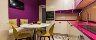
Bright highlight of the kitchen
There is one nuance in the images. They don't have to be very big. Large figures can frighten a child. The same applies to geometric shapes with sharp corners. The presence of a composition with these elements can cause anxiety in a child. And pastel colors won’t help here. As the child grows up, you can use quite adult shades, turning the children's room into a teenager's relaxation room.
For the little comic book lover
If with boys everything is approximately clear, then with girls everything is a little more complicated . They prefer colors from the warm part of the spectrum. If possible you should use:
- pink;
- peach;
- soft green;
- warm yellow wallpaper.
For boys the situation is the opposite. It is better for them to make a room with blue or gray wallpaper. A combination of yellow and green, gray and orange is welcome. You can use red and brown finishing materials.
Completely red wallpaper should not be used for a children's room. When children of different sexes live in the same room, it is important to distinguish zones. Each zone should have its own color or texture. Even if the child has become quite an adult, it is not at all necessary to decorate the room in black tones. A large amount of black can make you sad. There's no need to talk about children.
An original solution for those who like to draw
Selecting wallpaper for furniture in different rooms
The color scheme for the wallpaper should also be in harmony with the functional purpose of the room in order to create the right mood in the room. Below we will learn how to choose the right wallpaper for furniture in the bedroom, living room, children's room, kitchen and so on.
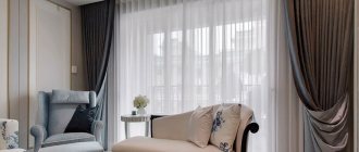
Bedroom
For the Bedroom
For the bedroom, it is recommended to choose wallpaper in light, cool shades, which will create a peaceful, sleepy atmosphere in the room. However, some people prefer passionate bright bedrooms - for example, based on red wallpaper. This decision is very bold, and red is well suited for rooms with black furniture. However, practice shows that people quickly get tired of such a solution, so it is better to give preference to light, calm tones.
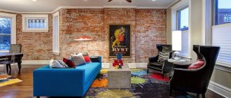
Living room
In the living
room Living rooms usually have light-colored furniture, which goes well with wallpaper in light, warm shades. Examples of good colors are beige, pink, turquoise, pistachio. If you have bulky furniture in your living room, you can use another solution:
- On the wall in the first half of the room, hang wallpaper based on calm, restrained shades.
- In the second half, wallpaper with brighter colors to create a sharp contrast.
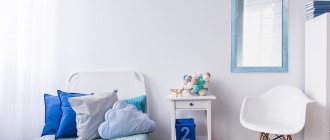
Children's room
Children's room
A children's room is a great place for photo wallpapers with unusual designs that will stimulate your child's creativity. Such wallpapers have their own hidden advantage - they can be combined with furniture of almost any shade, so you don’t have to rack your brains over color solutions. Although also take into account the baby’s temperament: light, cool shades are suitable for calm children, and bright and saturated ones for active children.
Note! Children's temperament often depends on their age: children under 10 years of age are usually calmer - however, after 10 years of age they become more active and cheerful.
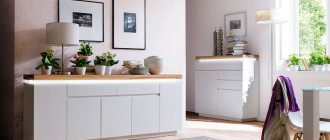
Kitchen
For the kitchen Plain
vinyl-coated wallpaper is ideal for the kitchen, since it can be washed. Kitchen furniture is made in white or brown, so your favorite colors for wallpaper should be yellow, light brown, cream, olive, green, light blue. But it is not recommended to give preference to dark tones, since eating in such an environment will be uncomfortable.
Bathroom
Bathroom
Cool, warm or neutral shades are suitable for the bathroom - there are no restrictions here. The main rule is that they should be very discreet, even a little pale. For example, you can use pink, pistachio, cream, light green or light blue shades. It is recommended to give preference to vinyl wallpaper, since it has a water-repellent surface and can be washed.
Hallway
Hallway
For the hallway, light wallpaper with a light pattern depicting exotic countries or unusual animals (for example, parrots) is perfect. They create a festive atmosphere, which will be very useful when receiving guests. Another good option is geometric repeating patterns. Shades should not be too bright so as not to set off the furniture.
Varieties of colors
In addition to the above factors, one of the influencing criteria is the preferences of the apartment owners themselves. Depending on temperament and aesthetic taste, some may like bright colors, while others, on the contrary, may like more muted colors.
We list the most acceptable color combination options from the point of view of interior design:
- If you want to make the interior of a room (whether it’s a bedroom, living room or children’s room) lighter and “airier”, choose white wallpaper and furniture. In addition, light colors promote a more relaxed and tranquil environment. By the way, not only the correct selection, but also the arrangement of chairs, tables, armchairs and beds is quite important.
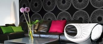
- As for wallpaper in dark colors, their use is also quite acceptable, and they will look no worse than light ones. It’s just that it’s a completely different style. The main condition in such a combination of colors is a careful balance of colors, since the overall harmony of the interior space of the room depends on it.
- In cases where the owners prefer a bright interior, a catchy and “live” atmosphere, rich colors can be used, incl. and exotic, such as orange, yellow. At the same time, too bright an environment can be somewhat annoying. In order to avoid this effect, some design experts recommend using combined wallpapers rather than solid ones. Thanks to their use, it is possible to highlight not the entire room with a bright color, but only a certain part of it, or one of the walls.
Please note! In such cases, it is allowed to use one or more dark-colored decorative items, for example, black or brown, in the interior. A kind of sharp contrast will only benefit your interior.
Types of wallpaper
Types of wallpaper
Indoor walls can be covered with wallpaper of various categories - paper, vinyl, non-woven, liquid, fabric, and so on. Below we will briefly look at them.
Vinyl
The surface of vinyl wallpaper has water-repellent properties. Therefore, they are an excellent option for finishing a bathroom or kitchen. If you often cook in the kitchen, then the material must be washed periodically - say, 2-3 times a year (the best option is every season).
Vinyl materials are thick and do not allow air to pass through. Therefore, they can hide small irregularities or defects in the wall. However, air retention can be a disadvantage, since the room will be very stuffy, so such materials need to be glued in well-ventilated rooms.
Attention! Some manufacturers make vinyl wallpaper with perforations so that they allow air to pass through - this solution does not look very aesthetically pleasing. Therefore, you need to choose perforated material wisely.
Non-woven
Non-woven fabric is an excellent option for finishing the wall of a living room or bedroom for further painting. But it is not recommended to use it in the kitchen, bathroom or hallway - it absorbs water and debris well, and it is not recommended to wash or clean it (it will become unusable quite quickly).
The material allows air to pass through well, so non-woven fabric can also be used in a nursery - the wall of the room with this option will breathe well. Non-woven wallpaper is of medium thickness, so it can also hide small defects in the walls.
Liquid
Liquid wallpaper is medium durable, and with its help you can only get a monochromatic pattern (although you can paint the wall in several “colors”). Therefore, they are most often used to decorate bedrooms or technical rooms. They are also well suited for additional finishing of rooms with laminate on the wall.
Liquid wallpaper does not absorb dirt and water well, but it is not recommended to install it in rooms with high humidity. Therefore, such wallpaper should not be used in the kitchen, bathroom or nursery. They are also not recommended to decorate the house from the street side.
Paper
Paper wallpapers are distinguished by a wide variety of patterns, so they can be used to decorate any room - from the hallway to bedrooms or technical rooms. Although in practice they are most often used for finishing cottages and technical premises, as well as in the case of a limited budget for repairs.
After all, paper is a very fragile material that can be easily damaged or scratched. If damaged, paper wallpaper cannot be repaired - you only need to re-glue the wallpaper sheet. In addition, paper absorbs water well, so gluing them in the bathroom or kitchen is not recommended.
Fabric
Fabric materials are distinguished by high-quality patterns that will retain their brightness for many years. You can hang fabric wallpaper in any room. Water does not cause serious harm to the material, but the fabric takes quite a long time to dry, so it is recommended to use other wallpaper in the bathroom or kitchen.
The fabric reduces noise levels well, so this material is often used to decorate a bedroom. The fibers of the fabric absorb dust and debris quite well, so it is recommended to periodically clean or vacuum such wallpaper (at least 1-2 times per season).
Rules for choosing the color of walls and furniture
Color scheme
When choosing the color of walls and furniture, you need to remember some important rules:
- White color visually expands the space. Use this effect to decorate the living room, corridor, children's room and bedroom. This option is also suitable in the case of a narrow kitchen, although if your kitchen is of normal size, then it is better to choose a different color.
- But black color works in the opposite way - visually it narrows the space. Therefore, black is a good color for a study, where the size of the room is not of serious importance. But it will not be suitable for other rooms, as it will cause discomfort.
- Warm shades are recommended for use in guest rooms, as well as in the living room, as they create a light, playful mood. But cool shades create the opposite effect - they calm and give peace. Therefore, they are recommended for use in the bathroom, bedroom, and kitchen.
White as the main color in the interior
White color creates a feeling of lightness and weightlessness in the room. He fills it with air. It gives cheerfulness and confidence, makes the environment softer and kinder. White color is very flexible: in the vicinity of warm tones it gives the same warm color to the room, in the vicinity of cold tones it refreshes. And most importantly, this is the only color that can be used undiluted.
White helps you concentrate, which is why it is often used for work spaces.
.
This color is associated with purity and sterility.
Therefore, it is widely used in the design of
kitchens and bathrooms
. However, here the white color can play a cruel joke: after all, the smallest dirt is noticeable on it.
Living room in white
It looks spacious, airy and carefree. Here you can relax after a hard day, casually communicate with friends, and hold family celebrations. This color does not create tension, but on the contrary, it is able to smooth out rough edges in communication.
A snow-white bedroom also looks good
— it sets you up for a serene rest, tranquility, meditation and tranquility. White helps fight bad mood, apathy and depression.
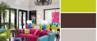
Beautiful combinations of shades
To understand how to choose the right wallpaper for furniture, let's learn the general rules for combining colors. To understand this, consider examples of optimal combinations:
| Main color | Goes well with flowers |
| White | Pink, turquoise, coffee, blue, green, purple, brown |
| Black | Dark grey, rich brown, yellow, gold, beige, pistachio |
| Brown | Beige, white, green, blue, light red, pink, burgundy |
| Blue | Red, grey, brown, burgundy, green, pink, yellow, orange |
| Green | Pink, blue, light blue, white, gray, light brown, burgundy, purple |
| Yellow | Green, blue, light blue, brown, black, dark brown, burgundy |
Color Chart
Wenge
If your living room is made in warm pistachio tones, then the cabinet for the walls of this color should be wenge (example in the photo below). Of course, in modern houses such wall design is rare. But if you make the right choice, this design will look quite interesting and unusual. A set of wenge shade will look most advantageous. This type of wood is very valuable and rare. It is characterized by good strength and a dark brown or golden tint with small black veins.
Wenge is an excellent option for arranging a chic interior. Then special attention needs to be paid to both style and lighting. In addition to warm olive or pistachio tones, you can choose wallpaper for a wenge cabinet of a different color. Everything will depend on what goal the owners of the house or apartment want to achieve.
For example, if you need to emphasize the exclusivity and beauty of a set, contrasting self-adhesive wall panels are chosen. You can buy very light or white. If you need to create an explosion of emotions in a room, then bright wall decoration (all shades of pink, turquoise, etc.) is suitable. If you want to tone down the unusual wenge color a little, use its shades in the interior, but they should be much lighter.
Design tips
In conclusion, let's look at some design tips:
- It is recommended to decide on the color scheme for the room in advance, and the purchase of furniture and wallpaper should be done in accordance with the chosen plan. You should not deviate from the given scheme: at best, you will get very bold eclecticism, and at worst, tasteless kitsch.
- When choosing shades for the walls, also take into account the color of the ceiling and floor, and it is recommended to select furniture to match the color of the floor. In the case of a light floor, do not use dark shades for the walls, as you will end up with an uncomfortable room. The same rule applies to furniture.
Balance in the interior color combination video