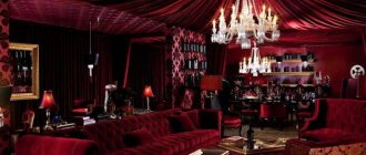
The main purpose of the living room is to receive visitors, a place for organizing festive feasts and parties, as well as a relaxing holiday for the whole family. It is not surprising that the owners approach the design of this premises with all responsibility. The interior must meet a number of strict requirements:
- to be comfortable, homely;
- have your own, unique appearance, reflecting the habits, lifestyle and worldview of the owners;
- embody the latest fashion trends or, on the contrary, create a feeling of reliability and respectability;
- create a certain mood that ideally suits the character of the residents;
- make a favorable impression on guests, delight the owners with their beautiful appearance.
If necessary, living rooms are divided into functional areas or combined with a kitchen. In this case, each section is worked out separately, with its own flavor, but the general style is necessarily preserved, uniting all sections into a single whole. One of the most beloved, sought-after colors in which state rooms are decorated is blue. The azure palette provides enormous scope for bringing unusual, magnificent designs to life. It is multifaceted and incredibly attractive, giving a feeling of flight and spaciousness. We will tell you how to decorate a living room in blue tones and choose furniture, what ideas to use, and show examples in this article.
General rules of use
Blue is considered a cool shade; it brings coolness to the room and refreshes it, so a good solution would be to use it in a room with windows facing south.
Blue color in the interior of a Greek-style bathroom
Light airy curtains in blue tones are simply irreplaceable for creating a cool, refreshing atmosphere on a hot summer day. Bright decorative elements, such as vases with flowers or dishes, will help complement the interior and add a sunny mood.
But does this mean that blue color cannot be used in the interior in winter or in the cold Russian climate? No, with the right combination and contrast, the room will be filled with “life” and bright colors.
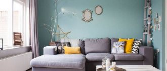
Bright living room in blue tones
Blue brings light with it, visually expanding the space, so it is suitable for narrow walls, low ceilings and small rooms.
White and blue bathroom
The combination of mint color in the interior with cream creates the effect of a delicate blue.
You can safely use this color in large quantities, as it is quite easy to perceive and does not weigh down the space. Light shades of blue can also be used as a basis for creating a bright design; its versatility is similar to white.
Kitchen in gray-blue tones
Sea of blue
Advice!
The ceiling can be painted in sea green or sky color, as a replacement for classic white, to add extravagance and originality to the room, and if you stick luminescent stars on top, then at night you will get a real firmament of stars!
Features of blue color and its effect on humans in the interior
The blue color gives rise to the most pleasant associations: an endless azure dome overhead, illuminated by sunlight; clear springs and clean forest lakes; turquoise tropical sea and the shine of mountain glaciers; frosty patterns on glass on New Year's Eve and the sparkling surface of snow fields at dusk. It captivates and enchants, and has been considered a sign of nobility since ancient times. It is not for nothing that the term “blue blood” indicates that a person belongs to the highest aristocracy.
Pure blue is cold, just like turquoise, cornflower blue and blue-gray. However, once you add a drop of yellow to it, the colors acquire a wonderful, warm, radiant light. Also, heavenly and all its variations are warm.
The azure palette has a beneficial effect on the psychological state of residents. It calms, while activating thought processes and promoting the search and memorization of new information, fruitful study and work. In addition, heavenly blue helps to understand oneself, gain a sense of inner balance and clarity of thinking. This is a great option for a living room combined with a work corner or relaxation area.
However, everything needs moderation. If the room is painted with plain paint or covered with pure blue wallpaper, the effect will be depressing. The abundance of azure will negatively affect the perception of the environment, which will quickly become boring. That is why shades of blue are creatively combined with each other, combined with other colors, looking for a middle ground. There are several basic rules that should be followed when decorating a room:
- dark colors are used sparingly to avoid creating a gloomy atmosphere. Particular care is taken in small apartments and rooms facing north, heavily shaded by trees or buildings;
- rich dark shades are suitable for a spacious room with high ceilings;
- if the windows face south, then cool colors are preferred, otherwise preference is given to warm, pearly tones;
- It is better to leave the ceiling white or choose a transparent light color – pale blue, cream, light beige;
- For interiors in heavenly colors, floor coverings in light, white or golden shades are selected. When using pastels, it is permissible to choose a parquet board or tile of chocolate, dark beige color;
- if one wall is decorated as an accent wall, a variety of decor or accessories are hung on the opposite wall - large wall clocks, paintings and posters, mirrors, photos in beautiful frames.
The wall decoration can be anything, from the usual wallpaper to fabric upholstery, decorative plaster or panels.
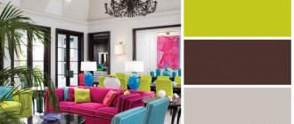
Color compatibility
Credit: @ and
Since blue is found everywhere in nature, it goes especially well with the same “natural” colors that it is next to: green, yellow, orange, red, white, blue, brown.
You may be interested in the combination of green color in the interior.
Combination of blue color in the interior
Blue-green shades
Combination of blue with other colors in the interior
Blue and brown in the interior
Important
remember that pale blue goes well with other pastel colors, such as cream, sand, peach, gray, mint and others.
Beige combined with blue and cream
Sand with blue
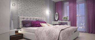
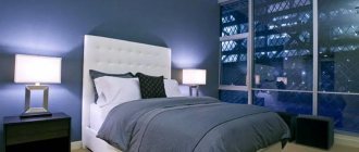
Blue color in the interior of a gray bedroom
Variety of pastel shades
If you want to create a bright design, then use rich shades of blue or combine it with colorful saturated colors: for example, blue in the bedroom interior.
Modern bright kitchen
Sunny yellow accents will dilute the coldness of blue and gray in the kitchen interior
Catchy stylish kitchen
A rather bold decision would be to use blue together with black, but if used correctly, the effect can be amazing.
Stylish bedroom with black and turquoise textiles
A room in pastel colors with a sky-colored bedspread and a matte black panel
Black wallpaper contrasts with white, cream and dusty blue tones
Blue for different interior styles
The color is universal - it can be successfully used for interiors of different directions. But it will look especially advantageous in rooms of the already mentioned classical and modern styles, as well as their mixture - modern classics.
Photo: Instagram kuhnimedyn1949
Also, blue as a light and neutral color is suitable for a room in a minimalist style. But in this case, it makes sense to add it as accents, and make the background more neutral.
Photo: Instagram masterskayaxvorost
A good idea is to make a room in an oriental style in blue. Oriental mosaic often has this shade, so the color solution literally suggests itself.
Photo: Instagram i_i_projects
Finally, you can find a place for this shade in fashionable eclecticism. Look, for example, how stylish this bedroom looks.
Photo: Instagram vadimbychkov
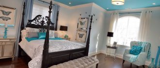
Blue bedroom
Blue, like a pastel shade, is ideal for the bedroom, creating the necessary peace and tranquility in the relaxation area. Also, according to psychologists, this color can help improve relationships between people.
For maximum relaxation and calm, use powdery shades in the bedroom
Niagara and azure gray
If you like calm colors, then a bedroom design in beige tones will definitely interest you.
For a warm, cozy atmosphere, you can use bright elements of turquoise and azure tones, combining them with tones from a warm color scheme. Orange and yellow will do the job well and dilute the cold shades.
Pillows in the color “frosty sky” are a bright, cool accent against the background of warm tones in an African-style bedroom
Dusty blue walls and textiles in blue-gray tones combine well with wooden furniture
Lush turquoise decoration as the main bright accent in a classic white bedroom
The combination of blue colors in the bedroom interior with other rich shades
Combination of blue with other colors
Blue goes well with many colors. It should be combined with different materials such as wood, stone and textiles.
When creating a design in one color scheme, sky blue looks harmonious with blue, gray, turquoise and mint. At the same time, it can be successfully combined with contrasting shades.
With gray
The greatest harmony is observed when combining heavenly and gray shades of the same intensity. The duo creates a laconic and stylish interior. Lace and patterns used on the surface will add expressiveness to the created interior.
With brown
One of the fashionable combinations is blue and brown. If you choose azure as a base, then brown is suitable for accents. Furniture and curtains in warm shades of chocolate will add warmth and create coziness.
The blue palette can act as bright accents if the interior is made in various shades of beige and brown. A sand sofa looks much more interesting if there are bright azure pillows on it.
Blue + green
Combining green and blue palettes is considered natural. Salad shades add brightness to the room, give positive emotions, lift your spirits and put you in a friendly mood.
You can adjust the saturation of green and blue. It is worth paying attention to pistachio and olive shades.
Purple and blue
The amount of purple used in a design depends on its intensity. Deep and dark options are recommended to be used in minimal quantities - as an accent. While a delicate lavender palette will help create a romantic atmosphere. It is recommended for premises in Provencal style.
With pink
The combination of rich pink and turquoise looks bright and childish, so this combination is perfect for the design of a girl’s room. If you reduce the saturation of both colors, they will acquire sophistication and are quite suitable for arranging a boudoir. It is important to consider that when combining these two colors, you need to choose equivalent saturation.
Bathroom in blue tones
The most popular color used in the bathroom is blue, and for good reason, because it is the color of rivers, lakes and seas, and it creates a stunning marine atmosphere in the bathroom. Thanks to blue shades and the current variety of coatings on tiles, you can turn the bathroom into a real relaxation area and get maximum pleasure and relaxation from water treatments, as well as aesthetic pleasure.
Beautifully tiled bathroom
Blue is also good because it goes perfectly with white. Therefore, with a white sink, pipes, bathtub and ceiling, you can decorate the walls with blue tiles, panels or waterproof paint. At the same time, if you use tiles with a pattern, then you need to cover two-thirds or half of the entire wall with them, otherwise it will create a feeling of heaviness, and besides, this technique will help to visually enlarge the space.
Classic lovers may be interested in the black and white design - here.
A nautical theme will make the room more fun and attractive.
Accessories in azure shades will help add brightness and originality; rich colors will look very impressive on a white background.
Cool arctic tones in a gray and white bathroom
Small mosaics in the interior will look very unusual and stylish. Decorated in a sky blue version, it does not weigh down the space and looks bold and picturesque.
Wall cladding with mosaic tiles
Furniture
To choose furniture that really suits the style and color scheme, you need to follow a number of tips:
- upholstered furniture should have a color that will become the second most important in the interior;
- cabinet furniture is chosen in harmony with the main background of the walls or floor;
- classics welcome the entire palette of natural wood, while modern styles welcome bright colors, glass and metal parts, and interesting decor.
A blue and white sofa is perfect for a living room done in pastel colors. Even massive chairs of this color will look elegant and completely unobtrusive. For upholstered furniture in heavenly shades, it is recommended to select fabrics that are pleasant to the touch: velvet, velor.
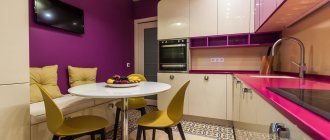
In the kitchen, a blue set will give the room freshness and nobility and will harmonize perfectly with the light dining area. Hand-painted drawers, benches and small cabinets look lovely and add unique charm and personality to the kitchen.
General recommendations
So, monochrome in the interior will not seem bland and boring if you use the following tips when decorating:
- nuances in the interior should be kept in slightly different shades from the main ones: this way it will be deeper and more interesting;
- use many contrasting textures: they “present” the same tone differently;
- Neutral inserts will perfectly “dilute” the monochrome: interspersing white elements or fragments of natural wood will always be advantageous.
One should not be afraid of monochrome in the interior, but it is correct to organize other colors and objects around it so as to avoid vulgarity. Blue brings a sense of security, peace and well-being - characteristics that already deserve attention!
Why should you choose a blue color for the bedroom, who is it suitable for?
The word “blue”, according to one version, means “dove”; according to another, “deep”. It attracts attention and draws you into its bottomless depths.
Infinity of shades of blue
Since ancient times, the color blue has been considered the color of nobility, because it is not for nothing that there is an expression about “blue blood” - a sign of belonging to the highest strata of society. The ancient Egyptians worshiped the color blue, and even painted their feet with blue paints to emphasize their chosenness.
The Ancient Egyptians often used blue
Thanks to the rich palette of shades, this is one of the predominant colors in design.
Palette of shades of blue and blue colors
It can be either warm or cold shades. His palette allows it to be heavenly, azure, cornflower blue and even blue. Blue color is preferable to use in rooms where there is a lot of sun, as it belongs to the category of cool tones. The sun's rays will fill it with warmth due to the play of light. Shades of blue should not be used in a dark room. The grayness of the street will mix in and the room will look gloomy and uncomfortable.
The sun's rays add lightness and warmth to the interior
Blue color has one more property - it is able to “pause” time, create the feeling that it is slowing down and everything around is coming to a state of peace . It relaxes, helps to turn to the inner “I”. According to psychologists, blue color is preferred by those who love peace and quiet, strive to find harmony with themselves and the world around them, aesthetes.
It is not advisable to use blue for very large rooms - it simplifies the decor.
Use blue sparingly - if the color is oversaturated, the bedroom will seem empty and too cold.
Photos of blue room design ideas
The collection of photos shows real interiors in azure and turquoise colors. Modern ideas can be turned into reality in your own apartment if you are looking for a unique way to diversify the design of a bedroom or children's room.
A blue accent wall will help expand a narrow room.
Sometimes it is enough to buy new curtains to make the interior look new. Use interesting ideas, experiment with color and texture combinations to create a unique and fashionable interior design in your apartment.
This color is recommended for use in a well-lit room.
Kitchen
If shades of blue are natural for the bathroom, then in the kitchen they need to be used very carefully so as not to reduce your appetite. Yes, yes, designers advise not to use saturated shades close to blue in the kitchen interior - problems with hunger are guaranteed. On the other hand, they can play into the hands of those who need to lose weight: it has been noticed that people eat less in a cold-colored dining room than in a sand or orange one.
Contrary to this, designers love to use blue furniture in ultra-modern kitchens, where high-tech reigns. This cool style includes one of the main colors - metallic. Glossy facades will harmonize perfectly with metal handles, a metal sink and other metallic-colored accessories.
Shade Variations
Blue and blue colors are actively used by designers around the world. This color is especially relevant for countries with hot climates.
The blue color creates a feeling of coolness and breeze. There are many tones of interesting colors:
- Deep blue
- Turquoise, or Tiffany color
- Purple. From soft cornflower blue to rich ultramarine
The design also uses combinations of several shades of blue. For example, delicate cornflower can be combined with active blue.
At the peak of popularity now is an icy blue shade. Be careful if you want to decorate a room in this color. It may turn out to be too uncomfortable. It is important to include some cute, delicate details.
Answering the question of what colors blue is combined with in the interior, we can confidently say that these colors are pink, yellow, gray, silver or gold.
Undesirable, or even dangerous combinations are: orange, red, green.