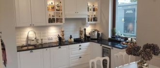
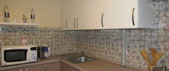
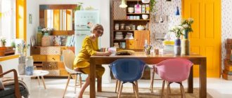
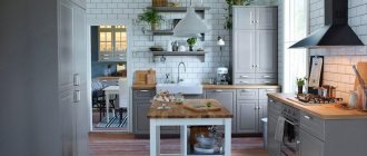
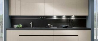
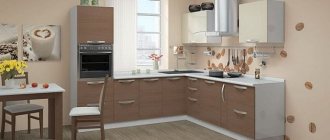
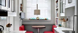
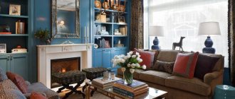
Cappuccino tones, due to their neutrality, are excellent for decorating kitchen areas. They fit perfectly into any style direction and are liked by almost everyone. Cappuccino shades make interiors soft and airy and evoke associations with a coffee drink, which makes them extremely popular.
Cappuccino color combination in the kitchen interior
Cappuccino shades look better in combination with other colors. The most successful of them are considered to be white, vanilla and wenge, which unobtrusively emphasize the softness and warmth of coffee tones.
White
In combination with cappuccino, it fills the interior with freshness and light and visually expands the space. However, this color is considered quite easily soiled and designers recommend using it sparingly.
Wenge
The dark brown shade of wenge successfully complements the light coffee color scheme of the interior and helps to correctly place contrasting accents without creating excessive diversity.
Vanilla
The shade of vanilla looks harmonious in combination with the color of cappuccino. It adds freshness to the interior, makes it more stylish and lifts your mood.
This combination is ideal for people for whom an atmosphere of harmony, calm and pleasant relaxation is important, but who do not want their kitchen to look too monotonous or boring. Is cappuccino color suitable for a small kitchen?
Light shades of coffee with milk are great for decorating the smallest rooms. It is recommended to complement the cappuccino color with white or a lighter shade of yellowish-brown, and also use glossy surfaces when decorating the kitchen.
If a cappuccino-colored kitchen is designed in one of the classic styles, then you need to choose a set of laconic shapes without an abundance of decor or too flashy fittings.
The color of cappuccino, considered neutral, can vary in color temperature. Its warm shades are well suited for decorating spacious kitchens located on the north side, while cold and light shades are well suited for small rooms facing south.
Almost all people like coffee shades; they calm, relax and bring notes of freshness and at the same time warmth to the interior. However, in order for a cappuccino-colored kitchen to look truly advantageous, designers recommend diluting this shade with other colors, for example, wenge, white or vanilla.
Furniture and kitchen set
When developing an interior design, it is not necessary to focus on installing the headset exactly in the color of the main furniture. It is important to maintain a uniform style, but colors may differ, both in tone and contrast. These are acceptable points, since here functionality goes hand in hand with style.
A set of kitchen furniture does not have to be monochromatic; a cappuccino shade can be present either in the lower or upper tier, harmoniously echoing other rich tones
Glossy facades bring a special style to the interior and make it lighter and more spacious
Features of choosing interior parts
In order for a cocoa or coffee-colored set to become a real interior decoration, rich details are required. These include edging of facades, interesting prints, unusual textures
It is also worth paying attention to the details that surround the kitchen
In this case, it is recommended to choose wall decoration very carefully, taking into account the overall style of the room. For a Provence style kitchen you should use wooden slats. Plastic analogues are also perfect. If you want to get a kitchen in the modern style, you should decorate the wall with artificial stone or glass.
Wallpaper is considered a standard option for wall decoration. For the kitchen, you should choose practical options. It is best to use a washable coating. Do not use liquid wallpaper, which will swell when exposed to moisture. It is best to choose glass or paper coverings. It is also permissible to use non-woven fabric. The cladding can be plain or textured. A coating with a pattern will look no less successful. Do not use large prints.
A fragment of the wall is covered with a kitchen apron. Depending on the designer's idea, it can reach the ceiling. A beautiful option in this palette would be brickwork or a concrete ledge. A glass niche with lighting looks no less successful. The apron can be made of ceramic or tiles. It also comes in glass, metal and even mirror. Mosaics on a grid are often used to create accents.
In addition, it is permissible to use plastic wall panels or wooden slats for wall decoration. They are often combined with wallpaper. In this case, the cladding is performed using locking technology. Such materials are chosen taking into account a specific style. This finish is considered very specific. At the same time, it visually increases the height of the walls, and therefore is very popular among manufacturers. Panels are used to highlight one wall or accentuate the entire dining area.
You should be very careful when choosing flooring. It must be wear-resistant and resistant to moisture
It is important that the material is durable and attractive. Depending on the style of the room, it is permissible to use stone, linoleum, laminate
No less successful options are self-leveling flooring or porcelain stoneware.
The choice of material for flooring is carried out taking into account the textures that are used for wall decoration
It is important that they look harmonious against the general background. To zone the space, it is permissible to use 2 materials
So, the cooking area is tiled, and the dining area is covered with linoleum. Kitchen doors vary in shape and width. They are made from different materials. Doors are made of wood or veneer. They are also made from wood chips. Options with glass elements look attractive. They help to visually enlarge the room.
At the same time, the inserts have different textures - matte, glossy, embossed. Doors may have 1-2 leaves. In this case, the color of the opening should differ slightly from the shade of the floor covering. Thanks to this, the interior will not look monotonous. To make the kitchen space more interesting, you should use original details. These include paintings, lamps, curtains. To make the room cozy, use all kinds of flowerpots and flower pots, textile napkins, and tablecloths.
All these elements help to quickly transform a space. In combination with a cappuccino-colored set, such details help create a homely atmosphere. To create a harmonious interior, it is recommended to choose accessories in colors similar to the set. At the same time, you should not use exclusively the shade of cappuccino in the room - a small accent in the color of the accessory is enough. The choice of decorative elements depends on the style of the room. So, textiles and floral prints are suitable for Provence. Chairs decorated with textile elements look good in this interior. Curtains with loops are also suitable.
Chrome parts will fit well into a modern interior. This could be the same finish on furniture handles and a ceiling lamp. It is also worth using a refrigerator with a chrome surface and built-in household appliances. A metal apron is suitable for a loft-style kitchen. In such an interior a chrome hood and exposed communications will look great.
Wallpaper color
Wallpaper is a traditional way of decorating a wall surface. For the kitchen area you need to choose practical finishing materials. You can cover the walls with washable wallpaper.
Important! You can’t wallpaper your kitchen with liquid wallpaper; it will immediately swell from high humidity.
Paper, non-woven and glass wallpapers are suitable for kitchen premises. The finish can be plain, textured or with patterns. The composition of the wallpaper ornament should not contain large flowers and squares.
On a note! Coffee-colored wallpaper can be combined with stone inserts and wood panels.
Decorating the kitchen with coffee with milk: furniture and more
The kitchen set does not have to be completely coffee
Furniture
When choosing a color, a kitchen in coffee tones will be an example of the manifestation of your imagination. For example, the upper and lower tiers will look either monochromatic or have a fairly strong contrast. Wall cabinets are usually made lighter than the cabinets. For example, there will be a coffee color at the bottom, and a creamy or vanilla shade at the top. The coffee color scheme, embellished with gloss, will look especially impressive. Thanks to the shiny surface, the interior will not only be more spacious and lighter, but also have a modern style.
The set can be plain or contrasting
A contrasting combination of light cappuccino with darker tones of a brown palette always looks impressive.
Decor
Real coffee is quite suitable for decorating the kitchen. Using whole grains, you can make panels, add them to ceramic dishes, or simply pour them into a transparent vessel.
From coffee beans you can create an original composition on a burlap canvas
Or make a unique decor from an ordinary porcelain mug
Coffee design can be diluted with brighter and lighter details. The following elements can be used as an example:
- furniture upholstery;
- curtains;
- tablecloths;
- napkins.
- chair covers;
- living plants.
If the shades of coffee are dark, it is necessary to dilute such an interior with lighter tones, apply gloss in the decoration, and take care of beautiful lighting. Use color charts to select additional colors.
You can diversify your kitchen interior with interesting shades of pendant lamps
A bright light green apron will add a touch of spring freshness to the kitchen.
When using a milky coffee shade in combination with gloss, do not overdo it too much. An oversaturation of shiny surfaces will create excess shine, but their complete absence will give the kitchen a strict look. The choice of coffee with milk will always delight you with comfort, tranquility and warmth. You will always want to stay here as long as possible, thinking about pressing matters and drinking coffee with milk. Coffee with milk - this shade will always be popular. Facades decorated in this color shade will never go out of fashion, unlike bright colors.
What color should I choose for my countertop?
The contrasting combination of a light cappuccino shade and a more saturated color of the tabletop looks great. The countertop should be much darker.
Cappuccino-colored kitchen: 10 interesting facts and photos
1. Cappuccino is a drink originally from Italy, consisting of espresso, milk and frothed milk. If before this it was difficult for you to imagine the color of cappuccino in the interior of the kitchen, now just mentally pour a little milk into the coffee and sprinkle the foam with cinnamon or vanilla. Yes, it is a light brown shade with a slight yellowness or a hint of gray.
2. In fact, the cappuccino-colored kitchen, the photo of which you see below, belongs to beige interiors, which automatically puts it in the category of neutral shades. They are often used when decorating the interior of kitchens and dining rooms. And beige and wood shades are especially famous for their ability to create coziness, comfort and that very warmth of a home. But our color in the kitchen interior looks even more interesting and brighter than the more phlegmatic beige.
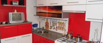
3. Cappuccino cuisine is also beautiful because it combines with various neutral and pastel shades. In this case, the interior of the room can be either exclusively monochromatic, or with the addition of white, gray, black and dark brown. Most often you can find a white and brown color scheme with small splashes of silver and black. To prevent the interior from seeming faded, you can add bright accents, for example, a bright red or lime green wall panel, a dining group or a work apron.
Although the color of cappuccino in a kitchen interior can mute the most irritating and bright colors, it is not recommended to use it together with acid green and dark blue because the color contrast is too strong.
4. Cappuccino kitchen, glossy or matte, can be made of any materials: plastic, MDF film, painted wood, acrylic countertops and apron. This shade will look great against both light and dark walls.
5. To make a large kitchen more comfortable and elegant, you should combine the cappuccino color in the kitchen interior with dark shades. But owners of small apartments should choose a “companion” from lighter colors. At your service are milky, white, creamy, golden, cream and sand. Using the right color scheme will make the kitchen visually more spacious and brighter.
6. The color of cappuccino in the kitchen interior can be used anywhere: on walls, textiles, furniture upholstery, kitchen facades, accessories. Any furniture of this color looks simply chic and elegant, be it Japanese-style rattan seats or carved baroque chairs. This color can manifest itself in zebra stripes, geometric or floral patterns. Cappuccino-colored kitchens with glossy facades that reflect light look especially beautiful. They can easily brighten up a small kitchen.
7. A cappuccino-colored kitchen suits any interior style, from classic to ethnic. You just need to choose the right material (for example, classic - wood, high-tech - film MDF) and accessories.
8. The cappuccino color in the kitchen interior allows the housewife to worry less about drops of water on the facades or work apron, because against this background they are not very visible.
9. A coffee kitchen will cost you little. It’s easy to choose not only a style, but also finishing materials, without the help of a professional designer. For example, the same milky paint for the walls that will set off this coffee-with-lait kitchen (photo below) will cost much less than a darker color.
10. A cappuccino-colored kitchen is always in trend, which means the interior of the room will remain stylish and fashionable for a long time.
It follows from this that if you are planning to make an inexpensive but high-quality renovation, then pay attention to matte or glossy cappuccino-colored kitchens. So you can create your unique, cozy, stylish, sophisticated interior of a room of eternal relaxation and good mood!
Attractiveness of the palette
Coffee with milk in gloss is multifunctional and will suit almost any kitchen interior. In addition to conservative classics, this color will be appropriate for almost any style: from Provence and country, to high-tech or eco.
A café au lait kitchen can be considered a classic due to the versatility of the shade.
It’s quite easy to create a harmonious interior based on a coffee shade.
It is enough to choose individual accessories for each style and decide on additional tones. The best combination for coffee colors would be white, black and gray. When using any of these colors, you should think about bright details in the design. The cafe au lait kitchen is one of the particularly popular examples for contrasting solutions, because the furniture here is specially highlighted against the background of the walls. Another way to use a coffee-colored kitchen is to use upper tiers that are a lighter shade than the lower cabinets. This combination is associated with coffee with a fairly high foam. Using various combinations of finishing bases and textures, it becomes possible to create an elegant interior for your kitchen.
Shades of coffee with milk evoke extremely positive emotions in a person
The color café au lait is an example of a complex color that combines several different shades. Thanks to its darker shade than regular beige, it reveals its unusual beauty with greater force against a neutral background.
Variety of coffee palette
A rich coffee range is a good way to create a magnificent and cozy interior. A very effective combination for the kitchen is to use coffee with milk together with gloss. But in this case, coffee tones in the overall interior may look monotonous, so it is advisable to dilute them with more expressive colors.
Decoration of walls, floors and ceilings in chocolate tones
Not everyone can competently decorate an entire apartment in extraordinary colors without a designer’s advice. If you follow the listed principles and examples in the photo, everything will work out. For example, if you don’t make completely brown walls, but insert panels of painted wallpaper and highlight them with furniture. The option with chocolate walls in the interior is suitable only for the southern room; the northern side will be dark.
Advice. Use expensive chocolate-colored wallpaper with a golden background in the interior when zoning a large room. As an option, a dark base for decorating a niche for a cabinet such as a showcase with lighting or a background for the noble tone of leather furniture.
Chocolate color in the interior
Kitchen design in chocolate color
Floors in the hall, living room with laminate or wenge-colored parquet boards look chic. But don’t overload the entire design with these shades. It is better to highlight furniture and accessories in the form of interesting contrasts with bright accents.
A multi-level ceiling will not be “overhanging” if it is supplemented with LED lighting. The stretch fabric should be glossy, almost mirror-like, then the “thickness of chocolate” can be diluted by the light reflected from the surface.
Golden Rule. The more dark the design of the floor, walls and ceiling, the greater the need to balance the overall color of the room with light shades.
Low ceilings should not be made dark; no design techniques will “raise” them. But if you use wenge-colored decor in a classic setting and make the ceiling light blue, you will have a visual feeling of “open sky.”
The modern interior looks noble with linear contrast (plinths and ceiling cornices, panels on the door, laminated PVC windows in a “dark wood” look).
Chocolate color in the interior of the room
Bedroom interior in chocolate color
Room design in chocolate color
- The shades of the Earth elements are rarely used in the bathroom, but in combination with gold and white, this interior looks very elegant. Brown plumbing fixtures and expensive patterned tiles with gold on the floor or walls will add nobility.
- A dark hallway with a natural wood look is a classic, especially if you choose the right shade for the façade of cabinet furniture, curtain fabric and accessories.
- The dining room and kitchen, decorated in “delicious” shades, also look very harmonious. Give preference to beautiful gilded dishes and furniture with curved elegant legs - this will add aristocracy to the balanced interior.
- In a classic bedroom there can be a lot of brown color - walls, furniture, bedspreads and curtains. But at the same time, choose a light pink or lemon background, a white ceiling and decor with pink and lilac tones. Brilliant and shimmering additions with original lighting will add beauty and nobility to a modern style.
- If you decorate a room according to all the rules of Feng Shui, then earth tones are practiced mainly in the eastern zone. It is believed that this will bring health and solidity to the family.
See our photo gallery for many interesting examples on the topic of decorating a home with this palette.
Coffee color: combination with other colors
If the main background of the room is coffee with milk, it must be diluted with other shades, but at the same time maintain a single decor palette - brown. Milk and coffee have many characteristics: basic, light, spicy. Use them when choosing a corporate color.
For a delicate palette, choose the same soft shades: pastel, cream, cream. The combination is suitable for a bedroom, bathroom, nursery. Shades of coffee, chocolate and cocoa are suitable for interiors with a cinematic atmosphere. This combination is ideal for a classic guest bedroom - it will decorate the interior and give it an elegant look.
Cocoa shade combines with shades of coffee and beige in a classic bedroom with a modern twist
The basic shade of coffee with milk makes the interior restrained and simple, unpretentious and excessive. But this does not mean that brightness should be avoided in decor. Add pops of color in fabrics and accents to transform the room visually.
The perfect combination of coffee colors:
- Monox - with shades of body type. Single room with different coffee shades is not suitable for all rooms due to its silence. It is better to decorate a bedroom or kitchen in a coffee shop. They relieve boredom in a monochromatic interior due to various fabrics, individual materials and accessories.
- Bronze. FURNITURE AND BRONZE FURNITURE, BRONZE AND DECORATION: All these details complete the neutral coffee-milk color.
- Grey. Shades of gray go with all colors. The combination of hot and cold gray coffee milk is especially successful - the combination will speed up the lack of space. Cool tones provide a visual increase in space, and warm light brown tones provide additional volume. The combination of gray and coffee is often used in small kitchens in a modern style.
In the color scheme of a room, a balance between architecture and decor is important. When choosing a color company for the coffee base, select the size of the room and the style of the interior. Don't overload a small room with bright colors and lots of details. In simple rooms, it is also not necessary to paint with one color - the volume and variety of shades will add subtlety to its display.
White
White plus café au lait is the perfect base for any space. This kind of interior always wins: cool colors, fresh palette, unobtrusive decor. Collect different facts to dissolve the dominance of white and white: leatherette furniture, glossy surfaces, wood texture.
Olive
It is easier to work with such a duet if both colors are of low intensity. With rich colors (and not only in a combination of cappuccino and olive, but also in combination with other tones), you can experiment with modern design, but add a neutral third that will balance the bright colors of the interior, for example, white, light gray, light beige , vanilla or ivory.
Pale olive and cappuccino create a beautiful combination that is typically found in Provence style kitchen projects.
In a modern interior, this combination occurs if you want to create an interior with a combination of natural and natural colors.
Beige
The beige color associated with the cappuccino shade can act as a base on which individual parts of the chocolate color can be highlighted. For example, the interior of a kitchen will look beautiful if the walls and kitchen units are made in beige or vanilla, and the chairs and curtains are the color of milk chocolate.
Nautical inspirations
The golden hue of latte often appears in nautical settings. Beige is a great counterbalance to shades of blue and white, as well as unpainted wood elements. The rough texture of the walls looks beautiful. Coffee and milk look great in combination with blue, cool and warm shades balance each other, making the environment fresh and cozy at the same time.
Orange
Light coffee and orange are a bright combination, especially suitable for rooms designed in ethno, modern and high-tech styles.
You have two options: apply these tones in equal proportions or make the milk predominant.
Yellow
The color of coffee combines with yellow, but not brightly, but plays. This room looks unusual, but very modest.
Bright colors
A modern interior is a great opportunity to combine beige with expressive colors:
- red,
- turquoise
- orange.
Contrasting bold colors combined with a cream background will create a harmonious and original composition. An interesting effect is achieved by the combination of beige and black colors. This combination can decorate a large living room or office.
Rules for choosing furniture
A very popular furniture color for today is espresso colors. There is often some confusion with another color called coffee, which is generally a little lighter and ranges from the light to dark chocolate brown color family.
The kitchen in this photo is decorated in espresso color.
There is no standardization of shade names in the furniture industry. Most companies create and mix their own colors, not to mention they name them themselves too.
Furniture manufacturers often do this to get you to buy a matching piece of Espresso furniture. This makes competitors' furniture items less attractive to the consumer due to the fact that they will not be the same color or in the same color family.
All furniture manufacturers try to add a “zest” to their models. Therefore, when purchasing kitchen furniture for yourself, you can be sure that your interior will be original and unique.
Choose furniture that is a few shades lighter or darker than the background color, but which is still within the milky brown palette.
An excellent interior option is furniture that is slightly lighter than the main tone of the walls.
Household appliances for the kitchen in chocolate color
In addition to the standard shades for household appliances, white, steel, black, manufacturers are increasingly choosing brown tones. Yes, they are in great fashion now. In any refrigerator store you can find at least 15 different models in chocolate and wood tones. This is an ideal choice for chocolate cuisine. It is only important that the shade is well coordinated. Finally, the color of the refrigerator can be customized. And here the possibilities are almost unlimited: cappuccino, beige, gold, olive. Many shades will fit perfectly into a chocolate kitchen, and you can support them with accessories.
In a kitchen with chocolate tones, household appliances with chromed steel fronts look good
Another option is appliances with black panels and stainless steel edging.
Combination of chocolate cuisine with other colors
Classic combinations of chocolate color suggest a warm palette. Milky white, vanilla, and golden tones look very harmonious with each other.
The high-tech style, which involves a large number of chrome parts, glass accessories and broken lines, can also be successfully combined with the color of coffee, vanilla or cocoa.
Photo by on
Bright, rich shades are effective in an interior where dark brown is the leading color. Red, blue or mint green accessories look great against this background and effectively complement the interior.
The chocolate-colored kitchen with red splashes looks unusual and stylish. Warm shades complement each other, and the kitchen design becomes harmonious and impressive.
Gold, silver, white and black create an atmosphere of luxury. In the design of a chocolate kitchen, they can be used for fittings, textiles, and household items.
Find out what examples and combinations are suitable for a black and white kitchen.
Materials that work best for chocolate color
Accessories and parts made from the following materials fit very organically into chocolate interiors:
- Wood.
- Stone.
- Various fabrics, including satin, silk.
- Fur.
- Skin.
- Ceramics.
- Vines or straw.
But more “artificial” elements are also suitable. Shiny accents (mirrors, crystal, gilding), chrome surfaces, and plastic are introduced.
In modern sets, the color of the facades is often combined, while light colors can be present both in the upper and lower parts of the furniture
Natural facades are often left matte to emphasize the nobility of wood
Prints that go perfectly with chocolate shades:
- Coffee, coffee beans.
- Imitation brick.
- Floral motifs.
- Geometric patterns, especially laconic large polka dots.
In general, there are no restrictions. Both graphic roses and textiles with images in the Zhuyi style can be used as a print. The only rule is to avoid variegation. Prints can be of any content, but it is better to give preference to graphic, one-color solutions.
Dark facades do not look flat if the texture of the material is clearly visible on them, for example, wood grain
Finish options
In the interior of a kitchen the color of coffee with milk, contrasting solutions are popular, when the furniture stands out against the background of the walls, or the upper tiers of the set are lighter than the lower cabinets. This combination is reminiscent of coffee with high foam. Using different combinations of finishing materials and textures, you can create an elegant interior. How different finishing options look in the design of a kitchen decorated in the color of coffee with milk can be seen in the photo below.
Walls
Since the coffee color scheme is universal, most tones are suitable for it. The surface of the walls can have any texture, and the choice of patterns is almost limitless. If cappuccino is used as a background, then you should choose lighter furniture - milk, vanilla, ivory or light beige. This combination looks light and elegant, attracting the eye.
The most natural combination is the whole range of coffee and beige shades
In small kitchens, you can choose walls of a lighter shade; in this case, the furniture should be a little darker, for example, chocolate. This setting is reminiscent of a French cafe, where you can comfortably sit with friends over a cup of coffee.
Floor
As a floor covering in the kitchen, you can use moisture-resistant laminate in the color of coffee with milk, linoleum or tiles in the same range. Various wood shades, both lighter and darker, also work well. But you shouldn’t choose parquet; it’s better to leave it for the living room.
Ceiling
To decorate the ceiling in the kitchen, it is better to use the lightest shades of cappuccino, or even milky or white. Dark colors can visually make a room appear lower and smaller. In small kitchens, gloss will help expand the space; stretch fabrics in milky or light coffee colors will fit perfectly into the design. But in a large kitchen you can allow experiments, for example, coffee-colored beams on a milky ceiling.
Doors
In the kitchen interior, cappuccino is used not only for finishing surfaces and furniture facades with gloss; doorways are decorated in the same range. The color of the opening and the floor covering can completely match, which is the most common option - this creates a single design. Also, the door frame and the door itself can echo the walls, decorative elements or furniture.
To make the doors visually lighter, you should choose models with glass inserts. In this case, the texture can be any - gloss, frosted glass, ornament, etc. The doors will not blend into the interior of the kitchen if you choose a color for them that is different from the set.
Which facade to choose: glossy or matte
In kitchen interiors designed in cappuccino color, both glossy and matte furniture are used. The advantages of glossy facades include:
- presentable appearance;
- visual expansion of spatial boundaries;
- with proper care, furniture does not become outdated;
- countertops are not afraid of contact with water and cleaning agents.
Disadvantages include the need for constant cleaning, the inability to hide scratches, and the visualization of fingerprints.
The advantages of matte facades are functionality and long service life. Scratches and dirt are invisible on their surfaces.
Disadvantages of sets with a matte finish: insufficiently presentable appearance, inability to visually expand the space.
Professional designers advise giving preference to furniture with glossy surfaces, despite the increased need for cleaning.
Tips for choosing
When choosing a kitchen set in the color of coffee with milk, you need to consider several factors. One of them is the correspondence between the kitchen and the size of a particular room.
Furniture should not look bulky; it is important that the space does not seem overloaded. If there is not enough space in the room, buy a set with wall cabinets
At the same time, they look at the width of the room: if the room is narrow, it is advisable to buy a linear set of small width.
If the room is wide, it is better to purchase a corner kitchen. In this case, the model can have a peninsula (a table fixed to the set) or an island (a separate table for meals). It looks harmonious in the modern design of sets with a bar counter. It can be located in the center of the room, thereby creating boundaries between different functional areas. The peninsula can be transformable: this version of the modular design is especially convenient in small kitchens with insufficient square footage.
In this case, the set may have a different shade of the upper and lower cabinets. Furniture with clear glass covering stone countertops will look beautiful in the kitchen. In addition to the fact that glass will add lightness to the interior, it will protect the working base in the cooking area.
When choosing a shade temperature, you need to take into account which side the windows face. For example, when they face north, the room will appear cold. If the shade of the set is cold, it is likely that the room will lose its visual comfort. If the windows are facing south, warm cappuccino will give off an orange color and the room will seem stuffy.
When choosing a design, it is important to pay attention to the material of the ceiling cladding. For example, glossy furniture goes well with stretch fabric and plasterboard ceilings. You need to look at the shape, as well as the lines of the furniture, which should be repeated in the interior of the entire room
You need to look at the shape, as well as the lines of the furniture, which should be repeated in the interior of the entire room.
As for the material of the headset, we will have to proceed from considerations of practicality, taking into account the style. For example, the classical branches of design are quite categorical: furniture in the classic, neoclassical, and classicist styles must necessarily be wooden and massive, decorated with gilding and ornate carvings.
For modernity, the synthetic component and an abundance of gloss are important. Here, in addition to glass, plastic is used. The set itself should be laconic and monochromatic, perhaps with glass facades of several wall cabinets.
An equally important criterion for choosing a kitchen set is its status. A set of expensive furniture will not look out of place surrounded by cheap furnishings: it will be conspicuous. You need to choose a modular or built-in ensemble correctly.
Useful tips
To make your kitchen design in coffee colors look impressive and harmonious, you should consider several nuances:
- Some shades of coffee are quite dark, so such an interior must be diluted with light colors, use gloss in the decoration, and also take care of high-quality lighting.
- In order not to make a mistake with the selection of additional colors, it is useful to consult color tables or a circle.
If you use gloss in combination with coffee with milk, do it in moderation. Too many shiny surfaces create unnecessary shine, while their complete absence will make the kitchen design too strict. The design of a cappuccino-colored kitchen is incredibly diverse; options for similar designs can be seen below in the selection of photos.
The coffee range is universal, it fits any design, combining with almost all colors. The choice of cappuccino for the kitchen interior is determined by the characteristics of this shade, its comfort, warmth and tranquility. You want to stay in such an environment for a long time, thinking about something over a cup of coffee with milk.
Style selection
The shade of cappuccino will harmoniously fit into any style. Classically, it can be used in mixtures with beige, brown, sand, champagne, etc.
In modern trends, it can become an excellent background or complement to rich and bright colors.
Provence
Cappuccino is a shade that creates a Provencal style, as it perfectly emphasizes the romantic and calm atmosphere in a rustic spirit.
Pairs perfectly with other shades characteristic of Provence: lavender, sand, ocher, olive, pistachio, blue and blue, khaki.
Scandi and eco
Interiors in Scandinavian or eco-style, in their concept, strive to be closer to nature, and coffee shades only emphasize the calm atmosphere. This design involves the use of predominantly natural materials, especially wood.
Classic and neoclassical
Cappuccino can be an excellent alternative to the beige and brown tones of a classic interior. In such a complex shade, the classic can reveal itself in a new way - elegant, expensive and festive, and at the same time more interesting due to its complex undertone.
Cappuccino, diluted with a light gray, milky or white shade, can add a modern touch to a traditional classic interior. Therefore, the use of this shade is an excellent field for experimentation when creating interiors in the style of eclecticism and neoclassicism.
Modern
For modern and technological trends such as minimalism and high-tech, cappuccino is ideal due to its neutrality and restraint. At the same time, its complex undertone will smooth out the severity and visual asceticism of these styles, adding softness and comfort.
When designing surfaces with complex textures and pronounced textures, the shade of coffee with milk will reveal its full aesthetics.
Ideas for decorating a kitchen in cappuccino color
Contrary to what many people think, the main shade of cappuccino is brown, and has the widest range of palette variations. Because it's made by mixing two opposing colors, it can look different, from cool with lots of blue-violet undertones, to something deeply warm if it contains flecks of red. This gives it great potential for decoration.
Cappuccino color has a wide range of shades.
Try deep chocolate brown paired with smooth milky cream. A rich, dark color creates drama and can pair beautifully with a deep wine-colored curtain as opposed to a milky brown.
A combination of deep chocolate and creamy color. Looks luxurious!
This combination works well with cobalt or sapphire. You can create a luxurious, relaxing brown ambiance by using some bold colors such as blue, black or white.
Look how well the chocolate color works with turquoise.
Ceiling
Low ceilings in kitchens are usually plastered or painted. For coffee design, light shades should prevail here. Dark brown ceiling color is great for small spaces. The white ceiling along with the white trim keeps the milky coffee interior fresh and bright.
A dark ceiling is great for a small space.The ceiling can also be successful in a coffee shade if the contrast between brown ceilings and white walls is maintained.
A light ceiling in the kitchen in coffee tones will add space and light.
Walls
The surfaces of the walls in such an interior can be decorated with wallpaper (with a special coating), plastered, covered with plasterboard, tiles or plastic. The apron can be finished with tiles, the color of which has the following accents: cherry, gray, lilac or green.
Finishing in dark colors is allowed only in spacious coffee-colored kitchens. For simple and strict versions, the walls are simply plastered, and a relief similar to shreds of milk foam is created in the accent area.
Floor
The floor in such an interior is usually tiled. Expensive options use a self-leveling floor, which is not only durable, but also creates an elegant “varnished” shine.
For a cappuccino-style design, tiles with a coffee theme can be chosen. In budget versions, linoleum is used as a floor covering. In such an interior it is ideal to use parquet or stone floors in combination with marble countertops.
Floors can be decorated with tiles, parquet or linoleum. The self-leveling floor will look especially good.
Doors
Most of the doors are made of wood in a brown shade. Therefore, such wooden doors can be easily adapted to coffee design. The ideal choice for contrast would be wenge doors against the background of milky brown walls. A softer option would be to paint bamboo doors white.
Most often, wooden doors in a brown shade are installed in such an interior.
Many people rightly assume that the invigorating design of a cappuccino will have the same effect on them. In addition, this is beneficial, since against a light and soft background of such a milky brown color, kitchen dirt and grease are not particularly noticeable.
Coffee palette in the interior: walls, floor and ceiling
The brown color palette has a huge number of shades. From the color of milk chocolate to the darkest - rich chocolate. All these shades are warm and cozy. Their distinctive feature is their amazing softness of perception. They exude reliability and age-old regularity.
This design will make you smile and not fall into a blues.
Dark brown evokes associations with aromatic coffee or dark chocolate. This is the color of the classical style with its nobility and aristocracy.
Red-brown is a luxurious representative of the Victorian style with its stability and conservatism. The color of red furniture made from expensive solid wood will also suit the brilliant art deco.
Yellow-brown will be appropriate in ethnic styles: wooden Russian, sultry African or luxurious Egyptian. This is an optimistic color of cheerful comfort and good mood.
Taupe or taupe is a discreet background for a solid Scandinavian style. An excessive amount of gray in decorative details will make this shade of brown uncomfortable and faded.
The light brown shade hides comfort and tranquility. This shade is conducive to quiet family evenings with a cup of coffee and intimate conversations in a close circle.
Ideal partners for brown shades in interior design:
- Relaxed beige and soft milky will lead to a self-sufficient union. Combining colors with milky color comes with the added warmth of this shade.
- Optimistic orange will give positive energy and add joy. White shades will fit into this duet and give the interior lightness and airiness.
- Blurred yellow will bring a bit of regularity and detachment. Better to use as a background.
- Fresh green will add coolness. Light shades are distinguished by restraint, and dark ones – by elegance.
- Rich gold will highlight the sophistication of the design in brown tones. This color is best used only for decorative elements.
- Reliable blue will bring practicality to the interior of a brown kitchen.
This kitchen creates an exquisite picture of the interior
Decor
Particular attention is paid to window and door openings. To emphasize the lightness and airiness of the atmosphere, the first ones are decorated with Roman blinds or thin tulle surrounded by thick coffee curtains. It is recommended to decorate interior doors in light shades of wood or replace them with an arched opening. Light, natural fabrics with a rough texture are used in textiles. Burlap, cotton and iridescent silk will look impressive, adding depth to any shade. The walls are decorated with collages of paintings depicting cups with hot drinks, sweets or coffee beans. Open shelves provide storage space for decorative items: bottles, vases, figurines. A stylish addition would be to place a set of coffee cups on a stand in a place of honor. If you want to draw a parallel with the barista’s place of work, then hang a chalkboard on the accent wall and update the “family” menu on it daily. Also, the resemblance to a coffee shop will be added by the “highlight of the program” - a stylish coffee maker. The “confectionery” theme is embodied on the apron: it is decorated with thematic drawings (falling coffee beans, a sketch of a cup with “steam” above it from a hot drink). Indoor plants are welcome in the cappuccino interior, as greenery will add freshness to the atmosphere. One or two floor pots or a vase with fresh flowers on the table will be enough.
