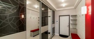
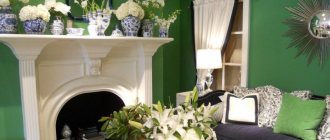
The ideal paint color for a small hallway should be fresh, inviting and provide the perfect welcome to visitors. When choosing a range of colors, there are no rules or restrictions. The most important thing is that the shades intersect with the tones of other rooms.
Often the color of the walls is selected depending on the paint of the front door. Calm shades characterize comfort and tranquility, while dark shades give a special character to the interior. What color is best to decorate a small corridor - see below in the article.
If you prefer a classic neutral, dark and atmospheric interior - choose an entryway scheme that reflects your personal personality as well as the style of the rest of the home.
In addition, when choosing a color for a small hallway, you do not need to rely on current fashion trends. They can change every year, but renovating the corridor every year is not the best pleasure.
Color selection criteria
Choosing the right color is especially important since the hallway is typically the first space people encounter when entering a home. Therefore, it should be a fresh and inviting space.
- To visually enlarge a room, it is best to use shiny materials.
- For visual convenience, you should not use more than three colors in the hallway.
- There should be only one neutral tone, other shades can be contrasting.
These rules will help create intrigue and an atmosphere of comfort and homely warmth.
What color to choose for decorating a small hallway
The corridor is by nature a dark room to which sunlight does not have direct access. This is why wall color is so important. He can change the space parameters - visually expand or narrow the room.
Warm shades are optimal for dark hallways - they lighten and visually expand a narrow corridor: yellow, peach, orange, cream and vanilla.
You can also choose cool colors: beige, blue, light green, white and gray shades.
If the corridor is small and rectangular, you can use optically increasing colors on the walls, that is: shades of yellow, bright orange, bright blue, green and aquamarine tone.
White doors and ceilings will add lightness to the interior and increase the impression of spaciousness.
Bright colors
They look great in a square hallway. To expand it, it is recommended to cover the walls perpendicular to the entrance: purple, green, beige, and the opposite walls with a dark shade.
More: Decorating a hallway in avant-garde style
If you need to optically lower a high ceiling, you can paint it the same tone or slightly darker than the walls, for example, it can be bright blue with light blue walls. It is also recommended to use white on the fronts of the doors and a light floor - this will further expand the room.
Combination of shades of the same color
Designers recommend painting the walls and doors in a small hallway alternately with two shades. This will divide and interestingly diversify a small space.
Color harmony
The color of the walls in the hallway should match the color of other interiors. This is especially true when the corridor is not a separate room, but is completely or partially open to the living room.
You shouldn't paint everything in the same tone - it's boring. It’s worth breaking it up with bright colors or decorative elements:
- paintings;
- mirror frames;
- wall decorations;
- flowers.
These details are great for adding variety to your hallway interior. Playing with colored, light, hanging shelves and arranging hangers can bring extremely interesting effects. It all depends on color preferences and lifestyle.
Black and white
This set of colors fits perfectly into a small corridor, even a very narrow one. And if you choose a hallway in shades of wood, you need to take care of the lighting so that the hallway is warm, so that it does not become gloomy and overloaded with wooden accessories. They can be diluted with aluminum elements.
Colorful ideas
The combination of intense shades is guaranteed to bring a luxurious character to the corridor. Don't be afraid of bold hues - it's all about ensuring they harmonize by choosing tones that can compete equally.
You can use a dark color on the lower half of the wall to keep the hallway feeling spacious.
Peach
If you're not up for a bold clash, you can still experiment with contrasting shades and color blocking, keeping the look neutral with an off-white scheme and nearly matching tones.
Peach tones look stunning when paired with white paint and rich-grained mid-tone wood.
Tip: When shopping for hallway paint, look for brands that offer the same range of wood and wall colors to find the perfect match.
Accent with line
You can add even more interest to a two-tone hallway by painting a sleek black horizontal line. Paired with gray and pink paint, black creates a casual, elegant finish, neatly tying the color scheme together.
Green
The most relaxing of colors, making it ideal for a busy family hallway. Lighter shades also work wonders for visually expanding small spaces, especially when paired with a bright white hue.
In this hallway, the subtle sage color against the white walls creates depth and the impression of space, plus it neatly ties into the color scheme of the room beyond.
More: Hallway decorating ideas
Red
This is a bold paint color choice for a small entryway, but it can look really good if you choose a subtle shade and pair it with more muted colors for the doors, floors, and woodwork.
Door design
With the help of various designs, you can turn white door shutters into a real piece of art.
With inserts
The design is decorated with two insert options:
- Mirrored. Regular, colored or patterned mirror inserts visually increase the area of the room and make it aesthetically pleasing.
- Cup. Such inserts give the product more lightness and airiness, so the door structures do not weigh down the space and bring more light into the room.
Functional and aesthetic white doors with inserts can not only provide zoning and insulation of the room, but also become a full-fledged decorative element that harmoniously supports the chosen style solution.
Under the tree
The elite appearance of a white wood-look door frame will give the interior a special flavor and sophistication. This independent decorative element will perfectly complement any style solution.
With patina
Such paintings look especially original. By removing the top layers, the natural structure of the wood becomes more pronounced and acquires a contrasting pattern.
Glossy
The shine not only gives the product a reflective effect, but also emphasizes its lightness. White lacquered models make the environment attractive, beautiful and sophisticated.
Matte
They have a matte smooth and slightly rough surface; such laconic products can be matte or have inserts made of various glass.
High doors
Original, elegant and formal high doors allow you to move away from stereotypes and create a non-standard and individual design. When open, they add scale, depth and some semblance of set to the room.
Aged
They are true antiques with an exclusive and luxurious look. Aged designs are an indicator of refined taste, elegance and high cost.
With an image
Using a variety of patterns, you can turn a blank canvas into a unique design piece with a strong decorative function. Such products are considered an independent art object that attracts all attention.
With layout
Placed indoors or outdoors, the layout can be made in a variety of geometric or figurative motifs. The English grille performs not only decorative functions, but also allows you to strengthen the glass in large doors.
Barn
These structures, due to their type of opening, are also ideal for small spaces, barn structures undoubtedly become the key decorative accent on which the entire interior rests.
The influence of color on the proportions of space
Colors are known for creating the climate of an interior. Some of them effectively warm up sterile landscapes, while others increase the feeling of cold. There is another potential in their power - the right colors can change the proportions of a room.
Designers and architects are capitalizing on these possibilities, transforming cramped and narrow rooms into spaces that appear much larger than they actually are.
Cabinet Painting Tools
To paint a cabinet yourself, you need to assemble a set of tools. You will need sheets of sandpaper, spatulas, a grinder, primer, putty, solvents, masking tape, a paint tray, glue, and a hair dryer.
Painting is done with brushes - narrow or wide, rollers - velor or foam rubber. A spray bottle or electric spray gun will help to apply the layer evenly. The equipment is used to process large surfaces.
For work you will need protective equipment: special clothing, glasses and gloves, as well as auxiliary materials: soft rags, sponges.
Colors for a narrow hallway
The color palette seems limited in small, narrow and often windowless rooms, and the layout - due to a poor range of tones - is dull and formulaic. In such interiors, both light and dark shades are suitable - provided they are used correctly.
The general rule is that cool pastel shades of blue, mint, gray and white will reflect light and thus optically enhance the area. They are recommended to be used where we want to visually add a few centimeters to the interior.
The colors will “separate” longer walls from each other and give the decor a fresh, light feel. Warm beige, sandy yellow, lilac or powdery pink, in turn, will bring the surfaces closer and absorb light. With their participation, the decor will become more comfortable.
The effect of absorbing and reflecting light, and therefore visual magnification or reduction, can also be achieved with the right finishing.
Matte colors will absorb light. Such coatings do a good job of masking surface unevenness or covering rough spots and streaks, and do not highlight coloring errors. On the contrary, in the case of satin or semi-matte alternatives, which will highlight any imperfections, but on the other hand they will improve the proportions of the interior, bring out the depth of dark tones and reflect rays of light, guaranteeing the impression of spaciousness.
Dark colors
They are supposed to be reserved only for owners of spacious apartments, but their presence in a narrow hallway should not be overwhelming.
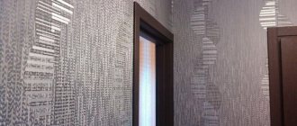
Painting the parallel, farthest walls bottle green, dark blue or even black will visually reduce the proportions of the room. A similar result can be achieved when we cover one of the longest walls with the same rich shade as on the floor.
What not to combine white doors with
Lightweight doors are great on the inside, but they don't always play well with the rest of the room. Let's consider in which cases installing white doors would not be the best option. This will help avoid mistakes and make the interior more harmonious. Like:
- We do not recommend installing light-colored doors in a room where the walls are finished with ivory, because they will look dirty against the background of snow-white fabric, especially if the floor is made in dark beige or reddish-brown shades.
- In a floral bathroom, a white door will look out of place and will create a rustic feel. And not in that rustic style of Provence or the countryside, but in the spirit of a tasteless province.
- Light doors look bad in a completely dark interior. There should be several elements of the same color in the room.
Color combination
A good idea for decorating a narrow corridor is a combination of shades with the same temperature, with varying degrees of saturation, as well as a composition of shades adjacent to each other on the color wheel.
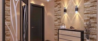
This gradation will be especially beneficial in a small hallway. On the opposite side, you can use the darkest option: coffee brown or granite tones. In turn, the ceiling, floor and furniture should be light, this balances the contrast.
More: How to comfortably arrange a small hallway
In color combinations - in addition to choosing the right shades - proportion is also important. If we choose three shades, it is recommended to distribute them at 70% (neutral), 20% (complementary) and 10% (contrast).
In the case of two, the dominant main tone (70%) is complemented by an accent color (30%). Thanks to this, chaos can be avoided, and the decor will be in perfect harmony.
Combination of shades
White color goes well with any other color. Therefore, as a rule, there are no problems with choosing a color scheme. White wallpaper can also be hung in the hallway. And yet you need to remember the most popular color schemes:
- a combination of white and gold – furniture painted in these tones will fit perfectly into a white hallway;
- the combination of white and black is the most popular design option. The main thing is not to get too carried away with dark colors. It is necessary only for placing accents.
The white composition can also be diluted a little with pastel colors. Furniture decor and textiles will serve as bright accents.
How to visually lower or raise the ceiling
Interior design dilemmas accumulate when, in addition to narrow planes, ceiling height poses a significant challenge. If the hallway is low, it is recommended to choose vertical stripes or cover the ceiling surfaces with a lighter color - for example, white, blue or soft gray.
The chosen shade should be slightly thinner than on the walls, this will create the illusion of increasing the distance between the ceiling and the floor. The resulting impression of “lifting” will be enhanced if the tonality passes to the walls in the form of a strip about a dozen centimeters thick.
In high interiors, you can also use drawing tricks that will align the proportions of the four corners and lower the ceiling.
- The first method involves the use of horizontal stripes, the task of which is to optically expand the room.
- The second is to cover the ceiling with a darker shade than on the walls. Thanks to this, the room becomes not only lower, but also more comfortable.
Door material
The following materials are often used to make white door structures:
- Wood.
- Metal (steel).
- Plastic.
A competent and thoughtful choice of material, taking into account taste preferences, performance characteristics and financial factors, will meet expectations and ensure maximum durability of the canvas.
How to visually change the proportions of a corridor
An effective way to change the proportions of a hallway is vertical stripes. They give the interior elegance and lightness, and also “lengthen” it. This will look good where the ceiling is lowered or the arrangement has a touch of sophistication.
For this reason, vertical lines often emphasize a glamorous, vintage or retro style. In turn, horizontal stripes optically expand the surfaces and increase the depth. When used on a shorter wall, they are the perfect tool for masking imperfections in a narrow room or long hallway.
Small and wide stripes are an extremely decorative element, so it is best to choose them on one, maximum two walls, and reduce the contrast with pastel, harmonizing or monochrome colors. This will prevent the decor from becoming overwhelming while highlighting surfaces and turning them into eye-catching features.
Conclusion
Colors affect more than just mood. In addition to their decorative and psychological function, they also effectively cope with complex surfaces, such as a narrow hallway, a small area, a high or low ceiling.
Choosing the right tone and its application in a certain plane will be a panacea for internal ailments. Light colors will optically enlarge a small corridor, dark colors will add depth, and stripes will expand the wall, lower or raise the ceiling. Using the designers' recommendations, you can enjoy the cozy interiors of small corridors.
What paint to paint the cabinet
In order to determine how to paint an old cabinet with your own hands, you need to study the compatibility of the dye with the material from which the furniture is made.
Acrylic-based coatings are the most popular for painting furniture, because... dry quickly, easy to apply, resistant to damage. The paint is diluted with water, which saves materials. The compositions do not have a strong odor and disappear quickly, so they are suitable for decorating children's rooms and kitchens. The material is applied with a brush or roller.
Cabinets made of chipboard and natural wood are painted with alkyd dyes. The material contains coloring pigments, kerosene solvent, and antiseptic additives.
A popular type of paint is in cans. The material is easy to apply and dries quickly. The paint is distributed evenly.
The choice of material is also influenced by the design project, because... the surface can be glossy or matte. For glossy products you will need enamel varnish paint, which adds shine to the surface. Matte shades are obtained after oil treatment. Transparent paints will help preserve the natural structure of wood.
Unexpected items
Sometimes, in order for all guests to remember your home at first glance, it is enough to place something extravagant next to the front door. This could be a surfboard, phone booth decor, or a pumpkin on a stool.
Design: Ekaterina Malmygina. Photo: Roman Spiridonov
Instagram: @land.inarc
Instagram: @coppercorners
Bicycles
A bicycle does not have to be an annoying nuisance on the balcony; it can be an excellent decoration for the apartment. Add some wall mounts and hang your vehicle on them.
Instagram: @eurostyle_spb
Instagram: @kandrackole
Natural decor
A budget-friendly and easy way to decorate the space near the front door is to bring something from the street. A wicker basket with logs or branches with yellow autumn leaves looks original. Vegetables on the chest of drawers or plant wreaths on the door are also suitable.
Instagram: @stillorgandecor
Instagram: @__styledby_michelle
Video description
About updating an old cabinet in the following video:
Preparation for painting: primer
All cabinet parts intended for painting are dusted and degreased. To do this, wipe the surface with a damp cloth, and then with a cloth moistened with alcohol or a special degreaser. At this stage, care is needed: the slightest particles of glue from the film must be sanded off and degreased.
Dining group in a pastel palette Source archidea.com.ua
Identified defects (scratches, cracks and small irregularities) are eliminated using a special wood putty. After waiting for the composition to dry, the treated areas are sanded and degreased again to level the surface. As a result of the work done, the surface of the product should be completely covered with a network of small scratches.
The primer helps the paint composition adhere better to the surface. It is recommended to prime in two layers, allowing each to dry. Then you need to go over the surface with fine sandpaper again; This must be done carefully so as not to remove the soil. Additional sanding will enhance adhesion, if you remember to thoroughly wipe off the dust afterwards.
Mirrors
Mirrors open up the space, add zest to the interior, but also have a functional purpose. Try to choose an unusually shaped mirror for the corridor: cut in half, in a three-dimensional frame.
Instagram: @ildiko.hirmann
Instagram: @mylands_london
Instagram: @feelslikehome_mina
- Hallway
Mirror in the hallway: design ideas and tips for choosing the right accessory
Carpet
A properly selected carpet immediately adds a touch of chic to the hallway. Choose it so that it matches the color of the furniture or the finish of the floors and walls. And be prepared to design the space so that people entering the house have the opportunity to take off their shoes before they step on the rug.
Instagram: @ildiko.hirmann
Instagram: @smallapartmentjoys
Instagram: @mosebacke
Plants
If daylight reaches the hallway, you can place a living plant there. Shade-loving species are suitable.
- Aspidistra. It tolerates shade well and does not require frequent watering.
- Hamedorea. A very beautiful palm tree with carved large leaves.
- Philodendron climbing. A perennial vine that can be hung in a pot near the ceiling.
Instagram: @insplosion
Instagram: @corrie_louise_w
Instagram: @lauraatnumberwelve
Painted walls
You can also add color with bright wall paint. At the same time, apply techniques to expand the space. For example, if the door, the wall around it and the ceiling are the same dark color, and the walls on the sides and the floor are light, then the ceiling will look noticeably higher.
Instagram: @casapalik
Authors of the project: Alexandra Ogorodnikova and Irina Karpova. Photo: Nick Rudenko
Instagram: @la_sidhu
Instagram: @land.inarc
