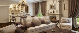
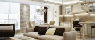
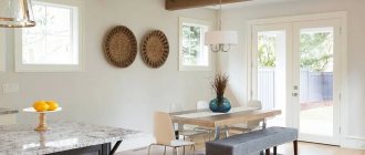
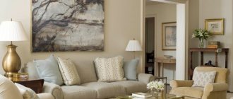
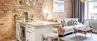
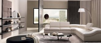
classic beige tones in a combined kitchen and living room
As you know, in the 50-70s in our country, houses with small apartments were built en masse to solve the housing problem. And if the first lucky ones, resettled from communal apartments, were glad to receive separate housing, then the current owners of Khrushchev apartments complain about the lack of square meters. Modern designers claim that the problem of cramped spaces in such apartments can be solved. One of the options for improving living conditions in Khrushchev is to combine a kitchen and a living room.
combining kitchen and living room in a small apartment
dining table on the border of the kitchen and living room combined by removing a common wall
"Pros and cons"
Most often, the kitchen is combined with the living room in order to gain additional space, place a full-fledged dining area and make moving around the apartment more convenient.
There are other advantages too. You increase the kitchen area, you can communicate with family members while cooking, while looking at the TV, and change the environment without moving. In addition, a sea of possibilities for extraordinary design opens up before you.
However, if you have already thought about a kitchen combined with a living room, then you know the advantages of this step.
Now about the disadvantages. The good news is that there may be fewer of them than you think. As you know, to combine rooms in a Khrushchev building you can:
- demolish the entire wall;
- make a wall instead of doors;
- demolish part of the wall.
Until recently, those who wanted to combine rooms were stopped by the need to obtain special permission to remodel or renovate the apartment. And this concerned not only Khrushchev buildings, but any apartment buildings. It’s easy to guess that this procedure involves lengthy and expensive bureaucratic legwork with paperwork.
Today the rules have changed. If during the renovation of a Khrushchev building you do not touch the main (load-bearing) walls, do not interfere with the sewer pipes passing through all floors, as well as ventilation, heating and water supply systems, you will not need a permit.
When such intervention is nevertheless planned, it is necessary to make changes to the technical passport of the apartment. This way you will avoid possible unpleasant consequences for the whole house and will not break the law.
By the way, administrative liability is provided for illegal redevelopment or reconstruction. And an apartment’s registration certificate, which corresponds to reality, will not subsequently complicate its sale, rental or re-registration.
For reference: you can read article 26 of the Housing Code of the Russian Federation.
The disadvantages of the kitchen-living room are considered to be:
- spread of kitchen odors;
- noises made by household appliances, guests or TV;
- the need to use moisture-, dirt-resistant, or at least wet-cleanable materials that are resistant to temperature changes;
- keeping both rooms clean.
As you can see, the kitchen, combined with the living room, is generously shared with the latter's pretentiousness in decoration.
But, you see, it’s not difficult to combat such shortcomings by installing a good exhaust system, silent equipment, and wisely selecting finishing materials and textiles. But for some, these are not disadvantages at all, but minor side effects. One way or another, it is better to learn about them before you start designing a kitchen-living room.
Selection of furniture, household appliances
When purchasing equipment, you should focus on choosing those models that make virtually no noise during operation. Try to place the noisiest appliances in cabinets. This is an ideal option to save space. You should also pay special attention when choosing furniture. Properly selected elements will help to highlight all the advantages of your apartment. It is recommended to select furniture of the same color shades so that all elements are in perfect harmony with each other.
An example of a successful selection of furniture for a kitchen-living room in Provence style
Consider these nuances when purchasing furniture:
- kitchen equipment should be comfortable and functional;
- choose closed facades so that the contents remain invisible to outsiders;
- use a curved cabinet as a work surface;
- Place large furniture against the walls.
Action plan
A well-thought-out plan is the key to the success of every business, right? Once you have received a permit or determined that it is not required, you can begin working on the project. You can compose it yourself or entrust it to professionals.
It is very convenient to use modern programs on the Internet - the so-called 3D online planners. You enter pre-taken measurements, virtually demolish or move walls, and arrange all objects and modules.
It is important to take the correct parameters of the rooms, taking into account all the niches, ledges, pipes, because the smallest error can lead to ruin of your plans. And although the layout of apartments in Khrushchev buildings is identical, it is better not to rely on standard parameters.
So, you have a project with precise measurements. Next action plan:
- determine the size of the kitchen;
- we place the dining area;
- visually separate the kitchen from the living room;
- choose a design style;
- we select materials.
First of all, you place the main modules connected to the hood, drain and other engineering systems, then other functional items. At the same time or finally, think over the interior of the kitchen and living room.
And here we would like to share the following recommendations:
- the smaller the size of the kitchen-living room, the more carefully you need to think about its layout;
- The more little things you take into account when designing, the more comfortable the room you create will be.
Additional Design Elements
What other techniques can you resort to when decorating a kitchen-living room? The space, although a little larger, still remains quite small. The situation can be corrected using optical tricks:
- Use glossy surfaces. For example, suspended ceilings of this type will visually enlarge spaces due to the reflection of light. But keep in mind that such designs will make the ceilings lower by several centimeters.
- To visually lengthen the walls, use shades of the cold spectrum: white, light blue, steel, pearl gray.
- Do not use horizontal lines when decorating the walls - they will make the already low ceilings of the Khrushchev building even lower. But vertical stripes will save the situation. Cover the walls in the living room with striped wallpaper, and decorate the apron in the same style in the kitchen.
- Gloss reflects light well and creates the illusion of space, but mirrors do this even better. A mirrored shelf is a stylish and unusual solution.
In the conditions of Khrushchev it is very difficult to combine a living room with a kitchen. However, the efforts spent on drawing up a design project and the renovation itself will more than pay off. You will receive a spacious and beautiful room in which it is convenient to both relax and host crowded dinners and celebrate holidays.
Important little things
Why do we so persistently draw your attention to the practical side of the issue? The fact is that the concept of beauty is very subjective, moreover, the aesthetic side is presented in all its glory by a selection of photos.
But some functional aspects may fall out of sight, which in the worst case will lead to lifelong inconvenience. In addition, as you know, smart design is in fashion, which will be especially appropriate in Khrushchev.
Therefore, we have prepared an approximate list of little things that directly or indirectly affect the layout and, accordingly, the level of comfort:
- the number of people and generations in the family, taking into account the addition of offspring;
- family traditions, habits, hobbies and ideas about convenience;
- the volume of food consumed and the “scope” of its preparation;
- cooking frequency;
- daily routines, biorhythms, height and weight of each family member;
- important points and factors for you.
Believe it or not, it is recommended to take into account whether you are right-handed or left-handed. It’s good that in most cases the guideline will be the previous layout of the rooms and the already noticed inconveniences in the placement of furniture or equipment.
Selection of colors
Not only zoning affects the convenience and proper use of the combined space. A small studio room also needs the right selection of colors. To make the design of a combined space look cozy and impressive, you need to follow some rules:
- the room should receive enough sunlight;
- the color of furniture, curtains, flooring and wallpaper should be in harmony with each other;
- If you are a fan of a rich palette, you should know that the color of an item depends on its size. The smaller and finer this item, the richer its palette should be. Therefore, curtains always get lighter colors;
- to balance the lighting, you need to choose interior items in brown or gray tones;
- When choosing a palette for the kitchen area, it is worth considering that cold tones reduce appetite, while warm ones increase it.
Kitchen
So how much space is better to devote to a kitchen in a Khrushchev-era building? Ask yourself whether you had enough space for cooking before, whether there is a need to place a table in the kitchen area for a quick snack. Ask yourself other questions that are important to you.
You can use a window sill as an additional working surface. By turning it into a folding or hanging table that can be folded out as needed, you will also create a place for a light breakfast.
A popular idea in organizing a kitchen space is a bar counter, on the console of which all kinds of rails are placed. The dimensions of kitchens in Khrushchev-era buildings simply force the maximum use of the vertical and literally every piece of space, and here is one example. The design of bar counters is so diverse that they have gone beyond modern trends and are found in interiors decorated in a classic style.
For small kitchens, a linear or L-shaped layout, shown in the photo below, is suitable. Parallel (double-row), U-shaped, layout with an island or peninsula is convenient from an ergonomic point of view, but is appropriate in medium-sized and large-sized kitchens.
Apartment redevelopment options
Having decided to combine a kitchen and a living room in a standard Khrushchev house, it is important to choose the best option for remodeling the space. Ultimately, the space should include space for preparing and eating meals, as well as for family time together. Professional interior designers usually use the following techniques:
- Choosing compact but roomy furniture that will accommodate all the necessary household appliances.
- The location of the dining area is next to the kitchen, making it possible to increase the living area.
- Replacing the dining table with a bar counter.
- Placing the TV on hanging brackets.
- Playing with color contrasts when visually zoning space.
Space zoning can be implemented in two ways: demolishing old walls and erecting new structures or installing lightweight movable partitions at the border of two functional zones. As a result, apartment owners will have more square meters. m. usable area than before.
Furniture and interior items are placed on both sides of the new wall
Dining area
Recent studies have proven that eating alone is harmful to your health. It is not for nothing that a large dining table for family and friendly gatherings has been an integral attribute of the home since time immemorial. It is placed between the kitchen and the living room, and if your tradition is to eat in the living room area, in front of the TV, then it is better to place the table in front of the sofa.
An interesting, modern and functional choice for the living room would be a transforming table. When folded, it looks like a coffee table and is suitable for 2-4 people, and when unfolded it is much more spacious, taller and can accommodate 9-10 guests or family members.
Sliding or folding furniture based on the matryoshka principle is an ideal option for Khrushchev, and its intricate mechanisms will emphasize the rationality and good taste of the owners.
Lighting
Using different lighting, you can easily separate different zones in the room, for example, in the kitchen you can install spotlights or lighting around the perimeter of wall cabinets, and in the living room you can hang a large chandelier. To highlight the recreation area, you can install floor lamps with diffused soft light or place a table lamp.
Living room
The main character of the room is a comfortable and beautiful sofa. Like the kitchen, it is arranged linearly, in the letter “L” or “P” - depending on the number of family members and free space. If you plan to frequently receive guests, do not forget to provide additional seating in the form of poufs, folding chairs, extendable chairs or floor pillows.
If necessary, the role of seats will be played by sofa cushions or bolsters. And here the degree of your forethought depends on the size of the room.
The interior of the hall should echo the kitchen in color, texture and materials, uniting both rooms into a single whole. Elegant but expensive natural stone, wood and other trendy materials can easily replace or complement practically indistinguishable imitations.
They are undemanding in care and will withstand high humidity, temperature changes and frequent cleaning. To appreciate the similarities mentioned, take a look at these photos.
Stereoscopic wallpaper will visually expand a small room - the latest in fashion, which is used to decorate an accent wall. They will literally move the wall away, creating the illusion of space - and isn’t this so necessary in Khrushchev?
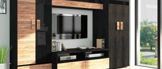
Another regular in the living room is the television or fireplace, usually located opposite the sofa, in an easy-to-view position. Alternatively, both can be placed on a small partition that visually separates the kitchen combined with the living room.
A false wall or partition 1-1.5 m long will not burden the interior. On one side you can hang a plasma on it, connect sockets and cables for the Internet, on the other you can place a small table, shelves for kitchen utensils or indoor plants. In addition, this is one of the good ways to divide space into functional zones.
Methods for zoning space
Zoning of a combined premises in a Khrushchev-era building plays an important role for comfortable living. The zoning of space should be approached with special care in order to correctly designate all the zones necessary for convenience. Despite the fact that the room after redevelopment has a common area, it is simply necessary to separate the kitchen, dining and recreation areas. For these purposes, you can resort to some design techniques:
- lighting;
- decor of wall, floor and ceiling surfaces;
- selection of suitable furniture;
- installation of partitions and screens.
Stylistic directions
The most popular styles for the kitchen-living room:
- hi-tech - an abundance of glass, shiny metal. The main colors are blue-gray, white, and less often black. All household appliances are built-in, hidden behind plain facades. Furniture – multifunctional, modular, transformable. The finishing materials are the most modern, the lighting is bright;
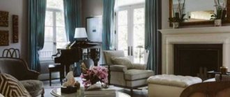
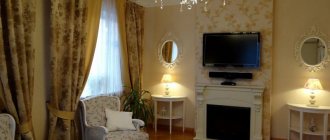
- classic - wooden furniture with smooth lines, light pastel shades. The windows and some of the cabinets are draped with openwork curtains, and the ceiling is decorated with a crystal chandelier. In the space of the hall there will be a false fireplace portal;
- Scandinavian – massive furniture, strict forms, a lot of light, free space. The main color is white and its shades, individual contrasting inclusions are acceptable, mainly in cool colors;
- Provence – light wood furniture, “warm” shades, live plants in flowerpots on the windows and floor. Finishing materials are predominantly natural, checkered or striped textiles, wallpaper is decorated with “rustic” prints;
- minimalism - the interior is predominantly monochromatic, with rare color contrasts. No unnecessary decor, kitchen machines are hidden behind closed cabinet doors. The set, sofa, chairs or armchairs are chosen in the simplest form. The windows have light blinds, Roman blinds;
- loft – rough wall decoration, lots of light, no curtains on the windows. Antique furniture, pretentious “factory” decor, undisguised communications. The ceiling is illuminated so that it appears high;
- Art Deco - smooth lines, predominantly black and white colors. The most expensive and rare finishing materials are used. The zones are clearly marked, there are many mirrors, “rich” decor, a luxurious multi-arm chandelier in the very center.
